Client Sentiment Survey - 4/12/13

April 12, 2013

Here we have the next round of the Dorsey, Wright Sentiment Survey, the first third-party sentiment poll. Participate to learn more about our Dorsey, Wright Polo Shirt raffle! Just follow the instructions after taking the poll, and we’ll enter you in the contest. Thanks to all our participants from last round.

As you know, when individuals self-report, they are always taller and more beautiful than when outside observers report their perceptions! Instead of asking individual investors to self-report whether they are bullish or bearish, we’d like financial advisors to weigh in and report on the actual behavior of clients. It’s two simple questions and will take no more than 20 seconds of your time. We’ll construct indicators from the data and report the results regularly on our blog–but we need your help to get a large statistical sample!

Click here to take Dorsey, Wright’s Client Sentiment Survey.

Contribute to the greater good! It’s painless, we promise.

Posted by:


Fund Flows

April 4, 2013

Mutual fund flow estimates are derived from data collected by The Investment Company Institute covering more than 95 percent of industry assets and are adjusted to represent industry totals.

fundflows

Posted by:


Client Sentiment Survey Results - 3/22/13

April 1, 2013

Our latest sentiment survey was open from 3/22/13 to 3/29/13. The Dorsey, Wright Polo Shirt Raffle continues to drive advisor participation, and we greatly appreciate your support! This round, we had 72 advisors participate in the survey. If you believe, as we do, that markets are driven by supply and demand, client behavior is important. We’re not asking what you think of the market—since most of our blog readers are financial advisors, we’re asking instead about the behavior of your clients. Then we’re aggregating responses exclusively for our readership. Your privacy will not be compromised in any way.

After the first 30 or so responses, the established pattern was simply magnified, so we are fairly comfortable about the statistical validity of our sample. Some statistical uncertainty this round comes from the fact that we only had four investors say that thier clients are more afraid of missing a stock upturn than being caught in a downdraft. Most of the responses were from the U.S., but we also had multiple advisors respond from at least two other countries. Let’s get down to an analysis of the data! Note: You can click on any of the charts to enlarge them.

Question 1. Based on their behavior, are your clients currently more afraid of: a) getting caught in a stock market downdraft, or b) missing a stock market upturn?
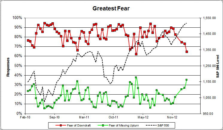
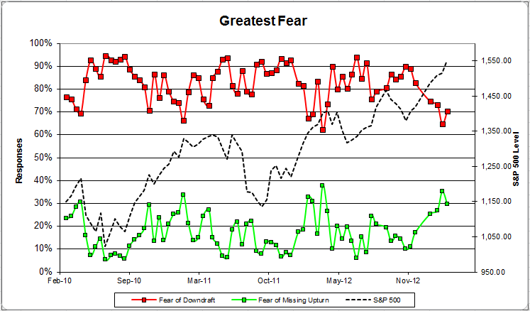
Chart 1: Greatest Fear. From survey to survey, the S&P; 500 was flat, and our indicators were mixed. The fear of downdraft group ticked up a point, from 70% to 71%. The downdraft group fell from 30% to 29%.

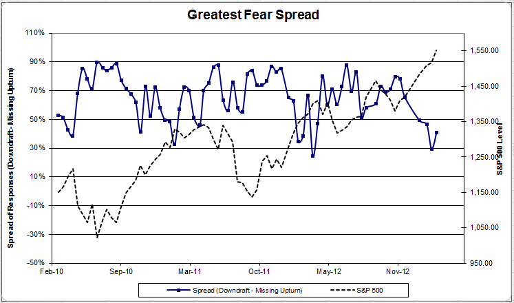
Chart 2: Greatest Fear Spread. Another way to look at this data is to examine the spread between the two groups. The spread rose from 41% to 42%.

Question 2. Based on their behavior, how would you rate your clients’ current appetite for risk?

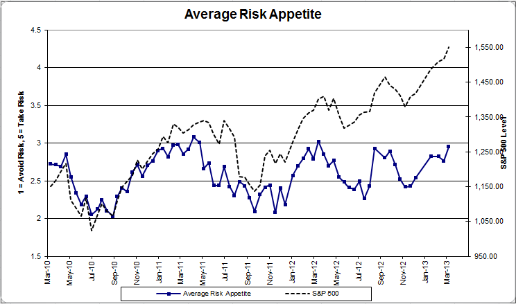
Chart 3: Average Risk Appetite. Average risk appetite jumped this round, from 2.95 to 3.08, matching the all-time survey highs for this indicator.

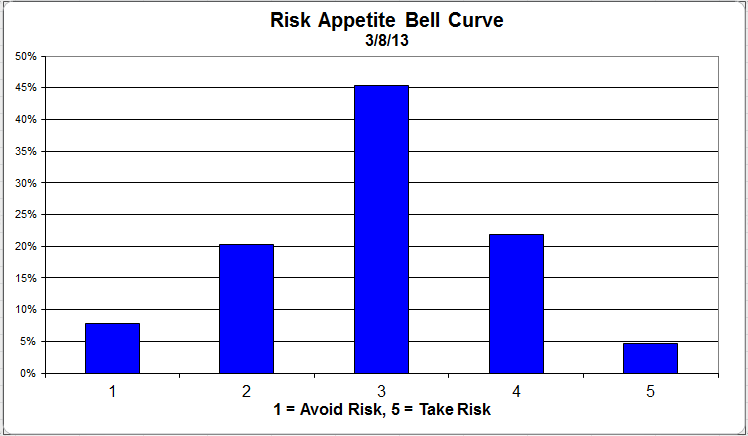
Chart 4: Risk Appetite Bell Curve. This chart uses a bell curve to break out the percentage of respondents at each risk appetite level. This round, there’s been a noticeable shift towards 3. Nearly half of all participants want a risk appetite of 3.

Chart 5: Risk appetite Bell Curve by Group. The next three charts use cross-sectional data. The chat plots the reported client risk appetite separately for the fear of downdraft and for the fear of missing upturn groups. We can see the upturn group wants more risk, while the fear of downturn group is looking for less risk.

Chart 6: Average Risk Appetite by Group. This round, the downturn group’s average rise, while the upturn group’s average fell slightly.

Chart 7: Risk Appetite Spread. This is a chart constructed from the data in Chart 6, where the average risk appetite of the downdraft group is subtracted from the average risk appetite of the missing upturn group. The spread dropped this round.

From survey to survey, the S&P; was basically flat. The overall risk appetite number is sitting at all-time highs. We can expect to see it break through if the market can continue to rally. The first quarter was great for the stock market, so here’s hoping to more of the same.

No one can predict the future, as we all know, so instead of prognosticating, we will sit back and enjoy the ride. A rigorously tested, systematic investment process provides a great deal of comfort for clients during these types of fearful, highly uncertain market environments. Until next time, good trading and thank you for participating.

Posted by:


Client Sentiment Survey - 3/22/13

March 22, 2013

Here we have the next round of the Dorsey, Wright Sentiment Survey, the first third-party sentiment poll. Participate to learn more about our Dorsey, Wright Polo Shirt raffle! Just follow the instructions after taking the poll, and we’ll enter you in the contest. Thanks to all our participants from last round.

As you know, when individuals self-report, they are always taller and more beautiful than when outside observers report their perceptions! Instead of asking individual investors to self-report whether they are bullish or bearish, we’d like financial advisors to weigh in and report on the actual behavior of clients. It’s two simple questions and will take no more than 20 seconds of your time. We’ll construct indicators from the data and report the results regularly on our blog–but we need your help to get a large statistical sample!

Click here to take Dorsey, Wright’s Client Sentiment Survey.

Contribute to the greater good! It’s painless, we promise.

Posted by:


Client Sentiment Survey Results - 3/8/13

March 19, 2013

Our latest sentiment survey was open from 3/8/13 to 3/15/13. The Dorsey, Wright Polo Shirt Raffle continues to drive advisor participation, and we greatly appreciate your support! This round, we had 65 advisors participate in the survey. If you believe, as we do, that markets are driven by supply and demand, client behavior is important. We’re not asking what you think of the market—since most of our blog readers are financial advisors, we’re asking instead about the behavior of your clients. Then we’re aggregating responses exclusively for our readership. Your privacy will not be compromised in any way.

After the first 30 or so responses, the established pattern was simply magnified, so we are fairly comfortable about the statistical validity of our sample. Some statistical uncertainty this round comes from the fact that we only had four investors say that thier clients are more afraid of missing a stock upturn than being caught in a downdraft. Most of the responses were from the U.S., but we also had multiple advisors respond from at least two other countries. Let’s get down to an analysis of the data! Note: You can click on any of the charts to enlarge them.

Question 1. Based on their behavior, are your clients currently more afraid of: a) getting caught in a stock market downdraft, or b) missing a stock market upturn?

Chart 1: Greatest Fear. From survey to survey, the S&P; 500 rose just over +2%, and our indicators responded with a mixed bag. The fear of downturn group actually rose from 65% to 70% in a rising market, which we would not expect to see. The upturn group fell from 35% to 30%.

Chart 2: Greatest Fear Spread. Another way to look at this data is to examine the spread between the two groups. The spread rose from 29% to 41%.

Question 2. Based on their behavior, how would you rate your clients’ current appetite for risk?

Chart 3: Average Risk Appetite. Average risk appetite jumped this round, from 2.76 to 2.95. We’re sitting just off 1-year highs of client risk appetite at this point. If the market continues to rally, this indicator should be able to break through 3.

Chart 4: Risk Appetite Bell Curve. This chart uses a bell curve to break out the percentage of respondents at each risk appetite level. This round, nearly 75% of all respondents wanted a risk appetite of 3 or less.

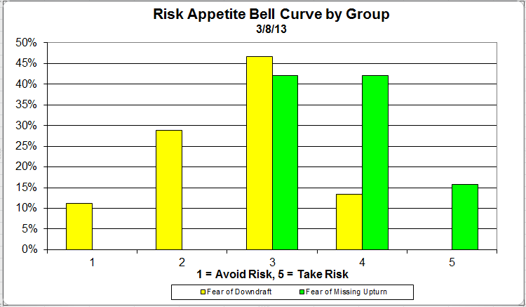
Chart 5: Risk appetite Bell Curve by Group. The next three charts use cross-sectional data. The chat plots the reported client risk appetite separately for the fear of downdraft and for the fear of missing upturn groups. We can see the upturn group wants more risk, while the fear of downturn group is looking for less risk.

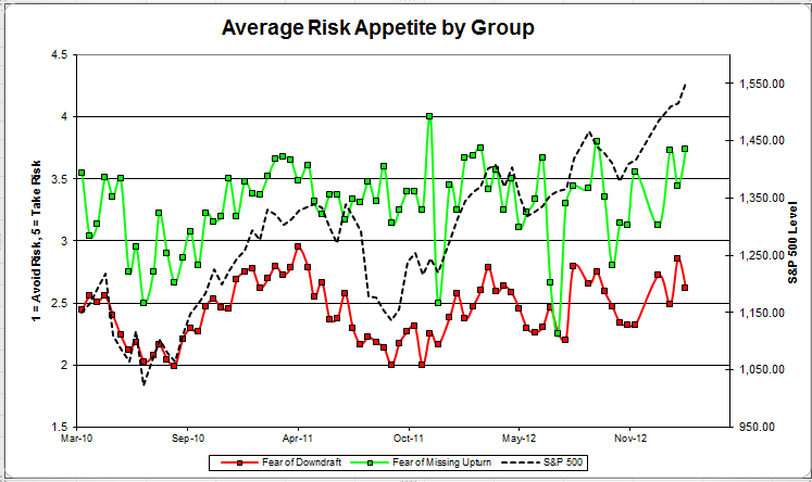
Chart 6: Average Risk Appetite by Group. This round, the downturn group’s average fell, while the upturn group’s average shot higher. This continues to be our most volatile indicator.

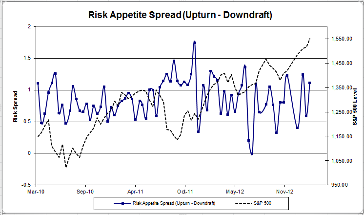
Chart 7: Risk Appetite Spread. This is a chart constructed from the data in Chart 6, where the average risk appetite of the downdraft group is subtracted from the average risk appetite of the missing upturn group. The spread moved higher this round.

The S&P; has now managed to rally nearly 10% for the year (as of this writing), and client sentiment has responded favorably. Hopefully, we can see the stock market continue to rally into the second quarter, and clients become more comfortable with taking risk and investing in the market.

No one can predict the future, as we all know, so instead of prognosticating, we will sit back and enjoy the ride. A rigorously tested, systematic investment process provides a great deal of comfort for clients during these types of fearful, highly uncertain market environments. Until next time, good trading and thank you for participating.

Posted by:


Client Sentiment Survey - 3/8/13

March 8, 2013

Here we have the next round of the Dorsey, Wright Sentiment Survey, the first third-party sentiment poll. Participate to learn more about our Dorsey, Wright Polo Shirt raffle! Just follow the instructions after taking the poll, and we’ll enter you in the contest. Thanks to all our participants from last round.

As you know, when individuals self-report, they are always taller and more beautiful than when outside observers report their perceptions! Instead of asking individual investors to self-report whether they are bullish or bearish, we’d like financial advisors to weigh in and report on the actual behavior of clients. It’s two simple questions and will take no more than 20 seconds of your time. We’ll construct indicators from the data and report the results regularly on our blog–but we need your help to get a large statistical sample!

Click here to take Dorsey, Wright’s Client Sentiment Survey.

Contribute to the greater good! It’s painless, we promise.

Posted by:


High RS Diffusion Index

March 6, 2013

The chart below measures the percentage of high relative strength stocks that are trading above their 50-day moving average (universe of mid and large cap stocks.) As of 3/5/13.

The 10-day moving average of this indicator is 91% and the one-day reading is 80%.

Posted by:


Client Sentiment Survey Results - 2/22/13

March 5, 2013

Our latest sentiment survey was open from 2/22/13 – 3/1/13. The Dorsey, Wright Polo Shirt Raffle continues to drive advisor participation, and we greatly appreciate your support! This round, we had 55 advisors participate in the survey. If you believe, as we do, that markets are driven by supply and demand, client behavior is important. We’re not asking what you think of the market—since most of our blog readers are financial advisors, we’re asking instead about the behavior of your clients. Then we’re aggregating responses exclusively for our readership. Your privacy will not be compromised in any way.

After the first 30 or so responses, the established pattern was simply magnified, so we are fairly comfortable about the statistical validity of our sample. Some statistical uncertainty this round comes from the fact that we only had four investors say that thier clients are more afraid of missing a stock upturn than being caught in a downdraft. Most of the responses were from the U.S., but we also had multiple advisors respond from at least two other countries. Let’s get down to an analysis of the data! Note: You can click on any of the charts to enlarge them.

Question 1. Based on their behavior, are your clients currently more afraid of: a) getting caught in a stock market downdraft, or b) missing a stock market upturn?

Chart 1: Greatest Fear. From survey to survey, the S&P; 500 rose about 0.5%, and our indicators responded with a mixed bag. The fear of downturn group fell big this round, from 73% to 65%, while the upturn group rose from 27% to 35%. This indicator is now showing the best client sentiment we’ve seen since March of 2012.
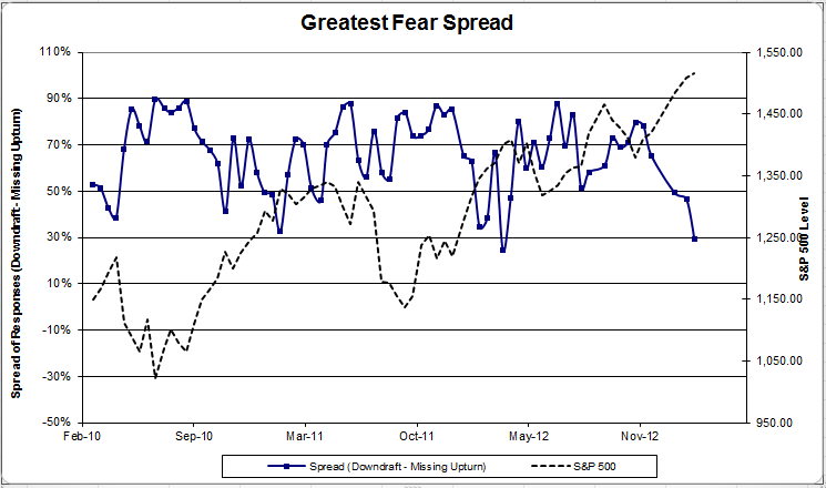
Chart 2: Greatest Fear Spread. Another way to look at this data is to examine the spread between the two groups. The spread continued to fall, from 46% to 29%.

Question 2. Based on their behavior, how would you rate your clients’ current appetite for risk?
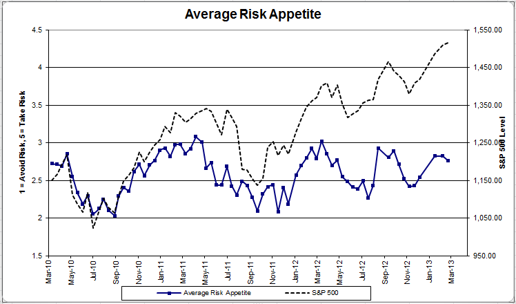
Chart 3: Average Risk Appetite. Average risk appetite fell this round, which is not what we’d expect to see. However, this indicator has been rising steadily with the market over the past few rounds, and it only fell by a small degree. If the market continues to rally, watch for average risk to continue to climb.
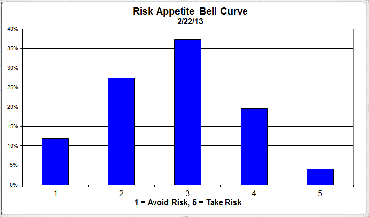
Chart 4: Risk Appetite Bell Curve. This chart uses a bell curve to break out the percentage of respondents at each risk appetite level. This round, over 75% of all respondents wanted a risk appetite of 3 or less.
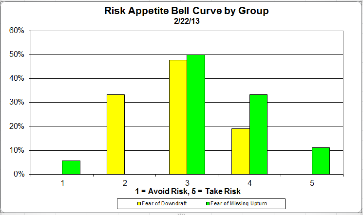
Chart 5: Risk appetite Bell Curve by Group. The next three charts use cross-sectional data. The chat plots the reported client risk appetite separately for the fear of downdraft and for the fear of missing upturn groups. We can see the upturn group wants more risk, while the fear of downturn group is looking for less risk. This is our most volatile indicator, as usual.
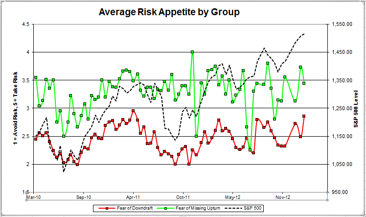
Chart 6: Average Risk Appetite by Group. This round, the downturn group’s average fell, while the upturn group’s average shot higher.
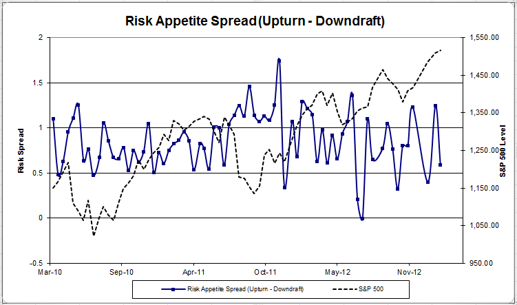
Chart 7: Risk Appetite Spread. This is a chart constructed from the data in Chart 6, where the average risk appetite of the downdraft group is subtracted from the average risk appetite of the missing upturn group. The spread moved higher this round.

The S&P; has now rallied for nearly two-thirds of the first quarter, and client sentiment has responded favorably. All of our indicators are showing broad improvement in client sentiment, save a slight mis-step here or there. If the stock market can continue to move higher, there’s no question that clients will become more aggressive and more comfortable with adding risk.

No one can predict the future, as we all know, so instead of prognosticating, we will sit back and enjoy the ride. A rigorously tested, systematic investment process provides a great deal of comfort for clients during these types of fearful, highly uncertain market environments. Until next time, good trading and thank you for participating.

Posted by:


Client Sentiment Survey - 2/22/13

February 22, 2013

Here we have the next round of the Dorsey, Wright Sentiment Survey, the first third-party sentiment poll. Participate to learn more about our Dorsey, Wright Polo Shirt raffle! Just follow the instructions after taking the poll, and we’ll enter you in the contest. Thanks to all our participants from last round.

As you know, when individuals self-report, they are always taller and more beautiful than when outside observers report their perceptions! Instead of asking individual investors to self-report whether they are bullish or bearish, we’d like financial advisors to weigh in and report on the actual behavior of clients. It’s two simple questions and will take no more than 20 seconds of your time. We’ll construct indicators from the data and report the results regularly on our blog–but we need your help to get a large statistical sample!

Click here to take Dorsey, Wright’s Client Sentiment Survey.

Contribute to the greater good! It’s painless, we promise.

Posted by:


Client Survey Results - 2/8/13

February 20, 2013

Our latest sentiment survey was open from 2/8/13 – 2/15/13. The Dorsey, Wright Polo Shirt Raffle continues to drive advisor participation, and we greatly appreciate your support! This round, we had 70 advisors participate in the survey. If you believe, as we do, that markets are driven by supply and demand, client behavior is important. We’re not asking what you think of the market—since most of our blog readers are financial advisors, we’re asking instead about the behavior of your clients. Then we’re aggregating responses exclusively for our readership. Your privacy will not be compromised in any way.

After the first 30 or so responses, the established pattern was simply magnified, so we are fairly comfortable about the statistical validity of our sample. Some statistical uncertainty this round comes from the fact that we only had four investors say that thier clients are more afraid of missing a stock upturn than being caught in a downdraft. Most of the responses were from the U.S., but we also had multiple advisors respond from at least two other countries. Let’s get down to an analysis of the data! Note: You can click on any of the charts to enlarge them.

Question 1. Based on their behavior, are your clients currently more afraid of: a) getting caught in a stock market downdraft, or b) missing a stock market upturn?

Chart 1: Greatest Fear. From survey to survey, the S&P; 500 rose around +1.5%, and our indicators responded as expected. The fear of downdraft group fell from 75% to 73%, while the upturn group rose from 25% to 27%. The market is continuing to rally well into the first quarter.

Chart 2: Greatest Fear Spread. Another way to look at this data is to examine the spread between the two groups. The spread nudged lower , from 49% to 46%.

Question 2. Based on their behavior, how would you rate your clients’ current appetite for risk?

Chart 3: Average Risk Appetite. Average risk remained the same, from 2.825 to 2.821.

Chart 4: Risk Appetite Bell Curve. This chart uses a bell curve to break out the percentage of respondents at each risk appetite level. This round, just under 85% of all respondents wanted a risk appetite of 3 or less.

Chart 5: Risk appetite Bell Curve by Group. The next three charts use cross-sectional data. The chat plots the reported client risk appetite separately for the fear of downdraft and for the fear of missing upturn groups. We can see the upturn group wants more risk, while the fear of downturn group is looking for less risk.

Chart 6: Average Risk Appetite by Group. This round, the downturn group’s average fell, while the upturn group’s average shot higher.

Chart 7: Risk Appetite Spread. This is a chart constructed from the data in Chart 6, where the average risk appetite of the downdraft group is subtracted from the average risk appetite of the missing upturn group. The spread moved higher this round.

The S&P; has now rallied for just over half the length of the first quarter, and client sentiment has responded favorably. All of our indicators are showing broad improvement in client sentiment. If the stock market can continue to move higher, there’s no question that clients will become more aggressive and more comfortable with adding risk.

No one can predict the future, as we all know, so instead of prognosticating, we will sit back and enjoy the ride. A rigorously tested, systematic investment process provides a great deal of comfort for clients during these types of fearful, highly uncertain market environments. Until next time, good trading and thank you for participating.

Posted by:


High RS Diffusion Index

February 20, 2013

The chart below measures the percentage of high relative strength stocks that are trading above their 50-day moving average (universe of mid and large cap stocks.) As of 2/12/13.

The 10-day moving average of this indicator is 92% and the one-day reading is also 92%.

Posted by:


Client Sentiment Survey - 2/8/13

February 8, 2013

Here we have the next round of the Dorsey, Wright Sentiment Survey, the first third-party sentiment poll. Participate to learn more about our Dorsey, Wright Polo Shirt raffle! Just follow the instructions after taking the poll, and we’ll enter you in the contest. Thanks to all our participants from last round.

As you know, when individuals self-report, they are always taller and more beautiful than when outside observers report their perceptions! Instead of asking individual investors to self-report whether they are bullish or bearish, we’d like financial advisors to weigh in and report on the actual behavior of clients. It’s two simple questions and will take no more than 20 seconds of your time. We’ll construct indicators from the data and report the results regularly on our blog–but we need your help to get a large statistical sample!

Click here to take Dorsey, Wright’s Client Sentiment Survey.

Contribute to the greater good! It’s painless, we promise.

Posted by:


86 Years of High Relative Strength

February 5, 2013

Ken French’s database is an unparalleled and *free* source of all types of stock market data. We’ve used this database to track high relative strength performance versus the broad market, other indices, against moving averages, and other return factors (like value).

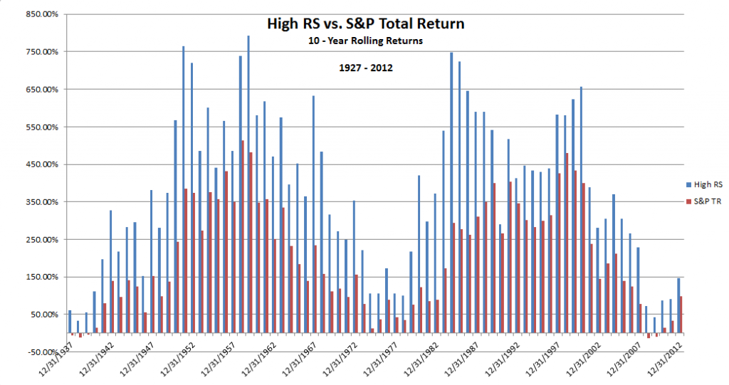
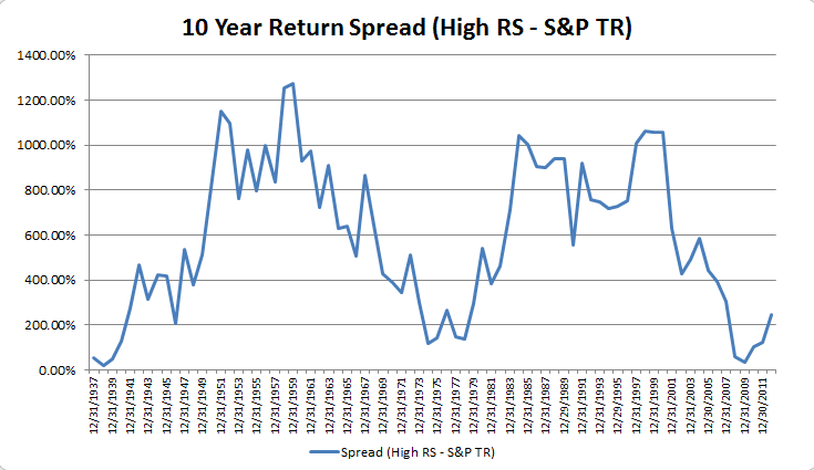
Let’s dip back into the well for another go-round. Today, we updated our database to account for the full year of 2012. The chart below shows the 10-year rolling return numbers for the High RS portfolio on the Ken French website. Click here to read the description of how this portfolio is constructed. In layman’s terms, it’s the biggest stocks by market capitalization (top half), and the best performing stocks by price performance (top third). The results speak for themselves. Since 1927, the 10-year rolling return of the High RS portfolio has outperformed the S&P; 500 Total Return index an astonishing 100% of the time.

“All I do is win”

Source: Ken French Database, Global Financial Data, Click to enlarge

Using that data, we constructed a linear graph of the spread between the two indexes. The spread was constructed by subtracting the 10-year rolling return of the S&P; Total Return from the returns of the High RS portfolio.

Source: Ken French Database, Click to enlarge

The spread looks to be exiting a recent low. Over the last near-century, these types of lows in the High RS Spread have led to extreme outperformance in the 10-year rolling numbers. Of course, there is no way to tell what will happen in the future. However, using the past as our guide, we believe that going forward, the relative strength factor will continue to be a source for outperformance in a constantly changing market.

Posted by:


Fund Flows

January 31, 2013

Mutual fund flow estimates are derived from data collected by The Investment Company Institute covering more than 95 percent of industry assets and are adjusted to represent industry totals.

Posted by:


Client Survey Results - 1/18/13

January 29, 2013

Our latest sentiment survey was open from 1/18/13 – 1/25/13. The Dorsey, Wright Polo Shirt Raffle continues to drive advisor participation, and we greatly appreciate your support! This round, we had 63 advisors participate in the survey. If you believe, as we do, that markets are driven by supply and demand, client behavior is important. We’re not asking what you think of the market—since most of our blog readers are financial advisors, we’re asking instead about the behavior of your clients. Then we’re aggregating responses exclusively for our readership. Your privacy will not be compromised in any way.

After the first 30 or so responses, the established pattern was simply magnified, so we are fairly comfortable about the statistical validity of our sample. Some statistical uncertainty this round comes from the fact that we only had four investors say that thier clients are more afraid of missing a stock upturn than being caught in a downdraft. Most of the responses were from the U.S., but we also had multiple advisors respond from at least two other countries. Let’s get down to an analysis of the data! Note: You can click on any of the charts to enlarge them.

Question 1. Based on their behavior, are your clients currently more afraid of: a) getting caught in a stock market downdraft, or b) missing a stock market upturn?

Chart 1: Greatest Fear. From survey to survey (it’s been just over 1 month), the S&P; 500 rose nearly +5%, and our indicators responded as expected. The fear of downdraft group fell from 83% to 75%, while the upturn group rose from 17% to 25%. The market is off to a strong start this year, and client sentiment is showing strong signs of improvement after a lackluster end of 2012.

Chart 2: Greatest Fear Spread. Another way to look at this data is to examine the spread between the two groups. The spread dropped by a large margin, down from 65% to 49%.

Question 2. Based on their behavior, how would you rate your clients’ current appetite for risk?

Chart 3: Average Risk Appetite. Average risk moved strongly upwards, from 2.54 to 2.83.

Chart 4: Risk Appetite Bell Curve. This chart uses a bell curve to break out the percentage of respondents at each risk appetite level. This round, over 85% of all respondents wanted a risk appetite of 3 or less.

Chart 5: Risk appetite Bell Curve by Group. The next three charts use cross-sectional data. The chat plots the reported client risk appetite separately for the fear of downdraft and for the fear of missing upturn groups. We can see the upturn group wants more risk, while the fear of downturn group is looking for less risk.

Chart 6: Average Risk Appetite by Group. This round, the upturn group’s risk appetite average fell, while the downturn group’s rose.

Chart 7: Risk Appetite Spread. This is a chart constructed from the data in Chart 6, where the average risk appetite of the downdraft group is subtracted from the average risk appetite of the missing upturn group. The spread fell this round.

The S&P; shot out of the gate for 2013, and client sentiment responded favorably. The fear of losing money in the market percentage declined to 75%. Average risk appetite climbed steadily with the market. If the stock market can manage to put together a rally over the first six months of the year, we definitely have a chance at seeing some of the best client sentiment in the history of this survey.

No one can predict the future, as we all know, so instead of prognosticating, we will sit back and enjoy the ride. A rigorously tested, systematic investment process provides a great deal of comfort for clients during these types of fearful, highly uncertain market environments. Until next time, good trading and thank you for participating.

Posted by:


Client Sentiment Survey - 1/18/13

January 18, 2013

Here we have the next round of the Dorsey, Wright Sentiment Survey, the first third-party sentiment poll. Participate to learn more about our Dorsey, Wright Polo Shirt raffle! Just follow the instructions after taking the poll, and we’ll enter you in the contest. Thanks to all our participants from last round.

As you know, when individuals self-report, they are always taller and more beautiful than when outside observers report their perceptions! Instead of asking individual investors to self-report whether they are bullish or bearish, we’d like financial advisors to weigh in and report on the actual behavior of clients. It’s two simple questions and will take no more than 20 seconds of your time. We’ll construct indicators from the data and report the results regularly on our blog–but we need your help to get a large statistical sample!

Click here to take Dorsey, Wright’s Client Sentiment Survey.

Contribute to the greater good! It’s painless, we promise.

Posted by:


Client Sentiment Survey Results - 12/7/12

December 17, 2012

Our latest sentiment survey was open from 12/7/12 to 12/14/12. The Dorsey, Wright Polo Shirt Raffle continues to drive advisor participation, and we greatly appreciate your support! This round, we had 58 advisors participate in the survey. If you believe, as we do, that markets are driven by supply and demand, client behavior is important. We’re not asking what you think of the market—since most of our blog readers are financial advisors, we’re asking instead about the behavior of your clients. Then we’re aggregating responses exclusively for our readership. Your privacy will not be compromised in any way.

After the first 30 or so responses, the established pattern was simply magnified, so we are fairly comfortable about the statistical validity of our sample. Some statistical uncertainty this round comes from the fact that we only had four investors say that thier clients are more afraid of missing a stock upturn than being caught in a downdraft. Most of the responses were from the U.S., but we also had multiple advisors respond from at least two other countries. Let’s get down to an analysis of the data! Note: You can click on any of the charts to enlarge them.

Question 1. Based on their behavior, are your clients currently more afraid of: a) getting caught in a stock market downdraft, or b) missing a stock market upturn?

Chart 1: Greatest Fear. From survey to survey, the S&P; 500 rose by around +0.5%, and our indicators responded as expected. The fear of downdraft group fell from 89% to 83%, while the upturn group rose from 11% to 17%. Despite the modest move towards more risk, client sentiment remains poor.

Chart 2: Greatest Fear Spread. Another way to look at this data is to examine the spread between the two groups. The spread dropped again, from 78% to 65%.

Question 2. Based on their behavior, how would you rate your clients’ current appetite for risk?

Chart 3: Average Risk Appetite. Average risk moved higher this round with the market, from 2.43% to 2.54%.

Chart 4: Risk Appetite Bell Curve. This chart uses a bell curve to break out the percentage of respondents at each risk appetite level. This round, over 90% of all respondents wanted a risk appetite of 3 or less for the third survey round in a row.

Chart 5: Risk appetite Bell Curve by Group. The next three charts use cross-sectional data. The chat plots the reported client risk appetite separately for the fear of downdraft and for the fear of missing upturn groups. We can see the upturn group wants more risk, while the fear of downturn group is looking for less risk.

Chart 6: Average Risk Appetite by Group. This round, the downturn group’s average remained exactly the same, while the upturn group’s average jumped by a large degree.

Chart 7: Risk Appetite Spread. This is a chart constructed from the data in Chart 6, where the average risk appetite of the downdraft group is subtracted from the average risk appetite of the missing upturn group. The spread jumped this round.

The S&P; 500 inched higher from survey to survey, and our indicators responded in-kind to the same degree. The greatest fear numbers moved slightly towards the positive, and overall risk appetite nudged higher. Client sentiment remains poor overall.

No one can predict the future, as we all know, so instead of prognosticating, we will sit back and enjoy the ride. A rigorously tested, systematic investment process provides a great deal of comfort for clients during these types of fearful, highly uncertain market environments. Until next time, good trading and thank you for participating.

Posted by:


Client Sentiment Survey - 12/7/12

December 7, 2012

Here we have the next round of the Dorsey, Wright Sentiment Survey, the first third-party sentiment poll. Participate to learn more about our Dorsey, Wright Polo Shirt raffle! Just follow the instructions after taking the poll, and we’ll enter you in the contest. Thanks to all our participants from last round.

As you know, when individuals self-report, they are always taller and more beautiful than when outside observers report their perceptions! Instead of asking individual investors to self-report whether they are bullish or bearish, we’d like financial advisors to weigh in and report on the actual behavior of clients. It’s two simple questions and will take no more than 20 seconds of your time. We’ll construct indicators from the data and report the results regularly on our blog–but we need your help to get a large statistical sample!

Click here to take Dorsey, Wright’s Client Sentiment Survey.

Contribute to the greater good! It’s painless, we promise.

Posted by:


Client Sentiment Survey Results - 11/23/12

December 4, 2012

Our latest sentiment survey was open from 11/23/12 to 11/30/12. The Dorsey, Wright Polo Shirt Raffle continues to drive advisor participation, and we greatly appreciate your support! This round, we had 73 advisors participate in the survey. If you believe, as we do, that markets are driven by supply and demand, client behavior is important. We’re not asking what you think of the market—since most of our blog readers are financial advisors, we’re asking instead about the behavior of your clients. Then we’re aggregating responses exclusively for our readership. Your privacy will not be compromised in any way.

After the first 30 or so responses, the established pattern was simply magnified, so we are fairly comfortable about the statistical validity of our sample. Some statistical uncertainty this round comes from the fact that we only had four investors say that thier clients are more afraid of missing a stock upturn than being caught in a downdraft. Most of the responses were from the U.S., but we also had multiple advisors respond from at least two other countries. Let’s get down to an analysis of the data! Note: You can click on any of the charts to enlarge them.

Question 1. Based on their behavior, are your clients currently more afraid of: a) getting caught in a stock market downdraft, or b) missing a stock market upturn?

Chart 1: Greatest Fear. From survey to survey, the S&P; 500 rose by just over 2%, and our indicators responded as expected. The fear of downdraft group ticked slightly lower, from 90% to 89%, while the upturn group managed to rise from 10% to 11%.

Chart 2: Greatest Fear Spread. Another way to look at this data is to examine the spread between the two groups. The spread dipped from 80% to 78%.

Question 2. Based on their behavior, how would you rate your clients’ current appetite for risk?

Chart 3: Average Risk Appetite. Average risk appetite bounced ever so slightly with the rising market, from 2.42 to 2.43.

Chart 4: Risk Appetite Bell Curve. This chart uses a bell curve to break out the percentage of respondents at each risk appetite level. This round, over 90% of all respondents wanted a risk appetite of 3 or less for the second survey round in a row.

Chart 5: Risk appetite Bell Curve by Group. The next three charts use cross-sectional data. The chat plots the reported client risk appetite separately for the fear of downdraft and for the fear of missing upturn groups. We can see the upturn group wants more risk, while the fear of downturn group is looking for less risk.

Chart 6: Average Risk Appetite by Group. This round, both groups’ average managed to move slightly lower, while the overage average ticked barely higher.

Chart 7: Risk Appetite Spread. This is a chart constructed from the data in Chart 6, where the average risk appetite of the downdraft group is subtracted from the average risk appetite of the missing upturn group. The spread remained unchanged.

The S&P; 500 rose around 2% from survey to survey, and our indicators nudged themselves into the right direction. The fear of downdraft group fell by a measly 1%. Overall risk appetite increased by a whopping .01 point, indicating a very tepid response to a short-term move higher in the market. Things still look bad sentiment-wise.

No one can predict the future, as we all know, so instead of prognosticating, we will sit back and enjoy the ride. A rigorously tested, systematic investment process provides a great deal of comfort for clients during these types of fearful, highly uncertain market environments. Until next time, good trading and thank you for participating.

Posted by:


Client Sentiment Survey - 11/23/12

November 26, 2012

Here we have the next round of the Dorsey, Wright Sentiment Survey, the first third-party sentiment poll. Participate to learn more about our Dorsey, Wright Polo Shirt raffle! Just follow the instructions after taking the poll, and we’ll enter you in the contest. Thanks to all our participants from last round.

As you know, when individuals self-report, they are always taller and more beautiful than when outside observers report their perceptions! Instead of asking individual investors to self-report whether they are bullish or bearish, we’d like financial advisors to weigh in and report on the actual behavior of clients. It’s two simple questions and will take no more than 20 seconds of your time. We’ll construct indicators from the data and report the results regularly on our blog–but we need your help to get a large statistical sample!

Click here to take Dorsey, Wright’s Client Sentiment Survey.

Contribute to the greater good! It’s painless, we promise.

Posted by:


Client Sentiment Survey Results - 11/9/12

November 20, 2012

Our latest sentiment survey was open from 11/9/12 to 11/16/12. The Dorsey, Wright Polo Shirt Raffle continues to drive advisor participation, and we greatly appreciate your support! This round, we had 69 advisors participate in the survey. If you believe, as we do, that markets are driven by supply and demand, client behavior is important. We’re not asking what you think of the market—since most of our blog readers are financial advisors, we’re asking instead about the behavior of your clients. Then we’re aggregating responses exclusively for our readership. Your privacy will not be compromised in any way.

After the first 30 or so responses, the established pattern was simply magnified, so we are fairly comfortable about the statistical validity of our sample. Some statistical uncertainty this round comes from the fact that we only had four investors say that thier clients are more afraid of missing a stock upturn than being caught in a downdraft. Most of the responses were from the U.S., but we also had multiple advisors respond from at least two other countries. Let’s get down to an analysis of the data! Note: You can click on any of the charts to enlarge them.

Question 1. Based on their behavior, are your clients currently more afraid of: a) getting caught in a stock market downdraft, or b) missing a stock market upturn?

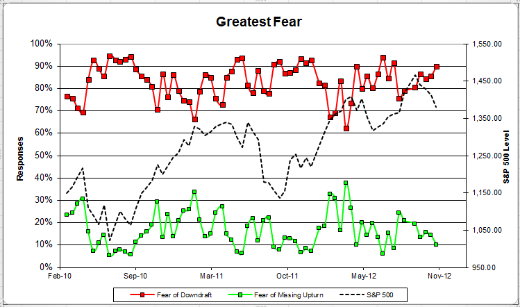
Chart 1: Greatest Fear. From survey to survey, the S&P; 500 fell just over -2%, and all of our sentiment indicators responded as expected. The fear of downdraft group crept up to 90%, up from 86%. The fear of missing opportunity group fell from 14% to 10%.

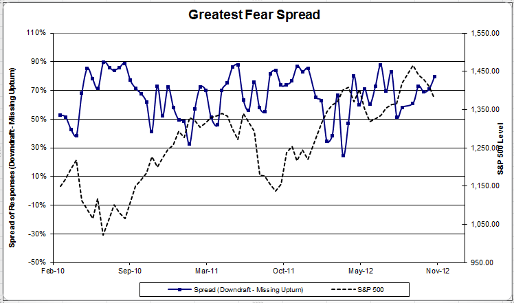
Chart 2: Greatest Fear Spread. Another way to look at this data is to examine the spread between the two groups. The spread continued to rise, up to 80% from 71%.

Question 2. Based on their behavior, how would you rate your clients’ current appetite for risk?

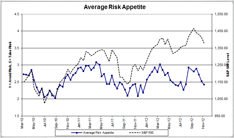
Chart 3: Average Risk Appetite. Average risk appetite fell for the second straight week, dropping from 2.52 to 2.42.

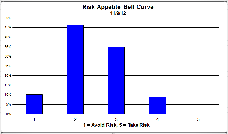
Chart 4: Risk Appetite Bell Curve. This chart uses a bell curve to break out the percentage of respondents at each risk appetite level. This round, over 90% of all respondents wanted a risk appetite of 3 or less.

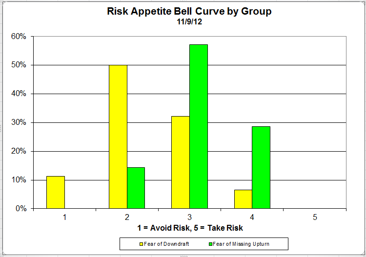
Chart 5: Risk appetite Bell Curve by Group. The next three charts use cross-sectional data. The chat plots the reported client risk appetite separately for the fear of downdraft and for the fear of missing upturn groups. We can see the upturn group wants more risk, while the fear of downturn group is looking for less risk.

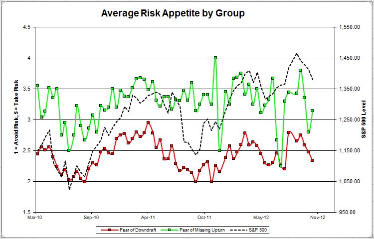
Chart 6: Average Risk Appetite by Group. This round, the upturn group’s risk appetite grew after an uncharacteristic low last survey. The downturn group’s average fell with the market.

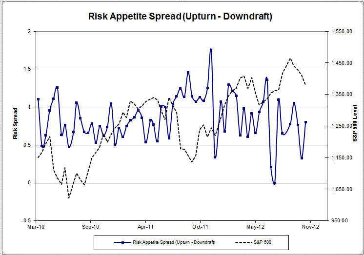
Chart 7: Risk Appetite Spread. This is a chart constructed from the data in Chart 6, where the average risk appetite of the downdraft group is subtracted from the average risk appetite of the missing upturn group. The spread continues to trend within its set range.

The S&P; 500 fell by -2% from survey to survey, and our sentiment indicators responded correctly. The overall fear number grew to 90%, meaning 90% of all clients are more worried about losing money in the market versus missing a market rally. The overall risk appetite also fell this round, in line with the market.

No one can predict the future, as we all know, so instead of prognosticating, we will sit back and enjoy the ride. A rigorously tested, systematic investment process provides a great deal of comfort for clients during these types of fearful, highly uncertain market environments. Until next time, good trading and thank you for participating.

Posted by:


Dorsey Wright Client Sentiment Survey - 11/9/12

November 9, 2012

Here we have the next round of the Dorsey, Wright Sentiment Survey, the first third-party sentiment poll. Participate to learn more about our Dorsey, Wright Polo Shirt raffle! Just follow the instructions after taking the poll, and we’ll enter you in the contest. Thanks to all our participants from last round.

As you know, when individuals self-report, they are always taller and more beautiful than when outside observers report their perceptions! Instead of asking individual investors to self-report whether they are bullish or bearish, we’d like financial advisors to weigh in and report on the actual behavior of clients. It’s two simple questions and will take no more than 20 seconds of your time. We’ll construct indicators from the data and report the results regularly on our blog–but we need your help to get a large statistical sample!

Click here to take Dorsey, Wright’s Client Sentiment Survey.

Contribute to the greater good! It’s painless, we promise.

Posted by:


Sector and Capitalization Performance

November 9, 2012

The chart below shows performance of US sectors and capitalizations over the trailing 12, 6, and 1 month(s). Performance updated through 11/8/2012.

Numbers shown are price returns only.

Posted by:


Fund Flows

November 8, 2012

The Investment Company Institute is the national association of U.S. investment companies, including mutual funds, closed-end funds, exchange-traded funds (ETFs), and unit investment trusts (UITs). Flow estimates are derived from data collected covering more than 95 percent of industry assets and are adjusted to represent industry totals.

Posted by:


Dorsey Wright Client Sentiment Survey Results - 10/26/12

November 6, 2012

Our latest sentiment survey was open from 10/26/12 to 11/2/12. The Dorsey, Wright Polo Shirt Raffle continues to drive advisor participation, and we greatly appreciate your support! This round, we had 70 advisors participate in the survey. If you believe, as we do, that markets are driven by supply and demand, client behavior is important. We’re not asking what you think of the market—since most of our blog readers are financial advisors, we’re asking instead about the behavior of your clients. Then we’re aggregating responses exclusively for our readership. Your privacy will not be compromised in any way.

After the first 30 or so responses, the established pattern was simply magnified, so we are fairly comfortable about the statistical validity of our sample. Some statistical uncertainty this round comes from the fact that we only had four investors say that thier clients are more afraid of missing a stock upturn than being caught in a downdraft. Most of the responses were from the U.S., but we also had multiple advisors respond from at least two other countries. Let’s get down to an analysis of the data! Note: You can click on any of the charts to enlarge them.

Question 1. Based on their behavior, are your clients currently more afraid of: a) getting caught in a stock market downdraft, or b) missing a stock market upturn?

Chart 1: Greatest Fear. From survey to survey, the S&P; 500 fell by around -1%, and all of our indicators responded as expected. The fear of downdraft group rose slightly from 84% to 86%. The fear of missing opportunity group fell from 16% to 14%.

Chart 2: Greatest Fear Spread. Another way to look at this data is to examine the spread between the two groups. The spread rose slightly from 69% to 71%.

Question 2. Based on their behavior, how would you rate your clients’ current appetite for risk?

Chart 3: Average Risk Appetite. Average risk appetite took a big hit this week, falling from 2.71 to 2.52. It looks like this recent market downturn is starting to put the squeeze on investor sentiment.

Chart 4: Risk Appetite Bell Curve. This chart uses a bell curve to break out the percentage of respondents at each risk appetite level. This round, over 90% of all respondents wanted a risk appetite of 3 or less.

Chart 5: Risk appetite Bell Curve by Group. The next three charts use cross-sectional data. The chat plots the reported client risk appetite separately for the fear of downdraft and for the fear of missing upturn groups. This chart sorts out as expected, with the downturn group wanting less risk and the upturn group looking to add risk.

Chart 6: Average Risk Appetite by Group. The average risk appetite of both groups fell this round by a large degree, in line with the market.

Chart 7: Risk Appetite Spread. This is a chart constructed from the data in Chart 6, where the average risk appetite of the downdraft group is subtracted from the average risk appetite of the missing upturn group. The spread is now at the lower end of its normal range.

The S&P; 500 fell around -1% from survey to survey, and the results were what we’d expect to see. The overall fear number rose as the market fell. Also, the overall risk appetite average also fell with the market.

No one can predict the future, as we all know, so instead of prognosticating, we will sit back and enjoy the ride. A rigorously tested, systematic investment process provides a great deal of comfort for clients during these types of fearful, highly uncertain market environments. Until next time, good trading and thank you for participating.

Posted by: