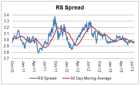
The chart below is the spread between the relative strength leaders and relative strength laggards (universe of mid and large cap stocks). When the chart is rising, relative strength leaders are performing better than relative strength laggards. As of 8/5/2013:
Weekly RS Recap
August 5, 2013The table below shows the performance of a universe of mid and large cap U.S. equities, broken down by relative strength decile and then compared to the universe return. Those at the top of the ranks are those stocks which have the best intermediate-term relative strength. Relative strength strategies buy securities that have strong intermediate-term relative strength and hold them as long as they remain strong.
Last week’s performance (7/29/13 – 8/2/13) is as follows:
Posted by: Andy Hyer
Sector and Capitalization Performance
August 2, 2013The chart below shows performance of US sectors and capitalizations over the trailing 12, 6, and 1 month(s). Performance updated through 8/1/2013.
Numbers shown are price returns only and are not inclusive of transaction costs. Source: iShares
Posted by: Andy Hyer
Case Study in a Dividend Cut: Barrick Gold
August 1, 2013Our recent post Relative Strength Dividend Investing highlighted a couple of key ways that relative strength screens have the potential to improve the experience of dividend investors. A “land of agony” for dividend investors is those holdings that cut their dividends. As pointed out in the article, companies that cut their dividends overwhelmingly had negative relative strength.
Today, we see another example of that with Barrick Gold:
The world’s largest gold miner has now written off nearly $13-billion in 2013.
Because of the latest charge, Barrick lost $8.6-billion during the second quarter. Stripping out the one-time item, the company made $663-million, or 66 cents per share, down from $821-million, or 82 cents per share in the same period last year.
To conserve cash, Barrick has decided to slash its dividend to 5 cents per share each quarter , down from 20 cents previously. The cut will help the company save $600-million annually.
And just like that, Barrick Gold has slashed its dividend (which was 4.66%) by 75%. However, the technical case for Barrick Gold has been weak for some time.
Source: Yahoo! Finance, 8/1/12 - 7/31/13, Price return only
Dorsey Wright also ranks all stocks by their “technical attributes” on a scale of 0-5 (5 being the strongest). Four of the attributes are based on relative strength and one is based on trend. The technical attribute history of Barrick Gold (ABX) has also been weak for years:
Source: Dorsey Wright
As Josh Peters of Morningstar recently pointed out, “Investing—even when focused on dividends—is never just about the dividends. Total return, which reflects both income and capital appreciation, is the bottom line for any investment strategy.” Relative strength has the potential to be an effective defense against dividend cutters.
Dorsey Wright manages Relative Strength Dividend UITs for First Trust. Click here for more information.
Past performance is no guarantee of future returns. A list of all holdings for the trailing 12 months is available upon request.
Posted by: Andy Hyer
Fund Flows
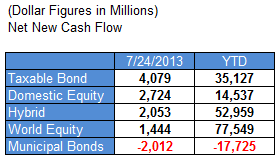
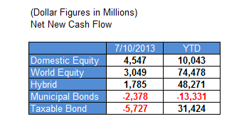
August 1, 2013Mutual fund flow estimates are derived from data collected by The Investment Company Institute covering more than 95 percent of industry assets and are adjusted to represent industry totals.
Posted by: Andy Hyer
Correlation and Expected Returns
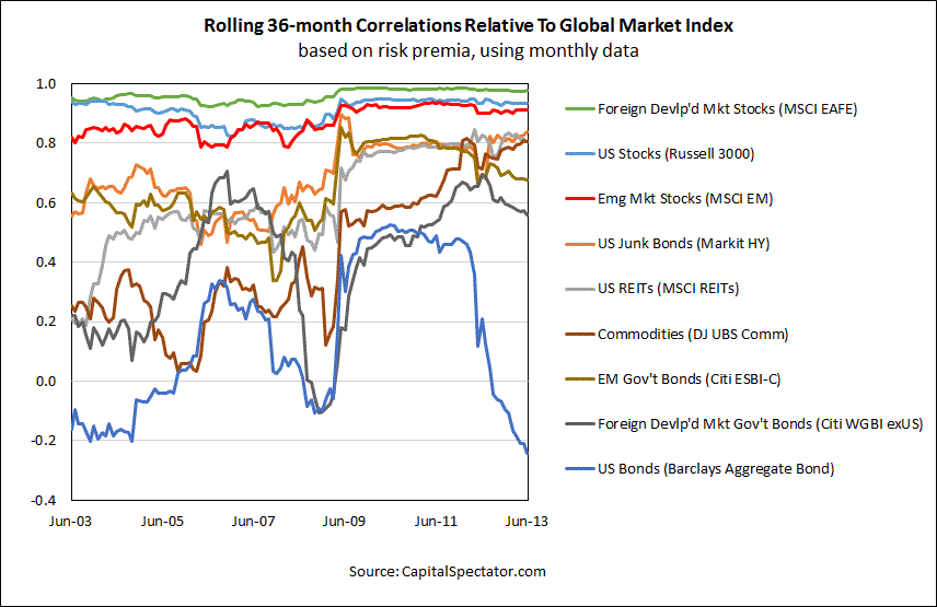
July 31, 2013Modern portfolio theory imagines that you can construct an optimal portfolio, especially if you can find investments that are uncorrelated. There’s a problem from the correlation standpoint, though. As James Picerno of The Capital Spectator points out, correlations are rising:
A new study from the Bank of International Settlements (BIS) raises doubts about the value of commodities as a tool for enhancing portfolio diversification. The paper’s smoking gun, so to speak, is that “the correlation between commodity and equity returns has substantially increased after the onset of the recent financial crisis.”
Correlations are a key factor in the design and management of asset allocation, but they’re not the only factor. And even if we can find assets and strategies with reliably low/negative correlations with, say, equities, that alone isn’t enough, as I discussed last week. You also need to consider other factors, starting with expected return. It may be tempting to focus on one pair of assets and consider how the trailing correlation stacks up today. But that’s hardly the last word on making intelligent decisions on how to build a diversified portfolio.
As more investors pile into commodities, REITs, hedge funds, and other formerly obscure corners, the historical diversification benefits will likely fade. Granted, the outlook for expected diversification benefits fluctuates through time, and so what looks unattractive today may look considerably more compelling tomorrow (and vice versa). But as a general proposition, it’s reasonable to assume that correlations generally will inch closer to 1.0. That doesn’t mean that diversifying across asset classes is destined to become worthless, but the expected payoff is likely to dim with the passage of time.
Mathematically, any two items that are not 100% correlated will reduce volatility when combined. But that doesn’t necessarily mean it’s a good addition to your portfolio—or that modern portfolio theory is a very good way to construct a portfolio. (We will set aside for now the MPT idea that volatility is necessarily a bad thing.) The article includes a nice graphic, reproduced below, that shows how highly correlated many asset classes are with the US market, especially if you keep in mind that these are 36-month rolling correlations. Many asset classes may not reduce portfolio volatility much at all.
Source: The Capital Spectator (click on image to enlarge)
As Mr. Picerno points out, optimal allocations are far more sensitive to returns than to correlations or volatility. So even if you find a wonderfully uncorrelated investment, if it has a lousy return it may not help the overall portfolio much. It would reduce volatility, but quite possibly at a big cost to overall returns. The biggest determinant of your returns, of course, is what assets you actually hold and when. The author puts this a slightly different way:
Your investment results also rely heavily on how and when you rebalance the mix.
Indeed they do. If you hold equities when they are doing well and switch to other assets when equities tail off, your returns will be quite different than an investor holding a static mix. And your returns will be way different than a scared investor that holds cash when stocks or other assets are doing well.
In other words, the return of your asset mix is what impacts your performance, not correlations or volatility. This seems obvious, but in the fog of equations about optimal portfolio construction, this simple fact is often overlooked. Since momentum (relative strength) is generally one of the best-performing and most reliable return factors, that’s what we use to drive our global tactical allocation process. The idea is to own asset classes as long as they are strong—and to replace them with a stronger asset class when they begin to weaken. In this context, diversification can be useful for reducing volatility, if you are comfortable with the potential reduction in return that it might entail. (We generally advocate diversifying by volatility, by asset class, and by strategy, although the specific portfolio mix might change with the preference of the individual investor.) If volatility is well-tolerated, maybe the only issue is trying to generate the strongest returns.
Portfolio construction can’t really be reduced to some “optimal” set of tradeoffs. It’s complicated because correlations change over time, and because investor preferences between return and volatility are in constant flux. There is nothing stable about the portfolio construction process because none of the variables can be definitively known; it’s always an educated approximation. Every investor gets to decide—on an ongoing basis—what is truly important: returns (real money you can spend) or volatility (potential emotional turmoil). I always figure I can afford Maalox with the extra returns, but you can easily see why portfolio management is overwhelming to so many individual investors. It can be torture.
Portfolio reality, with all of its messy approximations, bears little resemblance to the seeming exactitude of Modern Portfolio Theory.
Posted by: Mike Moody
High RS Diffusion Index
July 31, 2013The chart below measures the percentage of high relative strength stocks that are trading above their 50-day moving average (universe of mid and large cap stocks.) As of 7/30/13.
The 10-day moving average of this indicator is 89% and the one-day reading is 88%.
Posted by: Andy Hyer
Factor Performance and Factor Failure
July 30, 2013Advisor Perspectives recently carried an article by Michael Nairne of Tacita Capital about factor investing. The article discussed a number of aspects of factor investing, including factor performance and periods of factor underperformance (factor failure). The remarkable thing about relative strength (termed momentum in his article) is the nice combination of strong performance and relatively short periods of underperformance that it affords the investor seeking alpha.
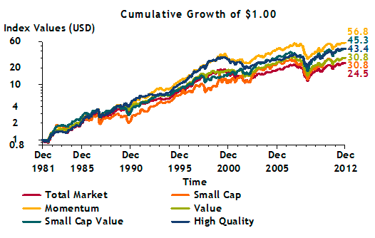
Mr. Nairne discusses a variety of factors that have been shown to generate excess returns over time. He includes a chart showing their performance versus the broad market.
Source: Advisor Perspectives/Tacita Capital (click on image to enlarge)
Yep, the one at the top is momentum.
All factors, even very successful ones, underperform from time to time. In fact, the author points out that these periods of underperformance might even contribute to their factor returns.
No one can guarantee that the return premia originating from these dimensions of the market will persist in the future. But, the enduring nature of the underlying causes – cognitive biases hardwired into the human psyche, the impact of social influences and incremental risk – suggests that higher expected returns should be available from these factor-based strategies.
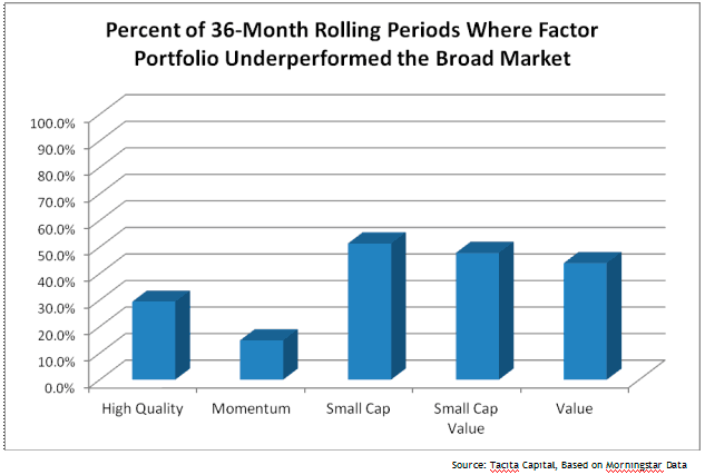
There is another reason to believe that these strategies offer the prospect of future return premia for patient, long-term investors. These premia are very volatile and can disappear or go negative for many years. The chart on the following page highlights the percentage of 36-month rolling periods where the factor-based portfolios – high quality, momentum, small cap, small cap value and value – underperformed the broad market.
To many investors, three years of under-performance is almost an eternity. Yet, these factor portfolios underperformed the broad market anywhere from almost 15% to over 50% of the 36-month periods from 1982 to 2012. If one were to include the higher transaction costs of the factor-based portfolios due to their higher turnover, the incidence of underperformance would be more frequent. One of the reasons that these premia will likely persist is that many investors are simply not patient enough to stay invested to earn them.
The bold is mine, but I think Mr. Nairne has a good point. Many investors seem to believe in magic and want their portfolio to significantly outperform—all the time.
That’s just not going to happen with any factor. Not surprisingly, though, momentum has tended to have shorter stretches of underperformance than many other factors, a consideration that might have been partially responsible for its good performance over time. Mr. Nairne’s excellent graphic on periods of factor failure is reproduced below.
Source: Advisor Perspectives/Tacita Capital (click on image to enlarge)
Once again, whether you choose to try to harvest returns from relative strength or from one of the other factors, patience is an underrated component of actually receiving those returns. The market can be a discouraging place, but in order to reap good factor performance you have to stay with it during the inevitable periods of factor failure.
Posted by: Mike Moody
Relative Strength Spread
July 30, 2013The chart below is the spread between the relative strength leaders and relative strength laggards (universe of mid and large cap stocks). When the chart is rising, relative strength leaders are performing better than relative strength laggards. As of 7/29/2013:
Posted by: Andy Hyer
Weekly RS Recap
July 29, 2013The table below shows the performance of a universe of mid and large cap U.S. equities, broken down by relative strength decile and quartile and then compared to the universe return. Those at the top of the ranks are those stocks which have the best intermediate-term relative strength. Relative strength strategies buy securities that have strong intermediate-term relative strength and hold them as long as they remain strong.
Last week’s performance (7/22/13 – 7/26/13) is as follows:
Posted by: Andy Hyer
Client Sentiment Survey - 7/26/13
July 26, 2013Here we have the next round of the Dorsey, Wright Sentiment Survey, the first third-party sentiment poll. Participate to learn more about our Dorsey, Wright Polo Shirt raffle! Just follow the instructions after taking the poll, and we’ll enter you in the contest. Thanks to all our participants from last round.
As you know, when individuals self-report, they are always taller and more beautiful than when outside observers report their perceptions! Instead of asking individual investors to self-report whether they are bullish or bearish, we’d like financial advisors to weigh in and report on the actual behavior of clients. It’s two simple questions and will take no more than 20 seconds of your time. We’ll construct indicators from the data and report the results regularly on our blog–but we need your help to get a large statistical sample!
Click here to take Dorsey, Wright’s Client Sentiment Survey.
Contribute to the greater good! It’s painless, we promise.
Posted by: JP Lee
Sector and Capitalization Performance
July 26, 2013The chart below shows performance of US sectors and capitalizations over the trailing 12, 6, and 1 month(s). Performance updated through 7/25/2013.
Numbers shown are price returns only and are not inclusive of transaction costs. Source: iShares
Posted by: Andy Hyer
Fund Flows
July 25, 2013Mutual fund flow estimates are derived from data collected by The Investment Company Institute covering more than 95 percent of industry assets and are adjusted to represent industry totals.
Posted by: Andy Hyer
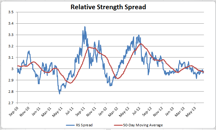
Relative Strength Spread
July 23, 2013The chart below is the spread between the relative strength leaders and relative strength laggards (universe of mid and large cap stocks). When the chart is rising, relative strength leaders are performing better than relative strength laggards. As of 7/22/2013:
Posted by: JP Lee
How to Pick a Winner
July 23, 2013Scientific American takes a look at the best way to select a winner:
Given the prevalence of betting and the money at stake, it is worth considering how we pick sides. What is the best method for predicting a winner? One might expect that, for the average person, an accurate forecast depends on the careful analysis of specific, detailed information. For example, focusing on the nitty-gritty knowledge about competing teams (e.g., batting averages, recent player injuries, coaching staff) should allow one to predict the winner of a game more effectively than relying on global impressions (e.g., overall performance of the teams in recent years). But it doesn’t.
In fact, recent research by Song-Oh Yoon and colleagues at the Korea University Business School suggests that when you zero in on the details of a team or event (e.g., RBIs, unforced errors, home runs), you may weigh one of those details too heavily. For example, you might consider the number of games won by a team in a recent streak, and lose sight of the total games won this season. As a result, your judgment of the likely winner of the game is skewed, and you are less accurate in predicting the outcome of the game than someone who takes a big picture approach. In other words, it is easy to lose sight of the forest for the trees.
So often people that consider employing relative strength strategies, which measure overall relative price performance of securities rather than delving into the weeds with various accounting level details, feel like they must not be doing an adequate job of analyzing the merits of a given security. As pointed out in this research, the best results came from focusing on less data, not more.
Whether trying to select a winner in sports or in the stock market, it is important to remember that “detailed analysis fog the future.”
Posted by: Andy Hyer
Relative Strength Dividend Investing
July 22, 2013Dividend investing is all the rage these days. It can be a valuable investment strategy if it is done well—and a very negative experience if it is done poorly. The editor of Morningstar’s DividendInvestor, Josh Peters, recently penned a great column after his model portfolio collected its 1000th dividend payment. The article involves the lessons he learned in his foray into dividend investing. It is a must-read for all dividend investors.
One interesting thing, to me, was that many of the dividend investing problems that he experienced could have been avoided with a relative strength screen. (We use just such a screeen for the First Trust dividend UITs we specify the portfolios for.) Allow me to explain what I mean.
Morningstar’s first lesson was that quality was important in dividend investing. Mr. Peters writes:
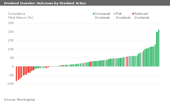
The dividend cutters occupy a land of agony: We lost money on 13 of the 16 portfolio holdings that cut their dividends, and the 3 that have been profitable-General Electric (GE), U.S. Bancorp (USB), and Wells Fargo (WFC)-only pulled into the black long after their dividends began to recover.
One of the first things we noticed when screening the dividend investing universe by relative strength was this: companies that cut their dividends overwhelmingly had negative relative strength. In fact, when I looked through the list of S&P Dividend Aristocrats that cut their dividends in the middle of the Great Recession, I discovered that all but two of them had negative relative strength before the dividend cut. Some had had poor relative strength for many years. Pitney Bowes (PBI) is just the most recent example. You can see from Morningstar’s chart below that most of their losses came from dividend cutters.
Source: Morningstar (click on image to enlarge)
In other words, screening for good relative strength is a pretty good insurance policy to avoid the land of agony.
Morningstar’s second lesson was that many of the best dividend stocks were not fundamentally cheap.
I’ve always believed dividends were the most important aspect of our investment strategy, but I’ve always been something of a cheapskate, too. I don’t like paying full price for anything if I can help it. In the first year or two of DividendInvestor’s run, I brought this impulse to my stock-picking, but I was often disappointed. In the banking industry, for example, I originally passed on top performers like M&T (MTB) and gravitated toward statistically cheaper names like National City and First Horizon (FHN).
Guess what top performers have in common? You guessed it—good relative strength. A relative strength screen is also a useful way to avoid slugs that are cheap and never perform well.
The third lesson is just that time is important. If you are doing dividend investing, a lot of the benefit can come from compounding over time, or perhaps from reinvesting all of the yield.
If you choose to use the Dorsey Wright-managed First Trust UITs, we always recommend that you buy a series of four UITs and just keep rolling them over time. That way you always have a current portfolio of strong performers, screened to try to avoid some of the dividend cutters. If the portfolio appreciates over the holding period—beyond just paying out the dividend yield—it might make sense when you roll it over to use the capital gains to buy additional units, in an effort to have the payout level increase over time.
Even if you never use our products, you might want to consider some basic relative strength screening of your dividend stock purchases.
Past performance is not indicative of future results. Potential for profits is accompanied by possibility of loss. See http://www.ftportfolios.com for more information.
Posted by: Andy Hyer
Weekly RS Recap
July 22, 2013The table below shows the performance of a universe of mid and large cap U.S. equities, broken down by relative strength decile and then compared to the universe return. Those at the top of the ranks are those stocks which have the best intermediate-term relative strength. Relative strength strategies buy securities that have strong intermediate-term relative strength and hold them as long as they remain strong.
Last week’s performance (7/15/13 – 7/19/13) is as follows:
Posted by: Andy Hyer
Fund Flows
July 18, 2013Mutual fund flow estimates are derived from data collected by The Investment Company Institute covering more than 95 percent of industry assets and are adjusted to represent industry totals.
Posted by: JP Lee
High RS Diffusion Index
July 17, 2013The chart below measures the percentage of high relative strength stocks that are trading above their 50-day moving average (universe of mid and large cap stocks.) As of 7/16/13.
The 10-day moving average of this indicator is 82% and the one-day reading is 89%.
Posted by: JP Lee
Relative Strength Spread
July 16, 2013The chart below is the spread between the relative strength leaders and relative strength laggards (universe of mid and large cap stocks). When the chart is rising, relative strength leaders are performing better than relative strength laggards. As of 7/15/2013:
Posted by: JP Lee
The Yield Curve Speaks
July 16, 2013The yield curve is a measurement of the relationship between short-term and long-term interest rates. When long-term rates are high relative to short-term rates, the economy is typically strong. The opposite case is not so rosy—when short-term rates are higher than long-term rates, a recession is often in the offing.
Mark Hulbert of Marketwatch makes this point about the yield curve in a recent column. He writes:
You’re wrong if you think that interest rate increases over the last month are bad for the stock market.
That’s because not all rate hikes are created equal. And the kind that we’ve seen over the last month is not the type that typically kills a bull market.
In fact, a strong argument can be made that the last month’s rate increases are actually good news for the stock market: Because the greatest increases have come at the longer end of the maturity spectrum, the yield curve in recent weeks has become steeper — just the opposite of the direction it would be heading if the odds of a recession were growing.
Later in the article, Mr. Hulbert quantifies the chances of a recession based on the yield curve indicator.
It’s a shame that because of concern that the yield curve might be manipulated, many in recent years have tended to dismiss its utility as a leading economic indicator. Its record, in fact, has been creditable — if not impressive.
Consider one famous econometric model based on the slope of the yield curve that was introduced more than a decade ago by Arturo Estrella, currently an economics professor at Rensselaer Polytechnic and, from 1996 through 2008, senior VP of the New York Federal Reserve Bank’s Research and Statistics Group, and Frederic
Mishkin, a Columbia University professor who was a member of the Federal Reserve’s Board of Governors from 2006 to 2008. The model last spiked upward in late 2007 and 2008, when it gauged the odds of a recession at more than 40% — just before the Great Recession. Click here to go to the page of the NY Fed’s website devoted to this model.Today, in contrast, the model is reporting the odds of a recession in the next 12 months at a minuscule 2.5%.
Now, I have no way of knowing or even guessing if the yield curve will be accurate this time around, but it’s worth noting in the sea of bearishness surrounding the recent increase in long-term interest rates. When pundits are nearly unanimous, it’s always worth considering if the opposite might in fact be the case.
Posted by: Mike Moody
Weekly RS Recap
July 15, 2013The table below shows the performance of a universe of mid and large cap U.S. equities, broken down by relative strength decile and then compared to the universe return. Those at the top of the ranks are those stocks which have the best intermediate-term relative strength. Relative strength strategies buy securities that have strong intermediate-term relative strength and hold them as long as they remain strong.
Last week’s performance (7/8/13 – 7/12/13) is as follows:
Posted by: JP Lee
Market Breadth
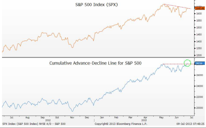
July 15, 2013Measurements of market breadth are a staple for technical analysts. Market breadth refers to measures of participation. Common market breadth indicators would include things like advance-decline lines or the NYSE Bullish Percent.
This has got to be one of the more hated rallies I can remember, possibly because so few people have been on board for it. But some measures of market breadth are confirming the move to new all-time highs.
Josh Brown of The Reformed Broker highlighted a chart of market breadth recently, as you can see below.
Source: The Reformed Broker, Bloomberg (click on image to enlarge)
This breadth breakout appeared on July 9 and the S&P 500 powered higher from there.
The typical take on market breadth from market technicians is that negative divergences in breadth will normally appear prior to a drop in the market. That’s not what’s happening now—in fact, just the opposite is the case. Market breadth expanded this time prior to the stock market moving to an all-time high.
Bulls and bears can both be articulate. It’s easy to listen to a well-spoken commentator who presents just one side of the story and have it feel very convincing. It’s useful to look at market-generated data as a check; sometimes the data has a very different picture of the issue.
Posted by: Mike Moody
Sector and Capitalization Performance
July 12, 2013The chart below shows performance of US sectors and capitalizations over the trailing 12, 6, and 1 month(s). Performance updated through 7/11/2013.
Posted by: JP Lee
Ritholtz on Prediction
July 12, 2013In Financial Advisor, Barry Ritholtz of The Big Picture blog gets asked about his market outlook. He answers with his view on prediction, which I would very much endorse.
Let’s start out with a basic question: What’s your outlook on the markets and the economy?
Let me begin with an answer you will hate: My opinion as to the future state of the economy or where the market might be going will be of no value to your readers. Indeed, as my blog readers will tell you, I doubt anyone’s perspectives on these issues are of any value whatsoever.
Here’s why: First, we have learned that you Humans are not very good at making these sorts of predictions about the future. The data overwhelmingly shows that you are, as a species, quite awful at it.
Second, given the plethora of conflicting conjectures in the financial firmament, how can any reader determine which author to believe and which to ignore? You can find an opinion to confirm any prior view, which is a typical way many investors make erroneous decisions. (Hey, that agrees with my perspective, I’ll read THAT!)
And third, relevant to the above, studies have shown that the most confident, specific and detailed forecasts about the future are: a) most likely to be believed by readers and TV viewers; and b) least likely to be correct. (So you have that going for you, which is nice.)
Last, across the spectrum of possible opinions, forecasts and outlooks, someone is going to be correct—how can you ever tell if it was the result of repeatable skill or merely random chance?
Kudos to Mr. Ritholtz for telling it like it is.
There is no way to know what is going to happen in the future. Prediction is neither useful or necessary.
Later in the article, Mr. Ritholtz makes the point that most investors do not know even what is going on right now. That is where relative strength can be a useful technique. Relative strength can identify what is strong, and trend following is a practical way to implement it, by owning what is strong as long as it remains strong. Long-term mean reversion methodologies will work too, of course. In other words, you don’t need to predict the future as long as you can assume that trends and reversion to the mean will continue to occur as they always have.
Posted by: Mike Moody


