In Price There is Knowledge: Medtronic Edition

June 30, 2011

Medtronic has been in the news lately for allegedly hiding side effects of one of its treatments. According to Bloomberg:

Studies funded by Medtronic Inc. (MDT) failed to disclose serious side effects associated with the company’s Infuse bone-growth treatment, misleading doctors about its safety and causing unnecessary use of the product, a series of articles reported.

No side effects were reported in 13 clinical trials funded by Minneapolis-based Medtronic, while data provided to U.S. regulators showed as many as half of patients had complications including infections, pain, cyst formation and cancer, a review in The Spine Journal found. The report said financial ties between Medtronic and researchers weren’t clearly disclosed.

Doctors began raising questions about Infuse shortly after its approval in 2002 for spinal fusion when patients started experiencing unanticipated side effects, said Eugene Carragee, chief of spinal surgery at Stanford School of Medicine near Palo Alto, California, who led the review.

2002 was a long, long time ago in medical technology terms and the information is just now coming to light. Or is it?

Below is a relative performance chart of Medtronic compared to the S&P; 500 from the end of 2002 to the current time. Over that stretch, Medtronic has had very poor relative strength and has underperformed the market by more than 50%! In 2002, Medtronic reported earnings per share of $1.40. Value Line projects that Medtronic will earn $3.60 in 2011, an increase of more than 150% from the 2002 level.

Yet Medtronic’s stock price is actually down more than 5% from the end of 2002. There are a lot of smart people making decisions with large amounts of money in the market. If a stock is performing terribly on a relative basis, more often than not there is a good reason for it. Ignore relative strength at your peril.

Earnings up 150%, price down 5%

Source: www.stockcharts.com

Posted by:


Surprise, Surprise, Surprise

June 30, 2011

From Trader’s Narrative comes an interesting piece on Citigroup’s Economic Surprise Index:

The Citigroup Economic Surprise Indexes are a clever concoction that measures the variations in the gap between the expectations and the real economic data. The input consists of the actual econometric data that moves foreign exchange markets – the bigger the data moves forex markets, the more significant its weight in the index.

For a visual, the index is below:

Surprise, Surprise, Surprise!

Source: Citigroup, Trader’s Narrative

Everyone hates the economy right now—and that often means we are close to a bottom. Our own sentiment survey indicates that investors remain deeply concerned about the market. I don’t know whether the indicator will pan out this time around, but it’s interesting and certainly non-consensus. Trader’s Narrative points out:

The important take away point here is when economic data is absolutely horrendous – as it is getting to be now – important lows are close at hand. When everything is sunshine and lollipops, you better run and find a good bombshelter!

Gomer Pyle couldn’t have said it any better.

Source: www. YouTube.com

Posted by:


Value Trap: Eastman Kodak

June 30, 2011

Bill Miller at Legg Mason Value Trust had one of the longest mutual fund outperformance streaks in history, 15 years through 2005. His record may end up like Joe DiMaggio’s longstanding consecutive game hits record—never equalled and rarely even approached. Yet even superstar fund managers may occasionally have feet of clay. According to a Bloomberg article, his fund has had a rough time with Eastman Kodak:

Legg Mason Capital Management Value Trust (LMVTX), run by Miller since 1982, disclosed in a semi-annual report last week that the fund sold 18.2 million Kodak shares late last year and during this year’s first quarter for about $3.89 each on average. The fund realized a $551 million loss through the divestiture, according to the report.

Miller, 61, began loading up on Kodak shares in 2000 and, by the end of 2005, his firm owned as much as 25 percent of the Rochester, New York, company. Value Trust, one of several Legg Mason funds and accounts to hold Kodak stock, kept the bulk of its stake for more than a decade, only to sell after the film company had lost more than 90 percent of its market value.

Someone took the Kodachrome away

Source: www.photographymonthly.com

One of the challenges that value investors must take on is the value trap. A value trap is a stock that looks cheap, but turns out to be cheap for a reason. EK didn’t necessarily hold Bill Miller back; he had quite a number of years of market outperformance with Kodak included in the portfolio. Other selections did pan out and more than offset the problem stocks. The problem with value traps is psychological. The Bloomberg article goes on:

“Part of it was just this mentality that this was just a temporary setback and Kodak would be able to get quickly back on track,” said Bridget Hughes, an analyst at Morningstar Inc., a Chicago-based stock and fund research firm. “It was not only a mistake, it was also causing a lot of client angst.”

I put the psychological problem in bold. It drives clients crazy to see a big loser in the portfolio quarter after quarter, year after year. Even when buying cheap stocks is obviously part of the investment philosophy and when patience is required to get good returns, clients sometimes struggle with it.

Portfolio management using a systematic relative strength process has different strengths and weaknesses. Clients are less likely to see a big loser sitting in the portfolio quarter after quarter, but are more likely to see more numerous transactions that result in small or moderate losses. I suspect clients are no happier about a string of small losses, but they often seem to be able to let it go. On the plus side, when using relative strength, most of the big winners will be retained in the portfolio for an extended time.

No investment approach is perfect, and every investment methodology will have its fair share of mistakes. Still, clients choose to stick with some investment managers and bail on others, even when their long-run performance is comparable. The client’s choice is often made primarily on the basis of emotion—sometimes just how they feel about how things are going. All other things being equal, why would you elect to have your big losers show up on client statements for an extended period of time?

Posted by:


Fund Flows

June 30, 2011

The Investment Company Institute is the national association of U.S. investment companies, including mutual funds, closed-end funds, exchange-traded funds (ETFs), and unit investment trusts (UITs). Members of ICI manage total assets of $11.82 trillion and serve nearly 90 million shareholders. Flow estimates are derived from data collected covering more than 95 percent of industry assets and are adjusted to represent industry totals.

Domestic equities continue to lose money as investors flee perceived risk for perceived safety. Taxable bonds continue to out-sell all others by a huge margin. More of the same!

Posted by:


The #1 Investment Return Factor No One Wants to Talk About

June 29, 2011

Relative strength is the #1 investment return factor no one wants to talk about. The reasons are not entirely clear to me, but perhaps it is because it is too simple. It does not require a CFA to forecast earnings or to determine an economic moat. It does not require a CPA to attempt to assess valuation. It does not require an MBA to assess strategic business decisions. In short, it does not play to the guild mentality wherein only certain masters of the universe have the elevated intellect, knowledge, and background to invest successfully.

Although relative strength is simple, I am not suggesting that relative strength is easy to implement. Losing weight is simple too: eat less, exercise more. That does not make it easy to do. Relative strength, probably like most successful investment strategies, requires an inordinate amount of discipline—and tolerance of a fair amount of randomness. Like most games that are easy to learn, but difficult to master—chess would be an apt example—proficient use of relative strength also requires deep study and experience.

Yet relative strength has been used successfully by practitioners for many generations. George Chestnutt of the American Investors Fund began using it to run money in the 1930s and said it had been in use by others for at least a generation before that. Relative strength has been shown to work in many asset classes, across many markets for more than 100 years. Since the early 1990s, even academics have gotten in on the act.

And for all that, relative strength remains ignored.

I was reminded of its apparent obscurity again this week when reading an excellent article on indexing by the macrocephalic Rob Arnott. He had a very nice piece in Advisor Perspectives about the virtues of alternative beta indexes.

In recent years, a whole new category of investments—called “alternative betas”—has emerged. Some of these alternative beta strategies, including the Fundamental Index® approach, use various structural schemes to select and/or weight securities in the index. In that sense, they fall between traditional cap-weighted approaches and active management: they pick up broadly diversified market exposure (beta) but seek to produce better results than cap-weighted indexes (what is desired from active managers).

Our CIO, Jason Hsu, and research staff have replicated the basic methodologies of many of these rules-based alternative betas, ranging from a simple equal-weighted approach to the straightforward Fundamental Index strategy to the truly exotic such as risk clustering and diversity weighting.7 The potential rewards are promising. Of the 10 non-cap-weighted U.S. equity strategies studied, all outperformed the passive cap-weighted benchmark. The range of excess returns by alternative beta strategies was between 0.4% and 3.0% per annum—matching a reasonable estimate of the top quartile of active managers—that is, the small cadre of managers who generally are successful at beating the benchmark (see Table 1). The bottom line: investors can obtain top-quartile performance with far less effort than is required to research and monitor traditional active equity managers.

Mr. Arnott has a very good point—and the numbers to prove it. Lots of alternative beta strategies are available that can potentially offer top-quartile performance relative to other active managers and that may also outperform traditional passive cap-weighted benchmarks. He is no doubt proselytizing on behalf of his firm’s Fundamental Index approach to some extent, but I think his underlying thesis is correct. He offers the following table as evidence that alternative beta strategies can outperform, using data from 1964- 2009:

Source: Advisor Perspectives, Research Affiliates (click to enlarge)

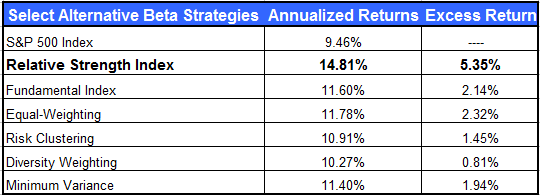
I would like to offer a slight modification of this table, since it is only a listing of “select” alternative beta strategies. Relative strength has been inexplicably excluded. Below, I present the same table of alternative beta strategies now including relative strength, the #1 investment return factor no one wants to talk about. (I have my own theory about why other indexers don’t want to talk about relative strength, but I will let you reach your own conclusions.) The relative strength returns presented in the table are for the exact same time period, 1964 through 2009. They are taken from Professor Ken French’s database and show the results of a simple relative strength selection process when using the top third (as ranked by relative strength) of the large cap universe.

Source: Research Affiliates, Dorsey Wright (click to enlarge)

Are you surprised that relative strength blows away the other alternative beta strategies?

You shouldn’t be. There are plenty of academic and practitioner studies attesting to the power of relative strength. In short, I agree with Mr. Arnott that alternative beta indexes are worth a close look. And I think it would be particularly prudent to consider relative strength weighted indexes.

See www.powershares.com for more information on our three DWA Technical Leaders Index ETFs (PDP, PIE, PIZ).

Click here for disclosures. Past performance is no guarantee of future results.

Posted by:


Top ADR Performers Over Trailing 12 Months

June 29, 2011

Although U.S. investors often focus on U.S.-based companies because of greater familiarity, I suspect that many would be interested in learning more about international companies that trade on U.S. exchanges in the form of American Depository Receipts (ADRs). The top ten performing ADRs over the past 12 months, out of our universe, are shown in the table below. As of 6/28/2011.

To learn more about Dorsey Wright’s Systematic Relative Strength International portfolio, click here.

Dorsey Wright’s ADR universe is a sub-set of the entire universe of ADRs. Dorsey Wright currently owns AMRN. A list of all holdings for this portfolio over the past 12 months is available upon request.

Posted by:


High RS Diffusion Index

June 28, 2011

The chart below measures the percentage of high relative strength stocks that are trading above their 50-day moving average (universe of mid and large cap stocks.) As of 6/27/11.

This index has pulled back sharply over the past couple of months. The 10-day moving average of this indicator is 41% and the one-day reading is 45%. Dips in this index have often provided good opportunities to add money to relative strength strategies.

Posted by:


The Woeful State of the American Saver

June 27, 2011

One of the biggest financial changes over the last generation has been the assumption of retirement savings risk by individuals. A generation ago, many workers in both the private and public sectors had defined benefit plans that were quite generous. (As we are finding out, the public pension plans were so generous that they are now bankrupting states, counties, and municipalities.) Even the private corporate pension plans had great benefits—often nice payouts along with retiree healthcare.

As automation and productivity increased, fewer workers were needed to reach the same production level and corporations found themselves with fewer current employees trying to support a large base of retirees. This is the same demographic situation that plans like Social Security find themselves in, by the way. The cost pressures became unbearable, especially if the corporations intended to survive in an increasingly competitive global economy.

Corporations looked for ways to shift the retirement cost burden and over the past generation have moved to defined contribution plans, most often 401k and profit-sharing plans. With a 401k plan, much of the onus of saving is shifted to the employee, although many of the best employers have excellent matching programs.

Alicia Munnell, the director of the Center for Retirement Research, recently penned an article in Smart Money that lays bare how Americans are doing on the path to retirement. She writes:

In theory, a typical worker who ends up at retirement with earnings of slightly more than $50,000 and who contributed 6 percent steadily with an employer match of 3 percent should have about $320,000.

In fact, the typical individual approaching retirement had only $78,000, far short of the simulated amount.

She pulls data from a number of other sources to support the $78,000 number as realistic, but whatever the actual number, it is clearly far short of $320,000. The amounts Americans have saved will produce a very meager retirement.

Using the SCF [Federal Reserve Survey of Consumer Finances] figure of $78,000, 401(k) balances will produce about $400 per month of income in retirement if the participant buys a joint-and-survivor annuity; $260 per month if the participant applies the “4-percent” rule.

$400 per month, even with some kind of Social Security benefit, is still going to put a lot of retirees squarely into the Alpo zone. And you’ve got to hope that the Social Security benefits will still be intact.

Not recommended for retirees

source: www.easyfoodandlaundry.com

This is not an outcome that is good for anybody. It’s not good for the retiree who is trying to eke out an existence on an insufficient level of income. And it’s not good for responsible savers who do have adequate assets—that’s the first place the government will look for money to redistribute.

What can you do to help your clients avoid this problem? As with most simple problems, the solution is fairly simple too.

1) Save more. 6%, as in the example, is probably not enough. Most experts recommend a minimum of 10% of your income be saved. I’d go for 15%. It would not be tragic if I had too much money saved for retirement and had to work down my balance by taking Mediterranean cruises, for example.

2) Invest for growth. You might have to embrace a little risk, but the ultimate payoff may be well worth it. Higher investment returns compounded over a long period of time can make a huge difference. (Hint: relative strength is an excellent return factor for growth.)

3) As you near the withdrawal phase, transition to a less volatile portfolio mix. Studies show that less volatile mixes provide steady income for a longer period of time.

None of this is new—the same policy prescription was advocated in Andy’s Short Course in Financial Planning way back in 2007, before the financial crisis was a gleam in Ben Bernanke’s eye. And eternal truths don’t change. Get your clients on the right track, and push to keep them there.

Posted by:


Dorsey, Wright Client Sentiment Survey Results - 6/17/11

June 27, 2011

Our latest sentiment survey was open from 6/17/11 to 6/24/11. The Dorsey, Wright Polo Shirt Raffle continues to drive advisor participation, and we greatly appreciate your support! This round, we had 128 advisors participate in the survey. If you believe, as we do, that markets are driven by supply and demand, client behavior is important. We’re not asking what you think of the market—since most of our blog readers are financial advisors, we’re asking instead about the behavior of your clients. Then we’re aggregating responses exclusively for our readership. Your privacy will not be compromised in any way.

After the first 30 or so responses, the established pattern was simply magnified, so we are comfortable about the statistical validity of our sample. Most of the responses were from the U.S., but we also had multiple advisors respond from at least four other countries. Let’s get down to an analysis of the data! Note: You can click on any of the charts to enlarge them.

Question 1. Based on their behavior, are your clients currently more afraid of: a) getting caught in a stock market downdraft, or b) missing a stock market upturn?

Chart 1: Greatest Fear. From survey to survey, the S&P; was down -2.2%, and client fear levels ticked higher from 93% to 94%. Right now, the market is down -5% from its recent May highs, and 94% of investors are afraid of losing money in the market. As we continue to point out, the S&P; is up nearly 25% in less than a year, but client sentiment continues to be dominated by fear.

In addition, since hitting fear levels in the mid-90s last summer, the market is up +25%. We can only hope that history repeats itself here.

Chart 2. Greatest Fear Spread. Another way to look at this data is to examine the spread between the two groups. The spread nudged higher, from 86% to 88% this round.

Question 2. Based on their behavior, how would you rate your clients’ current appetite for risk?

Chart 3: Average Risk Appetite. Average risk remained the same from survey to survey, sticking at 2.44. Last survey we saw a huge drop in average risk appetite, as the market fell. This round, despite a similar move of -2%, average risk appetite seems to have found its footing. We’ve still got a ways to go until we reach our all-time lows from September 2010.

Chart 4: Risk Appetite Bell Curve. This chart uses a bell curve to break out the percentage of respondents at each risk appetite level. Here we see more evidence of a fear-dominated atmosphere. There was only one wayward 5, and nearly half of all respondents wanted a risk appetite of 2.

Chart 5: Risk Appetite Bell Curve by Group. The next three charts use cross-sectional data. This chart plots the reported client risk appetite separately for the fear of downdraft and for the fear of missing upturn groups. This chart also sorts out pretty much as expected, with the fear group wanting less risk and the opportunity group wanting more. You can see the sole 5, which came from the fear group…probably a troll answer.

Chart 6: Average Risk Appetite by Group. Here we see both groups’ average risk appetite remain basically the same. Same as the overall average risk appetite, the risk by group numbers sort out even from last survey’s results. It may be that the initial plunge in risk appetite from two weeks ago was large enough to buffer any additional market downside. Despite another move lower in the market, average risk stayed the same in both camps.

Chart 7: Risk Appetite Spread. This is a spread chart constructed from the data in Chart 6, where the average risk appetite of the downdraft group is subtracted from the average risk appetite of the missing upturn group. Same as average risk, the spread for average risk stayed the same.

This round, fear continues to dominate investor sentiment, as we have now had a total of three surveys (6 weeks) of down moves in the market. All of our indicators are pointing towards heightened levels of fear, with an eye towards perceived safety (and lowered risk appetite). What’s interesting about this survey’s numbers is that the market fell by the same degree as last round, but both fear levels and average risk remained mostly the same. It seems as though investors are now in “hunker down” mode, and it’s anyone guess as to whether clients will become even more bearish (they can, if the market continues to go down).

No one can predict the future, as we all know, so instead of prognosticating, we will sit back and enjoy the ride. A rigorously tested, systematic investment process provides a great deal of comfort for clients during these types of fearful, highly uncertain market environments. Until next time, good trading and thank you for participating.

Posted by:


Weekly RS Recap

June 27, 2011

The table below shows the performance of a universe of mid and large cap U.S. equities, broken down by relative strength decile and quartile and then compared to the universe return. Those at the top of the ranks are those stocks which have the best intermediate-term relative strength. Relative strength strategies buy securities that have strong intermediate-term relative strength and hold them as long as they remain strong.

Last week’s performance (6/20/11 – 6/24/11) is as follows:

High RS stocks outperformed by a huge margin last week. Hopefully the high RS universe can close the quarter on a high note.

Materials and technology led the way last week as high RS stocks were in control.

Posted by:


Sector and Capitalization Performance

June 24, 2011

The chart below shows performance of US sectors and capitalizations over the trailing 12, 6, and 1 month(s). Performance updated through 6/23/2011.

Posted by:


Being Wrong vs. Staying Wrong

June 23, 2011

Perhaps nothing is more important in portfolio management than adaptation. Things change and your portfolio needs to reflect it. Companies that were once titans can shrivel over time as conditions change. Bloomberg Businessweek has an excellent article on a former titan, now fallen from grace:

At its December 2008 peak, Myspace attracted 75.9 million monthly unique visitors in the U.S., according to ComScore (SCOR). By May of this year that number had dropped to 34.8 million. Over the past two years, Myspace has lost, on average, more than a million U.S. users a month. Because Myspace makes nearly all its money from advertising, the exodus has a direct correlation to its revenue. In 2009 the site brought in $470 million in advertising dollars, according to EMarketer. In 2011, it’s projected to generate $184 million.

In February, News Corp. (NWS), which bought Myspace and its parent company, Intermix, in 2005 for $580 million, started officially looking for a potential buyer at an asking price of $100 million, according to a person familiar with the sale process. Yet even in the midst of a frenzy for social media that has seen LinkedIn (LNKD) valued at $6.4 billion and Groupon rebuff a $6 billion takeover offer from Google (GOOG), barely anyone wants to buy Myspace.

Is the valuation of Myspace accurate or fair? Who knows and who cares? That’s the nature of supply and demand—an asset is only worth what it can be sold for. In the case of Myspace, the decline has been rapid. In less dynamic industries perhaps the decline would take longer, but it might ultimately be no less damaging to your capital. Rupert Murdoch might be able to afford to lose $480 million, but I’m sure even he’s not too happy about it.

Don’t think it can’t happen to you, Mr. Blue Chip Buy-and-Hold Investor. There are plenty of historical examples like Eastman Kodak (once over $90 in the 1990s, now available in the bargain bin for less than a latte at $3), but every decade contains a few falls from grace. Even the massive General Electric may be turn out to be, in hindsight, a victim of history.

EK stayed wrong

GE: the next victim of history?

Source: Yahoo! Finance

What will you give up? Well, you will give up the dubious pleasure of buying something on the scrap heap that turns into gold. This could cost you valuable cocktail party fodder, but the retail investors who boast of their stock market conquests rarely mention the dozens of counter-examples—the companies they bought on the scrap heap that stayed there.

Relative strength is the only investment process I know of that is likely to keep the investor out of stocks in permanent decline. If you are constantly rotating into strong securities and out of weak ones, you won’t get stuck in things that ultimately fail. Sure, you might own them at the beginning of the decline, but you’re not likely to get trapped in a loser forever. As Tom Dorsey says, “It’s ok to be wrong, but it’s not ok to stay wrong.”

Posted by:


Satisfying Multiple Investor Goals

June 23, 2011

Source: Wall Street Journal

Posted by:


Fund Flows

June 23, 2011

The Investment Company Institute is the national association of U.S. investment companies, including mutual funds, closed-end funds, exchange-traded funds (ETFs), and unit investment trusts (UITs). Members of ICI manage total assets of $11.82 trillion and serve nearly 90 million shareholders. Flow estimates are derived from data collected covering more than 95 percent of industry assets and are adjusted to represent industry totals.

Nearly $7 billion was withdrawn from domestic equity funds last week — the largest weekly withdrawal of the year. Mo’ money for taxable bond funds, hybrid funds, and even a little for municipal bond funds last week.

Posted by:


40% Undervalued or 40% Overvalued?

June 22, 2011

Prominent portfolio managers, Don Hays and Jeremy Grantham, look at market history and come to wildly different conclusions about whether the US stock market is currently overvalued or undervalued. Hays says it is undervalued and Grantham says it is overvalued. Mark Hulbert of MarketWatch stated the difference as follows:

Even if you believe the markets follow a regression-to-the-mean process, you still can conclude that stocks are either as much as 40% overvalued or as much as 40% undervalued.

Although both Hays and Grantham came to their conclusions using regression-to-the mean analysis, Hays used four decades of market history and Grantham went back much further. Which is right?

Since none of us know whether the market will adhere to mean-reversion norms in place over the past four decades, ten decades, or twenty decades, doesn’t it make sense to adhere to a process that can adapt to paradigm shifts?

Posted by:


What’s Hot…and Not

June 22, 2011

How different investments have done over the past 12 months, 6 months, and month.


1PowerShares DB Gold, 2iShares MSCI Emerging Markets ETF, 3iShares DJ U.S. Real Estate Index, 4iShares S&P; Europe 350 Index, 5Green Haven Continuous Commodity Index, 6iBoxx High Yield Corporate Bond Fund, 7JP Morgan Emerging Markets Bond Fund, 8PowerShares DB US Dollar Index, 9iBoxx Investment Grade Corporate Bond Fund, 10PowerShares DB Oil, 11iShares Barclays 20+ Year Treasury Bond

Posted by:


The Real Wealth of Nations

June 21, 2011

This article is about history that is still being written, and about a simple way to create a powerful, sustainable economy. It is about Lee Kuan Yew and the Singapore Central Provident Fund. Never heard of it? Neither had I, until I happened upon a story about it in the book Animal Spirits by George Akerlof and Robert Schiller. I was fascinated and dug in to do a little further research. The best thing about this story is that it is true—and therefore it is repeatable. It has critical lessons for the United States, if we want to remain a world power. And it is something we can easily do, if we make the choice to do it.

Most debates about the sluggish economy are conducted along Keynesian lines and argue that spending needs to be stimulated. If people would just spend more, the economy would grow. After all, the reasoning goes, consumer spending is 2/3 of the economy. This line of thinking led to citizens actually being sent spending money—stimulus checks—in the mail! The effect was pretty much what you would expect if you thought about it for more than fifteen minutes: minimal and temporary. Giving someone money does not create prosperity—note the effects of sudden money on lottery winners.

What we have is not a spending problem, but a savings problem. Savings is what creates dynamic economic growth. Exhibit 1 in my case for the power of savings is Singapore. Singapore became quasi-independent in 1955, after being a British possession since the 1820s (although it was occupied by the Japanese during World War II). For a period of time, it was also part of Malaysia, but became fully independent in 1965. Lee Kuan Yew had some training at the London School of Economics and took classical economists like Adam Smith seriously. Adam Smith emphasized the capital accumulation that comes from savings. With no natural resources whatsoever, except its people and their work ethic, Singapore resolved to save its way out of poverty.

Singapore Skyline

Source: www.commons.wikimedia.org

Lee Kuan Yew started the Singapore Central Provident Fund in 1955 as a way for citizens to save for retirement. It has since been extended to include savings programs for housing and healthcare. According to Akerlof and Schiller:

Initially it required employees and employers each to contribute 5% of employees wage income to the fund, but then contribution rates were rapidly increased. They were steadily raised until 1983, when employer and employee were required to give 25% each (a total of 50%!). The contribution rates follow a complicated schedule, but even today high-wage employees age 25-50 pay 34.5% and their employers pay 20%. The system has not been “pay-as-you-go,” and the sums collected have really been invested. Largely because of the CPF, the gross national savings rate of Singapore has been in the vicinity of 50% for decades.

I put the important part in bold. This is completely unlike our Social Security system, where the employee and employer payroll contributions are deducted, but then spent immediately. As a result, in the US there is no actual surplus capital, only net debt which is an IOU on future generations. Singapore already has essentially privatized their Social Security system. Far from leading to fiscal disaster as some claim, the huge pool of enforced savings has not only secured the retirements of Singaporeans, it has allowed an enormous amount of capital investment.

Disciplined savings as a nation over a 50-year period literally transformed Singapore from a poor trading outpost that was kicked out of the Malaysian union to one of the wealthiest nations in the world. According to the Credit Suisse Global Wealth Report:

Household wealth in Singapore grew steadily and vigorously during the past decade, rising from USD 105,000 at the outset to more than USD 250,000 at the end. Most was due to domestic growth and asset price increases rather than favorable exchange rate movements. As a consequence, Singapore now ranks fourth in the world in terms of average personal wealth.

Wealth in Singapore is double the average wealth level in Taiwan and 20 times higher than in a neighbor like Indonesia—not to mention higher than in the US. Now, I suppose it is not entirely surprising that a high savings rate leads to wealth. What is more interesting, I think, is what it did to the Singaporean economy. What grew out of the immense savings was a capital investment boom unlike anything ever seen. And, the capital investment was not made with borrowed money, robbed from Peter today to pay Paul tomorrow, but was based on actual savings. Thus, the growth was sustainable. Coupled with the power of compounding, the results have been astonishing.

The able J.P. Lee did a little digging around for me and put together this graphic on the comparative GDP growth rates of the US and Singapore over the last 50 years. Shocking isn’t it?
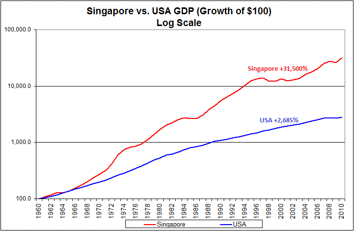
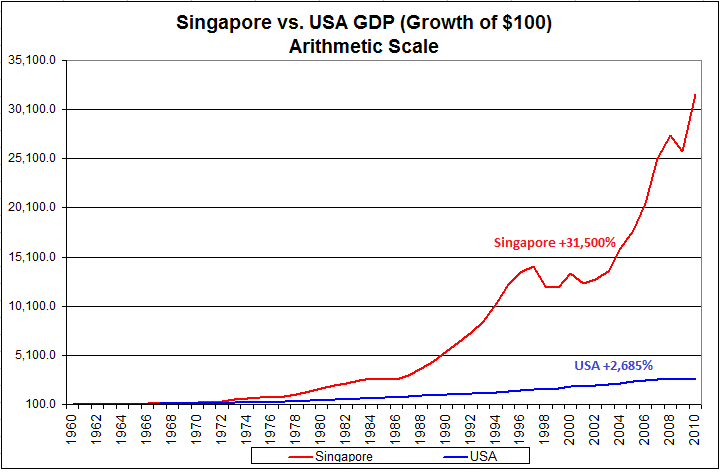
Click to enlarge. Source: St. Louis Fed; Dept of Statistics, Government of Singapore

The graph on the top is a logarithmic scale which shows how much more rapid the economic growth in Singapore has been. The magnitude of the compounded difference, though, isn’t really apparent until you take a look at the arithmetic chart below it! GDP growth in the US over the last fifty years has been a robust 6.8%, but it has been dwarfed by the growth rate in Singapore, which has averaged a stunning 12.2%! (If we could get even a fraction of this additional growth by privatizing Social Security, sign me up.)

Can you imagine what a national savings program could accomplish in the US? We have many economic advantages already, ranging from an excellent university system, a diversified economy, and abundant natural resources to an outstanding record of technological innovation. What we lack is savings. Intelligent incentives to save and invest, coupled with Social Security payroll deductions that are actually invested in accounts for the participants could have a mind-boggling impact down the road.

Personal savings is something quite different from government savings or spending. The US government seems addicted to deficit spending, but as a citizen you can’t do anything about that directly. On the other hand, your level of personal savings in entirely under your control. Like Singapore, most individuals have the ability to compound their savings for fifty years. Even if the US never adopts an intelligent enforced savings plan, there is nothing to stop you from doing it yourself.

Posted by:


High RS Diffusion Index

June 21, 2011

The chart below measures the percentage of high relative strength stocks that are trading above their 50-day moving average (universe of mid and large cap stocks.) As of 6/20/11.

This index has pulled back sharply over the past couple of months. The 10-day moving average of this indicator is 42% and the one-day reading is 33%. Dips in this index have often provided good opportunities to add money to relative strength strategies.

Posted by:


No Ax to Grind

June 20, 2011

Tyler Craig makes a good point about those selling newsletters (with a bullish or bearish bias):

It seems one could make the case for or against virtually any viewpoint or strategy depending on the objective. For example, if I sold a bearish newsletter I would no doubt discount any bullish news while trumpeting the slightest bearish developments with much fanfare. On the other hand, were I in the business of selling hope to the masses I would frequently gloss over any bearish developments while championing the bullish. Some cling to one idea or strategy and beat their proverbial drum day in and day out.

I think this is one of the main reasons that many pragmatists tend to gravitate to relative strength. Relative strength is just math and math doesn’t have an ax to grind.

Posted by:


Weekly RS Recap

June 20, 2011

The table below shows the performance of a universe of mid and large cap U.S. equities, broken down by relative strength decile and quartile and then compared to the universe return. Those at the top of the ranks are those stocks which have the best intermediate-term relative strength. Relative strength strategies buy securities that have strong intermediate-term relative strength and hold them as long as they remain strong.

Last week’s performance (6/13/11 – 6/17/11) is as follows:

Sub-par performance for high relative strength stocks last week.

Energy, Materials, and Technology took it on the chin last week, while some of the other sectors held up quite well.

Posted by:


Dorsey, Wright Client Sentiment Survey - 6/17/11

June 17, 2011

Here we have the next round of the Dorsey, Wright Sentiment Survey, the first third-party sentiment poll. Participate to learn more about our Dorsey, Wright Polo Shirt raffle! Just follow the instructions after taking the poll, and we’ll enter you in the contest. Thanks to all our participants from last round.

As you know, when individuals self-report, they are always taller and more beautiful than when outside observers report their perceptions! Instead of asking individual investors to self-report whether they are bullish or bearish, we’d like financial advisors to weigh in and report on the actual behavior of clients. It’s two simple questions and will take no more than 20 seconds of your time. We’ll construct indicators from the data and report the results regularly on our blog–but we need your help to get a large statistical sample!

Click here to take Dorsey, Wright’s Client Sentiment Survey.

Contribute to the greater good! It’s painless, we promise.

Posted by:


Retirement Planning In The New Normal

June 17, 2011

Today’s WSJ reports another signal that retirement planning is increasingly up to the individual.

AARP, the powerful lobbying group for older Americans, is dropping its longstanding opposition to cutting Social Security benefits, a move that could rock Washington’s debate over how to revamp the nation’s entitlement programs.

Why the change? Apparently, reality is finally beginning to sink in.

Social Security, which was created in 1935, is facing a demographic challenge as the baby-boom generation retires with fewer younger workers to support it. The program’s actuaries say that by 2036, the program will have exhausted its reserves and will only be able to pay 77% of promised benefits. Between now and 2036, the government, which has spent the money held in reserve, will have to borrow to meet those obligations.

I had to re-read to statement above to make sure that I understood (i.e. the program will have exhausted its reserves by 2036, yet there are no reserves now…). At any rate, the fact that even the AARP is coming around to the fact that Social Security cuts are on the way is significant.

Couple this development with the several decade-long trend away from defined benefit plans (where the employer is responsible for the saving and investing decisions) to defined contribution plans (where the employee is responsible for the saving and investing decisions) and we have a situation where it should becoming increasingly apparent that building and managing sufficient wealth to provide a comfortable retirement is up to the individual and nobody else.

(Click to Enlarge)

(Click to Enlarge)

These trends underscore the critical role of a financial advisor today and in the years ahead. Without competent guidance from an advisor, I highly doubt most individuals, including highly-paid individuals, will embrace a savings and investment discipline that will get the job done.

Posted by:


Sector and Capitalization Performance

June 17, 2011

The chart below shows performance of US sectors and capitalizations over the trailing 12, 6, and 1 month(s). Performance updated through 6/16/2011.

Posted by:


The Sad Plight of the Fundamental Analyst

June 16, 2011

Perhaps I should preface this post by saying that some of my best friends are fundamental analysts. This excerpt is taken from a funny article on Wall Street dress codes by Josh Brown of The Reformed Broker.

Prospective sell-side analysts should pretty much come in with a brown bag over their heads, eyeholes cut out of course. You will spend the next decade blowing people up with nonsensical calls like “overweight” or “strong neutral”. Your price targets will be based on discounted cash flow analysis which doesn’t really mean anything in the actual supply and demand-based stock market. Getting used to hiding and wearing a bag to cover your shame is probably a great idea, start early.

As he points out, the actual stock market is based on supply and demand. Found at the intersection of Supply Street and Demand Avenue: price.

Posted by:


No One Cares About Greece

June 16, 2011

Most investors don’t care what happens in Greece. Street riots will be news for a week or two, or until Charlie Sheen does something entertaining. Here’s what everyone is actually worried about:

U.S. banks had total exposure of $41 billion to Greece by the end of 2010, according to the latest figures, issued June 9, from the Bank for International Settlements. Most of the financial commitments appear to be indirect.

About 83% is tied to “guarantees” that range from protection for sellers of credit-derivative contracts to other obligations owed to third parties. Still the data are murky, according to economic consultant Kash Mansori.

“We don’t know exactly what the form of exposure is,” said Mansori, who authors the Street Light blog. “We can only make educated guesses.”

Marketwatch has a good point. US institutions have a lot of exposure to Greece, but no one knows exactly what it is. In the absence of transparency, investors are going to protect themselves by assuming the worst case scenario is true. It wouldn’t be surprising to see investors avoid US banks or overseas banks with Greek exposure entirely. In fact, it’s probably already going on. The financial sector has been one of the weakest areas of the market recently.

In Price We Trust

Source: Yahoo! Finance

One of the beautiful things about relative strength is that price is informed by the opinions of many large and knowledgeable market participants. You don’t have to be an expert on the Greek crisis or impending bank regulations to see that investors have concluded, at least for the time being, that banks are not where you want to be.

Posted by: