What You Don’t Own

October 31, 2012

Did you know that Japan made up approximately 60% of the MSCI EAFE Index in 1989? It’s true. Even today, Japan makes up about 20 percent of the MSCI EAFE Index. The horror show for Japanese equities since its 1989 peak is shown below:

japan2 What You Dont Own

Source: Yahoo! Finance

Relative strength strategies are often known for their ability to own the strong areas of the market, but just as important as what you own is what you don’t own. Current exposure to Japan in the PowerShares DWA Developed Markets Technical Leaders ETF (PIZ) is shown below:

piz 4 What You Dont Own

Japan is currently our biggest underweight.

See www.powershares.com for more details.

Posted by:


High RS Diffusion Index

October 31, 2012

The chart below measures the percentage of high relative strength stocks that are trading above their 50-day moving average (universe of mid and large cap stocks.) As of 10/26/12.

The 10-day moving average of this indicator is 64% and the one-day reading is 54%.

Posted by:


Beanbag Economics

October 31, 2012

We’ve written before about beanbag economics, the tendency of the world to adapt. When you smush down a beanbag chair in one area, it simply adapts by poofing out somewhere else. The global economy is no different.

Consider the beanbag economics at work in the following excerpt of an article on the bond market in the Financial Times:

Central bankers around the world have followed the lead of the Fed in forcing down interest rates in the hope of boosting economic recovery.

This has presented a dilemma for income investors, who can maintain previous levels of yield only by buying riskier or longer dated bonds.

For companies, though, it has been an unalloyed boon. Corporate treasurers have rushed to sell bonds, refinancing existing loans and expiring bonds with longer term debt paying low, fixed interest rates.

I put the relevant part in bold. Sure, low interest rates are tough on savers and bond buyers—but they’ve been great for companies. The full article points out that new corporate debt issuance has already hit a record this year, with a couple of months still to go. Some companies have been able to retire old debt and refinance it at very low rates.

From an investment point of view, the upside is that earnings leverage will be much more powerful. The drag from debt service will be much lower for companies that have been able to reduce their interest costs.

Thinking about global economics in terms of a beanbag can help underscore the idea that opportunities are always present. In a global economy, one sector’s loss may be another’s gain. Tracking the relative strength of a broad range of asset classes can help investors identify where those investment opportunities are.

Posted by:


Human Nature and Markets

October 30, 2012

Does human behavior evolve or is human nature relatively unchanging? A recent Wall Street Journal article by Jason Zweig made the case for human nature as relatively stable when it discussed the results of a fascinating study. Here’s the back story:

A fascinating new research paper analyzes how individual investors built stock portfolios soon after building portfolios first became possible: from 1690 to 1730.

The researchers, led by the distinguished financial historian Larry Neal of the University of Illinois, painstakingly replicated all the holdings and trades in the Bank of England, the East India Co. and the United East India Co., the Royal African Co., the Hudson’s Bay Co., the Million Bank and the South Sea Co. These were the dominant companies at the birth of the British capital markets three centuries ago. The share registries survive, so the scholars were able to match virtually every investment with the person who held it – encompassing 5,813 investors during the 1690s and 23,723 by the end of the period.

As a result, the way portfolios were constructed around 1700 can be compared to the way investors construct portfolios now. Mr. Zweig writes:

Three centuries ago, investors:

  • underdiversified, with 86% of them owning shares in only a single stock;
  • chased performance, with rising prices leading to higher trading volume;
  • underperformed the market as a whole, earning lower returns and incurring higher risk.

There’s little evidence of change in human nature now.

Investors today:

He concludes that:

The research findings on investors in the early days of the British stock market should remind us all that human nature is the same today as it was in the days of clay pipes, quill pens and horse-drawn carriages.

The investing crowd is as foolish now as it was then – or perhaps more so, considering that foolishness can spread faster over Twitter and smartphones than it could by foot through cobblestone streets.

In order to be a superior investor, you have to combat the crazy ideas of those around you and, above all, fight the hobgoblins in your own head. That was true in 1720. It is at least as true in 2012 as it was then.

Human nature is not an easy opponent for investors. We can’t run away from it because it is part of who we are. As a result, however, return factors that are based on human nature, like relative strength and value, are unlikely to change. That knowledge, at least, is somewhat comforting.

Posted by:


Weekly RS Recap

October 29, 2012

The table below shows the performance of a universe of mid and large cap U.S. equities, broken down by relative strength decile and quartile and then compared to the universe return. Those at the top of the ranks are those stocks which have the best intermediate-term relative strength. Relative strength strategies buy securities that have strong intermediate-term relative strength and hold them as long as they remain strong.

Last week’s performance (10/22/12 – 10/26/12) is as follows:

The top decile of the relative strength ranks saw the biggest pullback last week; however, the very bottom of the ranks also performed worse than the universe.

Posted by:


Dorsey Wright Client Sentiment Survey - 10/26/12

October 26, 2012

Here we have the next round of the Dorsey, Wright Sentiment Survey, the first third-party sentiment poll. Participate to learn more about our Dorsey, Wright Polo Shirt raffle! Just follow the instructions after taking the poll, and we’ll enter you in the contest. Thanks to all our participants from last round.

As you know, when individuals self-report, they are always taller and more beautiful than when outside observers report their perceptions! Instead of asking individual investors to self-report whether they are bullish or bearish, we’d like financial advisors to weigh in and report on the actual behavior of clients. It’s two simple questions and will take no more than 20 seconds of your time. We’ll construct indicators from the data and report the results regularly on our blog–but we need your help to get a large statistical sample!

Click here to take Dorsey, Wright’s Client Sentiment Survey.

Contribute to the greater good! It’s painless, we promise.

Posted by:


From the Archives: How to Find the Winners

October 26, 2012

Martjin Cremers, a professor at Yale, and his colleague, Antti Petajisto, authored a paper on the concept of active share. Advisor Perspectives recently interviewed Mr. Cremers to ask about his research. (This link is worth checking out, as it has links to additional articles such as From Yale University: New Research Confirms the Value of Active Management and Compelling Evidence That Active Management Really Works.)

Active share is a holdings-based measure of how different the holdings in an active portfolio are from the benchmark portfolio. As an example, an S&P 500 index fund would have an active share of 0%, since the holdings would be identical to the benchmark. Portfolios with low active shares around 20-60% are still so close to the benchmark that they are considered closet indexers.

Where Cremers and Petajisto differ from the establishment is that by segmenting managers in this way, they believe they are able to identify a subset of managers–those with high active share–who can outperform the benchmark over time.

That result is probably the most controversial. We find significant evidence, in our view, that a lot of managers actually do have some skill.

What I find refreshing about their approach is their willingness to examine aggregate data more thoroughly. In aggregate, their data also shows that fund managers do not outperform the benchmark. Most studies stop there, pretend not to notice that numerous tested factors show evidence of long-term outperformance, and then advise investors to buy index funds and to forget about active management.

Cremers and Petajisto were not content to take the lazy road. And, in fact, when looked at in more granular fashion, the data tells a different story. Closet indexers do worse than the market, but many managers with high active share show evidence of skill. This is much more in accord with other academic research that shows that broad, robust factors like relative strength and deep value can outperform over time. A manager that pursued such a strategy would have high active share and would have a good chance of long-term outperformance. That’s exactly what our systematic relative strength strategies are designed to do.

—-this article originally appeared 2/10/2010. Last week, another well-known pundit was advancing the results of their study, which showed that managers do not outperform the market. They also took the lazy road, claiming that investors should just buy index funds. The truth is more nuanced, as Cremers and Petajisto show. There are several tested return factors that show long-term outperformance, such as value and relative strength. Managers pursuing a factor-based strategy would be likely to have high active share, and according to Cremers and Petajisto, might be just the type of manager that shows evidence of significant skill.

Posted by:


Sector and Capitalization Performance

October 26, 2012

The chart below shows performance of US sectors and capitalizations over the trailing 12, 6, and 1 month(s). Performance updated through 10/25/2012.

Numbers shown are price returns only.

Posted by:


Fund Flows

October 25, 2012

The Investment Company Institute is the national association of U.S. investment companies, including mutual funds, closed-end funds, exchange-traded funds (ETFs), and unit investment trusts (UITs). Flow estimates are derived from data collected covering more than 95 percent of industry assets and are adjusted to represent industry totals.

Posted by:


Oil Demand and the New World Order

October 25, 2012

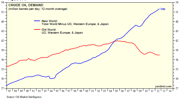
Ed Yardeni of Dr. Ed’s Blog had an interesting chart of oil demand. The interesting part was that he segmented the demand between Old World (US, Western Europe, and Japan) and New World (everyone else). There really is a new world order, something that your portfolio needs to reflect.

oildemand yardeni Oil Demand and the New World Order

Source: Dr. Ed’s Blog (click on image to enlarge)

In this case, a picture might be worth a few thousand words. You can see pretty clearly that the growth rate in oil demand is far higher outside the Old World. Up until 2004, aggregate demand was higher in the Old World, but that has changed too. The big engine of oil demand is no longer the large developed economies. The last recession created a downturn in oil demand in the Old World, but created barely a blip on the chart for the New World. I was surprised when I saw this chart, and I’m probably not the only one. I think most people in the investment industry would be surprised by this—and certainly many clients would be too.

To me, this is a good argument for global tactical asset allocation. Yes, the economy is slow—but clearly not everywhere. Based on oil demand, some economies are growing just fine. Global tactical asset allocation allows you to go where the returns are, regardless of where they may be. Relative strength is a good way to locate those returns.

Posted by:


Factor-Based ETFs: “A Growing Phenomenon”

October 24, 2012

Our Technical Leaders Indexes were prominently profiled in New Factor-Based Strategies Make ETFs Less Passive by Rosalyn Retkwa in Institutional Investor magazine.

Exchange-traded funds increasingly seek to rebalance their portfolios without bastardizing the concept of passive investing.

The article also includes quotes by Tom Dorsey and Mike Moody:

Invesco PowerShares of Wheaton, Illinois, offers four ETFs based on the DWA Technical Leaders index created by Dorsey Wright & Associates of Richmond, Virginia. That index measures the relative strength or momentum in stocks to pick out the top 100 stocks in three categories — large- and midcap U.S. stocks (PDP), developed markets ex-U.S. (PIZ), and emerging markets (PIE) — and the top 200 small-cap stocks (DWAS). All four are reweighted quarterly. “We could have chosen weekly or monthly, but quarterly worked out the best for us in our test,” says Tommy Dorsey, a principal in the firm, emphasizing that the selection of the “leaders” is all machine-driven, “with no human intervention. What’s taken out of the equation is human emotion. It’s all rules-activated.” Dorsey believes that ETFs “should stop short of being active and trying to compete with mutual funds,” because once they become actively managed, “you have that emotion, and that’s where the ETF has become bastardized,” he says.

But “people are experimenting and trying a lot of different things,” says Mike Moody, a senior portfolio manager at Dorsey Wright Money Management, the Pasadena, California–based asset management arm of the Richmond firm. “In just the last few years, there’s been an explosion with both academics and practitioners discussing how factor-based returns combine in a portfolio,” he says. “The dominant method for a long time has been characterizing equity through style boxes — small cap, large cap — and they’re all pretty highly correlated, but if you take that universe and you add in factors like low volatility and relative strength, they don’t have the same correlation,” he says.

See www.powershares.com for more information.

Posted by:


Perspective on Earnings Growth and the Markets

October 24, 2012

Most everything we post here comes from a technical perspective, but I enjoyed this rant by ING:

The headlines said this week’s corporate earnings were horrible. To borrow from the Presidential debates, “That is not true;” corporate earnings growth actually improved this week. Year-over-year earnings growth improved from -4% on Friday to -2.5% as of yesterday. Oh, but the markets went down big for a second time in less than a week. Big deal. Welcome to the equity markets. Accepting normal volatility is the price for building wealth, just look at the equity markets over the past year ending in the third quarter. That is, ending September the S&P 500 was up 30% for the year and 13.2% annualized for the past three years. It has been a wild ride for a king’s ransom, and hang on because some very large global companies are reporting over the next couple of days, and it is likely that earnings, with half of the companies reporting will end, at least this week, in positive territory.

Source: ING Investment Management

Posted by:


High RS Diffusion Index

October 24, 2012

The chart below measures the percentage of high relative strength stocks that are trading above their 50-day moving average (universe of mid and large cap stocks.) As of 10/23/12.

The 10-day moving average of this indicator is 68% and the one-day reading is 55%.

Posted by:


Relative Strength Spread

October 23, 2012

The chart below is the spread between the relative strength leaders and relative strength laggards (universe of mid and large cap stocks). When the chart is rising, relative strength leaders are performing better than relative strength laggards. As of 10/22/2012:

RS leaders and laggards continue to take turns leading. Neither has had a decisive advantage over the last three years.

Posted by:


Dorsey Wright Client Sentiment Survey Results - 10/12/12

October 22, 2012

Our latest sentiment survey was open from 10/12/12 to 10/19/12. The Dorsey, Wright Polo Shirt Raffle continues to drive advisor participation, and we greatly appreciate your support! This round, we had 90 advisors participate in the survey. If you believe, as we do, that markets are driven by supply and demand, client behavior is important. We’re not asking what you think of the market—since most of our blog readers are financial advisors, we’re asking instead about the behavior of your clients. Then we’re aggregating responses exclusively for our readership. Your privacy will not be compromised in any way.

After the first 30 or so responses, the established pattern was simply magnified, so we are fairly comfortable about the statistical validity of our sample. Some statistical uncertainty this round comes from the fact that we only had four investors say that thier clients are more afraid of missing a stock upturn than being caught in a downdraft. Most of the responses were from the U.S., but we also had multiple advisors respond from at least two other countries. Let’s get down to an analysis of the data! Note: You can click on any of the charts to enlarge them.

Question 1. Based on their behavior, are your clients currently more afraid of: a) getting caught in a stock market downdraft, or b) missing a stock market upturn?

greatestfear 59 Dorsey Wright Client Sentiment Survey Results   10/12/12

Chart 1: Greatest Fear. From survey to survey, the S&P 500 fell by around -1%, and some of our indicators responded as expected. The fear of downdraft grop fell slightly with a falling market, from 86% to 85%, which is the opposite of what we’d expect to see in a down market. The fear of missing opportunity group rose from 14% to 16%.

fearspreaad Dorsey Wright Client Sentiment Survey Results   10/12/12

Chart 2: Greatest Fear Spread. Another way to look at this data is to examine the spread between the two groups. The spread fell from 73% to 69%.

Question 2. Based on their behavior, how would you rate your clients’ current appetite for risk?

avgriskapp 46 Dorsey Wright Client Sentiment Survey Results   10/12/12

Chart 3: Average Risk Appetite. Average risk appetite fell with the market, which is what we’d expect to see. Average risk appetite fell from 2.89 to 2.71.

riskappbellcurve 34 Dorsey Wright Client Sentiment Survey Results   10/12/12

Chart 4: Risk Appetite Bell Curve. This chart uses a bell curve to break out the percentage of respondents at each risk appetite level. This round, over 80% of all respondents wanted a risk appetite of either 2 or 3.

riskappbellcurvegroup 17 Dorsey Wright Client Sentiment Survey Results   10/12/12

Chart 5: Risk appetite Bell Curve by Group. The next three charts use cross-sectional data. The chat plots the reported client risk appetite separately for the fear of downdraft and for the fear of missing upturn groups. This chart sorts out as expected, with the downturn group wanting less risk and the upturn group looking to add risk.

riskappbygroup 2 Dorsey Wright Client Sentiment Survey Results   10/12/12

Chart 6: Average Risk Appetite by Group. The average risk appetite of both groups fell this round, in line with the market.

riskappspread 47 Dorsey Wright Client Sentiment Survey Results   10/12/12

Chart 7: Risk Appetite Spread. This is a chart constructed from the data in Chart 6, where the average risk appetite of the downdraft group is subtracted from the average risk appetite of the missing upturn group. The spread is now back in its normal range.

The S&P 500 fell around -1% from survey to survey, and the results were a mixed bag. The overall fear number did the opposite of what we’d expect, with LESS people worried about losing money despite a falling market. However, our trusty risk appetite indicator fell along with the market, with people wanting less risk as stocks dropped.

No one can predict the future, as we all know, so instead of prognosticating, we will sit back and enjoy the ride. A rigorously tested, systematic investment process provides a great deal of comfort for clients during these types of fearful, highly uncertain market environments. Until next time, good trading and thank you for participating.

Posted by:


Quote of the Week

October 22, 2012

No strategy can make up for inadequate savings or premature retirement.—-Rob Arnott, Research Affiliates

I like this quote a lot. It gets at some of the factors that allow clients to achieve wealth, along with intelligent investment management.

  1. Savings, and
  2. Time.

Savings is usually more important than investment strategy, especially when a client is just beginning to accumulate capital. Without some savings to begin with, there’s no capital to manage.

Time is important to allow compounding to occur. This is often lost on young investors, who sometimes do not realize what a jump they will get by starting a portfolio early. How many of us in the industry have met with the 55-year-old client who has just finished putting the kids through college and is now ready to start saving for retirement—only to realize they will need to save 115% of their current income to reach the retirement goal they have in mind? Oops.

Save early and often, and give your capital lots of time to grow.

Posted by:


Weekly RS Recap

October 22, 2012

The table below shows the performance of a universe of mid and large cap U.S. equities, broken down by relative strength decile and quartile and then compared to the universe return. Those at the top of the ranks are those stocks which have the best intermediate-term relative strength. Relative strength strategies buy securities that have strong intermediate-term relative strength and hold them as long as they remain strong.

Last week’s performance (10/15/12 – 10/19/12) is as follows:

There was not a lot of dispersion in returns last week-all quartiles had a solid week of gains (with the bulk of the gains coming at the beginning of the week).

Posted by:


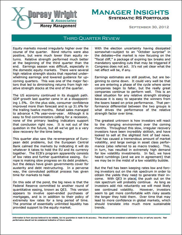
Manager Insights: Third Quarter Review

October 19, 2012

Click below for our take on the economy, the financial markets, and what it may mean for relative strength.

ManagerInsightsQ3 Manager Insights: Third Quarter Review


Posted by:


Net Wealth Shock and Portfolio Diversification

October 19, 2012

Professor Amir Sufi (University of Chicago Booth School of Business) is an interesting researcher. He recently tweeted a picture of what he called “net wealth shock” to show how the recession had affected various families. It’s reproduced below, but in effect, it shows that low and median net worth families have had a large negative impact from the recession while high net worth families have been impacted much less. I think portfolio diversification has everything to do with it.
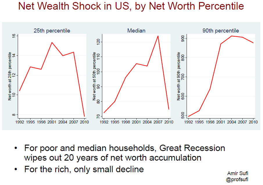
netwealthshock Net Wealth Shock and Portfolio Diversification

The Effect of Buying One Stock on Margin

Source: Amir Sufi (click on image to enlarge)

For clues to why this happened, consider an earlier paper that Dr. Sufi co-wrote on household balance sheets. I’ve linked to the entire paper here (you should read it for insight into very clever experimental design), but here’s the front end of the abstract:

The large accumulation of household debt prior to the recession in combination with the decline in house prices has been the primary explanation for the onset, severity, and length of the subsequent consumption collapse.

Later in the paper, he reiterates that it is the combination of these two things that is deadly.

The household balance sheet shock in high leverage counties came from two sources: high ex ante debt levels and a large decline in house prices. One natural question to ask is: could the decline in house prices alone explain the collapse in consumption in these areas?

Our answer to this question is a definitive no-it was the combination of house price declines and high debt levels that drove the consumption decline.

And he and his co-authors, through clever data analysis, proceed to explain why they believe that to be the case.

Now consider what this is saying from a portfolio management point of view: why was the impact of falling home prices so devastating to low and median net worth households?

The negative impact came primarily from lack of diversification. Low and median net worth households had essentially one stock on margin. I know people don’t think they are buying their house on margin, but the net effect of a home loan—magnifying gains and losses—is the same. When that stock (their house) went south, their net worth went right along with it.

High net worth households were simply better diversified. It’s not that their houses didn’t decline in value also; it’s just that their house was not their only asset. In addition, they were less leveraged.

There are probably a couple of things to take away from this.

  • Diversify broadly. It’s no fun to have everything in one asset when things go wrong, whether it’s your house or Enron stock in your pension plan.
  • Debt kills. Having a single asset that nosedives is bad, but having it on margin is disastrous. There’s no room for error with leverage—and no way to wait things out.

Perhaps high net worth families are more diversified simply because they have greater wealth. Maybe they took the same path as everyone else and just got lucky not to have a recession in the middle of their journey. However, I think it’s also worth contemplating the converse: maybe those families achieved greater wealth because they diversified more broadly and opted to use less leverage.

Posted by:


Sector and Capitalization Performance

October 19, 2012

The chart below shows performance of US sectors and capitalizations over the trailing 12, 6, and 1 month(s). Performance updated through 10/18/2012.

gics101912 Sector and Capitalization Performance

Numbers shown are price returns only.

Posted by:


Raging Bull Market

October 18, 2012

I saw an article on CNBC that discussed the opinion of Citigroup strategist Tobias Levkovich. Here’s an excerpt of his thinking on a bull market:

Tobias Levkovich, Citigroup’s U.S. strategist, is expecting the market to enter a ‘raging bull’ market next year.

While he continues to stick with his 2013 year-end target on the S&P 500 of 1,615, that would take the index above the prior peak of 1,558 reached in 2007.

Is this valid? I have no idea. However, I am getting pretty sick of reading bearish forecasts, so I like the way Mr. Levkovich thinks!

In truth, things are never usually as bad or as good as people forecast. Given the pervasive gloom surrounding equity markets for the last several years, a bull market is not out of the question. The stock market often does whatever is required to make the most people wrong, and a bull market would certainly catch a lot of investors flat-footed.


Posted by:


Complementary Strategies: One Key to Diversification

October 18, 2012

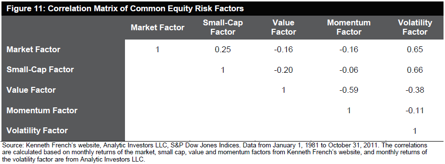
We use relative strength (known as “momentum” to academics) in our investment process. We’ve written extensively how complementary strategies like low volatility and value can be used alongside relative strength in a portfolio. S&P is now on board the train, as they show in this research paper how alternative beta strategies are often negatively correlated. In fact, here’s the correlation matrix from the paper:

Altbetacorrelation Complementary Strategies: One Key to Diversification

Source: Standard & Poors (click to enlarge image)

You can see that relative strength/momentum is negatively correlated with both value and low volatility. This is why we prefer diversification through complementary strategies.

They conclude:

…combining alternative beta strategies that are driven by distinct sets of risk factors may help to reduce the active risk and improve the information ratio.

Diversification is important for portfolios, but it’s not easily achieved. For example, if you decide to segment the market by style box rather than by return factors, you will find that the style boxes are all fairly correlated. Although it’s a mathematical truism that anything that isn’t 100% correlated will help diversification, diversification is far more efficient when correlations are low or negative.

We think using factor returns to identify complementary strategies is one of the more effective keys to diversification.

Posted by:


Invest for the Long Run?

October 18, 2012

“Invest for the long-run” can ring hollow for a recent retiree looking to carefully manage his or her nest egg. Via an article in the New York Times by Paul Sullivan comes the following example:

How should people do the math to avoid dying broke? The answer depends as much on timing as spending.

Mark A. Cortazzo, senior partner at Macro Consulting Group, tells clients who ask this question about three fictional brothers. Each one retired with $1 million on Jan. 1 but three years apart — in 1997, 2000 and 2003. They all invested that $1 million in the Vanguard 500 Index Investor Fund.

Between when they retired and Aug. 31, 2012, each brother withdrew $5,000 a month. The brother who had been retired the longest had $1.14 million on Aug. 31. The one who retired most recently had $1.15 million left.

But the one in the middle, who began taking his monthly withdrawals in 2000, had only $160,568. The reason? The stock market went down for the first three years he was retired, and then plummeted again in 2008. He had to sell more shares to get $5,000 each month.

“Most clients say, ‘I don’t mind dying broke if I’m bouncing my last check to the undertaker,” Mr. Cortazzo said. “But I don’t want to run out at 80 if I’m going to live to 95.”

I can’t think of a better argument for employing our Global Macro strategy as part of the solution than this. Global tactical asset allocation seeks to be adaptive enough to respond to these types of adverse market conditions. The reality is that most recent retirees are in danger of running out of money in one of two ways: losing a substantial amount of money in a bear market or failing to earn enough of a return on their money to keep up with inflation. I think Global Macro does an effective job of balancing those two risks.

To view a video on our Global Macro strategy, click here.

Click here and here for disclosures. Past performance is no guarantee of future returns.

Posted by:


Fund Flows

October 18, 2012

The Investment Company Institute is the national association of U.S. investment companies, including mutual funds, closed-end funds, exchange-traded funds (ETFs), and unit investment trusts (UITs). Flow estimates are derived from data collected covering more than 95 percent of industry assets and are adjusted to represent industry totals.

ici101812 Fund Flows

Posted by:


Affluent Investors Settle Down

October 17, 2012

According to a Merrill Lynch survey of affluent investors, they are beginning to adapt to the current economic and market situation as the new normal, as opposed to looking at it as a temporary period of high volatility. Perhaps because they’ve now made that psychological leap, affluent investors are beginning to feel that their situation is more stable. From a Penta article:

To prepare for a more volatile environment, this affluent group also is making efforts to control what they can by spending less, paying down debt, and generally “putting their lives in check,” Durkin said. Of the families surveyed, 50% said they’ve taken steps to gain greater control of their finances, like sticking to a budget (32%), making more joint investment decisions with a spouse (29%), and setting tangible goals (28%). One third of respondents said they’re living “more within their means.”

In other words, the affluent are adapting by toggling back their lifestyle and saving more.

Making that psychological shift is critical because it allows a lot of good things to happen. It’s also perhaps a realization that although you can’t control the markets, there is a lot you can control that will impact your eventual net worth—namely, living beneath your means and saving more. Being affluent, in and of itself, won’t build net worth.

Once a client has good habits in place, compounding kicks in and net worth tends to grow more rapidly than clients expect. Clients are usually delighted with this discovery!

Posted by: