From the Archives: Was It Really a Lost Decade?

February 28, 2013

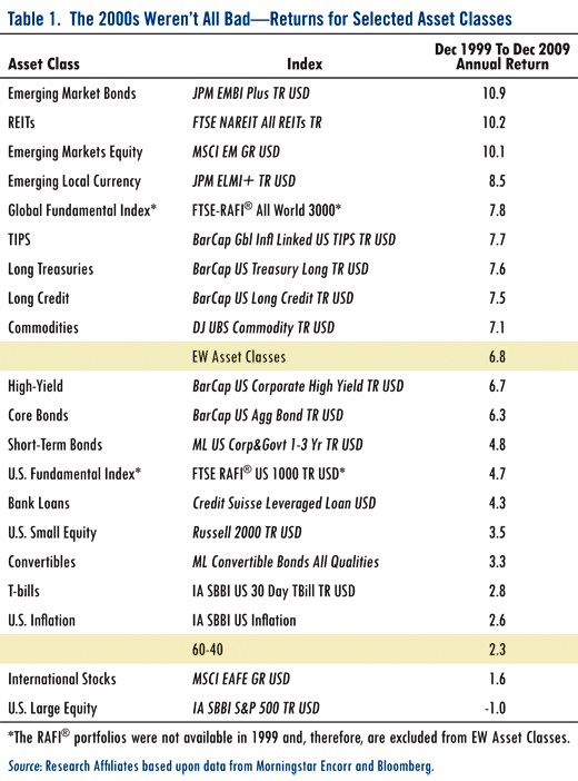
Index Universe has a provocative article by Rob Arnott and John West of Research Affiliates. Their contention is that 2000-2009 was not really a lost decade. Perhaps if your only asset was U.S. equities it would seem that way, but they point out that other, more exotic assets actually had respectable returns.

The table below shows total returns for some of the asset classes they examined.

 From the Archives: Was It Really a Lost Decade?

click to enlarge

What are the commonalities of the best performing assets? 1) Lots of them are highly volatile like emerging markets equities and debt, 2) lots of them are international and thus were a play on the weaker dollar, 3) lots of them were alternative assets like commodities, TIPs, and REITs.

In other words, they were all asset classes that would tend to be marginalized in a traditional strategic asset allocation, where the typical pie would primarily consist of domestic stocks and bonds, with only small allocations to very volatile, international, or alternative assets.

In an interesting way, I think this makes a nice case for tactical asset allocation. While it is true that most investors–just from a risk and volatility perspective–would be unwilling to have a large allocation to emerging markets for an entire decade, they might find that periodic significant exposure to emerging markets during strong trends would be quite acceptable. And even assets near the bottom of the return table like U.S. Treasury bills would have been very welcome in a portfolio during parts of 2008, for example. You can cover the waterfront and just own an equal-weighted piece of everything, but I don’t know if that is the most effective way to do things.

What’s really needed is a systematic method for determining which asset classes to own, and when. Our Systematic Relative Strength process does this pretty effectively, even for asset classes that might be difficult or impossible to grade from a valuation perspective. (How do you determine whether the Euro is cheaper than energy stocks, or whether emerging market debt is cheaper than silver or agricultural commodities?) Once a systematic process is in place, the investor can be slightly more comfortable with perhaps a higher exposure to high volatility or alternative assets, knowing that in a tactical approach the exposures would be adjusted if trends change.

—-this article originally appeared 2/17/2010. There is no telling what the weak or strong assets will be for the coming decade, but I think global tactical asset allocation still represents a reasonable way to deal with that uncertainty.
Posted by:


Quote of the Week

February 28, 2013

Fascinating story written by Jeff Lin about the perseverance of Ang Lee, who recently won the Academy Award for Best Director for Life of Pi.

Much is made of genius and talent, but the foundation of any life where you get to realize your ambitions is simply being able to out-last everyone through the tough, crappy times — whether through sheer determination, a strong support network, or simply a lack of options.

HT: Abnormal Returns

Posted by:


Fund Flows

February 28, 2013

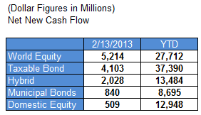
Mutual fund flow estimates are derived from data collected by The Investment Company Institute covering more than 95 percent of industry assets and are adjusted to represent industry totals.

ici 02.28.13 Fund Flows

Posted by:


The Case for Dividends

February 27, 2013

The case for investing for dividends is nicely summarized in this paper produced by First Trust.

The Importance of Dividends

With interest rates at historically low levels,these are challenging times to invest for income. In this environment, dividend-paying companies may reward investorsseeking income as well as capital appreciation potential. This paper outlines some of the benefits of dividend-paying stocks as well as their significance in today’s market environment.

Reasons to Consider Dividend-Paying Stocks

  • Interest rates are at historically low levels
  • Key component of total return
  • May be a signal of capital strength

Historical Perspective

Investing in dividend-paying stocks is a time-tested strategy that provides an attractive combination of income and capital appreciation potential. A dividend is a distribution of a portion of a company’s earnings which is decided by the company’s board of directors and payable to its shareholders. Companies that pay dividends tend to be mature companies and may be less volatile than companies that do not pay dividends.Corporations are not obligated to share their earnings with stockholders and not all companies do. It is for this reason that dividends may be viewed as an indication of a company’s profitability, as well as management’s assessment of the future.

A Key Component of Total Return

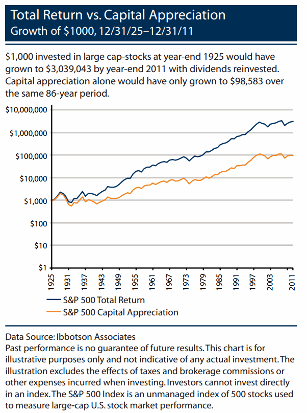
Historically, dividends have made up a significant portion of stock market total return. According to Ibbotson Associates, dividends have provided approximately 44% of the 9.77% average annual total return on the S&P 500 Index from 1926 through 2011. In addition, dividend-payers have historically outperformed non-payers.The chart at right shows that dividend payers in the S&P 500 Index have outperformed non-dividend payers in 21 out of the last 32 years, a period which included both rising and falling markets. Additionally,the dividend payers had a negative return in only 3 of the 32 years versus 10 years of negative performance for the non-payers. According to Standard and Poor’s, in 2011,the payers were up 1.40% vs. a decline of 7.60% for the non-payers. It is important to note that there can be no assurance that companies will declare dividends in the future or that, if declared,they will remain at current levels or increase over time.

dividends The Case for Dividends

Dorsey Wright has partnered with First Trust for several years now to provide relative strength-based UITs, including a Relative Strength Dividend UIT. A key feature of this strategy is that our relative strength analysis is done on a total return basis (incorporating price and yield). We believe that this will have some important performance and risk management benefits over time. Past performance, holdings, and other information about these strategies can be found at www.ftportfolios.com.

Posted by:


Assessing Fixed Income

February 27, 2013

Interesting perspective via ETF Trends on the potential risks in the fixed income markets—high-yield bonds in particular:

Michael Holland, chairman of Holland & Co., told Bloomberg that bond prices are acting like dot-com stocks during the Internet craze. “I’ve been in the business for 40 years, and the reality is that we’ve never had a situation like this because this is totally manufactured by the Fed,” he said.

“The interest-rate risk is just a law of nature,” said Craig Packer, head of Americas leveraged finance for Goldman Sachs, referring to junk bonds.

“I don’t know if it will be this year, but five years from now we’re going to look back and realize that investors were taking on real interest-rate risk when they were buying any of these products and that risk came to fruition,” Packer said in the Bloomberg story. “I feel pretty comfortable predicting that. It’s not the 2006-2007 credit risk. It’s the 2013 interest-rate risk.”

Will this prediction be any different than the countless other bearish predictions over the last couple years for fixed income? Who knows. However, at some point I do think it is highly likely that interest rates rise—perhaps substantially so. There are many different factors at work here, including Fed policy and the strength of the economic recovery. If and when rates do rise, there are going to be a lot of investors asking questions not only about yield, but also about risk management.

Right now, we do hold high-yield bonds in some of our investment strategies, due to their strong relative strength. However, I take comfort in the fact that we approach our exposure tactically. In other words, we are not married to any one position.

Dorsey Wright even introduced a Tactical Fixed Income strategy earlier this year (financial professionals can click here to view a video presentation on the strategy) that we believe may prove very valuable in the years ahead.

Dorsey Wright currently owns HYG. A list of all holdings for the trailing 12 months is available upon request. Please click here for disclosures.

Posted by:


High RS Diffusion Index

February 27, 2013

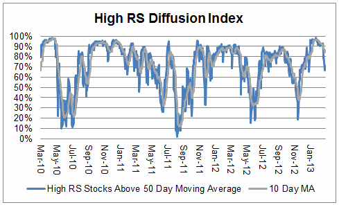
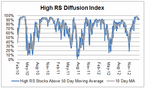
The chart below measures the percentage of high relative strength stocks that are trading above their 50-day moving average (universe of mid and large cap stocks.) As of 2/26/13.

diffusion 02.27.131 High RS Diffusion Index

The 10-day moving average of this indicator is 84% and the one-day reading is 71%.

Posted by:


Relative Strength Spread

February 26, 2013

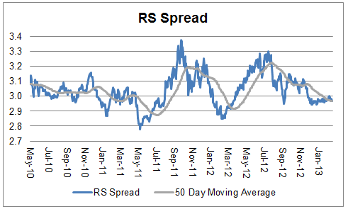
The chart below is the spread between the relative strength leaders and relative strength laggards (universe of mid and large cap stocks). When the chart is rising, relative strength leaders are performing better than relative strength laggards. As of 2/25/2013:

spread 02.26.13 Relative Strength Spread

Posted by:


Tame Inflation: Will It Last?

February 25, 2013

Brian Westbury and Bob Stein, Chief Economists for First Trust, have an interesting view of what may be in store for inflation in the coming years:

Inflation is tame. For now. The CPI (consumer price inflation) was flat in January and is up only 1.6% from a year ago. The PPI (producer prices) rose a small 0.2% in January and is up just 1.4% from a year ago.

And even though energy prices spiked in February, the year ago comparisons are likely to stay tame. The consensus expects the February CPI to rise 0.6% - the largest in 44 months. Nonetheless, it would still show just 1.9% inflation in the past year, which is still below the Federal Reserve’s target of 2%.

This won’t last. With the Fed loose; we expect consumer prices to rise toward 3% during 2013. Then rise to 4% in 2014 on its way to 5% gains, maybe even higher, in the next few years. In theory, the Fed has said that 6.5% unemployment and 2.5% or greater inflation would force it to tighten policy.

However, we believe the Fed will remain in denial about inflation. Ben Bernanke, Janet Yellen, and Bill Dudley – the power-elite – don’t believe inflation can head higher, so when it does, they will either ignore it or blame it on temporary, one-off shocks as the Fed did in the 1970s.

The first excuse will be that higher inflation is due to commodities, and they are just not that large a part of the economy. Moreover, “core” inflation remains tame.

But when rising housing prices (and rents) push “core” inflation above the 2% target, the Fed will resort to its second excuse: housing prices are just bouncing back to normal…and that this is just a temporary phenomenon.

The third excuse will be that “it is not actual inflation that matters, but what the Fed forecasts future inflation will be” over the next year or two. And, as long as the Fed is forecasting a return to 2% or lower, then there’s nothing to worry about.

If we are right and inflation persists above 2% and continues to rise, that excuse won’t work anymore, either.

Enter excuse number four: this is when the troika of Bernanke, Yellen and Dudley will argue that “it’s OK for inflation to exceed a 2% target because it has to make up for when inflation averaged below target during past years.”

Finally, the Fed will resort to excuse number five, which will blame increasing price pressures, not on loose money, but on things like temporary weakness in the dollar or a temporary increase in velocity or the money multiplier.

The fact that CPI has been so tame over the last couple years of this recovery has surprised many, but Wesbury and Stein may well be correct about inflation (and the Fed’s response to it) going forward. For those approaching asset allocation from a tactical perspective, this doesn’t necessarily have to be a bad thing. In fact, a portfolio that has the ability to make meaningful allocations to commodities and real estate, among other asset classes, may even thrive in that environment.

Posted by:


Weekly RS Recap

February 25, 2013

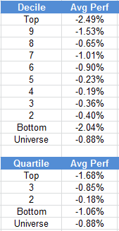
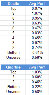
The table below shows the performance of a universe of mid and large cap U.S. equities, broken down by relative strength decile and quartile and then compared to the universe return. Those at the top of the ranks are those stocks which have the best intermediate-term relative strength. Relative strength strategies buy securities that have strong intermediate-term relative strength and hold them as long as they remain strong.

Last week’s performance (2/18/13 – 2/22/13) is as follows:

ranks 02.25.13 Weekly RS Recap

Posted by:


Small Caps Shining in 2013

February 22, 2013

So far, 2013 has offered some pretty impressive returns for equity investors—especially in the small-cap space. Through 2/21/13, the Russell 2000 (small caps) is up 6.60%, outpacing the S&P 500 (large caps) by over 1.25%. Chances are good that many investors have not given a whole lot of thought to allocating to small caps. After all, the natural tendency for investors is to just focus on the more recognizable large-cap companies. However, I think there are some good reasons why investors can benefit from adding small-cap exposure to their portfolios. The Borneo Post recently wrote up some of the compelling reasons for considering small caps in a portfolio, including the following:

Stronger earnings growth

While earnings growth of the broader stock market is usually dependent on the pace of growth of the underlying economy, smaller or mid-sized companies may possess the ability to grow earnings at a much quicker pace.

Larger companies may find it more difficult to grow their revenues more quickly than the overall pace of economic growth, especially when they already hold a sizable market share in a particular industry. On the other hand, it is more plausible for a smaller company which has a negligible market share to grow its revenues by double digits each year, which could lead to a doubling or tripling of profits over a shorter period of time.

This trend is evident from a look at the historical earnings of global small caps versus the broader market, with small cap stocks delivering a 7.8 per cent annualised growth in earnings between 1999 to 2012, versus the more modest 5.2 per cent earnings growth for the broader market.

Last July, Dorsey Wright began providing a relative strength based index to PowerShares for the PowerShares DWA Small-Cap Technical Leaders Portfolio (DWAS). This ETF differs from many of the other small-cap ETFs in the marketplace in that it is not cap-weighted. Rather, it is an index of 200 small-cap stocks with strong relative strength. Through 2/21/13, DWAS is up an impressive 9.59% for the year.

dwas Small Caps Shining in 2013

Source: Yahoo! Finance

For more information about DWAS, please see www.powershares.com. Past performance is no guarantee of future returns.

Posted by:


Podcast #26 Animal Spirits Returning

February 22, 2013

Podcast #26 Animal Spirits Returning

Mike Moody, John Lewis, and Andy Hyer

Posted by:


Client Sentiment Survey - 2/22/13

February 22, 2013

Here we have the next round of the Dorsey, Wright Sentiment Survey, the first third-party sentiment poll. Participate to learn more about our Dorsey, Wright Polo Shirt raffle! Just follow the instructions after taking the poll, and we’ll enter you in the contest. Thanks to all our participants from last round.

As you know, when individuals self-report, they are always taller and more beautiful than when outside observers report their perceptions! Instead of asking individual investors to self-report whether they are bullish or bearish, we’d like financial advisors to weigh in and report on the actual behavior of clients. It’s two simple questions and will take no more than 20 seconds of your time. We’ll construct indicators from the data and report the results regularly on our blog–but we need your help to get a large statistical sample!

Click here to take Dorsey, Wright’s Client Sentiment Survey.

Contribute to the greater good! It’s painless, we promise.

Posted by:


Sector and Capitalization Performance

February 22, 2013

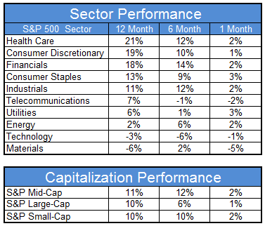
The chart below shows performance of US sectors and capitalizations over the trailing 12, 6, and 1 month(s). Performance updated through 2/21/2013.

gics 02.22.13 Sector and Capitalization Performance

Numbers shown are price returns only and are not inclusive of transaction costs. Source: iShares

Posted by:


How Long Might Your Portfolio Last?

February 21, 2013

When it comes to retirement, you want your portfolio to last at least as long as you do. From BlackRock comes a useful table for estimating how long your portfolio will last, given return and withdrawal rate assumptions:

withdrawal 02.21.13 How Long Might Your Portfolio Last?

(Click to enlarge)

It is very interesting that choosing a 5 percent withdrawal rate rather than 6 percent resulted in an additional portfolio life of 11 years in this study! A client who has amassed $1 million may be feeling like they must be set for retirement. However, when they realize that this means $50,000 a year (increased annually for inflation), they may no longer feel so good. The earlier that clients begin to think about the concept of withdrawal rates, the more time they will have to affect the absolute value of those withdrawals (through saving and investment decisions) and be able to set themselves up for a comfortable lifestyle.

Posted by:


Waiting for Clarity

February 21, 2013

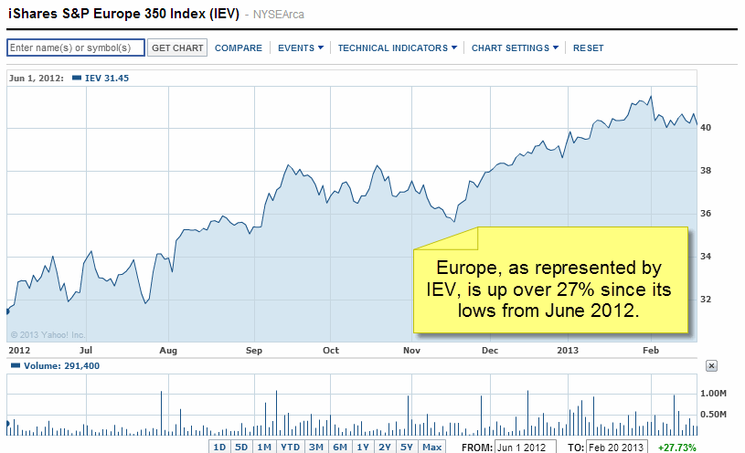
Grim rhetoric about Europe’s economic prospects are plentiful. For example, consider Martin Wolf’s view, as recently detailed in the Financial Times:

Those who believe the eurozone’s trials are now behind it must assume either an extraordinary economic turnaround or a willingness of those trapped in deep recessions to soldier on, year after grim year. Neither assumption seems at all plausible.

And then there is the chart:

iev Waiting for Clarity

Source: Yahoo! Finance

So what gives? Perhaps, Martin Wolf is just plain wrong and there is reason for optimism in Europe. Alternatively, maybe the market is just failing to see how bad things really are in Europe and Wolf will eventually be proven correct. Maybe investors should just sit this one out and wait for some clarity.

This type of thought process goes on constantly with investors. As is obvious to anyone who has been around the markets for a while, waiting for clarity before making an investment is a recipe for disaster. Markets climb a wall of worry—an adage that has been around for decades is a market reality. Trend following doesn’t wait for clarity. It leads investors to enter positions after signs of strength and to exit after signs of weakness. Europe is currently strong. We have seen the trends and relative strength of international equities, including Europe, improve dramatically in recent months. Of course we don’t know whether or not this trend has legs (one never does until after the fact), but trend followers can’t be overly concerned about whether or not each particular trade will work out. Some trades will quickly fail, while others will lead to long-term investments that produce spectacular gains. Embracing a logical methodology, like trend following, is likely to be a much more productive exercise than trying to gain investment wisdom from the current market prognosticators.

HT: Abnormal Returns

Dorsey Wright currently owns IEV and other positions in Europe. A list of all holdings for the trailing 12 months is available upon request. Past performance is no guarantee of future returns.

Posted by:


Fund Flows

February 21, 2013

Mutual fund flow estimates are derived from data collected by The Investment Company Institute covering more than 95 percent of industry assets and are adjusted to represent industry totals.

ici 02.21.13 Fund Flows

Posted by:


From the Archives: Rob Arnott and the Key to Better Returns

February 21, 2013

Rob Arnott is a thought leader in tactical asset allocation, currently well-known for his RAFI Fundamental Indexes. In his recent piece, Lessons from the Naughties, he discusses how investors will need to find return going forward.

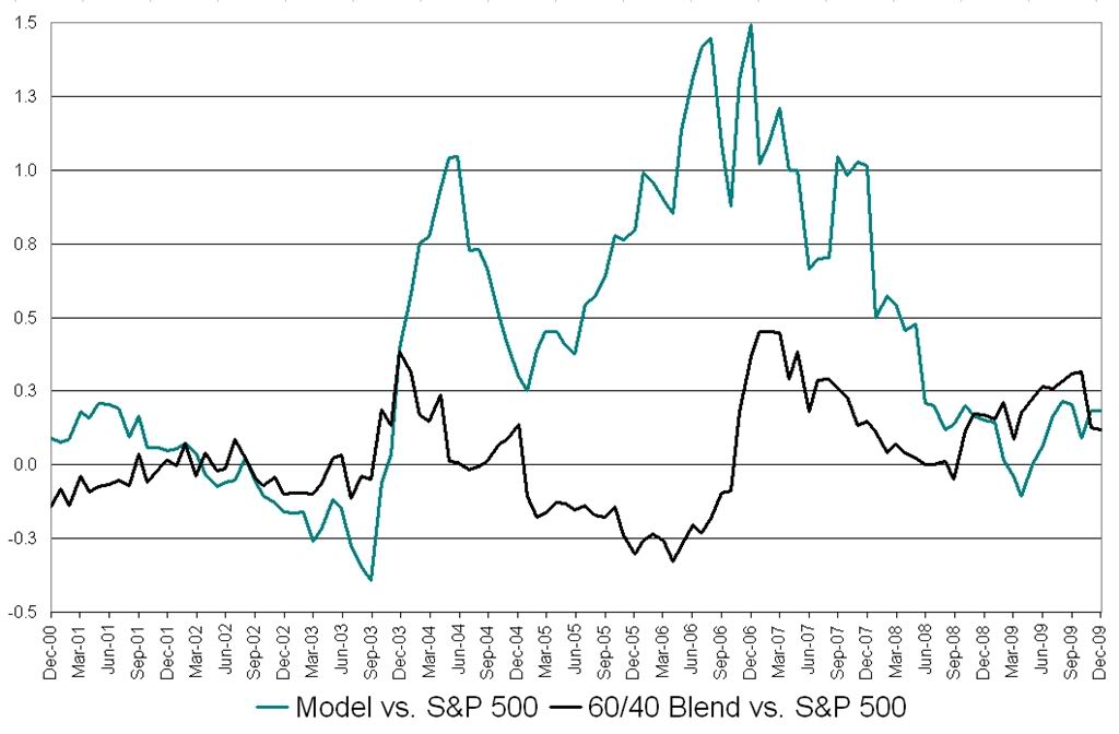
The key to better returns will be to respond tactically to the shifting spectrum of opportunity, especially expanding and contracting one’s overall risk budget.

It’s a different way to view tactical asset allocation–looking at it from a risk budget point of view. The general concept is to own risk assets in good markets and safe assets in bad markets.

It turns out that systematic application of relative strength accomplishes this very well. The good folks at Arrow Funds recently asked us to take a look at how the beta in a tactically managed portfolio changed over time. When we examined that issue, it showed that as markets became risky, relative strength reduced the beta of the portfolio by moving toward low volatility (strong) assets. When markets were strong, allocating with relative strength pushed up the beta in the portfolio, thus taking good advantage of the market strength.

 From the Archives: Rob Arnott and the Key to Better Returns

click to enlarge

Using relative strength to do tactical asset allocation, the investor was not only able to earn an acceptable rate of return over time, but was able to have some risk mitigation going on the side. That’s a pretty tasty combination in today’s markets.

—-this article originally appeared on 2/26/2010. Amid all of the publicity given recently to risk parity, Arnott’s approach, which is to vary the risk budget over time depending on the opportunities available, has been largely ignored. I think this is unfortunate. His approach, although perhaps not easy, has merit. Tactical asset allocation driven by relative strength is one way to do that.

Posted by:


Client Survey Results - 2/8/13

February 20, 2013

Our latest sentiment survey was open from 2/8/13 - 2/15/13. The Dorsey, Wright Polo Shirt Raffle continues to drive advisor participation, and we greatly appreciate your support! This round, we had 70 advisors participate in the survey. If you believe, as we do, that markets are driven by supply and demand, client behavior is important. We’re not asking what you think of the market—since most of our blog readers are financial advisors, we’re asking instead about the behavior of your clients. Then we’re aggregating responses exclusively for our readership. Your privacy will not be compromised in any way.

After the first 30 or so responses, the established pattern was simply magnified, so we are fairly comfortable about the statistical validity of our sample. Some statistical uncertainty this round comes from the fact that we only had four investors say that thier clients are more afraid of missing a stock upturn than being caught in a downdraft. Most of the responses were from the U.S., but we also had multiple advisors respond from at least two other countries. Let’s get down to an analysis of the data! Note: You can click on any of the charts to enlarge them.

Question 1. Based on their behavior, are your clients currently more afraid of: a) getting caught in a stock market downdraft, or b) missing a stock market upturn?

greatestfear 60 zps864500aa Client Survey Results   2/8/13

Chart 1: Greatest Fear. From survey to survey, the S&P 500 rose around +1.5%, and our indicators responded as expected. The fear of downdraft group fell from 75% to 73%, while the upturn group rose from 25% to 27%. The market is continuing to rally well into the first quarter.

fearspread 4 zps6ec76880 Client Survey Results   2/8/13

Chart 2: Greatest Fear Spread. Another way to look at this data is to examine the spread between the two groups. The spread nudged lower , from 49% to 46%.

Question 2. Based on their behavior, how would you rate your clients’ current appetite for risk?

avgriskapp 50 zpsf70be4f3 Client Survey Results   2/8/13

Chart 3: Average Risk Appetite. Average risk remained the same, from 2.825 to 2.821.

riskappbellcurve 37 zps1b71aeda Client Survey Results   2/8/13

Chart 4: Risk Appetite Bell Curve. This chart uses a bell curve to break out the percentage of respondents at each risk appetite level. This round, just under 85% of all respondents wanted a risk appetite of 3 or less.

bellcurvegroup 13 zpsaf2caeb1 Client Survey Results   2/8/13

Chart 5: Risk appetite Bell Curve by Group. The next three charts use cross-sectional data. The chat plots the reported client risk appetite separately for the fear of downdraft and for the fear of missing upturn groups. We can see the upturn group wants more risk, while the fear of downturn group is looking for less risk.

avgriskgroup 8 zps9aec22cb Client Survey Results   2/8/13

Chart 6: Average Risk Appetite by Group. This round, the downturn group’s average fell, while the upturn group’s average shot higher.

riskappspread 50 zpsc5aa2d89 Client Survey Results   2/8/13

Chart 7: Risk Appetite Spread. This is a chart constructed from the data in Chart 6, where the average risk appetite of the downdraft group is subtracted from the average risk appetite of the missing upturn group. The spread moved higher this round.

The S&P has now rallied for just over half the length of the first quarter, and client sentiment has responded favorably. All of our indicators are showing broad improvement in client sentiment. If the stock market can continue to move higher, there’s no question that clients will become more aggressive and more comfortable with adding risk.

No one can predict the future, as we all know, so instead of prognosticating, we will sit back and enjoy the ride. A rigorously tested, systematic investment process provides a great deal of comfort for clients during these types of fearful, highly uncertain market environments. Until next time, good trading and thank you for participating.

Posted by:


High RS Diffusion Index

February 20, 2013

The chart below measures the percentage of high relative strength stocks that are trading above their 50-day moving average (universe of mid and large cap stocks.) As of 2/12/13.

Capture High RS Diffusion Index

The 10-day moving average of this indicator is 92% and the one-day reading is also 92%.

Posted by:


Weekly RS Recap

February 19, 2013

The table below shows the performance of a universe of mid and large cap U.S. equities, broken down by relative strength decile and quartile and then compared to the universe return. Those at the top of the ranks are those stocks which have the best intermediate-term relative strength. Relative strength strategies buy securities that have strong intermediate-term relative strength and hold them as long as they remain strong.

Last week’s performance (2/11/13 – 2/15/13) is as follows:

ranks 02.19.13 Weekly RS Recap

Posted by:


Hyperinflation

February 15, 2013

Apparently hyperinflation can occur anywhere!

Source: Greg Mankiw

Posted by:


Fund Flows

February 14, 2013

Mutual fund flow estimates are derived from data collected by The Investment Company Institute covering more than 95 percent of industry assets and are adjusted to represent industry totals.

ici 02.14.13 Fund Flows

Posted by:


Bonds and Risk Parity

February 13, 2013

I had risk parity in mind when I noted that a recent article at Financial Advisor quoted long-time awesome bond manager Dan Fuss on the state of the bond market:

Dan Fuss, whose Loomis Sayles Bond Fund beat 98 percent of its peers in the last three years, said the fixed-income market is more “overbought” than at any time in his 55-year career as he prepares to open a fund to British individual investors.

“This is the most overbought market I have ever seen in my life in the business,” Fuss, 79, who oversees $66 billion in fixed-income assets as vice chairman of Boston-based Loomis Sayles & Co., said in an interview in London. “What I tell my clients is, ‘It’s not the end of the world, but for heaven’s sakes don’t go out and borrow money to buy bonds right now.’”

The reason this intrigues me is the strong institutional interest in “risk parity” portfolios at the moment. The base idea behind risk parity is that in a typical investment portfolio, equities provide most of the volatility. A risk parity portfolio typically tries to equalize the volatility contribution of different asset classes, which often means reducing the equity allocation—and also often leveraging the bond allocation. (Equating volatility with risk is a whole different discussion.) In other words, risk parity portfolios often borrow money to buy bonds, just the thing Dan Fuss is urging his clients to avoid right now.

To me, the marker of a bubble is irrational behavior. By that standard, bonds are in a bubble. Consider that at the end of last week the 10-year Treasury could be purchased with a yield of about 2.00%. Yet, the 10-year breakeven yield was about 2.57%, indicating that a buyer of 10-year Treasurys expected a negative real return.

Is it rational to buy something with the expectation of a negative return? Think about it this way: Imagine telling a prospective client, “If you buy this stock portfolio, we expect that you’ll lose about a half percent a year for the next decade.” Think you would have any buyers? Would people bid at auction to get a piece of the action?

Expectations, of course, could be wrong. Maybe bonds will continue to do well for an extended period of time, or maybe buying with the expectation of a slight negative return will turn out to be a genius move because every other asset class does much worse.

The problem with bubbles is not really that they exist. Bubbles are great for investors and for the economy on the way up. Bubbles often have an evolutionary financial purpose as well—probably the foundation for many later businesses was laid during the internet bubble. Much of the first internet generation might have died off, but their offspring populate Silicon Valley now. We’ll always have bubbles, human nature being what it is.

The more specific problem with bubbles concerns the investors trapped in them as they deflate—and the absolute impossibility of determining when that might happen. It’s way easier to identify a bubble than to guess when it will pop. Trends of all types, including bubbles, can go on for a lot longer than people think.

The most practical way to handle bubbles, I think, is to use some type of trend following tactical approach. You’ll never be out at the top, of course, but you might be able to be along for much of the ride and be able to exit without extensive damage. If you’re a bond market investor today that might be one way to think about your exposure. Committing to bonds as a permanent part of a risk parity strategy, especially with leverage, is a different animal.

Posted by:


High RS Diffusion Index

February 13, 2013

The chart below measures the percentage of high relative strength stocks that are trading above their 50-day moving average (universe of mid and large cap stocks.) As of 2/12/13.

diffusion 02.13.131 High RS Diffusion Index

The 10-day moving average of this indicator is 92% and the one-day reading is also 92%.

Posted by:


Quote of the Week

February 12, 2013

To attain knowledge, add things every day. To attain wisdom, subtract things every day.—-Lao-Tzu

There are many theories about investing in the market. Some are simple, while others are mind-numbingly complex. Relative strength is one of the simple methods. Because it is simple, it is robust and much more difficult to break than a multi-factor method that relies on many relationships between factors. Complicated things are fragile and tend to break easily. That’s not to say that relative strength is perfect—it will underperform periodically like every other method. But relative strength subtracts everything except price, and asserts that strong price action is typically a precursor of good relative performance. History bears that out.

Posted by: