Q2 2013 Technical Leaders

March 29, 2013

Each quarter, the PowerShares DWA Technical Leaders Indexes are reconstituted. These indexes are designed to thoroughly evaluate their respective investment universes (U.S equities, Emerging Market equities, Developed International Market equities, and U.S. Small-Cap equities) and build an index of stocks with superior relative strength characteristics. This quarter’s allocations are as follows:

Source: PowerShares, MSCI, and Standard & Poor’s

There is now over $1.5 billion in asset under management and licensing in PDP, PIE, PIZ, and DWAS.

See www.powershares.com for more information.

Posted by:


“Least Loved Bull Market in Modern History”

March 29, 2013

USA Today assesses investor sentiment as the S&P 500 hits a new all-time high:

Normally, when the Standard & Poor’s 500-stock index hits a new all-time high and completes the third year of a bull market, you expect certain things.

You expect your Uncle Elmer to call you and tell you what a chump you are for not buying triple-leveraged biotechnology funds. You expect stadiums named after mutual fund companies. You expect to see your fund manager being carried in to TV appearances on a litter.

So far, however, the normal ebullience that accompanies a bull market has been hard to find, even in light of the S&P 500′s 10% gain in the first quarter of 2013.

This has been the least-loved bull market in modern history.

Which is exactly why it may continue.

Posted by:


Fund Flows

March 28, 2013

Mutual fund flow estimates are derived from data collected by The Investment Company Institute covering more than 95 percent of industry assets and are adjusted to represent industry totals.

Posted by:


Looking Beyond the BRICS

March 27, 2013

Seeking Alpha weighs in on the merits of the PowerShares DWA Emerging Markets Technical Leaders ETF (PIE):

Most emerging market stock ETFs are heavy on the BRIC (Brazil, Russia, India, China). The problem? If you are hanging with the largest emerging economies in 2013, you’ve been losing money. Note: Think Vanguard Emerging Markets (VWO).

In contrast, PIE uses relative strength when conducting its quarterly rebalancing. With Thailand, Indonesia, and Mexico having had the best momentum in the most recent quarter, the continuation of that momentum has led to phenomenal gains in Q1 2013. Despite a tendency by some commentators to overplay the fundamental valuation card, individual investors should not underestimate the impact that technical analysis is having on successful portfolios.

pie2 Looking Beyond the BRICS

Source: Yahoo! Finance

Past performance is no guarantee of future returns. See www.powershares.com for more information. A list of all holdings for the trailing 12 months is available upon request.

Posted by:


High RS Diffusion Index

March 27, 2013

The chart below measures the percentage of high relative strength stocks that are trading above their 50-day moving average (universe of mid and large cap stocks.) As of 3/26/13.

The 10-day moving average of this indicator is 89% and the one-day reading is 88%.

Posted by:


Relative Strength Spread

March 26, 2013

The chart below is the spread between the relative strength leaders and relative strength laggards (universe of mid and large cap stocks). When the chart is rising, relative strength leaders are performing better than relative strength laggards. As of 3/25/2013:

Posted by:


Buy the Unloved

March 25, 2013

Morningstar has a market-beating strategy call “Buy the Unloved” that they update from time to time. Essentially, it consists of buying the fund categories with the most outflows and holding on to them for three years, on the theory that retail investors generally get things wrong. Sadly, “Buy the Unloved” has a good track record, indicating that their thesis is largely correct!

Here are a couple of key excerpts from their 2013 update on the Buy the Unloved strategy:

Morningstar has followed this strategy since the early 1990s, using annual net cash flows to identify each year’s three most unloved and loved equity categories, which feed into two separate portfolios (unloved and loved). We track the average returns for those categories for the subsequent three years, adding in new categories each year and swapping out categories after three years are up. We’ve found that holding a portfolio of the three most unpopular equity categories for at least three years is an effective approach: From 1993 through 2012, the “unloved” strategy gained 8.4% annualized to the “loved” strategy’s 5.1% annualized. The unloved strategy has also beaten the MSCI World Index’s 6.9% annualized gain and has slightly beat the Morningstar US Market Index’s 8.3% return.

According to Morningstar fund flow data, the most popular equity categories in 2012 were diversified emerging markets (inflows of $23.2 billion), foreign large value (inflows of $4.6 billion), and real estate (inflows of $3.8 billion). Those looking across asset classes might want to be cautious on sending new money to intermediate-term bond (inflows of $112.3 billion), short-term bond (inflows of $37.6 billion), and high-yield bond (inflows of $23.6 billion), particularly as interest rates have nowhere to go but up.

The most unloved equity categories are also the most unpopular overall: large growth (outflows of $39.5 billion), large value (outflows of $16 billion), and large blend (outflows of $14.4 billion). These categories have seen outflows despite posting double-digit gains in 2012. The money leaving from these categories reflects a broader trend of investors fleeing equity funds while piling into fixed-income offerings and passive ETFs.

Now that we are almost a full quarter into 2013, it might be worthwhile to think about what we have seen so far this year: good performance from large-cap equities and sluggish performance from bonds.

Morningstar should get a public service award for publishing this data—and it’s worth thinking about what you can learn from it. The most popular investment trends are not always the profitable ones. In fact, their work indicates that it could be valuable to spend time thinking about going into areas that are currently unpopular. Obviously, this does not need to be used (and probably shouldn’t be) as a stand-alone strategy, but it might be useful as a guide to portfolio adjustments.

Posted by:


Weekly RS Recap

March 25, 2013

The table below shows the performance of a universe of mid and large cap U.S. equities, broken down by relative strength decile and quartile and then compared to the universe return. Those at the top of the ranks are those stocks which have the best intermediate-term relative strength. Relative strength strategies buy securities that have strong intermediate-term relative strength and hold them as long as they remain strong.

Last week’s performance (3/18/13 – 3/22/13) is as follows:

Posted by:


How Do It Know?

March 22, 2013

“How Do It Know?” is the punchline to an old joke. According to Urban Dictionary (with a little of my own copy editing!):

This expression is taken from a joke that describes a person’s failure to grasp the obvious or that demonstrates such intellectual ineptitude as to elicit a comment of “How Do It Know?”

The joke refers to a question posed to a scientist by a student (or in variations, a corporate executive and employee, a Congressman and voter, etc.) “Sir, in your opinion, what is the world’s greatest invention?” asked a student. The scientist replied “The thermos bottle!” “Why?” asked the student, obviously confused. ” Well” said the scientist, “it keeps cold drinks cold in the summer and hot drinks hot in the winter.” Holding up his thermos bottle in awe, he says “How do it know?”

Technical analysts make this joke all the time. The reason is that the stock market is a discounting mechanism and often reacts before the fundamentals become apparent.

Consider, for example, an article in the New York Times, dated March 21, 2013, entitled Sudden Rise in Home Demand Takes Builders by Surprise. Here are a few excerpts from the article, which has series of anecdotes about how the industry was caught off guard with the surprise housing demand.

The housing turnaround seems to have caught almost everyone in the business by surprise. As desirable as the long-awaited improvement may be, the unusually low level of homes for sale is creating widespread problems for buyers and sellers alike, leading to bidding wars and bubblelike price jumps in places that not long ago were suffering from major declines.

Monthly permits for single-family homes in the Sacramento area more than doubled from January 2012 to January 2013, though they are still only a quarter of the level they reached during the bubble. Nationally, the construction industry added 48,000 jobs in February, the biggest increase since 2007.

“You walk into the permit office, and it’s like a ghost town in there,” said Michael Haemmig, president of Haemmig Construction in Nevada City, Calif., about an hour north of Sacramento. He says local governments were caught off-guard by the suddenly renewed interest in building and do not have enough people in place to handle the paperwork.

Here’s what wasn’t caught by surprise: the price charts of housing stocks. Below is a chart of XHB, the ETF for the S&P Homebuilders Index, and Lennar (LEN), one of the larger homebuilders that happens to be in some of our managed accounts. XHB is up more than 100% from the trough in October 2011, while LEN is up around double that much.

How Do It Know?

Source: Yahoo! Finance (click on image to enlarge)

Although this is clearly a well-chosen example, this happens often enough that it is pretty clear that a lot of information is contained in prices. After all, prices simply reflect supply and demand—and often the buyers and sellers are very well informed.

Fundamentalists often deride technical analysis as some kind of voodoo, but supply and demand is pretty firmly rooted in economics. Informed buyers and sellers often catch on far sooner than economists or even most Wall Street analysts. For example, take a look a another chart of the same two items—with one twist. The only difference is the time frame. This chart runs from early 2006 to the end of 2007, a period when the economy was booming and few economists, fundamental analysts, or Fed officials were concerned about a housing bust.

Housing Bust on the Way?

Source: Yahoo! Finance (click on image to enlarge)

As you can see, before 2008 rolled around, the homebuilders had already been cut in half. In price, there is knowledge. That’s because prices contain investor’s expectations, not just what is currently visible. Of course, expectations can change—but prices will adjust to that too.

That’s the point of relative strength analysis. It allows an investor to scan the entire universe of securities and see where the strongest performances are. That’s usually where you want your portfolio to be too.

HT to Abnormal Returns

Past performance is no guarantee of future returns. A list of all holdings for the trailing 12 months is available upon request.

Posted by:


The Ridiculous Efficient Frontier

March 22, 2013

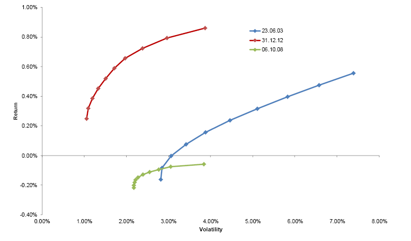
It’s hard to believe this paper was not written ironically. Perhaps I am missing the author’s sense of dry humor? In a paper entitled Principal Component Analysis of Time Variations in the Mean-Variance Efficient Frontier, author Andreas Steiner subjects mean-variance optimization to principal component analysis, a mathematical way to determine the relative importance of factors. He extracted three important factors that determine the efficient frontier. The three factors together explained 99% of the shape of the efficient frontier.

In fact—and this is the funny part to me-one factor explained 95% of the shape of the efficient frontier. And what was that magic factor?

It was the level of returns. In other words, the shape of the efficient frontier depends on the returns of the various assets. If you can predict the returns, you will (mostly) know the shape of the efficient frontier. And, in case you were wondering, the shape of the efficient frontiers varies enormously depending on the time period. Below, for example, is a clip from the paper showing efficient frontiers calculated from trailing data at different times. I’m sure you can see the slight problem—the curves look nothing alike.

ridiculousfrontier zps5d9cf98d The Ridiculous Efficient Frontier

The Ridiculous Frontier

Source: Andreas Steiner/SSRN (click on image to enlarge)

The author writes:

We find that the level factor is highly correlated with average asset returns.

We interpret this result as evidence that successful investment management is mainly driven by return estimates and not “risk management” as has been in the spotlight since the Financial Crisis.

Here’s the immediate question that occurs to my feeble brain, although I’m guessing most 5th graders would be right there with me: If I could predict the return of each asset, why would I need an efficient frontier? Wouldn’t I just buy the best-performing asset?

Indeed, risk management is no big deal if I simply predict all of the asset returns. We’ve discussed many times before that mean-variance optimization is highly dependent upon returns, although correlations and standard deviation play a supporting role. All of these factors are moving targets, none more so than returns. Mean variance optimization, in practice, is a complete bust because obviously no one can reliably and consistently predict returns.

This kind of study—although mathematically rigorous—is silliness of the first degree. It reminds me certain academic follies, like the professors who wondered if monkeys at typewriters really could reproduce the works of Shakespeare. (The short answer is “no.”)

Modern portfolio theory would be relatively harmless if it remained in academia. However, when investors try to use it to build portfolios, it has the potential to cause a lot of damage. Although it is simply another theory that does not work in practice, it is enshrined in many finance textbooks and still taught to budding practitioners. Is it any wonder that we prefer tactical asset allocation driven by relative strength to guessing at future returns?

HT to CXO Advisory

Posted by:


Client Sentiment Survey - 3/22/13

March 22, 2013

Here we have the next round of the Dorsey, Wright Sentiment Survey, the first third-party sentiment poll. Participate to learn more about our Dorsey, Wright Polo Shirt raffle! Just follow the instructions after taking the poll, and we’ll enter you in the contest. Thanks to all our participants from last round.

As you know, when individuals self-report, they are always taller and more beautiful than when outside observers report their perceptions! Instead of asking individual investors to self-report whether they are bullish or bearish, we’d like financial advisors to weigh in and report on the actual behavior of clients. It’s two simple questions and will take no more than 20 seconds of your time. We’ll construct indicators from the data and report the results regularly on our blog–but we need your help to get a large statistical sample!

Click here to take Dorsey, Wright’s Client Sentiment Survey.

Contribute to the greater good! It’s painless, we promise.

Posted by:


Sector and Capitalization Performance

March 22, 2013

The chart below shows performance of US sectors and capitalizations over the trailing 12, 6, and 1 month(s). Performance updated through 3/21/2013.

Numbers shown are price returns only and are not inclusive of transaction costs. Source: iShares

Posted by:


Bond Math

March 22, 2013

Advisor Perspectives ran a recent research piece from Leuthold Weeden on bond math. Although this stuff is fairly well known within the advisor community—or at least I hope it is—it seems to be almost completely unknown to clients. The one bond math item that I think clients would be most shocked to know is this:

One of the better bond forecasting tools over the past several decades involves no inflation forecast whatsoever. It turns out the prevailing yield on the 10-year Treasury has provided a wonderfully accurate forecast of bond market total returns 10 years out. In fact, the correlation between current yields and the subsequent 10-year total return is a stunning 0.96 based on monthly data back to 1930!

The emphasis is theirs. A 96% correlation is exceptionally high, and here’s what it says about bonds going forward: your bond returns are likely to be low. As of 3/15, the 10-year constant-maturity Treasury yield was 2.04%. That’s also, it turns out, the best forecast for bond total returns for the next 10 years.

By the way, that’s not the real return adjusted for inflation. That’s the total return. Most of your clients are not going to be able to afford to retire on a 2% return. They are either going to have to liquidate their account over time or find some way to earn more than 2% over time. Fortunately, there are a lot of alternatives in a well-considered portfolio approach, from equities to tactical asset allocation that might own bonds only periodically.

You really should read the entire article. Doug Ramsey is not only tall, but also a nice guy. And it is his considered opinion that the 10-year Treasury forecast may even be too high. For the most part, I don’t think clients are thinking this way about bond returns. Perhaps you can help them do the math.

Posted by:


The Capitalism Distribution

March 21, 2013

Why relative strength?

Longboard Asset Management completed a study called The Capitalism Distribution that examined stock returns from the top 3000 stocks from 1983-2007. They found that:

-39% of stocks were unprofitable investments.

-19% of stocks lost at least 75% of their value.

-64% of stocks underperformed the index.

-25% of stocks were responsible for all the market’s gains.

Simply picking a stock out of a hat means you have a 64% chance of underperforming a basic index fund, and roughly a 40% chance of losing money!

Luckily, investors don’t need to picks stocks out of a hat and hope they get lucky in order to find the winners. Relative strength provides an effective framework for building a portfolio of winners and capitalizing on long term trends. Click here to read Relative Strength and Portfolio Management by John Lewis to see the results of relative strength tests on U.S. equities over a 16 year period. As summarized in the paper:

Relative strength and momentum strategies have delivered market-beating returns for many years. There has been a great deal of research in this area by both practitioners and academics. However, despite this public disclosure of information, these strategies continue to outperform over time. Many of the testing methodologies used over the years are not consistent with real-world portfolio construction and do not address the possible range of outcomes when implementing a relative strength strategy. Our continuous, Monte Carlo testing process corrects for both of these deficiencies. Similar to other research, our process shows simple relative strength factors to be extremely robust over intermediate horizon formation periods, and weak over very short-term and long-term horizons. We also find there can be great variation in portfolio returns over short time periods, but over long holding periods the portfolios perform exceptionally well.

HT: Mebane Faber Research

Posted by:


Emerging Markets ETFs

March 21, 2013

Morningstar came out with a piece yesterday titled Are There Better Emerging-Markets ETF Choices? The article discussed the availability of alternative beta funds in the area, and had this to say, in part, about momentum:

While there has been relatively little academic research done on momentum in emerging-markets stocks, it has been observed in this asset class. There is currently one ETF that looks to capitalize on momentum in emerging-markets stocks-PowerShares DWA Emerging Markets (PIE), which was launched in December 2007. Over the five year period ending Feb. 28, 2013, this fund’s benchmark index produced annualized returns that outstripped the MSCI Emerging Markets Index by 155 basis points while exhibiting fairly similar levels of volatility.

Risk-tolerant investors looking for more growth-oriented exposure to emerging markets may want to consider PIE; it is currently the only emerging-markets ETF of reasonable size to provide a growth tilt.

The article also discusses some of the funds that offer low-volatility exposure, but did not mention that the low-vol and high relative strength return factors often complement one another nicely. In the domestic market, we’ve seen that these factors have excess returns that are negatively correlated. Although usage of low volatility in emerging markets has a much shorter history, it’s possible that we’ll see the same thing there over time.

It’s nice to see Morningstar give relative strength some attention!

PIE2 Emerging Markets ETFs

Source: Yahoo! Finance

See www.powershares.com for more information. Past performance is no guarantee of future returns.

Posted by:


Relative Strength Turns

March 21, 2013

Our partners at Arrow Funds have recently published some relative strength research that should be essential reading for any advisor who is looking to provide value to their clients. Relative Strength Turns provides important insights into the cyclical nature of relative strength performance and makes a compelling case why now may be a great time to be allocating to relative strength strategies.

Historically, over very long periods of time, each of these relative strength models outperforms a buy-and-hold equity model. However, like many investment approaches, relative strength will sometimes underperform the market, and at other times it may outperform. This comparative performance, also known as RS Alpha, can be cyclical resulting in long-term trends with significant tops followed by underperformance and bottoms folloed by outperformance, as the chart below illustrates.

Performance Cycles Relative Strength Turns

When the trend turns upward, it starts long periods of time when relative strength performance above the historical average.

RS Alpha Turning Periods Relative Strength Turns

The normal course of business in this industry is for fund companies to pound the table on a strategy or return factor that has already had an extended run of outperformance. Arrow Funds has taken a different approach with this research. Using historical data, they make a solid case for why relative strength is a winning long-term return factor and why the opportunity to enter relative strength strategies now may be particularly profitable.

Click below to read the entire piece.

Arrow Insights Relative Strength Turns

Past performance is no guarantee of future returns. Click here for disclosures.

Posted by:


Fund Flows

March 21, 2013

Mutual fund flow estimates are derived from data collected by The Investment Company Institute covering more than 95 percent of industry assets and are adjusted to represent industry totals.

Posted by:


Retirement Stress

March 20, 2013

AdvisorOne ran an interesting article recently, reporting the results of a retirement study done by Franklin Templeton. Investors are feeling a lot of stress about retirement, even early on. And given how things are going for many of them, feeling retirement stress is probably the appropriate response! In no particular order, here are some of the findings:

A new survey from Franklin Templeton finds that nearly three-quarters (73%) of Americans report thinking about retirement saving and investing to be a source of stress and anxiety.

In contrast to those making financial sacrifices to save, three in 10 American adults have not started saving for retirement. The survey notes it’s not just young adults who are lacking in savings; 68% of those aged 45 to 54 and half of those aged 55 to 64 have $100,000 or less in retirement savings.

…two-thirds (67%) of pre-retirees indicated they were willing to make financial sacrifices now in order to live better in retirement.

“The findings reveal that the pressures of saving for retirement are felt much earlier than you might expect. Some people begin feeling the weight of affording retirement as early as 30 years before they reach that phase of their life,” Michael Doshier, vice president of retirement marketing for Franklin Templeton Investments, said in a statement. “Very telling, those who have never worked with a financial advisor are more than three times as likely to indicate a significant degree of stress and anxiety about their retirement savings as those who currently work with an advisor.”

As advisors, we need to keep in mind that our clients are often very anxious over money issues or feel a lot of retirement stress. We often labor over the math in the retirement income plan and neglect to think about how the client is feeling about things—especially new clients or prospects. (Of course, they do feel much better when the math works!)

The silver lining, to me, was that most pre-retirees were willing to work to improve their retirement readiness—and that those already working with an advisor felt much less retirement stress. I don’t know if clients of advisors are better off for simply working with an advisor (other studies suggest they are), but perhaps even having a roadmap would relieve a great deal of stress. As in most things, the unknown makes us anxious. Working with a qualified advisor might make things seem much more manageable.

Posted by:


High RS Diffusion Index

March 20, 2013

The chart below measures the percentage of high relative strength stocks that are trading above their 50-day moving average (universe of mid and large cap stocks.) As of 3/19/13.

The 10-day moving average of this indicator is 91% and the one-day reading is 88%.

Posted by:


Client Sentiment Survey Results - 3/8/13

March 19, 2013

Our latest sentiment survey was open from 3/8/13 to 3/15/13. The Dorsey, Wright Polo Shirt Raffle continues to drive advisor participation, and we greatly appreciate your support! This round, we had 65 advisors participate in the survey. If you believe, as we do, that markets are driven by supply and demand, client behavior is important. We’re not asking what you think of the market—since most of our blog readers are financial advisors, we’re asking instead about the behavior of your clients. Then we’re aggregating responses exclusively for our readership. Your privacy will not be compromised in any way.

After the first 30 or so responses, the established pattern was simply magnified, so we are fairly comfortable about the statistical validity of our sample. Some statistical uncertainty this round comes from the fact that we only had four investors say that thier clients are more afraid of missing a stock upturn than being caught in a downdraft. Most of the responses were from the U.S., but we also had multiple advisors respond from at least two other countries. Let’s get down to an analysis of the data! Note: You can click on any of the charts to enlarge them.

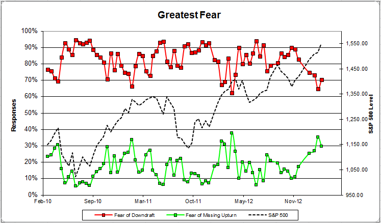
Question 1. Based on their behavior, are your clients currently more afraid of: a) getting caught in a stock market downdraft, or b) missing a stock market upturn?

greatestfear 60 zps92e939ed Client Sentiment Survey Results   3/8/13

Chart 1: Greatest Fear. From survey to survey, the S&P 500 rose just over +2%, and our indicators responded with a mixed bag. The fear of downturn group actually rose from 65% to 70% in a rising market, which we would not expect to see. The upturn group fell from 35% to 30%.

greatestfearspread 2 zpsc448425b Client Sentiment Survey Results   3/8/13

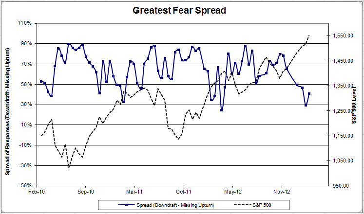
Chart 2: Greatest Fear Spread. Another way to look at this data is to examine the spread between the two groups. The spread rose from 29% to 41%.

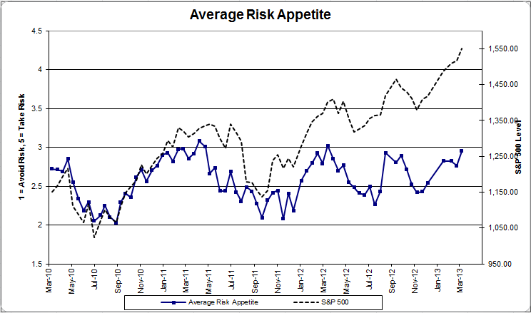
Question 2. Based on their behavior, how would you rate your clients’ current appetite for risk?

avgriskapp 50 zps6c4eb14a Client Sentiment Survey Results   3/8/13

Chart 3: Average Risk Appetite. Average risk appetite jumped this round, from 2.76 to 2.95. We’re sitting just off 1-year highs of client risk appetite at this point. If the market continues to rally, this indicator should be able to break through 3.

riskappbellcurve 37 zps697698e5 Client Sentiment Survey Results   3/8/13

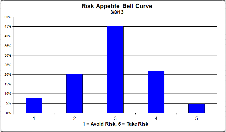
Chart 4: Risk Appetite Bell Curve. This chart uses a bell curve to break out the percentage of respondents at each risk appetite level. This round, nearly 75% of all respondents wanted a risk appetite of 3 or less.

riskappgroup 6 zpsf13fd4e5 Client Sentiment Survey Results   3/8/13

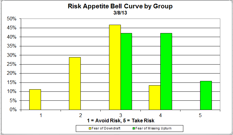
Chart 5: Risk appetite Bell Curve by Group. The next three charts use cross-sectional data. The chat plots the reported client risk appetite separately for the fear of downdraft and for the fear of missing upturn groups. We can see the upturn group wants more risk, while the fear of downturn group is looking for less risk.

avgriskgroup 8 zps74d09f04 Client Sentiment Survey Results   3/8/13

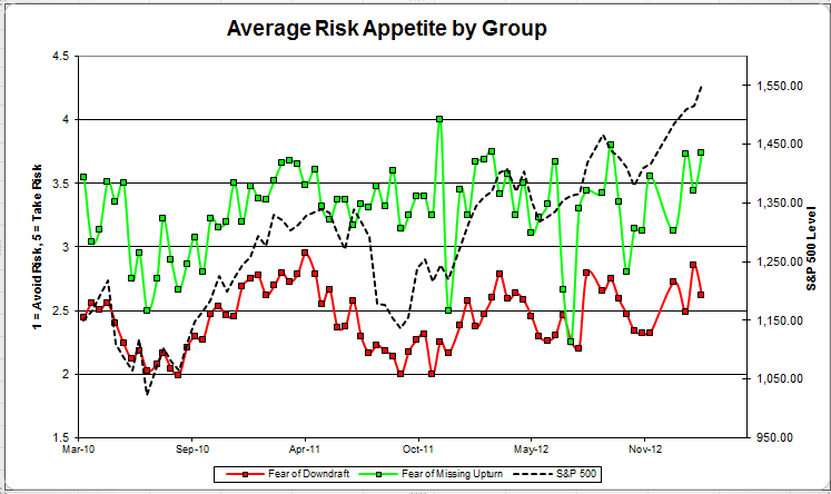
Chart 6: Average Risk Appetite by Group. This round, the downturn group’s average fell, while the upturn group’s average shot higher. This continues to be our most volatile indicator.

riskappspread 50 zps4d2ac9f7 Client Sentiment Survey Results   3/8/13

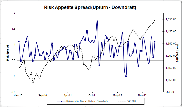
Chart 7: Risk Appetite Spread. This is a chart constructed from the data in Chart 6, where the average risk appetite of the downdraft group is subtracted from the average risk appetite of the missing upturn group. The spread moved higher this round.

The S&P has now managed to rally nearly 10% for the year (as of this writing), and client sentiment has responded favorably. Hopefully, we can see the stock market continue to rally into the second quarter, and clients become more comfortable with taking risk and investing in the market.

No one can predict the future, as we all know, so instead of prognosticating, we will sit back and enjoy the ride. A rigorously tested, systematic investment process provides a great deal of comfort for clients during these types of fearful, highly uncertain market environments. Until next time, good trading and thank you for participating.

Posted by:


Small-Cap Leaders: Flying Under the Radar

March 19, 2013

With the Dow recently hitting a new all-time high, the ongoing strength of the U.S. equity markets has received no shortage of media attention. However, the bulk of the coverage has been focused on the large-cap stocks. This makes sense since those are the names that the larger population is largely familiar with. However, some of the best performance in the U.S. equity markets so far this year has actually come from the small caps. Consider, for example, that the PowerShares DWA Small-Cap Technical Leaders ETF (DWAS) is +17.21% YTD, through 3/18/2013, easily outpacing its cap-weighted benchmarks. This ETF is based on a relative strength index, constructed by Dorsey Wright, which identifies approximately 200 small-cap stocks with the best relative strength. The index is rebalanced quarterly.

The five best performing stocks in the index YTD are as follows:

Not exactly household names. You might be interested to know exactly what it is that these companies do. According to Yahoo! Finance:

Celldex Therapeutics (CLDX), based in Needham, MA:

Celldex Therapeutics, Inc., a biopharmaceutical company, focuses on the development, manufacture, and commercialization of novel therapeutics for human health care primarily in the United States. The company has a pipeline of drug candidates in development for the treatment of cancer and other difficult-to-treat diseases.

Carriage Services (CSV), based in Houston, TX:

Carriage Services, Inc. provides death care services and merchandise in the United States. The company operates in two segments, Funeral Home Operations and Cemetery Operations. The Funeral Home Operations segment offers burial and cremation services, and related merchandise to meet a family’s death care needs, including consultation; removal and preparation of remains; sale of caskets and related funeral merchandise; use of funeral home facilities for visitation and services; and transportation services.

First Financial Holdings (FFCH), based in Charleston, SC:

First Financial Holdings, Inc. operates as the holding company for First Federal Savings and Loan Association of Charleston that provides integrated financial solutions to individuals and businesses. It offers deposit products comprising noninterest-bearing checking, interest-bearing checking, savings, money market, time deposits, certificate of deposit account registry service, and brokered time deposits.

Pharmacyclics (PCYC), based in Sunnyvale, CA:

Pharmacyclics, Inc., a clinical-stage biopharmaceutical company, focuses on the development and commercialization of small-molecule drugs for the treatment of cancer and immune mediated diseases.

Virtus Investment Partners (VRTS), based in Hartford, CT:

Virtus Investment Partners, Inc. provides investment management products and services to individuals and institutions in the United States. The company operates a multi-manager asset management business, comprising various individual affiliated managers, each with its own investment style, autonomous investment process, and individual brand.

I love it that one of the best performers is a funeral home operator—maybe not what comes to mind when you think of an exciting investment. Part of the beauty of applying relative strength to the small-cap universe is that it can pull out companies that may not be getting much of any attention, but there is clearly something positive taking place here. Relative strength thoroughly analyzes the entire small-cap universe and pulls out the best, from a relative strength perspective.

Please see www.powershares.com for more information. Past performance is no guarantee of future returns. A list of all holdings for the trailing 12 months is available upon request.

Posted by:


RS Spread

March 19, 2013

The chart below is the spread between the relative strength leaders and relative strength laggards (universe of mid and large cap stocks). When the chart is rising, relative strength leaders are performing better than relative strength laggards. As of 3/18/2013:

Posted by:


Weekly RS Recap

March 18, 2013

The table below shows the performance of a universe of mid and large cap U.S. equities, broken down by relative strength decile and quartile and then compared to the universe return. Those at the top of the ranks are those stocks which have the best intermediate-term relative strength. Relative strength strategies buy securities that have strong intermediate-term relative strength and hold them as long as they remain strong.

Last week’s performance (3/11/13 – 3/15/13) is as follows:

Posted by:


Inextricable Link Between the Economy and the Stock Market?

March 15, 2013

Abnormal Returns hits on one of the single most important topics for investors to understand if they want a shot at making money over time. Without understanding the reality that the economy and the stock market are two very different things investors are doomed to a frustrating, and likely unfruitful, experience with the financial markets. By the way, this also happens to be one of the key arguments for the use of technical analysis. For example, relative strength calculations are derived from the price of the security only. After all, there is no reason to include additional inputs in the analysis if there is no clear relationship between the data point and the future performance of the security.

I think one of the hardest things for novice investors to grasp is the idea that the economy and stock market are two very different animals. In fact I start a chapter on Equities in my book Abnormal Returns: Winning Strategies from the Frontlines of the Investment Blogosphere with the title: “The Stock Market is Not the Economy.” There is ample data to show that a negative relationship exists between economic growth and equity market returns. What this relationship omits is valuation. Starting valuations have a big role in future returns, not economic growth.

This theme about the perceived disconnect between the stock market and economy has been touched on by a number of writers this past week.* Josh Brown at The Reformed Broker post-debate on the link between the two had this to say:

It’s a difficult concept to grasp when you’re trained to look for narratives and storylines as most journalists are. Steve is a very good economic reporter and brings a wealth of information to the viewers each time he’s on. I was simply trying to make the point that the Greek stock market had risen by 30% last year despite a contracting economy while in Shanghai stocks were down all year as the Chinese economy grew by 7%. Thus, the Economy ≠ the Stock Market.

Barry Ritholtz writing at the Washington Post has an article arguing not only does economic have a limited role in investor decision making but so do political machinations as well. Barry also notes the importance of valuation on decision making as well.

Most folks seem surprised when I tell them the sequester will have “little or no” impact on markets. The correlation between how markets perform relative to economic events is actually quite weak…Indeed, the correlation between economic noise and how equity markets perform has been wildly overemphasized. To quote Warren Buffett: “If you knew what was going to happen in the economy, you still wouldn’t necessarily know what was going to happen in the stock market.”

Peter Coy at Businessweek had this to say about the relationship between the economy and the stock market.

The stock market’s importance is more symbolic than economic. Only a handful of companies use it to raise money in a typical year, and most families have more wealth in real estate than in stocks. What higher stock prices do is signal to CEOs that investors want them to put their money to work. Farmer argues that rising stock prices may yet rouse dormant animal spirits and get the economy going again. If that’s so, then the Fed’s strategy will have worked.

Although not directly related to the earlier discussion I thought this piece by François Sicart at AlphaNow was interesting in that it delineates the differences between the goals of the entrepreneur and the stock market investor. They have very different outlooks and one shouldn’t approach stock market investing with the same attitude entrepreneurs bring to the table.

The primary goal of an entrepreneur is to create a fortune, in part by taking significant risk when necessary and when the potential return warrants it. The goal of an investment manager is to protect a patrimony against (or through) economic, political, or financial crises – as well as against the loss of purchasing power due to inflation. With the right discipline, this patrimony should also grow over time.

But the successful entrepreneur and the successful investment manager have different skill sets and instincts. Good judgment demands that one should not attempt to practice in the other’s field of excellence.

We want to believe the stock market and economy are inextricably linked. That is what the financial news industry is built upon. The economic indicator announcement is a staple of business TV. Maybe that is yet another good reason to go on a “news diet.”

*Although one could argue like Joe Weisenthal at Money Game does that the stock market has been moving in lockstep with initial weekly unemployment claims over the past six years.

Posted by:


Sector and Capitalization Performance

March 15, 2013

The chart below shows performance of US sectors and capitalizations over the trailing 12, 6, and 1 month(s). Performance updated through 3/14/2013.

Numbers shown are price returns only and are not inclusive of transaction costs. Source: iShares

Posted by: