Almost all of the performance from a relative strength or momentum model comes from the upper end of the ranks. We run different models all the time to test different theories or to see how existing decision rules work on different groups of securities. Sometimes we are surprised by the results, sometimes we aren’t. But the more we run these tests, the more some clear patterns emerge.
One of these patterns we see constantly is all of the outperformance in a strategy coming from the very top of the ranks. People are often surprised at how quickly any performance advantage disappears as you move down the ranking scale. That is one of the things that makes implementing a relative strength strategy so difficult. You have to be absolutely relentless in pushing the portfolio toward the strength because there is often zero outperformance in aggregate from the stuff that isn’t at the top of the ranks. If you are the type of person that would rather “wait for a bounce” or “wait until I’m back to breakeven,” then you might as well just equal-weight the universe and call it a day.
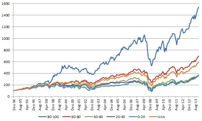
Below is a chart from a sector rotation model I was looking at earlier this week. This model uses the S&P 500 GICS sub-sectors and the ranks were done using a point & figure matrix (ie, running each sub-sector against every other sub-sector) and the portfolio was rebalanced monthly. You can see the top quintile (ranks 80-100) performs quite well. After that, good luck. The “Univ” line is a monthly equal-weighted portfolio of all the GICS sub-sectors. The next quintile (ranks 60-80) barely beats the universe return and probably adds no value after you are done with trading costs, taxes, etc… Keep in mind that these sectors are still well within the top half of the ranks and they still add minimal value. The other three quintiles are underperformers. They are all clustered together well below the universe return.
(Click on image to enlarge)
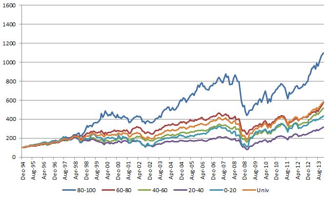
The overall performance numbers aren’t as good, but you get the exact same pattern of results if you use a 12-Month Trailing Return to rank the sub-sectors instead of a point & figure matrix:
(click on image to enlarge)
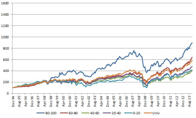
Same deal if you use a 6-Month Trailing Return:
(click on image to enlarge)
This is a constant theme we see. The very best sectors, stocks, markets, and so on drive almost all of the outperformance. If you miss a few of the best ones it is very difficult to outperform. If you are unwilling to constantly cut the losers and buy the winners because of some emotional hangup, it is extremely difficult to outperform. The basket of securities in a momentum strategy that delivers the outperformance is often smaller than you think, so it is crucial to keep the portfolio focused on the top-ranked securities.
