Q1 Manager Insights

April 15, 2016

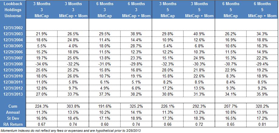
The year got off to a rocky start. After the holidays ended and everyone returned to work, the stock market had a sharp selloff that left it in negative territory for January. The market would eventually bottom out in mid-February and continue to recover through the end of the quarter. Despite the early selloff, the S&P; 500 actually finished up 1.3% for the quarter. Small cap and International stocks didn’t fare as well as both of those categories finished in negative territory for the first three months of the year. Fixed Income and interest rate sensitive securities were some of the best performing areas during the first quarter with broad bond market indexes finishing up about 3%. Commodities also finished the quarter in negative territory, but did stop the relentless slide they had been on since last year.

Looking at the summary numbers for the first quarter might lead you to believe it was a ho-hum first three months of the year, but that was certainly not the case. We saw a tremendous amount of rotation under the surface that had a big impact on all of our strategies. In this piece, we normally like to update you on some big picture items that are affecting the markets and economy, but we felt it was more appropriate to go into greater detail about the specifics of the rotation we saw and how it affected our strategies.

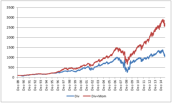
The overarching theme for our investing style was that the laggards finally had their day in the sun. Simply put, the stocks and asset classes that had been leading the market lower since last summer finally stopped going down and actually went up a lot from the lows. This is known as a laggard rally, and is never a time when we perform well. These laggard rallies come along every so often so we are used to them by now. Everyone realizes the leaders can’t lead forever so we view these periods as an opportunity to refresh the portfolios and find new leadership. More importantly, they don’t cause a change in our strategy, but they do cause trading activity to pick up as the old leadership is removed from the portfolios and our process tries to find the emerging leadership. So, if you have noticed a lot more trading in your account recently, that is the reason why.

The changes we have made in the portfolios really changed the characteristics of some of the strategies. One example of this was the weakening U.S. Dollar. The Dollar had been strong for quite some time, and finally exhibited enough weakness that we needed to remove it from the portfolios. We saw a weak dollar asset, Gold, added to many of the strategies. The strong Dollar had caused quite a headwind for assets such as international equities and commodities, which generally do better in a weak dollar environment. If the dollar continues to weaken, we expect to see more of these types of assets come into the strategies. That would actually be a welcome change as it would allow our strategies to do what they do best: find bull markets anywhere around the globe (and in places many people are overlooking).

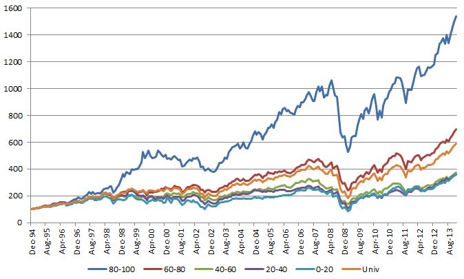
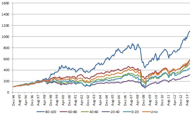
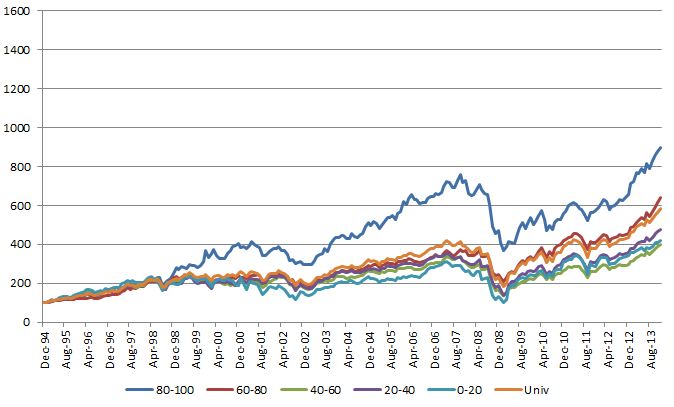
On the individual equity side, it was much the same as the asset class side. The so-called FANGs (Facebook, Amazon, Netflix, and Google) were stellar performers last year, but had a difficult start to the year. What really performed well were the things like energy and basic materials that had such dreadful performance last year. In some of our other writing we touched on these issues during the quarter. One example of this is when we look at the S&P; 500 industry groups. The worst relative strength groups outperformed the best performing group by more than 12% during the first quarter! That was completely opposite from last year when just avoiding the worst groups was the key to outperformance. Whether these groups can continue to perform is anyone’s guess, but often times they have a large rally off the bottom and then settle in as average performers while they work out their issues.

We are 100% sure (which you almost never hear in this business!) that some of the changes we made to the portfolios won’t work out and we will have to continue to search for leadership. That is totally normal, and we expect that to be the case over the coming months. If you have any questions, please don’t hesitate to call us.

Performance numbers provided are the performance of indexes that are not available for direct investment and do not include dividends or transaction costs. Past performance is not indicative of future results and there is no assurance that any forecasts mentioned in this report will be attained. Stocks offer growth potential but are subject to market fluctuations. Dividends are not guaranteed; companies can reduce or eliminate their dividend at any time. There are special risks associated with an investment in real estate, including credit risk, interest rate fluctuations and the impact of varied economic conditions. Technical analysis is just one form of analysis. You may also want to consider quantitative and fundamental analysis before making any investment decisions. The information contained herein has been prepared without regard to any particular investor’s investment objectives, financial situation, and needs. Accordingly, investors should not act on any recommendation (express or implied) or information in this material without obtaining specific advice from their financial advisors and should not rely on information herein as the primary basis for their investment decisions. Information contained herein is based on data obtained from recognized statistical services, issuer reports or communications, or other sources believed to be reliable (“information providers”). However, such information has not been verified by Dorsey, Wright & Associates, LLC (DWA) or the information provider and DWA and the information providers make no representations or warranties or take any responsibility as to the accuracy or completeness of any recommendation or information contained herein. DWA and the information provider accept no liability to the recipient whatsoever whether in contract, in tort, for negligence, or otherwise for any direct, indirect, consequential, or special loss of any kind arising out of the use of this document or its contents or of the recipient relying on any such recommendation or information (except insofar as any statutory liability cannot be excluded). Any statements nonfactual in nature constitute only current opinions, which are subject to change without notice. Neither the information nor any opinion expressed shall constitute an offer to sell or a solicitation or an offer to buy any securities, commodities or exchange traded products. This document does not purport to be complete description of the securities or commodities, markets or developments to which reference is made. Potential for profits is accompanied by possibility of loss. You should consider this strategy’s investment objectives, risks, charges and expenses before investing. The examples and information presented do not take into consideration commissions, tax implications, or other transaction costs. The material has been prepared or is distributed solely for information purposes and is not a solicitation or an offer to buy any security or instrument or to participate in any trading strategy.

Posted by:


What’s All The Fuss About

February 18, 2016

If you own last year’s laggards you are probably wondering what all the fuss over the market is about. It has been tough sledding for the leaders so far this year as they have underperformed the laggards by quite a bit. In one of the models we track, the laggards moved in to positive territory with yesterday’s price action!

We track a model of the S&P; 500 Sub-Industry Groups that is broken into quintiles. All of the holdings in the S&P; 500 are assigned to one of the 130 GICS sub industry groups. We then rank those sub groups using relative strength and assign to one of five quintiles. Each month we repeat the process and equally weight all the sub groups in each quintile. We wrote a white paper about the process a couple of years ago that can be accessed here.

So far this year the worst quintile is positive and outperforming the best quintile by over 6%. That is quite a change from last year when the worst quintile got smashed and the other four quintiles all performed about the same.

Capture

Although this kind of performance happens from time to time, it certainly isn’t the norm. If we look at the top quintile versus the bottom quintile over time you can see the dramatic outperformance of the best over the worst groups.Sub Industry Performance

Any strategy that buys the leaders probably isn’t doing too well this year. This happens from time to time. The long term results certainly favor owning the best groups and avoiding the worst groups.

The performance above is based on total return, inclusive of dividends, but does not include transaction costs. Performance updated through 2/17/16. Past performance is not indicative of future results. Potential for profits is accompanied by possibility of loss. The relative strength strategy is NOT a guarantee. There may be times where all investments and strategies are unfavorable and depreciate in value.

Some performance information presented is the result of back-tested performance. Back-tested performance is hypothetical and is provided for informational purposes to illustrate the effects of the strategy during a specific period. The hypothetical returns have been developed and tested by DWA, but have not been verified by any third party and are unaudited. Back-testing performance differs from actual performance because it is achieved through retroactive application of a model investment methodology designed with the benefit of hindsight. Model performance data (both backtested and live) does not represent the impact of material economic and market factors might have on an investment advisor’s decision making process if the advisor were actually managing client money. Past performance is not indicative of future results. Potential for profits is accompanied by possibility of loss.

Posted by:


Q3 2015 Manager Insights

October 8, 2015

The third quarter was a difficult one for the stock market as U.S. stocks fell by -6.4% (measured by the S&P; 500 Total Return Index). The decline in equities actually began in May, so the August selloff caused the S&P; 500 to fall by more than 10% from its high, which is considered to be a “correction.” It had been nearly three years since the market had last entered correction territory, which made it the fifth-longest correction-free streak on record. Other markets fared even worse than U.S. stocks. International Developed Markets stocks were down over -10%, and Emerging Markets equities fell nearly -18% during the third quarter. Commodities were also terrible as Energy prices tumbled. The one bright spot was Fixed Income, which managed to eke out a small gain of 1.2% (measured by the Barclay’s Aggregate Index).

The main catalyst for the selloff in the third quarter was China. The Shanghai Composite Index was down more than -25% over the last three months. The drop in Chinese equities was so severe that the government intervened during the summer and halted trading in some companies, as well as purchasing massive amounts of stock. The Chinese economy has been slowing, and in August the government devalued the Yuan. The official reason for the devaluation was to give market forces a bigger role in setting the exchange rate. Market participants viewed the devaluation as a way for the Chinese government to prop up the ailing industrial sector. If the government was going to such extreme measures to prop up industry then many people thought they might be in worse shape than we think.

The Federal Reserve was also in focus during the third quarter. Everyone has been waiting for that first rate hike for what seems like forever. It seemed like the consensus was that there would be a rate hike during the September meeting. The Fed, however, decided to leave rates unchanged for the time being. The issues in China were certainly part of this decision to postpone the rate increase. Normally, investors are happy with the Fed when they don’t raise rates, but that wasn’t the case this time. We had another selloff after the lack of a rate increase because people are worried that the global economy might be slowing too much to handle a rate increase. If that is the case, it will be difficult to use monetary policy to kick start the economy because we are already starting from historically low interest rates. We also think the disappointment over a lack of a rate increase is because people are simply tired of waiting for it to happen. The Fed has telegraphed this move so far in advance it is hard to believe anyone will be caught off guard by it. At this point, it seems like the Fed risks being the parent who constantly threatens punishment, but never follows through with the discipline. Eventually, the kids stop listening and chaos ensues. Looking at the big picture, a 0.25% rate increase really isn’t a big deal, and rates will still be historically low. It seems like raising rates in the near future would signal that the Fed feels the economy is strong enough to handle it and would be welcomed by most investors.

The news hasn’t been all bad though! High Relative Strength stocks continued to maintain their spread over the broad market on a year to date basis. Momentum stocks generally performed in-line with the broad market over the summer, which leaves them ahead of the benchmarks for the year. The biggest area of excess performance this year has come from avoiding the laggard stocks. Energy and Basic Materials have performed terribly this year, and avoiding those areas has been crucial. Owning the highest RS stocks has helped, but not as much as avoiding the losers. That situation isn’t common, but we do see it happen from time to time.

Heading in to the fourth quarter we are optimistic that we are near the bottom of the correction. Many of our indicators are in oversold territory where historically, we have seen significant rallies develop. We do anticipate more volatility in the near term, but we believe the environment is setting up nicely for a rally late in the year.

Information is from sources believed to be reliable, but no guarantee is made to its accuracy. This should not be considered a solicitation to buy or sell any security. Past performance should not be considered indicative of future results. Potential for profits is accompanied by possibility of loss.

Posted by:


Relative Strength and Dividend Investing

October 1, 2015

The portfolio manager of a large, active dividend fund was recently interviewed by Morningstar. (“What Active Management Can Bring To Dividend Investing” http://www.morningstar.com/cover/videocenter.aspx?id=716392). The portfolio manager argues that simply looking for stocks with high dividend yields is insufficient because so many of those very high yielding stocks go through dividend cuts. She says that using fundamental analysis and looking at things like cash flow generation can help a dividend investor avoid some (not all) of the stocks that eventually have dividend cuts. That is certainly sound advice, and avoiding stocks that undergo dividend cuts is really the key to a successful dividend strategy.

Another way to help find stocks that might have a dividend cut is to use relative strength. There is often a lot of selling pressure well before a dividend cut as more and more people figure out a company is not going to be able to maintain its current payout. Like good fundamental analysis, using relative strength to screen out weak dividend stocks doesn’t mean you avoid every stock that has a dividend cut. But it does help you avoid enough of them to add value over the long-term.

The following two models draw stocks from the same universe. The universe is the top 1000 domestic stocks by market capitalization (a mid and large cap universe similar to the Russell 1000). Each model is rebalanced at the end of each calendar quarter with 50 stocks. The Dividend model simply selects the top 50 yielding stocks from the universe at the rebalance date and then weights those securities by their yield (i.e., higher yielding stocks get a larger percentage in the model). The Dividend+Momentum model takes the top 50 yielding stocks from the universe that are also on a Buy Signal and in a Column of X’s on their Point and Figure RS chart. The only difference between the two models is the Dividend+Momentum model adds the PnF RS filter to the yield screen.

div

The chart above shows how using an RS filter can enhance a dividend yield strategy. Over the entire test period from 12/31/1989 through 9/30/2015 the added RS screen adds a tremendous amount of value. Some of that outperformance comes from avoiding the stocks that have very high current yields that are unsustainable. Also keep in mind that relative strength is not predictive so it isn’t necessary to try to “get out in front” of every dividend cut. The market tends to recognize these situations well before the cut actually happens.

The article also addresses the financial crisis when a lot of dividend strategies were heavy in financials that eventually cut their payouts. Just about every fully invested strategy had difficulty during that period, but the RS screen on the dividend portfolio did help to cut the drawdown versus a yield only portfolio:

div_ann

The Dividend+Momentum definitely had a rough 2008, but was much better than not using the screen. There are a number of periods during the test where the relative strength screen really improved performance. This year is no exception. We have seen this across the board with some other factors we track. Things like Value+Momentum are doing much better so far this year than just Value alone. The exception is Low Volatility where the relative strength screens aren’t adding as much value, but they are still outperforming their counterparts that don’t use the relative strength overlay.

The downside of using a relative strength screen with dividends comes in big mean reversion years. This should be expected in any type of strategy that adds a momentum overlay. Years like 2001 and 2009 are much better on a raw dividend yield basis. However, if you are willing to deal with those periods of relative underperformance then adding a momentum screen to a yield strategy has the potential to add a tremendous amount of excess return over time.

The portfolio manager in the article is 100% correct about needing to find companies with high yields that are sustainable. There are number of different ways you can accomplish this. Most methods involve using some sort of fundamental data to ascertain if the company’s payout is sustainable or not. Another effective way to do this is to use a relative strength overlay to fund stocks that are outperforming the market with high yields. Using a RS overlay might cut down on the current yield of the portfolio, but testing shows that the gains from capital appreciation can make up for this. Making sure your portfolio of high yielding stocks remains on a buy signal and in a column of X’s versus the broad market is another way to filter out stocks that might have unsustainable yields.

The performance above is based on total returns, inclusive of dividends, but does not include all transaction costs. Past performance is not indicative of future results. Potential for profits is accompanied by possibility of loss. The relative strength strategy is NOT a guarantee. There may be times where all investments and strategies are unfavorable and depreciate in value.

Posted by:


Q2 Manager Insights

July 8, 2015

Stocks managed small gains in the second quarter of 2015. The S&P; 500 was up slightly, leaving it up about 1.2% so far this year. Bond yields also rose during the second quarter as investors braced for upcoming rate hikes from the Federal Reserve. Despite the underperformance of international equities during the second quarter, they remain ahead U.S. equities on a year–to-date basis.

High relative strength equities had much choppier returns during the quarter than the broad market. After their stellar performance during the first three months of the year we expected there might be some giveback this quarter. Right out of the gate, high momentum equities began underperforming the broad market, and reached a relative low during the last part of April and beginning of May. But the second half of the quarter was very good for our strategies. We made up a lot of the performance lag during the last six weeks of the quarter. High momentum stocks generally finished slightly behind their benchmarks for the quarter, but that still leaves them well ahead of the broad market for the year. We were pleased to see the rebound in the types of stocks we buy given the exceptionally strong performance to begin the year.

The circus in Greece dominated the headlines at the end of the second quarter. There is really no question whether Greece will default on their debts to their creditors – they are going to. The big question seems to be whether Greece will accept austerity measures that will allow them to borrow even more money, and if not, whether they will abandon the Euro as their currency and return to the Drachma. To put things in perspective, Greece has spent a good portion of its modern history in some sort of financial crisis so this is really nothing new. What is new is that Greece doesn’t have its own currency any more so that can not be used as a tool to inflate their way out of debt. The political and economic ramifications of any scenario in Greece are, quite frankly, impossible to determine. There is no shortage of opinions being expressed in the media about what should happen, but nobody knows for sure. We do know, however, that this will play out in the price action of various securities and asset classes around the globe. It appears U.S. investors have been largely shrugging off the news so far. If that changes, new trends will emerge and our process is designed to shift the portfolios to those emerging trends.

The economic data received during the second quarter confirmed that the economy is slowing down. Gross Domestic Product decreased 0.2% during the first three months of the year. There were some mixed data points that were released later in the quarter so it is really too early to tell if the slowdown in Q1 was the beginning of something bigger or just a small dip within a larger trend. The economic data did seem to have an effect on Federal Reserve policy. It appeared as if the Fed was looking to raise rates over the summer (as early as June), but the slowing economy seems to have delayed those plans. The Fed minutes indicated they would like to begin rate increases some time this year, but the pace of those increases might not be as rapid as people thought. The Fed has spent an enormous amount of time and energy (and money!) helping the economy limp along, and their statement confirmed they are not about to abandon that policy any time soon.

Overall, we were pleased that our strategies held their own during the quarter after such a strong start to the year. We believe this leaves us well positioned to capitalize on the second half of the year. There are definitely some news headlines that will get a lot of attention and add to the volatility over the summer. However, it is important to remember there have been numerous “problems” that have cropped up during the entire bull run over the last 5 plus years, and nothing has been able to derail this bull market yet.

E-mail [email protected] to request the brochure for our Systematic Relative Strength portfolios.

Posted by:


Q1 Manager Insights

April 9, 2015

The stock market chopped its way to a small gain in the first three months of 2015. February was definitely the best month of the first quarter and made up for negative returns in the other two months. That pattern held true for international markets as well. Bonds also turned in a positive performance for the quarter, but, like equities, experienced some volatility along the way.

One of the biggest stories of the first quarter continued to be the decline in oil prices. As the world continues to have an oversupply of oil, it is a double-edged sword as far as the markets are concerned. Obviously, weak oil prices are not good for the Energy sector which has been one of the worst performing areas lately, and we are seeing a major slowdown in capital spending for new and existing energy projects. On the other hand, lower energy prices are very good for consumers. Many of you have probably noticed much lower gasoline prices. I just drove by a gas station with gas under $3.00 per gallon, which is unheard of in our area of Southern California. Lower energy prices give consumers more spending power, and they seem to be taking advantage of it. Our strategies have recognized this and have allocated more toward areas benefitted by increased consumer spending while underweighting energy companies. It will be interesting to see how this dynamic plays out, but for now it appears the consumer is the biggest beneficiary of the oil price decline.

The big news overseas was the European Central Bank announcement of a bond buying program that could top $1 trillion. That sent the euro into a tailspin, but also helped buoy the European equity markets. In contrast to last year when international markets dramatically underperformed U.S. markets, international markets performed much better during the first three months of the year. Most of the performance came from Developed Markets (reflecting the strength in Europe). Emerging Markets performed better than U.S. markets, but didn’t perform as well as Developed Markets.

Investors are also becoming more concerned with when the Federal Reserve is finally going to raise rates. That possibility was once way off in the distance, but now it appears it may come later this year. Even if the Fed does raise rates later this year, interest rates will still be low by historical standards so the move will be mostly symbolic. It will also be symbolic of a move toward a more “normal” market with much less government intervention. This would be a welcome sign for our strategies. Our decision-making process is primarily focused on market price movements. Less government intervention should mean fewer price shocks and less correlation among stocks and sectors than during the risk on, risk off environment of the last few years.

Our relative strength strategies performed well across the board in the first quarter. We track a Relative Strength Spread, which measures the performance of a basket of strong momentum stocks versus a basket of weak momentum stocks. That measure exploded higher during the first quarter. The spread has been moving sideways for a couple of years, so seeing it begin to move upward again is a very good sign. The strong momentum performance was fairly broad- based, and wasn’t the result of a few lucky stocks. We track a number of strategies that mix momentum with value, dividends, or some other factor. In each case, the strategy with the momentum overlay was superior to the other factor by itself this quarter. The momentum move was very broad based and appeared in numerous segments of the market.

As the bull market continues to mature we are expecting the leadership to narrow. Valuations are up and it is getting more difficult to find bargains. When investors can’t find enough value they often turn to companies that can continue to grow earnings despite a slowing economy. This is usually a very healthy period for momentum strategies. We think we are entering that phase of the cycle and are quite optimistic for what that will mean for our strategies for the rest of 2015.

Information is from sources believed to be reliable, but no guarantee is made to its accuracy. This should not be considered a solicitation to buy or sell any security. The relative strength (momentum) strategy is not a guarantee. There may be times when all investments and strategies are unfavorable and depreciate in value. Past performance should not be considered indicative of future results. Potential for profits is accompanied by possibility of loss.

Posted by:


Point and Figure RS Signal Implementation

September 2, 2014

Over the course of the summer we published three different whitepapers looking at point and figure relative strength signals on a universe of domestic equities. In the first two papers, we demonstrated the power of using PnF RS signals and columns to find high momentum stocks, and then we looked at the optimal box size for calculating relative strength. If you were on vacation and happened to miss one of the first two papers they can be found here and here.

The third paper examines the performance profiles you can reasonably expect by following a process designed around point and figure relative strength. You can download a pdf version of the paper here. Most momentum research focuses on performance based on purchasing large baskets of stocks, which is impractical for non-institutional investors. Once we know that the entire basket of securities outperforms over time the next logical question is, “What happens if I just invest in a subset of the most highly ranked momentum securities?” To answer this question, we created portfolios of randomly drawn securities and ran the process through time. Each portfolio held 50 stocks at all times, which we believe is a realistic number for retail investors. Each month we sold any security in the portfolio that was not one of the top relative strength ranks. For every security that was sold, we purchased a new security at random from the high relative strength group that wasn’t already held in the portfolio. We ran this process 100 times to create 100 different portfolio return streams that were all different. The one thing all 100 portfolios had in common was they were always 100% invested in 50 stocks from the high relative strength group. But the exact 50 stocks could be totally different from portfolio to portfolio.

The graph below taken from the paper shows the range of outcomes from our trials. From year to year you never know if your portfolio is going to outperform, but over the length of the entire test period all 100 trials outperformed the broad market benchmark.

(Click To Enlarge)

We believe this speaks to the robust nature of the momentum factor, and also demonstrates the breadth of the returns available in the highest ranked names. It wasn’t just a small handful of names that drove the returns. As long as you stick to the process of selling the underperforming securities and replacing them with stocks having better momentum ranks there is a high probability of outperformance over time. Over short time horizons the outperformance can appear random, and two people following the same process can wind up with very different returns. But over long time horizons the process works very well.

Past performance is not indicative of future results. Potential for profits is accompanied by possibility of loss. A momentum strategy is NOT a guarantee. There may be times where all investments and strategies are unfavorable and depreciate in value.

Posted by:


PnF Relative Strength Signals White Paper

June 15, 2014

Earlier this week we released a whitepaper on Point and Figure Relative Strength signals. If you haven’t had a chance to read the paper you can access a copy of it here. The current paper covers the basics of how different Point and Figure Relative Strength patterns perform over time. In the coming months, we hope to release a few follow up papers that will look at some other aspects of a momentum strategy.

Relative Strength (also known as momentum) has been an incredibly robust factor for quite some time. Technicians have used momentum as a primary tool for over 100 years, but it has been in the last 20 years or so that research into the factor has really taken off. In 1993, “Returns to Buying Winners and Selling Losers” was published and the exploration of the momentum factor really began by the academics. There are hundreds of papers in the public domain that have found the momentum factor works across asset classes and within asset classes. As long as there is some volatility and some dispersion in the universe you can generally make a relative strength strategy work over time.

Most of the current research centers around time-based calculations of momentum. For example, you sort securities by their trailing 12 month price return and then put the top decile into the portfolio. Point and Figure, on the other hand, ignores time and really looks at volatility. The more volatile something is versus its benchmark the more columns you will have moving across the page. What all of these methods have in common is ranking on an intermediate term time horizon. If you use too short of a time window or too small of a point and figure box size you wind up trading on the noise rather than the trend. If you use too long of a window or too large of a box size you get into an area where mean reversion rather than trend continuation is the rule.

Every momentum study I have seen comes to the same conclusions. Buying the stuff with the best momentum works very well over time. You can short the stocks with weak momentum, but that presents two big problems. First, not everyone can sell positions short. And second, the laggard rallies off of bear market bottoms are a killer on the short side. You can see that in the performance table in the whitepaper in 2003 and 2009. The laggards tend to do very well off the bottom and the leaders tend to underperform. But otherwise, momentum is a very robust and consistent factor.

So why does momentum work, and why does it get such a bad rap in the press? I think the latter is easy to explain. Everyone understands the concept of getting something at a discount. If I want a roll of paper towels why would I buy one for $1.00 when I could get the same roll on sale for $0.50? Everyone can identify with that, and deals with those decisions on a daily basis. But not all stocks are the same! Buying IBM is not similar to buying AAPL. Each stock has its own identity. It is similar to betting on the NBA Finals right now. After the Spurs embarrassed the Heat the last two games who would you bet on to win the finals? Probably the Spurs because they have now demonstrated the ability to outperform the Heat. A good momentum stock does the same thing. It demonstrates the ability to outperform. Why not buy something that is doing well rather than betting on the Heat and hoping Mario Chalmers remembers how to shoot and Ray Lewis sends Dwayne Wade some deer antler spray for his creaky knee? Vegas figured this out a long time ago! If they didn’t set odds on the series everyone would bet on the Spurs right now because they have a high probability of winning. They aren’t a sure thing to win, but the odds are definitely in their favor. They have to entice people to bet on the Heat to try to even the money on both sides of the bet. The Heat can certainly still win, but it is going to take a major change in what we have seen so far in the series. When you are buying stocks there are no odds! The stocks on a buy signal and in a column of x’s have a high probability of outperforming over time. Why not just buy those rather than bottom fishing? You don’t get 2:1 odds if you buy the beaten down stock. You don’t get worse odds if you buy the winner. It’s all even odds. It is a great gift just sitting there waiting to be opened. Merry Christmas.

The conclusion we hope everyone eventually reaches is simple: disciplined implementation of the strategy is the ultimate key to success. Step back and think about what is the the BX group, for example. There are stocks with good fundamentals, bad fundamentals, some on pullbacks, and some on spikes. I’m sure that BX group contained tons of stocks that were bought right at the top and then sold very shortly after they were purchased. There were stocks that pulled back, fell out of the top group, and then turned around and shot to new highs. It is important to realize that all those potential problems didn’t matter in the long run. Somehow that best group kept right on chugging. The real issue is the opportunity cost of not constantly packing the portfolio in to the best momentum names. Hoping a stock turns around because you just bought it and your clients might be upset, not buying a strong relative strength name because it is on a spike, and not re-buying a strong stock after you had to sell it are not included in the BX group equity curve. The opportunity cost of leaving things that aren’t strong in the portfolio is what kills performance over time. Weak stocks are for value buyers. If you are going to buy high relative strength stocks you have to keep strong names in the portfolio.

Posted by:


What Are We Really Trying To Accomplish Here?

February 28, 2014

March 1st is the seventh anniversary of our Technical Leaders Index launching on the NYSE. The last seven years have seen some crazy markets! Through it all we have been really happy at how the index has adapted to the different market environments we have had.

We often get caught up in the day-to-day gyrations of the market and we forget to take a step back and look at what a strategy is designed to accomplish. The Technical Leaders Index is designed to keep the index invested in high momentum stocks. It is a process that is supposed to cut the underperforming stocks out and ride the winners as long as they continue to outperform. That is how most successful momentum and trend-following strategies work.

With that in mind, I thought it would be interesting to show everyone what would be coming out of the index and what would be going in if we rebalanced it today. Remember, the process is designed to cut out the stocks that aren’t performing well and to buy stocks that are performing better than what we are selling. Here are the stocks we would be selling (I have taken the names off the charts for compliance reasons, but the actual names of the stocks don’t really matter anyways):

(Click To Enlarge)

And here is what we would be buying:

(Click To Enlarge)

Pretty remarkable difference, right? The performance over the last few months is quite different for the two groups of stocks. Over time that is what the Technical Leaders process does. It constantly replaces weak stocks with stronger ones.

Posted by:


It’s All At The Upper End

February 3, 2014

Almost all of the performance from a relative strength or momentum model comes from the upper end of the ranks. We run different models all the time to test different theories or to see how existing decision rules work on different groups of securities. Sometimes we are surprised by the results, sometimes we aren’t. But the more we run these tests, the more some clear patterns emerge.

One of these patterns we see constantly is all of the outperformance in a strategy coming from the very top of the ranks. People are often surprised at how quickly any performance advantage disappears as you move down the ranking scale. That is one of the things that makes implementing a relative strength strategy so difficult. You have to be absolutely relentless in pushing the portfolio toward the strength because there is often zero outperformance in aggregate from the stuff that isn’t at the top of the ranks. If you are the type of person that would rather “wait for a bounce” or “wait until I’m back to breakeven,” then you might as well just equal-weight the universe and call it a day.

Below is a chart from a sector rotation model I was looking at earlier this week. This model uses the S&P; 500 GICS sub-sectors and the ranks were done using a point & figure matrix (ie, running each sub-sector against every other sub-sector) and the portfolio was rebalanced monthly. You can see the top quintile (ranks 80-100) performs quite well. After that, good luck. The “Univ” line is a monthly equal-weighted portfolio of all the GICS sub-sectors. The next quintile (ranks 60-80) barely beats the universe return and probably adds no value after you are done with trading costs, taxes, etc… Keep in mind that these sectors are still well within the top half of the ranks and they still add minimal value. The other three quintiles are underperformers. They are all clustered together well below the universe return.

(Click on image to enlarge)

The overall performance numbers aren’t as good, but you get the exact same pattern of results if you use a 12-Month Trailing Return to rank the sub-sectors instead of a point & figure matrix:

(click on image to enlarge)

Same deal if you use a 6-Month Trailing Return:

(click on image to enlarge)

This is a constant theme we see. The very best sectors, stocks, markets, and so on drive almost all of the outperformance. If you miss a few of the best ones it is very difficult to outperform. If you are unwilling to constantly cut the losers and buy the winners because of some emotional hangup, it is extremely difficult to outperform. The basket of securities in a momentum strategy that delivers the outperformance is often smaller than you think, so it is crucial to keep the portfolio focused on the top-ranked securities.

Posted by:


Improving Sector Rotation With Momentum Indexes

January 21, 2014

Sector has been a popular investment strategy for many years. The proliferation of sector based exchange traded funds has made it quick and easy to implement sector bets, but has also added a level of complexity to the process. There are now many different flavors of ETF’s for each macro sector ranging from simple capitalization weightings to semi-active quantitative models to construct the sector index. The vast array of choices in each sector allows investors to potentially add additional performance over time versus a simple capitalization based model.

Dorsey, Wright has a suite of sector indexes based on our Technical Leaders Momentum factor. These indexes are designed to give exposure to the securities with the best momentum characteristics in each of the 9 broad macro sectors (Telecomm is split between Technology and Utilities depending on the industry group). Long time readers of our blog should be aware of all of the research that demonstrates how effective the momentum factor has been over time providing returns above a broad market benchmark. Using indexes constructed with the momentum factor have the potential to add incremental returns above a simple capitalization weighted sector rotation strategy just like they do on the individual stock side.

The sector SPDRs are the most popular sector suite of exchange traded products. When investors make sector bets using this suite of products they are making a distinct sector bet and also making a bet on large capitalization stocks since the sector SPDRs are capitalization weighted. There are times when large cap stocks outperform, but there are also times when the strength might be in small cap, value, momentum, or some other factor. By not considering other weighting methodologies investors are potentially leaving money on the table.

We constructed several very simple sector rotation models to determine how returns might be enhanced by implementing a sector rotation strategy with indexes based on momentum. The base models were created with either 3 or 5 holdings from the sector SPDR universe. Each month a trailing 3 or 6 month return was calculated (based on the model specification) and the top n holdings were included in equal weights in the portfolio. Each month the portfolio was rebalanced with the top 3 or 5 sector SPDRs based on the trailing return. This is an extremely simple way to implement a momentum based sector rotation strategy, but one that proves to be surprisingly effective.

The second group of portfolios expanded the universe of securities we considered to implement the strategy. All of the momentum rankings were still based on the trailing returns of the sector SPDRs, but we made one small change in what was purchased. If, for example, the model selected Healthcare as one of the holdings we would buy either the sector SPDR or our Healthcare Momentum Index. The way we determined which version of the sector to buy was simple: whichever of the two had the best trailing return (the window was the same as the ranking window) was included in the portfolio for the month. In a market where momentum stocks were performing poorly the model would gravitate to the cap weighted SPDRs, but when momentum was performing well the model would tend to buy momentum based sectors. Making that one small change allowed us to determine how important implementing the sector bet actually was.

(Click Image To Enlarge)

The table above shows the results of the tests. Trials were run using either 3 or 6 month look back windows to rank the sectors and also with either 3 or 5 holdings. In each case, allowing the model to buy a sector composed of high momentum securities was materially better than its cap weighted counterpart. Standard deviation also increased, but the returns justified the increased volatility as the risk adjusted return increased in each case.

This is one simple case illustrating how implementing your sector bests with different sector construction philosophies can be additive to investment returns. The momentum factor is one of the premier investment anomalies out there, and using a basket of high momentum stocks in a specific sector has shown to increase returns in the testing we have done.

The performance numbers are not inclusive of any commissions or trading costs . The Momentum Indexes are hypothetical prior to 3/28/2013 and do not reflect any fees or expenses. Past performance is no guarantee of future returns. Potential for profit is accompanied by potential for loss. The models described above are for illustrative purposes only and should not be taken as a recommendation to buy or sell any security or strategy mentioned above. Click here for additional disclosures.

Posted by:


DWA Technical Leaders Index Trade Profiles

January 6, 2014

The Dorsey, Wright Technical Leaders Index is composed of a basket of 100 mid and large cap securities that have strong relative strength (momentum) characteristics. Each quarter we reconstitute the index by selling stocks that have underperformed and by adding new securities that score better in our ranking system. We began calculating the index in real-time at the end of 2006. Over the last seven years there have been quite a few deletions and additions as the index has adapted to some very dynamic market conditions.

Any relative strength or momentum-based investment strategy is a trend following strategy. Trend following has worked for many years in financial markets (although not every year). These systems are characterized by a several common attributes: 1) Losing trades are cut quickly and winners are allowed to run, 2) there are generally a lot of small losing trades, and 3) all of the money is made by the large outliers on the upside. When we look at the underlying trades inside of the index over the years we find exactly that pattern of results. There is a lot going on behind the scenes at each rebalance that is designed to eliminate losing positions quickly and maintain large allocations to the true winners that drive the returns.

We pulled constituent level data for the DWATL Index going back to the 12/31/2006 rebalance. For each security we calculated the return relative to the S&P; 500 and how many consecutive quarters it was held in the index. (Note: stocks can be added, removed, and re-added to the index so any individual stock might have several entries in our data.) The table below shows summary statistics for all the trades inside of the index over the last seven years:

The data shows our underlying strategy is doing exactly what a trend following system is designed to accomplish. Stocks that aren’t held very long (1 to 2 quarters), on average, are underperforming trades. But when we are able to find a security that can be held for several quarters, those trades are outperformers on average. The whole goal of a relative strength process is to ruthlessly cut out losing positions and to replace them with positions that have better ranks. Any investor makes tons of mistakes, but the system we use to reconstitute the DWATL Index is very good at identifying our mistakes and taking care of them. At the same time, the process is also good at identifying winning positions and allowing them to remain in the index.

Here is the same data from the table shown graphically:

You can easily see the upward tilt to the data showing how relative performance on a trade-level basis improves with the time held in the index. For the last seven years, each additional consecutive quarter we have been able to keep a security in the Index has led to an average relative performance improvement of about 920 basis points. That should give you a pretty good idea about what drives the returns: the big multi-year winners.

We often speak to the overall performance of the Index, but we sometimes forget what is going on behind the scenes to generate that return. The process that is used to constitute the index has all of the characteristics of a trend following system. Underperforming positions are quickly removed and the big winning trades are allowed to remain in the index as long as they continue to outperform. It’s a lot like fishing: you just keep throwing the small ones back until you catch a large one. Sometimes it takes a couple of tries to get a keeper, but if you got a big fish on the first try all the time it would be called “catching” not “fishing.” I believe part of what has made this index so successful over the years is there is zero human bias that enters the reconstitution process. When a security needs to go, it goes. If it starts to perform well again, it comes back. It has no good or bad memories. There are just numbers.

The performance numbers are pure price return, not inclusive of fees, dividends, or other expenses. Past performance is no guarantee of future returns. Potential for profit is accompanied by potential for loss. A list of all holdings for the trailing 12 months is available upon request.

Posted by:


Momentum in Rising Rate Environments

November 19, 2013

The latest PowerShares Connection report is out. There is a nice writeup about the PowerShares DWA Small Cap Momentum ETF and what happens to high momentum securities during rising rate environments. You can view the report here.

Posted by:


The Coach Who Never Punts

November 14, 2013

Have you ever been to a football game and never seen a punt? Yeah, me neither. You would probably think that coach was crazy. I would have thought so too, but the numbers say otherwise.

It seems like most of the comparisons between advanced statistical metrics in sports and investing have revolved around baseball. This is the first example I have seen of a football coach really thinking outside of the box to give his team a statistical advantage every game. Sure, football coaches have used statistics to game plan and find tendencies, but what this coach is doing goes way beyond that.

How does this relate to investing? This coach has found an edge and relentless exploits the edge no matter what the cost. He knows that statistically he is better off never giving the ball to the other team. He never punts the ball to them. When he kicks off, it is always an onside kick. If the other team wants the ball they have to earn it. He readily admits they only have a 50% fourth down conversion rate so it isn’t like this is some sort of offensive juggernaut that can never be stopped. This coach is wrong a lot. He no doubt looks like a fool quite often. But he has done the math and knows his methods give him a clear statistical advantage to win games over time. It might not work on any given play, series, quarter, or half. Winning investment strategies don’t work every day, week, quarter, or even every year. But over time they do, and the only thing preventing you from realizing those gains buckling under the pressure and failing to execute the strategy. The edges are small, but they add up over time.

Posted by:


Q1 RS Factor Review

April 4, 2012

Earlier this quarter we updated our white paper on using relative strength to invest in stocks. If you haven’t read the paper you can find it here. In this post I will be recapping the performance of various relative strength (momentum) factors using the same methodology used in the paper.

The S&P; 500 had a great first quarter ending up about 12% (price only). Relative strength strategies did OK. The best performing factors during Q1 were actually the factors that performed the worst over a long time horizon (see the white paper for details). Several of the best long-term winning factors had a tough time in Q1.

(Click To Enlarge)

The graph above shows the returns for all 100 trials for each of the time-based RS factors we track. A trailing 18 month and 36 month window to compute RS worked very well. These worked well because those models didn’t rotate into low volatility names at the end of last year, and then rotate back out of them during Q1. In effect, the long time horizon allowed them to capitalize on the laggard bounce that was so prevalent during the first part of the quarter. The very short-term windows also did well. They were able to quickly rotate into the high beta names that were the leadership. But, more importantly, that trend was sustainable so the short-term mean reversion effect didn’t hurt those factors in Q1. The 6 month and 9 month factors performed very poorly. The main reason is these intermediate term factors rotated into low beta and high dividend stocks at the end of last year. Those were the laggards during Q1, and it took some time for those models to rotate into the new leadership. Keep in mind, however, that these two factors are two of the best performing over long time horizons.

The laggard bounce was most pronounced in January and February. By March things had settled back down and the intermediate term factors were performing well. The better performance was the result of the market rewarding intermediate term momentum, and the models having a chance to shed the laggards and re-position themselves into the current leadership.

January Performance

(Click To Enlarge)

February Performance

(Click To Enlarge)

March Performance

(Click To Enlarge)

The turnaround for intermediate term momentum strategies wasn’t enough to totally reverse the underperformance during the first two months of the year. But it is very good to see the intermediate term factors getting back into gear! We noticed the same thing in our managed portfolios too. Things definitely picked up in the last part of the quarter for high RS stocks.

All of the factors in this post are simple, time based relative strength (momentum) factors. These are the factors that match what we published in the white paper. We do track other RS factors though. It is interesting to note, that the underperformance of the intermediate term factors was most pronounced in the simple, time based factors. Intermediate term factors we track that use some sort of smoothing or multiple time periods performed much better than the 6 and 9 month factors. The only explanation I have for that is that the 6 month ranking window was the perfect time to maximize your whipsaw into low volatility and back out again. The smoothed and compound factors did a much better job this quarter at avoiding that whipsaw.

Posted by:


Relative Strength And Portfolio Management

February 3, 2012

Years ago we developed a testing protocol to help us determine how robust a strategy really is. We wanted to determine how much of the strategy’s tested returns were a result of luck and how much of the return was due to the underlying factor performance. We have run all of our strategies through that process over the years, and we published some of those results back in 2010. The data was just updated through the end of last year and the updated can be found here.

When testing a model it is always difficult to determine if the results you are achieving are repeatable or not. If you are testing a high relative strength model, for example, are the results coming from one or two stocks that make the whole test look fantastic? If that is the case I would have my doubts about how that strategy would perform in real-time. But if the results are truly from an underlying factor performance (regardless of the individual securities in the portfolio) then you have something you can work with.

The way we determine if a model is lucky or not is to run multiple simulations based on a random draw of securities. In a relative strength model we might break our universe into ten different buckets. Out of the highest bucket we might draw 50 stocks at random. We hold those stocks until they are no longer classified as high relative strength securities. Once they fall below a specific rank we sell the security and buy another one at random. If we run 100 trials we get 100 different portfolios over time. What we are trying to determine is if the individual securities in the test really matter, or is just the concept of buying high relative strength securities over time what causes the outperformance.

As it turns out, what stocks go in to the portfolio aren’t as important as exploiting the factor. A disciplined approach is that consistently drives the portfolio to strength is what drives the returns over time.

(Click To Enlarge)

The table shows the results from one of the factors tested in the paper. You can see the range of outcomes each year as well as how each model did over the 16 year test period. Sometimes the models outperform, sometimes the underperform, and some years you have mixed results. But over 16 years, all of the models outperformed! All we did was pick stocks at random out of a high relative strength basket. There is nothing complicated about it. The main thing is that the process is systematic and extremely disciplined.

More details about the testing process and results can be found in the paper (click here).

Posted by:


It’s Not You, It’s Me…..

January 12, 2012

It’s not you, it’s me…. I think everyone has used that line at some point, but nobody does it better than George Costanza!

I have been putting data together to update our white papers. It’s no secret that running a Global Tactical Asset Allocation (TAA) strategy was difficult last year. But when I looked at the data it was very clear that the problem wasn’t the strategies. The real problem was how the market behaved during 2011. It’s not you, it’s me. It’s not your trend following strategy, it’s what you’re trying to follow. The market was essentially a psycho, stage 5 clinger last year!

The data I will reference in this post is an extension of the data we published last year in two white papers. If you haven’t read them you can find them here. Our research process for this dataset takes a diverse universe of ETF’s and creates 100 different equity curves for a number of different momentum factors. The universe has a number of different asset classes represented including Equities (Domestic & Foreign), Bonds, Commodities, Currencies, and Real Estate. The results provide a good idea about how a momentum-based, global TAA strategy would have performed. By creating 100 different equity curves we are taking luck out of the equation and showing a realistic range of outcomes from buying high relative strength securities out of our universe.

Most of the momentum factors we follow underperformed last year. The factors we are showing refer to the lookback period to do our rankings. The 1MORET factor (1-month return) means we used 1 month of data to calculate our momentum ranks (all securities are held until they fall out of the top of the ranks, which might be as short as one week or as long as a couple of years). The 12MORET factor uses the prior 12 months of price data to rank the securities. The 3-month factor actually performed the best in 2011, but only 40 out of the 100 trials outperformed the S&P; 500, so you needed some luck to outperform. The 6-month factor was the next best, but only 1 trial outperformed so you needed to be really lucky. All the other trials were very poor. There was so much short-term volatility back and forth last year that the very short 1-month formulation period was deadly. It paid not to be too quick on the trigger last year!

Full Year 2011

(Click To Enlarge)

But looking at 2011 in aggregate doesn’t really tell the whole story. The beginning of the year was good for these strategies. That person you were dating held it together pretty well for the first couple of dates! Through the end of April, most of the strategies were outperforming the S&P; 500 on average. The 6-month factor was doing great as all 100 trials were outperforming. Ironically, the factor doing the worst was the 3-month factor.

2011 Through April

(Click To Enlarge)

The problems for trend following strategies began in May. There were a series of sharp trend reversals in a number of different assets: Bonds, Stocks, Precious Metals, Currencies (Yen & Swiss Franc). No matter what factor you were using from May to the end of the year it was difficult. It was tough to get traction anywhere. The only factor that did even so-so was the 3-month factor, and that was the worst factor through April. That’s just one of many examples of how crazy the 2011 market was!

2nd Half 2011

(Click To Enlarge)

So where do we go from here? Well, the, “It’s not you, it’s me…” line always leads to a breakup. That’s probably not a bad idea when dealing with something that doesn’t change. Does that psycho, stage 5 clinger ever get any better? Nope. It only gets worse.

But markets change, and TAA based on momentum is very adaptive. We will not be in a choppy, range bound environment forever. Trends will emerge. (If they don’t, it will be the first time in history.)

Investors were euphoric about momentum-based TAA strategies in the first part of the year. Looking at the data you can see why – they were working exceptionally well. After the last few months, people are certainly not as excited. In reality, now is the time to be really excited about relative strength strategies, not back in April. Now is the time you want to be adding money.

Posted by:


Relative Strength and Market Volatility

September 30, 2011

Markets have been extremely volatile over the last couple of months. Volatile markets are very difficult to navigate. It is very easy to make mistakes, and when a mistake is made it is magnified by the volatility. From a relative strength standpoint, there are things you can do to help ease the pain of all of these large, unpredictable market moves. But judging by all the client calls we have taken over the years–almost always when volatility was high–the steps needed to make a relative strength model perform well are most definitely not what most investors would think!

Before we look at relative strength specifically, let’s take a step back and look at different investment strategies on a very broad basis. There are really two types of strategies: trend continuation and mean reversion. A trend continuation strategy buys a security and assumes it will keep moving in the same direction. A mean reversion (or value) strategy buys a security and assumes it will reverse course and come closer to a more “normal” state. Both strategies work over time if implemented correctly, but volatility affects them in different ways. Mean reversion strategies tend to thrive in high volatility markets, as those types of markets create larger mispricings for value investors to exploit.

When we construct systematic relative strength models, we have always preferred to use longer-term rather than shorter-term signals. This decision was made entirely on the basis of data—by testing many models over a lot of different types of markets. Judging by all the questions we get during periods of high volatility, I would guess that using a longer-term signal when the market is volatile strikes most investors as counter-intuitive. In my years at Dorsey Wright, I can’t remember talking to a single client or advisor that told me when markets get really volatile they look to slow things down!

During volatile markets, generally we hear the opposite view–everyone wants to speed up their process. Speeding up the process can take many forms. It might mean using a smaller box size on a point and figure chart, or using a 3-month look back instead of a 12-month look back when formulating your rankings. It might be as simple as rebalancing the portfolio more often, or tightening your stops. Whatever the case, most investors are of the opinion that being more proactive in these types of markets makes performance better.

Their gut response, however, is contradicted by the data. As I mentioned before, our testing has shown that slowing down the process actually works better in volatile markets. And we aren’t the only ones who have found that to be the case! GMO published a whitepaper in March 2010 that discussed momentum investing (the paper can be found here). Figure 17 on page 11 specifically addresses what happens to relative strength models during different states of market volatility.

(Click Image To Enlarge. Source: GMO Whitepaper, Sept. 2010)

The chart clearly shows how shortening your look back period decreases performance in volatile markets. The 6-12 month time horizon has historically been the optimal time frame for formulating a momentum model. But when the market gets very volatile, the best returns come from moving all the way out to 12 months, not shortening your window to make your model more sensitive.

Psychologically, it is extremely difficult to lengthen your time horizon in volatile markets. Every instinct you have will tell you to respond more quickly in order to get out of what isn’t working and into something better. But the data says you shouldn’t shorten your window, and conceptually this makes sense. Volatile markets tend to be better for mean reversion strategies. But for a relative strength strategy, volatile markets also create many whipsaws. When thinking about how volatility interacts with relative strength, it makes sense to lengthen your time horizon. Hopping on every short term trend is problematic if the trends are constantly reversing! All the volatility creates noise, and the only way to cancel out the noise is to use more (not less) data. You can’t react to all the short-term swings because the mean reversion is so violent in volatile markets. It doesn’t make any sense to get on trends more rapidly when you are going through a period that is not optimal for a trend following strategy.

We use a data-driven process to construct models. We have found that using a relatively longer time horizon, while uncomfortable, ultimately leads to better performance over time. Outside studies show the same thing. If the data showed that reacting more quickly to short-term swings in volatile markets was superior we would advocate doing exactly that!

As is often the case in the investing world, this seems to be another situation where doing the most uncomfortable thing actually leads to better performance over time. Good investing is an uphill run against human nature. Of course, it stands to reason that that’s the way things usually are. If it were comfortable, everyone would do it and investors would find their excess return quickly arbitraged away.

Posted by:


The Lucky Few

August 9, 2011

I just read Andy’s post about the High RS Diffusion Index. My first reaction was, “Wow, that’s a really low number!” My second reaction was, “Good God, what’s still above its 50 Day Moving Average from that universe?”

The list of securities is short:

  • Green Mountain Coffee Roasters (GMCR)
  • Southern Union Co (SUG)
  • Timberland Co (TBL)
Southern Union and Timberland have held up well because they are buyouts. That leaves Green Mountain as the only true company from the universe above the 50 Day MA on its own merits. I don’t think that really means much for GMCR. I think it just shows how incredibly washed out this market is right now. The “real” number rounds down to zero!
Disclosure: Dorsey Wright Money Management has positions in GMCR in a number of different account styles.

Posted by:


The Love Affair Continues

July 13, 2011

I wish I could quit you, Quantitative Easing.

You complete me, Quantitative Easing.

You had me at hello……

Posted by:


Small Cap & NASDAQ Technical Leaders Update

July 1, 2011

At the end of March we began tracking two new indexes based on our Technical Leaders methodology. The two new indexes follow Small Capitalization stocks and stocks traded on the NASDAQ exchange. We use our Technical Leaders methodology for three other indexes: Domestic Equities, Developed Markets Foreign Equities, and Emerging Markets Equities. These three indexes are licensed by PowerShares and you can purchase ETF’s based on the (tickers: PDP, PIZ, and PIE respectively).

These two new indexes aren’t licensed by an ETF provider so you can’t directly invest in them. We like the concept for both indexes because history shows that relative strength works very well with small cap stocks. The NASDAQ Technical Leaders is also very intriguing because there are many companies in that universe with very dynamic business models, and those are the type of companies that relative strength is very good at identifying and capitalizing on.

The constituents for both indexes are below:

Small Cap:

NASDAQ:

The performance for the second quarter was so-so. Both indexes had a huge first quarter (as did most RS strategies) so they remain well ahead of their benchmarks for the year.

If you have any questions about the indexes please post them in the comments section.

Posted by:


The Widowmaker Rides Again

June 3, 2011

Netflix has been one of the real battleground stocks over the last year. Momentum buyers love the stock. The shorts think it is way overvalued. Whitney Tilson even had to throw in the towel on his well-publicized short of NFLX. NFLX has confounded so many people it was referred to recently as a Widowmaker!

Why is NFLX such a widowmaker for the shorts? Probably because it has performed very well when the market is down! If you are shorting any stock you should be relieved to look over at the quote screen and see a sea of red. But over the past year, that’s not exactly what you get with NFLX. Below is a chart of NFLX’s performance over the last 12 months when the S&P; 500 is down for the day. NFLX is up substantially over the past year when the S&P; is down. That has to be a killer if you’re short. Hence, The Widowmaker.

Now look at the performance of NFLX over the past year when the S&P; has an up day. It hasn’t exactly shot the lights out for the longs on up days!

I suppose when you are looking for a good solid defensive name that will hold up in a down market you should put NFLX at the top of the list! It does look like that relationship is changing over the last couple of months. But no matter how you cut it, NFLX continues to confound everyone! Same old story with this stock today. The market is selling off hard on the anemic jobs number, but NFLX was up in the morning.

Disclosure: Dorsey Wright Money Management has positions in NFLX. Past performance is no guarantee of future results. A list of all holdings for this portfolio over the past 12 months is available upon request.

Posted by:


New Technical Leaders Indexes

March 31, 2011

The Technical Leaders Indexes are indexes created by Dorsey Wright Money Management and are constituted with high relative strength securities from a given universe. We currently run three indexes: Domestic mid to large cap equity, Foreign Developed Markets Equity, and Emerging Markets Equity. These three indexes are licensed by PowerShares and can be purchased in an ETF format (Tickers: PDP, PIZ, PIE).

We are expanding the number of indexes we create. We are adding two more indexes to the Technical Leaders family. (Please note that these indexes are not licensed by any ETF sponsor so there is no vehicle to purchase them directly.)

One of the new Technical Leaders indexes will cover the Domestic Small Cap space. All of our other indexes are constituted with 100 securities, but the Small Cap Technical Leaders Index will have 200. This will still allow us to select the top decile from a small cap index like the Russell 2000, while keeping liquidity constraints in mind. To see a list of the current constituents you can click here:

(Click To Enlarge)

The second index we are beginning to publish tracks 100 high RS securities traded on the NASDAQ exchange. As you can imagine, the selection process will pull out a lot of emerging growth companies so we think this index will be very interesting to follow. For a list of the current constituents you can click here:

(Click To Enlarge)

Over the next couple of days I’ll post some more information about what is in the indexes. If you have any questions feel free to post them in the comments section and I’ll try to respond to them.

Posted by:


Buying The Dips

March 22, 2011

Retail investors and hedge funds have taken opposing views on the most recent stock market correction. Clusterstock has a short post on what Global Macro hedge funds did during the dip (click here for the original post). The graph below (taken from the original Clusterstock post) was produced by BofA ML and shows net exposure to the S&P; 500 Index for Global Macro Hedge Funds.

(Click To Enlarge)

You can see spike up in long exposure to equities over the last month. Our own sentiment survey (the full results of the most recent survey can be seen here), and the most recent AAII survey both show retail investors have become more bearish over the last month. These two surveys don’t measure actual exposure like the BofA survey does, but I think it is safe to assume that retail investors are not increasing equity exposure while they are becoming more bearish on stocks.

(Click To Enlarge)

In our survey we ask financial professionals whether their clients are becoming more fearful. As equities rallied, their clients became less worried about a downturn. But as the S&P; 500 corrected over the last month their clients became more worried about getting caught in a downdraft.

(Click To Enlarge)

The AAII poll asks individual investors directly whether they are bullish or bearish. This chart was taken from Bespoke and clearly shows individual investors became more bearish very quickly during the decline.

Only time will tell which group is correct. However, I think it is a positive sign for equity markets that there are large pools of money ready to move into stocks during very small corrections. It is also a positive sign that not everyone is buying the dips! When everyone is excited to buy dips you are often closer to a top than a bottom.

Posted by:


Updated White Paper Data

April 8, 2010

Back in January, we published a white paper that discussed using relative strength and portfolio management. If you haven’t read the paper (or would like to read it again) it can be found here. (Note: Please see the original paper for all of the necessary disclosures.) The original paper also outlines the unique process we use to test various relative strength factors. All of the data in that paper was updated through 2009. Since we have just finished updating all of our data through the end of Q1, we can update the data in the paper.

The first quarter was very good for relative strength. The data in the original paper showed that the best returns come from an intermediate term time horizon (about 3-12 months). Last year that was very different. We found very good returns for 2009 at very short-term time horizons. A 1-Month RS factor was actually one of the better performers in 2009. Over longer periods, a 1-Month RS factor has been a very poor performer so we definitely saw some anomalies during the huge laggard rally last year. The first quarter of 2010 was much more normal for relative strength strategies. The table below shows the performance for the first three months of 2010 for all of the models we tested in the original paper.

(Click To Enlarge)

The best returns came in the 6-12 month time horizon, which is what we would expect. (For those of you who are confused about the “Factor,” it is not a holding period. It is the lookback period for calculating relative strength. So the 6-Mo Price Return, for example simply takes the 6-month return for all stocks in the universe and ranks them from best to worst.)

The next table shows the cumulative annualized returns for all of the models updated through 3/31/10.

(Click To Enlarge)

The various models keep chugging along! The intermediate term factors work very well. Even when we are throwing darts at a basket of high relative strength stocks we find 100 out of 100 trials outperforming the benchmark over time. As the original paper showed, relative strength models aren’t going to outperform each quarter or each year, but over time they do exceptionally well.

Posted by: