High RS Diffusion Index

October 30, 2013

The chart below measures the percentage of high relative strength stocks that are trading above their 50-day moving average (universe of mid and large cap stocks.) As of 10/29/13.

diffusion 10.30.13 High RS Diffusion Index

The 10-day moving average of this indicator is 89% and the one-day reading is also 89%.

Posted by:


Relative Strength Spread

October 29, 2013

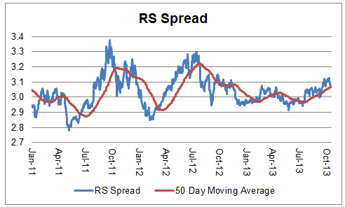
The chart below is the spread between the relative strength leaders and relative strength laggards (universe of mid and large cap stocks). When the chart is rising, relative strength leaders are performing better than relative strength laggards. As of 10/28/2013:

spread 10.29.13 Relative Strength Spread

Posted by:


PDP Passes $1 Billion

October 22, 2013

A huge thank you to all who have climbed aboard!

PDP 10.22.13 PDP Passes $1 Billion

See www.powershares.com for more information.

Posted by:


Relative Strength Spread

October 22, 2013

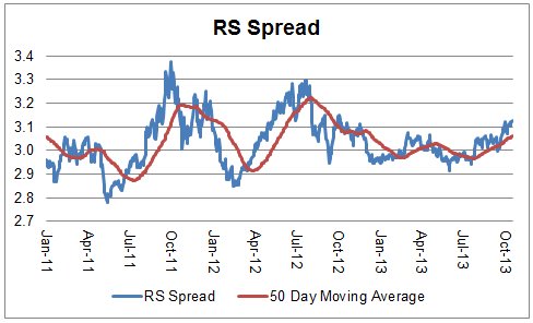
The chart below is the spread between the relative strength leaders and relative strength laggards (universe of mid and large cap stocks). When the chart is rising, relative strength leaders are performing better than relative strength laggards. As of 10/21/2013:

spread 10.22.13 Relative Strength Spread

The RS Spread has broken out to its highest levels of the year and is trending strongly above its 50 day moving average.

Posted by:


Weekly RS Recap

October 21, 2013

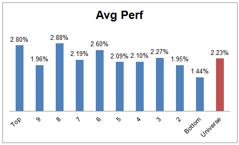
The table below shows the performance of a universe of mid and large cap U.S. equities, broken down by relative strength decile and then compared to the universe return. Those at the top of the ranks are those stocks which have the best intermediate-term relative strength. Relative strength strategies buy securities that have strong intermediate-term relative strength and hold them as long as they remain strong.

Last week’s performance (10/14/13 – 10/18/13) is as follows:

ranks 10.21.13 Weekly RS Recap

Posted by:


Q4 Technical Leaders Indexes Webinar

October 17, 2013

Click below to access the Q4 DWA Technical Leaders Indexes Webinar.

TL Webinar Q4 Technical Leaders Indexes Webinar

Posted by:


YTD Factor Performance

October 15, 2013

From The Leuthold Group’s October Green Book:

leuthold 10.15.13 YTD Factor Performance

For quants employing the traditional metrics shown in the chart above, the only noteworthy factor during 2013 has been Momentum. We’ve consistently said that ever since most investors left this approach for dead in 2009 it was likely to be the best factor going forward, which is what’s happened.

Posted by:


September Arrow DWA Funds Review

October 15, 2013

9/30/2013

The Arrow DWA Balanced Fund (DWAFX)

At the end of August, the fund had approximately 46% in U.S. Equities, 26% in Fixed Income, 17% in International Equities, and 11% in Alternatives. Our best performing holdings in September were international equities. The Eurozone economy continues to recover. While unemployment is still excruciatingly high in many parts of Europe, there are signs of growth, and the borrowing costs for many of the countries who were most at risk just a few years ago have declined. The U.S. equity markets also added to their gains for the year. Our small and mid-cap exposure performed especially well in September. U.S. equities continue to be our biggest overweight. Our fixed income exposure remains near the lower end of its constraints, yet bond prices did rise in September as interest rates declined. The Federal Reserve continues its quantitative easing program of buying $85 billion worth of bonds each month. Although, there was speculation that the Fed would begin to taper its monetary stimulus, that appears to now be on hold.

We did make one change to the holdings in September. We removed our position in real estate and added a position in a bearish dollar fund. Real-estate investment trusts posted negative returns in the third quarter and continue to trail the broader stock market. Although interest rates pulled back in September, the overall trend of interest rates remains higher. REITs, which pay little or no corporate income tax and usually pay steep dividends, are sensitive to rising interest rates because they depend on borrowed money to expand their business. The U.S. dollar has declined relative to many other currencies since the middle of the year, perhaps partly as a result of the continued aggressive monetary policy.

DWAFX rose 3.68% in September, and is up 9.51% through 9/30/13.

We believe that a real strength of this strategy is its balance between remaining diversified, while also adapting to market leadership. When an asset class is weak its exposure will tend to be towards the lower end of the exposure constraints, and when an asset class is strong its exposure in the fund will trend toward the upper end of its exposure constraints. Relative strength provides an effective means of determining the appropriate weights of the strategy.

dwafx 10.15.13 September Arrow DWA Funds Review

The Arrow DWA Tactical Fund (DWTFX)

At the end of September, the fund had approximately 90% in U.S. Equities and 9% in International equities. This largely unconstrained tactical asset allocation strategy tends to perform best when there are stable trends and 2013 has provided plenty of such trends. Sectors like Consumer Cyclical and Healthcare came into the year strong and have remained strong. Our international equity holdings, benefiting in part from weak dollar, generated our strongest gains in September. Our U.S. small and mid-cap exposure also performed well, outpacing large-caps. There are no shortages of headline risks, such as Syria or the government shutdown, but the U.S. equity markets continue their impressive performance.

Although this strategy has the ability to invest in many different asset classes, including commodities, real estate, currencies, and fixed income, the fund has been focused on equities this year as that is where the dominant relative strength has been. Commodities, particularly precious metals, have been weak for the last couple of years. Real estate, which generated strong gains for most of the last several years, appears to have run out of steam for the time being. Fixed income has generally produced modest gains over the last couple of years, but most sectors of fixed income are negative this year as the trend in interest rates has generally been higher.

DWTFX was up 4.42% in September, and has gained 15.54% through 9/30/13.

This strategy is a go-anywhere strategy with very few constraints in terms of exposure to different asset classes. The strategy can invest in domestic equities, international equities, inverse equities, currencies, commodities, real estate, and fixed income. Market history clearly shows that asset classes go through secular bull and bear markets and we believe this strategy is ideally designed to capitalize on those trends. Additionally, we believe that this strategy can provide important risk diversification for a client’s overall portfolio.

dwtfx 10.15.13 September Arrow DWA Funds Review


See www.arrowfunds.com for more information.

Posted by:


Momentum and Dividends in Rising Rate Environments

October 14, 2013

In a low-interest rate environment, investors have naturally turned their attention to stocks paying high dividends as a way to generate income. Momentum, as a return factor, has not been in the spotlight. However, as interest rates have moved higher from their lows of last summer (On October 10, 2013 the 10-year US Treasury yield was 2.71% compared to 1.43% on July 25, 2012.), you might wonder how high dividend paying stocks tend to perform in rising rate environments over time. A current trend chart of the 10-year U.S. Treasury Yield Index, shows that yields are trending higher.

10YR Yield1 Momentum and Dividends in Rising Rate Environments

Source: Dorsey Wright

A longer-term chart of the 10-year US Treasury Yield Index is shown below:

10 Year Treasury Rates Momentum and Dividends in Rising Rate Environments

Jim O’Shaughnessy’s What Works On Wall Street says this about high-yielders:

The high-yielders from Large Stocks do best in market environments in which value is outperforming growth, winning 74 percent of the time. They also do well in markets in which bonds are outperforming stocks, winning 65 percent of the time in those environments.

O’Shaughnessy’s book lays out the performance of portfolios formed by a number of return factors since the 1920s. His book includes the performance of portfolios formed by market capitalization, price-to-earnings ratios, EBITDA, price-to-cash flow ratios, price-to-sales ratios, price-to book ratios, dividend yields, relative strength (momentum), and many other factors.

In the rising interest rate environment of the 1960s and 1970s, O’Shaughessy shows the performance for the portfolio of the highest yielders as follows:

comparison Momentum and Dividends in Rising Rate Environments

Source: What Works On Wall Street

Not bad—the dividend-focused portfolio was still able to generate modest outperformance. However, a portfolio formed by price momentum was clearly able to generate much higher returns in a rising rate environment. While this may not be the best environment for portfolios of high dividend payers to really stand out, investors may find that momentum can excel in rising-rate periods.

Past performance is no guarantee of future returns.

Posted by:


Quote of the Week

October 13, 2013

Markets are fundamentally volatile. No way around it. Your problem is not in the math. There is no math to get you out of having to experience uncertainty.—-Ed Seykota

As long as humans are involved this is probably not going to change! It makes sense to use an adaptive investment strategy.


Posted by:


Rats, Humans, and Probability

October 9, 2013

Investors—or people generally—find it difficult to think in terms of probability. A quote from a recent ThinkAdvisor article on probability is instructive:

In multiple studies (most prominently those by Edwards and Estes, as reported by Philip Tetlock in his book Expert Political Judgment), subjects were asked to predict which side of a “T-maze” held food for a rat. The maze was rigged such that the food was randomly placed (no pattern), but 60% of the time on one side and 40% on the other. The rat quickly “gets it” and waits at the “60% side” every time and is thus correct 60% of the time. Human observers keep looking for patterns and choose sides in rough proportion to recent results. As a consequence, the humans were right only 52% of the time—they (we!) are much dumber than rats. We routinely misinterpret probabilistic strategies that accept the inevitability of randomness and error.

Even rats get probability better than people! It is for this reason that a systematic investing process can be so valuable. Away from the pressure and hubbub of the markets, strategies can be researched and probabilities investigated and calculated. Decisions can be made on the basis of probability because a systematic process incorporates the notion that there is a certain amount of randomness that cannot be overcome with clever decision-making.

Ironically, because humans have sophisticated pattern recognition skills built in, we see patterns in probability where there are none. A systematic investment process can reduce or eliminate the “overinterpretation” inherent in our own cleverness. When we can base our decisions only on the actual probabilities embedded in the data, those decisions will be much better over a large number of trials.

Good investing is never easy, but a systematic investing process can eliminate at least one barrier to good performance.

Posted by:


Income-Producing Securities

October 3, 2013

According to Morningstar, the whole idea of income-producing securities is flawed—and I think they are right. In an article entitled “Option Selling Is Not Income,” author Philip Guziec points out that option income is not mysterious free money. Option selling can modify the risk-reward tradeoff for a portfolio, but the income is part of the total return, not some extra money that happens to be lying around.

By way of explanation, he shows a chart of an option income portfolio without the reinvestment of the income. As you can see below, it’s pretty grim.

optionincome zpsf9c92fda Income Producing Securities

Source: Morningstar

(click on image to enlarge)

Why is that? Well, the plummeting line is the one where you spend the income instead of reinvesting it in the portfolio. So much for an income-producing security that has “free” income. In this graphic context, it is very clear that the income is just one part of the total return. (You can read the whole article—the link is above—if you want more information on the specifics of an option income portfolio.)

However, I thought the article was great for another reason. Mr. Guziec generalizes the case of option income funds to all income securities. He writes:

In fact, the very concept of an income-producing security is a fallacy. A dollar of return is a dollar of return, whether that return comes from capital gains, coupons, dividends, or option premium.

I put the whole thing in bold because 1) I think it is important, and 2) most investors do not understand this apparently simple point. This can be generalized to investors who refuse to buy certain stocks because they don’t “have enough yield” or who prefer high-yield bonds to investment-grade bonds simply because they “have more yield.” In both cases, income is just part of the total return—and may also move you to a different part of the risk-return spectrum. There is nothing magic about income-producing securities, whether they are MLPs, dividend stocks, bonds, or anything else. What matters is the total return.

From a mathematical standpoint, shaving 25 basis points off of your portfolio every month to spend is no different than spending a 3% dividend yield. Once you can wrap your head around this concept, it’s easy to pursue the best opportunities in the market because you aren’t wearing blinders or forcing investments through a certain screen or set of filters. If your portfolio grows, that 25 basis points keeps getting to be a bigger number and that’s really what matters.

Posted by:


High RS Diffusion Index

October 2, 2013

The chart below measures the percentage of high relative strength stocks that are trading above their 50-day moving average (universe of mid and large cap stocks.) As of 10/1/13.

diffusion 10.02.13 High RS Diffusion Index

The 10-day moving average of this indicator is 78% and the one-day reading is 85%.

Posted by:


Q4 2013 DWA Momentum ETFs

October 1, 2013

Each quarter, the PowerShares DWA Momentum Indexes are reconstituted. These indexes are designed to evaluate their respective investment universes (U.S Mid and Large-Cap equities, U.S. Small-Cap equities, Developed International Market equities, and Emerging Market equities) and build an index of stocks with superior relative strength characteristics. This quarter’s allocations are shown below. The two largest increases and the two largest decreases in sector/country exposure for the Q4 rebalance are also shown.

PDP2 Q4 2013 DWA Momentum ETFs


pdpa Q4 2013 DWA Momentum ETFs


PDP1 Q4 2013 DWA Momentum ETFs


DWAS3 Q4 2013 DWA Momentum ETFs


dwasa Q4 2013 DWA Momentum ETFs


DWAS2 Q4 2013 DWA Momentum ETFs


PIZ3 Q4 2013 DWA Momentum ETFs


PIZa Q4 2013 DWA Momentum ETFs


PIZ2 Q4 2013 DWA Momentum ETFs


PIE3 Q4 2013 DWA Momentum ETFs


PIEa1 Q4 2013 DWA Momentum ETFs


PIE2 Q4 2013 DWA Momentum ETFs

Source: PowerShares, MSCI, and Standard & Poor’s

There is now over $2 billion in asset under management and licensing in PDP, PIE, PIZ, and DWAS. YTD performance is shown below:

momentum etfs Q4 2013 DWA Momentum ETFs

See www.powershares.com for more information. The Dorsey Wright SmallCap Momentum Index is calculated by Dow Jones, the marketing name and a licensed trademark of CME Group Index Services LLC (“CME Indexes”). “Dow Jones Indexes” is a service mark of Dow Jones Trademark Holdings LLC (“Dow Jones”). Products based on the Dorsey Wright SmallCap Momentum IndexSM, are not sponsored, endorsed, sold or promoted by CME Indexes, Dow Jones and their respective affiliates make no representation regarding the advisability of investing in such product(s).

Posted by:


Relative Strength Spread

October 1, 2013

The chart below is the spread between the relative strength leaders and relative strength laggards (universe of mid and large cap stocks). When the chart is rising, relative strength leaders are performing better than relative strength laggards. As of 9/30/2013:

spread 10.01.13 Relative Strength Spread

Posted by:


Weekly RS Recap

September 30, 2013

The table below shows the performance of a universe of mid and large cap U.S. equities, broken down by relative strength decile and then compared to the universe return. Those at the top of the ranks are those stocks which have the best intermediate-term relative strength. Relative strength strategies buy securities that have strong intermediate-term relative strength and hold them as long as they remain strong.

Last week’s performance (9/23/13 – 9/27/13) is as follows:

ranks 09.30.13 Weekly RS Recap

Posted by:


Quote of the Week

September 28, 2013

CAPE, the popular cyclically adjusted P/E ratio, for the S&P 500 has signaled an “overvalued” market in all but nine months in the last 22 years. Financial metrics can make lots of sense in theory but be flawed in practice.—-Morgan Housel, Motley Fool

You can always find some reason not to invest, or you can just let the trend be your friend.

Posted by:


Underperformance

September 26, 2013

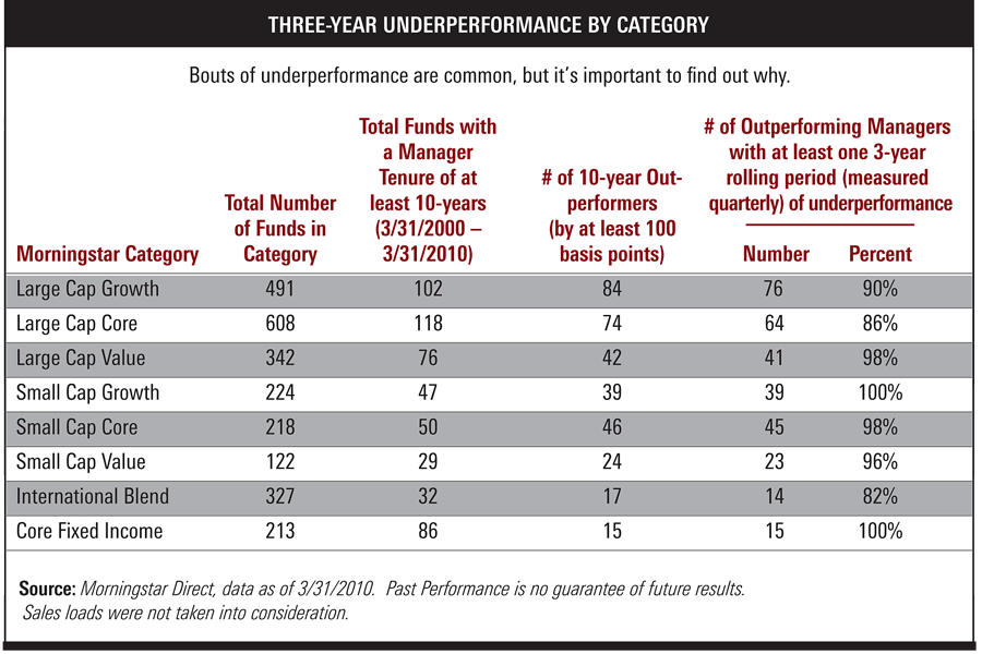
Whether you are an investment manager or a client, underperformance is a fact of life, no matter what strategy or methodology you subscribe to. If you don’t believe me, take a look at this chart from an article at ThinkAdvisor.

underperformancebouts zps8212b96b Underperformance

Source: Morningstar, ThinkAdvisor (click on image to enlarge)

Now, this chart is a little biased because it is looking at long periods of underperformance—3-year rolling periods—from managers that had top 10-year track records. In other words, these are exactly the kinds of managers you would hope to hire, and even they have long stretches of underperformance. When things are going well, clients are euphoric. Clients, though, often feel like even short periods of underperformance mean something is horribly wrong.

The entire article, written by Envestnet’s J. Gibson Watson, is worth reading because it makes the point that simply knowing about the underperformance is not very helpful until you know why the underperformance is occurring. Some underperformance may simply be a style temporarily out of favor, while other causes of underperformance might suggest an intervention is in order.

It’s quite possible to have a poor experience with a good manager if you bail out when you should hang in. Investing well can be simple, but that doesn’t mean it will be easy!

Posted by:


Fund Flows

September 26, 2013

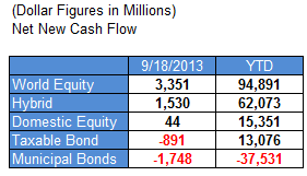
Mutual fund flow estimates are derived from data collected by The Investment Company Institute covering more than 95 percent of industry assets and are adjusted to represent industry totals.

ici 09.26.13 Fund Flows

Posted by:


High RS Diffusion Index

September 25, 2013

The chart below measures the percentage of high relative strength stocks that are trading above their 50-day moving average (universe of mid and large cap stocks.) As of 9/24/13.

diffusion 09.25.13 High RS Diffusion Index

The 10-day moving average of this indicator is 78% and the one-day reading is 76%.

Posted by:


From the Archives: Market Anxiety Disorder

September 24, 2013

A recent article in the Personal Finance section of the Wall Street Journal had a prescription for anxious investors that Andy has been talking about for more than a year: consider asset allocation funds. Our Global Macro separate account has been very popular, partly because it allows investors to get into the market in a way that can be conservative when needed, but one that doesn’t lock investors into a product that can only be conservative.

The stock market’s powerful rally over the past year has gone a long way toward reducing the losses that many mutual-fund investors suffered in late 2007 and 2008.

But the rebound—with the Standard & Poor’s 500-stock index up 74% from its March 9, 2009, low—has done nothing for one group of investors: those who bailed out of stocks and have remained on the sidelines. Some of these investors have poured large sums into bond funds, even though those holdings may take a beating whenever interest rates rise from today’s unusually low levels, possibly later this year. Some forecasters, meanwhile, believe that stocks may finish 2010 up as much as 10%.

So, for investors who want to step back into stocks but are still anxious, here’s a modest suggestion: You don’t have to take your stock exposure straight up. You can dilute it by buying an allocation fund that spreads its assets across many market sectors, from stocks and bonds to money-market instruments and convertible securities.

While the WSJ article is a good general introduction to the idea, I think there are a few caveats that should be mentioned.

There’s still a big difference between a strategic asset allocation fund and a tactical asset allocation fund.

Many [asset allocation funds] keep their exposures within set ranges, while others may vary their mix widely.

Your fund selection will probably depend a lot on the individual client. A strategic asset allocation fund will more often have a tight range or even a fixed or target allocation for stocks or bonds. This can often target the volatility successfully–but can hurt returns if the asset classes themselves are out of favor. Tactical funds will more often have broader ranges or be unconstrained in terms of allocations. This additional flexibility can lead to higher returns, but it could be accompanied by higher volatility.

One thing the article does not mention at all, unfortunately, is that you also have a choice between a purely domestic asset allocation fund or a global asset allocation fund. A typical domestic asset allocation fund will provide anxious investors with a way to ease into the market, but will ignore many of the opportunities in international markets or in alternative assets like real estate, currencies, and commodities. With a variety of possible scenarios for the domestic economy, it might make sense to cast your net a little wider. Still, the article’s main point is valid: an asset allocation fund, especially a global asset allocation fund, is often a good way to deal with a client’s Market Anxiety Disorder and get them back into the game.

—-this article originally appeared 4/7/2010. Investors still don’t like this rally, even though we are a long way down the road from 2010! An asset allocation fund might still be a possible solution.

Posted by:


Relative Strength Spread

September 24, 2013

The chart below is the spread between the relative strength leaders and relative strength laggards (universe of mid and large cap stocks). When the chart is rising, relative strength leaders are performing better than relative strength laggards. As of 9/23/2013:

spread 09.24.13 Relative Strength Spread

Posted by:


Weekly RS Recap

September 23, 2013

The table below shows the performance of a universe of mid and large cap U.S. equities, broken down by relative strength decile and then compared to the universe return. Those at the top of the ranks are those stocks which have the best intermediate-term relative strength. Relative strength strategies buy securities that have strong intermediate-term relative strength and hold them as long as they remain strong.

Last week’s performance (9/16/13 – 9/20/13) is as follows:

ranks 09.23.13 Weekly RS Recap

Posted by:


Emerging Markets Picking Up

September 20, 2013

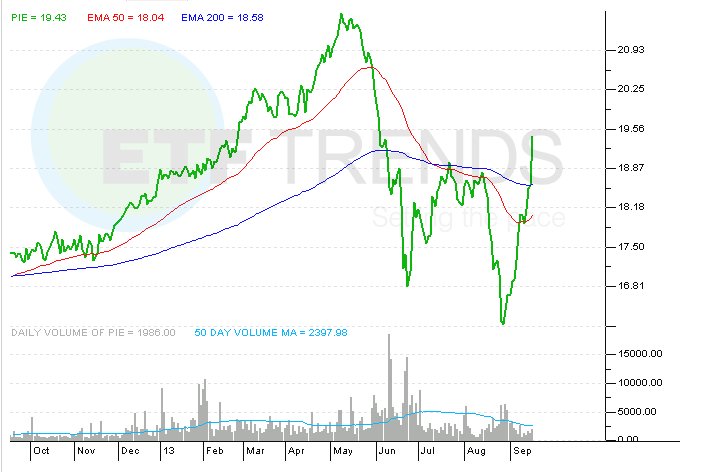
Tom Lydon covers the huge spike in PIE and other Emerging Market ETFs over the last week:

Emerging markets ETFs had been perking up for several weeks, but the group got the lift it really needed Wednesday when the Federal Reserve eschewed tapering. The U.S. central bank said its $85 billion in monthly bond purchases will remain in place and those comments could be just what the doctor ordered when it comes to confirming a significant rally for emerging markets ETFs.

There were multiple examples of the intensity with which emerging markets ETFs rallied on Wednesday. The Vanguard FTSE Emerging Markets ETF (VWO) jumped 4% while the iShares MSCI Brazil Capped ETF (EWZ) soared 5.1% and those are just two examples. With a Wednesday gain of 4.6%, the PowerShares DWA Emerging Markets Technical Leaders Portfolio (PIE) belongs on the list of emerging markets “no tapering” beneficiaries.

PIE does not follow the same cap-weighted methodology used by VWO and other larger, diversified emerging markets ETFs. Rather, PIE tracks the Dorsey Wright Emerging Markets Technical Leaders Index, which ranks its components based on relative strength traits. PIE and its index rebalance quarterly. That methodology previously helped PIE thwart larger rivals like VWO. Earlier this year when the BRIC nations were lagging, PIE was beating its rivals because it had scant BRIC exposure.

However, PIE was left vulnerable to the tapering-induced emerging markets swoon that started in earnest in May. Although PIE was not highly exposed to BRIC, the fund did have large allocations to some developing markets that waned in the face of tapering talk and higher U.S. interest rates. Think Turkey, Indonesia and Thailand as a few examples.

With tapering off the table, PIE could be in a position to thrive again. The ETF can hold stocks from the following countries: Argentina, Brazil, Chile, China, Colombia, Czech Republic, Egypt, Hungary, India, Indonesia, Israel, Malaysia, Mexico, Morocco, Pakistan, Peru, Philippines, Poland, Russia, South Africa, Taiwan, Thailand and Turkey.

PowerShares DWA Emerging Markets Technical Leaders Portfolio

PIE Emerging Markets Picking Up

Past performance is no guarantee of future returns. See www.powershares.com for more information.

Posted by:


Stocks for the Long Run

September 20, 2013

Unlike certain authors, I am not promoting some agenda about where stocks will be at some future date! Instead, I am just including a couple of excerpts from a paper by luminaries David Blanchett, Michael Finke, and Wade Pfau that suggests that stocks are the right investment for the long run—based on historical research. Their findings are actually fairly broad and call market efficiency into question.
We find strong historical evidence to support the notion that a higher allocation to equities is optimal for investors with longer time horizons, and that the time diversification effect is relatively consistent across countries and that it persists for different levels of risk aversion.

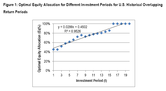
When they examine optimal equity weightings in a portfolio by time horizon, the findings are rather striking. Here’s a reproduction of one of their figures from the paper:
optimalequity zpsa19b1cfd Stocks for the Long Run

Source: SSRN/Blanchett, Finke, Pfau (click to enlarge)

They describe the findings very simply:

Figure 1 also demonstrates how to interpret the results we include later in Tables 2 and 3. In Figure 1 we note an intercept (α) of 45.02% (which we will assume is 45% for simplicity purposes) and a slope (β) of .0299 (which for simplicity purposes we will assume is .03). Therefore the optimal historical allocation to equities for an investor with a 5 year holding period would be 60% stocks, which would be determined by: 45% + 5(3%) = 60%.

In other words, if your holding period is 15-20 years or longer, the optimal portfolio is 100% stocks!

Reality, of course, can be different from statistical probability, but their point is that it makes sense to own a greater percentage of stocks the longer your time horizon is. The equity risk premium—the little extra boost in returns you tend to get from owning stocks—is both persistent and decently high, enough to make owning stocks a good long-term bet.

Posted by: