December 17, 2012
Our latest sentiment survey was open from 12/7/12 to 12/14/12. The Dorsey, Wright Polo Shirt Raffle continues to drive advisor participation, and we greatly appreciate your support! This round, we had 58 advisors participate in the survey. If you believe, as we do, that markets are driven by supply and demand, client behavior is important. We’re not asking what you think of the market—since most of our blog readers are financial advisors, we’re asking instead about the behavior of your clients. Then we’re aggregating responses exclusively for our readership. Your privacy will not be compromised in any way.
After the first 30 or so responses, the established pattern was simply magnified, so we are fairly comfortable about the statistical validity of our sample. Some statistical uncertainty this round comes from the fact that we only had four investors say that thier clients are more afraid of missing a stock upturn than being caught in a downdraft. Most of the responses were from the U.S., but we also had multiple advisors respond from at least two other countries. Let’s get down to an analysis of the data! Note: You can click on any of the charts to enlarge them.
Question 1. Based on their behavior, are your clients currently more afraid of: a) getting caught in a stock market downdraft, or b) missing a stock market upturn?

Chart 1: Greatest Fear. From survey to survey, the S&P; 500 rose by around +0.5%, and our indicators responded as expected. The fear of downdraft group fell from 89% to 83%, while the upturn group rose from 11% to 17%. Despite the modest move towards more risk, client sentiment remains poor.

Chart 2: Greatest Fear Spread. Another way to look at this data is to examine the spread between the two groups. The spread dropped again, from 78% to 65%.
Question 2. Based on their behavior, how would you rate your clients’ current appetite for risk?

Chart 3: Average Risk Appetite. Average risk moved higher this round with the market, from 2.43% to 2.54%.

Chart 4: Risk Appetite Bell Curve. This chart uses a bell curve to break out the percentage of respondents at each risk appetite level. This round, over 90% of all respondents wanted a risk appetite of 3 or less for the third survey round in a row.

Chart 5: Risk appetite Bell Curve by Group. The next three charts use cross-sectional data. The chat plots the reported client risk appetite separately for the fear of downdraft and for the fear of missing upturn groups. We can see the upturn group wants more risk, while the fear of downturn group is looking for less risk.

Chart 6: Average Risk Appetite by Group. This round, the downturn group’s average remained exactly the same, while the upturn group’s average jumped by a large degree.

Chart 7: Risk Appetite Spread. This is a chart constructed from the data in Chart 6, where the average risk appetite of the downdraft group is subtracted from the average risk appetite of the missing upturn group. The spread jumped this round.
The S&P; 500 inched higher from survey to survey, and our indicators responded in-kind to the same degree. The greatest fear numbers moved slightly towards the positive, and overall risk appetite nudged higher. Client sentiment remains poor overall.
No one can predict the future, as we all know, so instead of prognosticating, we will sit back and enjoy the ride. A rigorously tested, systematic investment process provides a great deal of comfort for clients during these types of fearful, highly uncertain market environments. Until next time, good trading and thank you for participating.
 Leave a Comment » |
  Investor Behavior, Markets, Sentiment |
  Permalink

Posted by:
JP Lee
December 7, 2012
Here we have the next round of the Dorsey, Wright Sentiment Survey, the first third-party sentiment poll. Participate to learn more about our Dorsey, Wright Polo Shirt raffle! Just follow the instructions after taking the poll, and we’ll enter you in the contest. Thanks to all our participants from last round.
As you know, when individuals self-report, they are always taller and more beautiful than when outside observers report their perceptions! Instead of asking individual investors to self-report whether they are bullish or bearish, we’d like financial advisors to weigh in and report on the actual behavior of clients. It’s two simple questions and will take no more than 20 seconds of your time. We’ll construct indicators from the data and report the results regularly on our blog–but we need your help to get a large statistical sample!
Click here to take Dorsey, Wright’s Client Sentiment Survey.
Contribute to the greater good! It’s painless, we promise.
Leave a Comment » | Investor Behavior, Markets, Sentiment | Permalink
Posted by:
JP Lee
December 4, 2012
Our latest sentiment survey was open from 11/23/12 to 11/30/12. The Dorsey, Wright Polo Shirt Raffle continues to drive advisor participation, and we greatly appreciate your support! This round, we had 73 advisors participate in the survey. If you believe, as we do, that markets are driven by supply and demand, client behavior is important. We’re not asking what you think of the market—since most of our blog readers are financial advisors, we’re asking instead about the behavior of your clients. Then we’re aggregating responses exclusively for our readership. Your privacy will not be compromised in any way.
After the first 30 or so responses, the established pattern was simply magnified, so we are fairly comfortable about the statistical validity of our sample. Some statistical uncertainty this round comes from the fact that we only had four investors say that thier clients are more afraid of missing a stock upturn than being caught in a downdraft. Most of the responses were from the U.S., but we also had multiple advisors respond from at least two other countries. Let’s get down to an analysis of the data! Note: You can click on any of the charts to enlarge them.
Question 1. Based on their behavior, are your clients currently more afraid of: a) getting caught in a stock market downdraft, or b) missing a stock market upturn?

Chart 1: Greatest Fear. From survey to survey, the S&P; 500 rose by just over 2%, and our indicators responded as expected. The fear of downdraft group ticked slightly lower, from 90% to 89%, while the upturn group managed to rise from 10% to 11%.

Chart 2: Greatest Fear Spread. Another way to look at this data is to examine the spread between the two groups. The spread dipped from 80% to 78%.
Question 2. Based on their behavior, how would you rate your clients’ current appetite for risk?

Chart 3: Average Risk Appetite. Average risk appetite bounced ever so slightly with the rising market, from 2.42 to 2.43.

Chart 4: Risk Appetite Bell Curve. This chart uses a bell curve to break out the percentage of respondents at each risk appetite level. This round, over 90% of all respondents wanted a risk appetite of 3 or less for the second survey round in a row.

Chart 5: Risk appetite Bell Curve by Group. The next three charts use cross-sectional data. The chat plots the reported client risk appetite separately for the fear of downdraft and for the fear of missing upturn groups. We can see the upturn group wants more risk, while the fear of downturn group is looking for less risk.

Chart 6: Average Risk Appetite by Group. This round, both groups’ average managed to move slightly lower, while the overage average ticked barely higher.

Chart 7: Risk Appetite Spread. This is a chart constructed from the data in Chart 6, where the average risk appetite of the downdraft group is subtracted from the average risk appetite of the missing upturn group. The spread remained unchanged.
The S&P; 500 rose around 2% from survey to survey, and our indicators nudged themselves into the right direction. The fear of downdraft group fell by a measly 1%. Overall risk appetite increased by a whopping .01 point, indicating a very tepid response to a short-term move higher in the market. Things still look bad sentiment-wise.
No one can predict the future, as we all know, so instead of prognosticating, we will sit back and enjoy the ride. A rigorously tested, systematic investment process provides a great deal of comfort for clients during these types of fearful, highly uncertain market environments. Until next time, good trading and thank you for participating.
Leave a Comment » | Investor Behavior, Markets, Sentiment | Permalink
Posted by:
JP Lee
November 26, 2012
Here we have the next round of the Dorsey, Wright Sentiment Survey, the first third-party sentiment poll. Participate to learn more about our Dorsey, Wright Polo Shirt raffle! Just follow the instructions after taking the poll, and we’ll enter you in the contest. Thanks to all our participants from last round.
As you know, when individuals self-report, they are always taller and more beautiful than when outside observers report their perceptions! Instead of asking individual investors to self-report whether they are bullish or bearish, we’d like financial advisors to weigh in and report on the actual behavior of clients. It’s two simple questions and will take no more than 20 seconds of your time. We’ll construct indicators from the data and report the results regularly on our blog–but we need your help to get a large statistical sample!
Click here to take Dorsey, Wright’s Client Sentiment Survey.
Contribute to the greater good! It’s painless, we promise.
3 Comments | Investor Behavior, Markets, Sentiment | Permalink
Posted by:
JP Lee
November 20, 2012
Our latest sentiment survey was open from 11/9/12 to 11/16/12. The Dorsey, Wright Polo Shirt Raffle continues to drive advisor participation, and we greatly appreciate your support! This round, we had 69 advisors participate in the survey. If you believe, as we do, that markets are driven by supply and demand, client behavior is important. We’re not asking what you think of the market—since most of our blog readers are financial advisors, we’re asking instead about the behavior of your clients. Then we’re aggregating responses exclusively for our readership. Your privacy will not be compromised in any way.
After the first 30 or so responses, the established pattern was simply magnified, so we are fairly comfortable about the statistical validity of our sample. Some statistical uncertainty this round comes from the fact that we only had four investors say that thier clients are more afraid of missing a stock upturn than being caught in a downdraft. Most of the responses were from the U.S., but we also had multiple advisors respond from at least two other countries. Let’s get down to an analysis of the data! Note: You can click on any of the charts to enlarge them.
Question 1. Based on their behavior, are your clients currently more afraid of: a) getting caught in a stock market downdraft, or b) missing a stock market upturn?

Chart 1: Greatest Fear. From survey to survey, the S&P; 500 fell just over -2%, and all of our sentiment indicators responded as expected. The fear of downdraft group crept up to 90%, up from 86%. The fear of missing opportunity group fell from 14% to 10%.

Chart 2: Greatest Fear Spread. Another way to look at this data is to examine the spread between the two groups. The spread continued to rise, up to 80% from 71%.
Question 2. Based on their behavior, how would you rate your clients’ current appetite for risk?

Chart 3: Average Risk Appetite. Average risk appetite fell for the second straight week, dropping from 2.52 to 2.42.

Chart 4: Risk Appetite Bell Curve. This chart uses a bell curve to break out the percentage of respondents at each risk appetite level. This round, over 90% of all respondents wanted a risk appetite of 3 or less.

Chart 5: Risk appetite Bell Curve by Group. The next three charts use cross-sectional data. The chat plots the reported client risk appetite separately for the fear of downdraft and for the fear of missing upturn groups. We can see the upturn group wants more risk, while the fear of downturn group is looking for less risk.

Chart 6: Average Risk Appetite by Group. This round, the upturn group’s risk appetite grew after an uncharacteristic low last survey. The downturn group’s average fell with the market.

Chart 7: Risk Appetite Spread. This is a chart constructed from the data in Chart 6, where the average risk appetite of the downdraft group is subtracted from the average risk appetite of the missing upturn group. The spread continues to trend within its set range.
The S&P; 500 fell by -2% from survey to survey, and our sentiment indicators responded correctly. The overall fear number grew to 90%, meaning 90% of all clients are more worried about losing money in the market versus missing a market rally. The overall risk appetite also fell this round, in line with the market.
No one can predict the future, as we all know, so instead of prognosticating, we will sit back and enjoy the ride. A rigorously tested, systematic investment process provides a great deal of comfort for clients during these types of fearful, highly uncertain market environments. Until next time, good trading and thank you for participating.
Leave a Comment » | Investor Behavior, Markets, Sentiment | Permalink
Posted by:
JP Lee
November 9, 2012
Here we have the next round of the Dorsey, Wright Sentiment Survey, the first third-party sentiment poll. Participate to learn more about our Dorsey, Wright Polo Shirt raffle! Just follow the instructions after taking the poll, and we’ll enter you in the contest. Thanks to all our participants from last round.
As you know, when individuals self-report, they are always taller and more beautiful than when outside observers report their perceptions! Instead of asking individual investors to self-report whether they are bullish or bearish, we’d like financial advisors to weigh in and report on the actual behavior of clients. It’s two simple questions and will take no more than 20 seconds of your time. We’ll construct indicators from the data and report the results regularly on our blog–but we need your help to get a large statistical sample!
Click here to take Dorsey, Wright’s Client Sentiment Survey.
Contribute to the greater good! It’s painless, we promise.
Leave a Comment » | Investor Behavior, Markets, Sentiment | Permalink
Posted by:
JP Lee
November 6, 2012
Our latest sentiment survey was open from 10/26/12 to 11/2/12. The Dorsey, Wright Polo Shirt Raffle continues to drive advisor participation, and we greatly appreciate your support! This round, we had 70 advisors participate in the survey. If you believe, as we do, that markets are driven by supply and demand, client behavior is important. We’re not asking what you think of the market—since most of our blog readers are financial advisors, we’re asking instead about the behavior of your clients. Then we’re aggregating responses exclusively for our readership. Your privacy will not be compromised in any way.
After the first 30 or so responses, the established pattern was simply magnified, so we are fairly comfortable about the statistical validity of our sample. Some statistical uncertainty this round comes from the fact that we only had four investors say that thier clients are more afraid of missing a stock upturn than being caught in a downdraft. Most of the responses were from the U.S., but we also had multiple advisors respond from at least two other countries. Let’s get down to an analysis of the data! Note: You can click on any of the charts to enlarge them.
Question 1. Based on their behavior, are your clients currently more afraid of: a) getting caught in a stock market downdraft, or b) missing a stock market upturn?

Chart 1: Greatest Fear. From survey to survey, the S&P; 500 fell by around -1%, and all of our indicators responded as expected. The fear of downdraft group rose slightly from 84% to 86%. The fear of missing opportunity group fell from 16% to 14%.

Chart 2: Greatest Fear Spread. Another way to look at this data is to examine the spread between the two groups. The spread rose slightly from 69% to 71%.
Question 2. Based on their behavior, how would you rate your clients’ current appetite for risk?

Chart 3: Average Risk Appetite. Average risk appetite took a big hit this week, falling from 2.71 to 2.52. It looks like this recent market downturn is starting to put the squeeze on investor sentiment.

Chart 4: Risk Appetite Bell Curve. This chart uses a bell curve to break out the percentage of respondents at each risk appetite level. This round, over 90% of all respondents wanted a risk appetite of 3 or less.

Chart 5: Risk appetite Bell Curve by Group. The next three charts use cross-sectional data. The chat plots the reported client risk appetite separately for the fear of downdraft and for the fear of missing upturn groups. This chart sorts out as expected, with the downturn group wanting less risk and the upturn group looking to add risk.

Chart 6: Average Risk Appetite by Group. The average risk appetite of both groups fell this round by a large degree, in line with the market.

Chart 7: Risk Appetite Spread. This is a chart constructed from the data in Chart 6, where the average risk appetite of the downdraft group is subtracted from the average risk appetite of the missing upturn group. The spread is now at the lower end of its normal range.
The S&P; 500 fell around -1% from survey to survey, and the results were what we’d expect to see. The overall fear number rose as the market fell. Also, the overall risk appetite average also fell with the market.
No one can predict the future, as we all know, so instead of prognosticating, we will sit back and enjoy the ride. A rigorously tested, systematic investment process provides a great deal of comfort for clients during these types of fearful, highly uncertain market environments. Until next time, good trading and thank you for participating.
Leave a Comment » | Investor Behavior, Markets, Sentiment | Permalink
Posted by:
JP Lee
October 26, 2012
Here we have the next round of the Dorsey, Wright Sentiment Survey, the first third-party sentiment poll. Participate to learn more about our Dorsey, Wright Polo Shirt raffle! Just follow the instructions after taking the poll, and we’ll enter you in the contest. Thanks to all our participants from last round.
As you know, when individuals self-report, they are always taller and more beautiful than when outside observers report their perceptions! Instead of asking individual investors to self-report whether they are bullish or bearish, we’d like financial advisors to weigh in and report on the actual behavior of clients. It’s two simple questions and will take no more than 20 seconds of your time. We’ll construct indicators from the data and report the results regularly on our blog–but we need your help to get a large statistical sample!
Click here to take Dorsey, Wright’s Client Sentiment Survey.
Contribute to the greater good! It’s painless, we promise.
Leave a Comment » | Investor Behavior, Markets, Sentiment | Permalink
Posted by:
JP Lee
October 22, 2012
Our latest sentiment survey was open from 10/12/12 to 10/19/12. The Dorsey, Wright Polo Shirt Raffle continues to drive advisor participation, and we greatly appreciate your support! This round, we had 90 advisors participate in the survey. If you believe, as we do, that markets are driven by supply and demand, client behavior is important. We’re not asking what you think of the market—since most of our blog readers are financial advisors, we’re asking instead about the behavior of your clients. Then we’re aggregating responses exclusively for our readership. Your privacy will not be compromised in any way.
After the first 30 or so responses, the established pattern was simply magnified, so we are fairly comfortable about the statistical validity of our sample. Some statistical uncertainty this round comes from the fact that we only had four investors say that thier clients are more afraid of missing a stock upturn than being caught in a downdraft. Most of the responses were from the U.S., but we also had multiple advisors respond from at least two other countries. Let’s get down to an analysis of the data! Note: You can click on any of the charts to enlarge them.
Question 1. Based on their behavior, are your clients currently more afraid of: a) getting caught in a stock market downdraft, or b) missing a stock market upturn?

Chart 1: Greatest Fear. From survey to survey, the S&P; 500 fell by around -1%, and some of our indicators responded as expected. The fear of downdraft grop fell slightly with a falling market, from 86% to 85%, which is the opposite of what we’d expect to see in a down market. The fear of missing opportunity group rose from 14% to 16%.

Chart 2: Greatest Fear Spread. Another way to look at this data is to examine the spread between the two groups. The spread fell from 73% to 69%.
Question 2. Based on their behavior, how would you rate your clients’ current appetite for risk?

Chart 3: Average Risk Appetite. Average risk appetite fell with the market, which is what we’d expect to see. Average risk appetite fell from 2.89 to 2.71.

Chart 4: Risk Appetite Bell Curve. This chart uses a bell curve to break out the percentage of respondents at each risk appetite level. This round, over 80% of all respondents wanted a risk appetite of either 2 or 3.

Chart 5: Risk appetite Bell Curve by Group. The next three charts use cross-sectional data. The chat plots the reported client risk appetite separately for the fear of downdraft and for the fear of missing upturn groups. This chart sorts out as expected, with the downturn group wanting less risk and the upturn group looking to add risk.

Chart 6: Average Risk Appetite by Group. The average risk appetite of both groups fell this round, in line with the market.

Chart 7: Risk Appetite Spread. This is a chart constructed from the data in Chart 6, where the average risk appetite of the downdraft group is subtracted from the average risk appetite of the missing upturn group. The spread is now back in its normal range.
The S&P; 500 fell around -1% from survey to survey, and the results were a mixed bag. The overall fear number did the opposite of what we’d expect, with LESS people worried about losing money despite a falling market. However, our trusty risk appetite indicator fell along with the market, with people wanting less risk as stocks dropped.
No one can predict the future, as we all know, so instead of prognosticating, we will sit back and enjoy the ride. A rigorously tested, systematic investment process provides a great deal of comfort for clients during these types of fearful, highly uncertain market environments. Until next time, good trading and thank you for participating.
Leave a Comment » | Investor Behavior, Markets, Sentiment | Permalink
Posted by:
JP Lee
October 12, 2012
Here we have the next round of the Dorsey, Wright Sentiment Survey, the first third-party sentiment poll. Participate to learn more about our Dorsey, Wright Polo Shirt raffle! Just follow the instructions after taking the poll, and we’ll enter you in the contest. Thanks to all our participants from last round.
As you know, when individuals self-report, they are always taller and more beautiful than when outside observers report their perceptions! Instead of asking individual investors to self-report whether they are bullish or bearish, we’d like financial advisors to weigh in and report on the actual behavior of clients. It’s two simple questions and will take no more than 20 seconds of your time. We’ll construct indicators from the data and report the results regularly on our blog–but we need your help to get a large statistical sample!
Click here to take Dorsey, Wright’s Client Sentiment Survey.
Contribute to the greater good! It’s painless, we promise.
Leave a Comment » | Investor Behavior, Markets, Sentiment | Permalink
Posted by:
JP Lee
October 9, 2012
Our latest sentiment survey was open from 9/28/12 to 10/5/12. The Dorsey, Wright Polo Shirt Raffle continues to drive advisor participation, and we greatly appreciate your support! This round, we had 45 advisors participate in the survey. If you believe, as we do, that markets are driven by supply and demand, client behavior is important. We’re not asking what you think of the market—since most of our blog readers are financial advisors, we’re asking instead about the behavior of your clients. Then we’re aggregating responses exclusively for our readership. Your privacy will not be compromised in any way.
After the first 30 or so responses, the established pattern was simply magnified, so we are fairly comfortable about the statistical validity of our sample. Some statistical uncertainty this round comes from the fact that we only had four investors say that thier clients are more afraid of missing a stock upturn than being caught in a downdraft. Most of the responses were from the U.S., but we also had multiple advisors respond from at least two other countries. Let’s get down to an analysis of the data! Note: You can click on any of the charts to enlarge them.
Question 1. Based on their behavior, are your clients currently more afraid of: a) getting caught in a stock market downdraft, or b) missing a stock market upturn?

Chart 1: Greatest Fear. From survey to survey, the S&P; 500 fell around -1.5%, and some of our indicators responded as expected. The fear of downdraft group rose from 81% to 86%, while the upturn group fell from 19% to 14%. This is what we’d expect to see in a falling market.

Chart 2: Greatest Fear Spread. Another way to look at this data is to examine the spread between the two groups. The spread continued to rise, from 61% to 73%.
Question 2. Based on their behavior, how would you rate your clients’ current appetite for risk?

Chart 3: Average Risk Appetite. Average risk crept higher as the market fell, which is not typical. However, you can see that the overall trend remained positive over the summer as the market moved higher. Average risk appetite fell from 2.89 to 2.81.

Chart 4: Risk Appetite Bell Curve. This chart uses a bell curve to break out the percentage of respondents at each risk appetite level. This round, over 50% of all respondents requested a risk appetite of 3. There were no 5’s.

Chart 5: Risk appetite Bell Curve by Group. The next three charts use cross-sectional data. The chat plots the reported client risk appetite separately for the fear of downdraft and for the fear of missing upturn groups. This chart sorts out as expected, with the downturn group wanting less risk and the upturn group looking to add risk.

Chart 6: Average Risk Appetite by Group. The average risk appetite of both groups rose this week despite a falling market.

Chart 7: Risk Appetite Spread. This is a chart constructed from the data in Chart 6, where the average risk appetite of the downdraft group is subtracted from the average risk appetite of the missing upturn group. The spread is now back in its normal range.
The S&P; 500 fell around -1.5% from survey to survey, and our indicators held a mixed bag this round. The greatest fear number rose, which we’d expect. On the other hand, we saw the overall risk appetite number tick slightly higher.
No one can predict the future, as we all know, so instead of prognosticating, we will sit back and enjoy the ride. A rigorously tested, systematic investment process provides a great deal of comfort for clients during these types of fearful, highly uncertain market environments. Until next time, good trading and thank you for participating.
Leave a Comment » | Investor Behavior, Markets, Sentiment | Permalink
Posted by:
JP Lee
September 28, 2012
Here we have the next round of the Dorsey, Wright Sentiment Survey, the first third-party sentiment poll. Participate to learn more about our Dorsey, Wright Polo Shirt raffle! Just follow the instructions after taking the poll, and we’ll enter you in the contest. Thanks to all our participants from last round.
As you know, when individuals self-report, they are always taller and more beautiful than when outside observers report their perceptions! Instead of asking individual investors to self-report whether they are bullish or bearish, we’d like financial advisors to weigh in and report on the actual behavior of clients. It’s two simple questions and will take no more than 20 seconds of your time. We’ll construct indicators from the data and report the results regularly on our blog–but we need your help to get a large statistical sample!
Click here to take Dorsey, Wright’s Client Sentiment Survey.
Contribute to the greater good! It’s painless, we promise.
Leave a Comment » | Investor Behavior, Markets, Sentiment | Permalink
Posted by:
JP Lee
September 21, 2012
It’s no secret that investors have had a fairly negative outlook toward the stock market lately. Their negative perception shows up both in flow of funds data and in our own advisor survey of investor sentiment.
One possible—and shocking—reason for the negative sentiment may be that the public thinks the stock market has been going down!
Investment News profiled recent research done by Franklin Templeton Funds. Here is the appropriate clip, which is just stunning to me:
One surprising finding shows that investors are likely so consumed by the negative economic news, including high unemployment and the weak housing market, that they haven’t even noticed the strength of the stock market.
For example, when 1,000 investors were asked whether they thought the S&P; was up or down during each of the past three years, 66% thought it was down in 2009, 48% thought it was down in 2010, and 53% thought it was down last year.
In fact, the S&P; gained 26.5% in 2009, 15.1% in 2010, and 2.1% last year.
That blows me away. I have never seen a clearer case of the distinction between perception and reality. This data shows clearly that many investors act on their perceptions—that the market has been declining for years—not the reality, which has been a choppy but steadily rising market.
The stock market is ahead again year-to-date and money is continuing to flow out of equity mutual funds. I understand that the market is scary sometimes and difficult always, but really? It amazes me that so many investors think the stock market has been dropping when it has actually been going up. Of course, perhaps investors’ aggregate investment decisions are more understandable when it becomes clear that only a minority of them are in touch with reality!
Advisors obviously have a lot of work to do with anxious clients. The stock market historically has been one of the best growth vehicles for investors, but it won’t do them any good if they choose to stay away. Some of the investor anxiety might be lessened if advisors stick with a systematic investment process using relative strength—and least that way, the client is assured that money will only be moved toward the strongest assets. If stocks really do have a long bear market, as is the current perception, clients may be somewhat shielded from it.
3 Comments | Investor Behavior, Markets, Sentiment, Thought Process | Tagged: equities, financial advisor, investor behavior, investor sentiment, stock market | Permalink
Posted by:
Mike Moody
September 14, 2012
Here we have the next round of the Dorsey, Wright Sentiment Survey, the first third-party sentiment poll. Participate to learn more about our Dorsey, Wright Polo Shirt raffle! Just follow the instructions after taking the poll, and we’ll enter you in the contest. Thanks to all our participants from last round.
As you know, when individuals self-report, they are always taller and more beautiful than when outside observers report their perceptions! Instead of asking individual investors to self-report whether they are bullish or bearish, we’d like financial advisors to weigh in and report on the actual behavior of clients. It’s two simple questions and will take no more than 20 seconds of your time. We’ll construct indicators from the data and report the results regularly on our blog–but we need your help to get a large statistical sample!
Click here to take Dorsey, Wright’s Client Sentiment Survey.
Contribute to the greater good! It’s painless, we promise.
Leave a Comment » | Investor Behavior, Markets, Sentiment | Permalink
Posted by:
JP Lee
September 12, 2012
Why, you may ask, am I writing about investor sentiment from July now that it is mid-September? I think it’s often a useful exercise to look back at the primary sources—the historical data—as my US history teacher used to point out. We all have a way of mis-remembering history. We modify it to fit the present, so that whatever happened seems inevitable. The future, of course, is always uncertain.
Investor sentiment is a peculiar form of history because it generally works in contrary fashion. Studies show that when investors are most bullish, the market tends to go down. And when investors are bearish, the market perversely tends to go up.
July was just such a period. Consider, for example, a CNBC article on the weekly sentiment poll conducted by the American Association of Individual Investors (AAII):
Main Street bulls are fast becoming an endangered species.
Despite the fact that the broad U.S. stock market is up 8.4 percent in 2012, only 22 percent of mom-and-pop investors said they were bullish, the American Association of Individual Investors found in its latest weekly poll.
That’s the lowest sentiment reading since summer 2010, when markets were careening lower in the face of the first post-recession global growth scare and the emergence of Europe’s debt crisis.
But to drive home just how pessimistic Main Street investors have become in the face of a weak U.S. economy, slowing growth in China and continued uncertainty about Europe’s financial crisis, consider that:
• Bullishness now is more depressed than in the fall of 2008, when Wall Street titan Lehman Bros. declared bankruptcy, thrusting the financial crisis into a more dangerous phase.
• The percentage of bulls today is barely above the 18.9 percent on March 5, 2009, just four days before the bottom of the worst stock slide since the Great Depression.
I think it’s fair to say that investor sentiment was pretty negative in July.
So what’s happened since then? All of the bearish investors were not able to make the market go down. Instead, it has risen—the S&P; 500 level has gone from about 1350 to 1435!
In fact, this is a typical outcome:
But all the negativity may turn out to be a positive: History shows that super-low sentiment readings tend to act as a contrarian signal. In other words, when everyone is worried, stocks tend to rally.
In fact, according to Bespoke, going back to November 2009, U.S. stocks have posted average gains of 5 percent — with gains 100 percent of the time — in the month after AAII’s sentiment poll showed bullish sentiment readings below 25 percent.
I added the bold to emphasize the cost of bad investor behavior. What if you had exited the market in July because you were bearish? About half of the gains year-to-date have occurred since then. Things always seem darkest before the dawn, but it’s important to resist bailing out when frightened. Better to structure your portfolio so that you can sit tight regardless of the current situation—or to cut back when things seem to be going exceptionally well. It’s tough to get the upside exit right, but it’s relatively easier to flag time periods marked by poor sentiment that are likely to be bad times to get out. If you stay the course, it could make a big positive difference to your returns.
Leave a Comment » | Investor Behavior, Sentiment | Tagged: contrary opinion, investor behavior, investor sentiment, sentiment | Permalink
Posted by:
Mike Moody
August 27, 2012
Our latest sentiment survey was open from 8/3/12 to 8/10/12. The Dorsey, Wright Polo Shirt Raffle continues to drive advisor participation, and we greatly appreciate your support! We will announce the winner next Monday! This round, we had 44 advisors participate in the survey. If you believe, as we do, that markets are driven by supply and demand, client behavior is important. We’re not asking what you think of the market—since most of our blog readers are financial advisors, we’re asking instead about the behavior of your clients. Then we’re aggregating responses exclusively for our readership. Your privacy will not be compromised in any way.
After the first 30 or so responses, the established pattern was simply magnified, so we are fairly comfortable about the statistical validity of our sample. Some statistical uncertainty this round comes from the fact that we only had four investors say that thier clients are more afraid of missing a stock upturn than being caught in a downdraft. Most of the responses were from the U.S., but we also had multiple advisors respond from at least two other countries. Let’s get down to an analysis of the data! Note: You can click on any of the charts to enlarge them.
Question 1. Based on their behavior, are your clients currently more afraid of: a) getting caught in a stock market downdraft, or b) missing a stock market upturn?

Chart 1: Greatest Fear. From survey to survey, the S&P; 500 rose by just under 4%, but the overall fear numbers did not perform as expected. The fear of downturn number rose from 76% to 79%, while the fear of upturn group fell from 24% to 21%.

Chart 2: Greatest Fear Spread. Another way to look at this data is to examine the spread between the two groups. The spread rose slightly from 51% to 58%.
Question 2. Based on their behavior, how would you rate your clients’ current appetite for risk?

Chart 3: Average Risk Appetite. Unlike the overall fear numbers, overall risk appetite performed exactly as expected, in a big way. Overall risk appetite rose from 2.4 to 2.9, the highest we’ve seen since March 2012. We’ve noticed over time that this indicator performs as we’d expect it to.

Chart 4: Risk Appetite Bell Curve. This chart uses a bell curve to break out the percentage of respondents at each risk appetite level. This round, we saw a big shift towards more risk, and that is reflected in this bell curve. Currently, over 50% of all respondents would like a risk profile of 3 or higher.

Chart 5: Risk appetite Bell Curve by Group. The next three charts use cross-sectional data. The chat plots the reported client risk appetite separately for the fear of downdraft and for the fear of missing upturn groups. This chart sorts out as expected, with the downturn group wanting less risk and the upturn group looking to add risk.

Chart 6: Average Risk Appetite by Group. The average risk appetite of both groups decreased this week, even as the market did well. Both groups want to add more risk relative to last survey.

Chart 7: Risk Appetite Spread. This is a chart constructed from the data in Chart 6, where the average risk appetite of the downdraft group is subtracted from the average risk appetite of the missing upturn group. The spread is now back in its normal range.
The S&P; 500 shot nearly 4% higher from survey to survey, and the risk appetite indicators responded in-kind. The overall fear numbers pulled back after a big move last round despite the strong market move. As usual, the overall risk appetite indicator maintained the most consistent relationship between market action and client sentiment.
No one can predict the future, as we all know, so instead of prognosticating, we will sit back and enjoy the ride. A rigorously tested, systematic investment process provides a great deal of comfort for clients during these types of fearful, highly uncertain market environments. Until next time, good trading and thank you for participating.
Leave a Comment » | Investor Behavior, Markets, Sentiment | Permalink
Posted by:
JP Lee
August 17, 2012
Here we have the next round of the Dorsey, Wright Sentiment Survey, the first third-party sentiment poll. Participate to learn more about our Dorsey, Wright Polo Shirt raffle! Just follow the instructions after taking the poll, and we’ll enter you in the contest. Thanks to all our participants from last round.
As you know, when individuals self-report, they are always taller and more beautiful than when outside observers report their perceptions! Instead of asking individual investors to self-report whether they are bullish or bearish, we’d like financial advisors to weigh in and report on the actual behavior of clients. It’s two simple questions and will take no more than 20 seconds of your time. We’ll construct indicators from the data and report the results regularly on our blog–but we need your help to get a large statistical sample!
Click here to take Dorsey, Wright’s Client Sentiment Survey.
Contribute to the greater good! It’s painless, we promise.
Leave a Comment » | Investor Behavior, Markets, Sentiment | Permalink
Posted by:
JP Lee
August 13, 2012
Our latest sentiment survey was open from 8/3/12 to 8/10/12. The Dorsey, Wright Polo Shirt Raffle continues to drive advisor participation, and we greatly appreciate your support! We will announce the winner in two weeks [Ed note: Last round we incorrectly stated the prize date]. This round, we had 38 advisors participate in the survey. If you believe, as we do, that markets are driven by supply and demand, client behavior is important. We’re not asking what you think of the market—since most of our blog readers are financial advisors, we’re asking instead about the behavior of your clients. Then we’re aggregating responses exclusively for our readership. Your privacy will not be compromised in any way.
After the first 30 or so responses, the established pattern was simply magnified, so we are fairly comfortable about the statistical validity of our sample. Some statistical uncertainty this round comes from the fact that we only had four investors say that thier clients are more afraid of missing a stock upturn than being caught in a downdraft. Most of the responses were from the U.S., but we also had multiple advisors respond from at least two other countries. Let’s get down to an analysis of the data! Note: You can click on any of the charts to enlarge them.
Question 1. Based on their behavior, are your clients currently more afraid of: a) getting caught in a stock market downdraft, or b) missing a stock market upturn?

Chart 1: Greatest Fear. From survey to survey, the S&P; 500 was basically flat, but client sentiment improved noticeably. The fear of downturn group fell from 91% to 76%, while the upturn group rose from 9% to 24%. Clients seemed to have settled down towards the end of the summer.

Chart 2: Greatest Fear Spread. Another way to look at this data is to examine the spread between the two groups. The spread fell from 83% to 51%. We’re still a long way from even though.
Question 2. Based on their behavior, how would you rate your clients’ current appetite for risk?

Chart 3: Average Risk Appetite. Average risk appetite rose this round, from 2.27 to 2.43. This move mirrors the greatest fear indicator.

Chart 4: Risk Appetite Bell Curve. This chart uses a bell curve to break out the percentage of respondents at each risk appetite level. We are still seeing low risk appetites, with most clients having a risk appetite of 2 or 3. We had zero advisers say that their clients were looking for high risk investments (5) this week.

Chart 5: Risk appetite Bell Curve by Group. The next three charts use cross-sectional data. The chat plots the reported client risk appetite separately for the fear of downdraft and for the fear of missing upturn groups. This chart sorts out as expected, with the downturn group wanting less risk and the upturn group looking to add risk.

Chart 6: Average Risk Appetite by Group. The average risk appetite of both groups decreased this week, even as the market did well. After two “off” surveys in a row, the fear of upturn group is back in its normal range, while the downturn group’s risk appetite continues to move lower.

Chart 7: Risk Appetite Spread. This is a chart constructed from the data in Chart 6, where the average risk appetite of the downdraft group is subtracted from the average risk appetite of the missing upturn group. The spread shot higher this round and is back to its normal range.
The S&P; 500 was basically flat from survey to survey, but client sentiment improved markedly. Both the overall fear numbers and the overall risk appetite numbers highlighted a push towards a more balanced risk appetite and fear levels. Could client sentiment be improving as the summer doldrums march on?
No one can predict the future, as we all know, so instead of prognosticating, we will sit back and enjoy the ride. A rigorously tested, systematic investment process provides a great deal of comfort for clients during these types of fearful, highly uncertain market environments. Until next time, good trading and thank you for participating.
1 Comment | Investor Behavior, Markets, Sentiment | Tagged: client sentiment, survey results | Permalink
Posted by:
JP Lee
August 3, 2012
Here we have the next round of the Dorsey, Wright Sentiment Survey, the first third-party sentiment poll. Participate to learn more about our Dorsey, Wright Polo Shirt raffle! Just follow the instructions after taking the poll, and we’ll enter you in the contest. Thanks to all our participants from last round.
As you know, when individuals self-report, they are always taller and more beautiful than when outside observers report their perceptions! Instead of asking individual investors to self-report whether they are bullish or bearish, we’d like financial advisors to weigh in and report on the actual behavior of clients. It’s two simple questions and will take no more than 20 seconds of your time. We’ll construct indicators from the data and report the results regularly on our blog–but we need your help to get a large statistical sample!
Click here to take Dorsey, Wright’s Client Sentiment Survey.
Contribute to the greater good! It’s painless, we promise.
Leave a Comment » | Sentiment | Permalink
Posted by:
Amanda Schaible
August 3, 2012
After poor stock market performance over the past few years, many investors are holding on to cash. A survey by BlackRock ranks the reasons why people aren’t investing, and the results may be different from what you had expected.
Uncertainty about where to invest (37%)
Belief that it’s a poor investing environment (26%)
Fear of investing/losing money (23%)
Previous portfolio losses (8%)
Not applicable, have not pulled back on investment activity (6%)
Investors are not completely closed off to the idea of investing, but instead don’t know where they should put their money. One of the chief benefits of employing a relative strength strategy is that it provides the framework for allocating assets–thereby removing the biggest stumbling block to getting investors in the game.
1 Comment | Investor Behavior, Sentiment | Tagged: investment, market, sentiment | Permalink
Posted by:
Amanda Schaible
July 30, 2012
Our latest sentiment survey was open from 7/20/12 to 7/27/12. The Dorsey, Wright Polo Shirt Raffle continues to drive advisor participation, and we greatly appreciate your support! We will announce the winner early next week. This round, we had 49 advisors participate in the survey. If you believe, as we do, that markets are driven by supply and demand, client behavior is important. We’re not asking what you think of the market—since most of our blog readers are financial advisors, we’re asking instead about the behavior of your clients. Then we’re aggregating responses exclusively for our readership. Your privacy will not be compromised in any way.
After the first 30 or so responses, the established pattern was simply magnified, so we are fairly comfortable about the statistical validity of our sample. Some statistical uncertainty this round comes from the fact that we only had four investors say that thier clients are more afraid of missing a stock upturn than being caught in a downdraft. Most of the responses were from the U.S., but we also had multiple advisors respond from at least two other countries. Let’s get down to an analysis of the data! Note: You can click on any of the charts to enlarge them.
Question 1. Based on their behavior, are your clients currently more afraid of: a) getting caught in a stock market downdraft, or b) missing a stock market upturn?
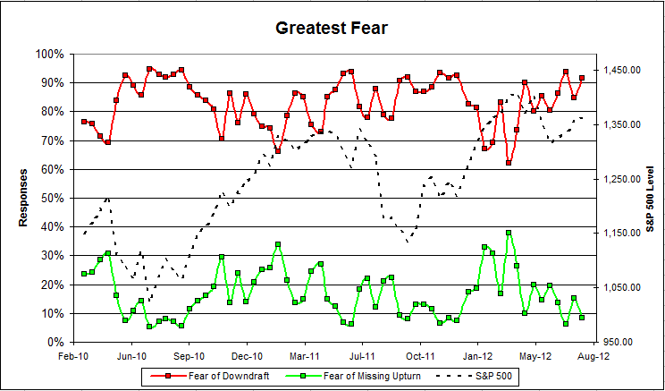
Chart 1: Greatest Fear. From survey to survey, the S&P; 500 rose 1.5%, but the greatest fear numbers did not perform as expected. The size of the fear of downturn group increased 85% to 91%, while fear of a missed upturn fell from 15% to 9%. Client sentiment remains poor even as the S&P; has risen.
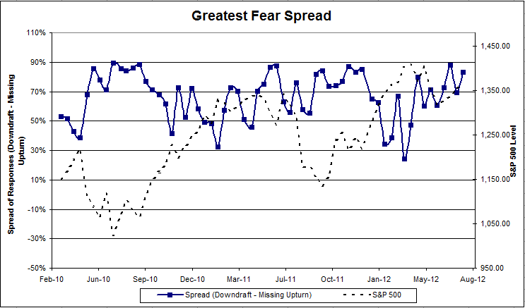
Chart 2: Greatest Fear Spread. Another way to look at this data is to examine the spread between the two groups. The spread increased from 69% to 83%.
Question 2. Based on their behavior, how would you rate your clients’ current appetite for risk?
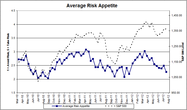
Chart 3: Average Risk Appetite. Average risk appetite usually falls in line with the market, but this week it did not. As the S&P; rose, average risk appetite fell from 2.49 to2.27.
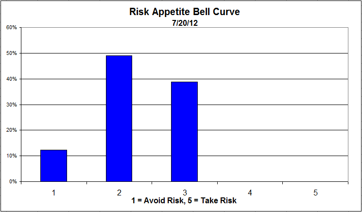
Chart 4: Risk Appetite Bell Curve. This chart uses a bell curve to break out the percentage of respondents at each risk appetite level. We are still seeing low risk appetites, with most clients having a risk appetite of 2 or 3. We had zero advisers say that their clients were looking for high risk investments this week.
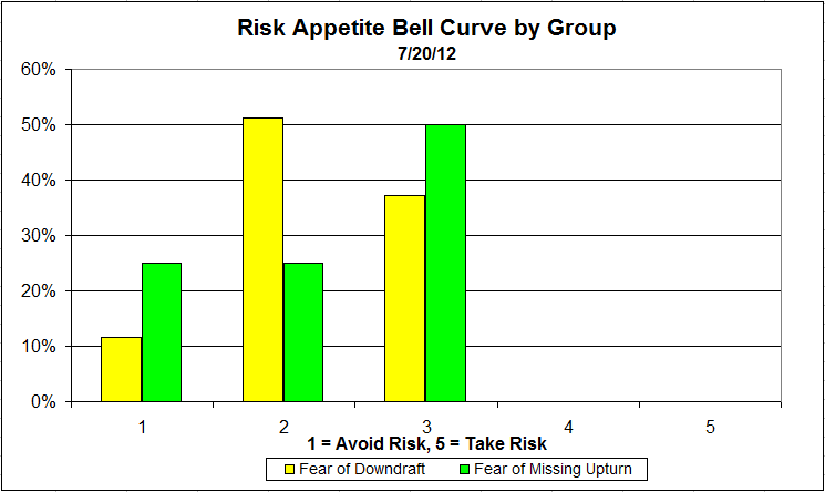
Chart 5: Risk appetite Bell Curve by Group. The next three charts use cross-sectional data. The chat plots the reported client risk appetite separately for the fear of downdraft and for the fear of missing upturn groups. This chart performs partially as expected. A higher percentage of the fear of missing an upturn respondents have a risk appetite of 3. However, a higher percentage of the upturn respondents have a risk appetite of 1. Both groups prefer a relatively low amount of risk.
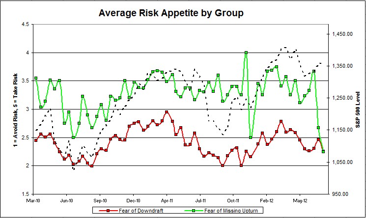
Chart 6: Average Risk Appetite by Group. The average risk appetite of both groups decreased this week, even as the market did well. The average risk appetite for the fear of missing an upturn group dropped to the lowest it has been since we started the survey. In fact, it converged with the average risk appetite of the fear of downdraft group.
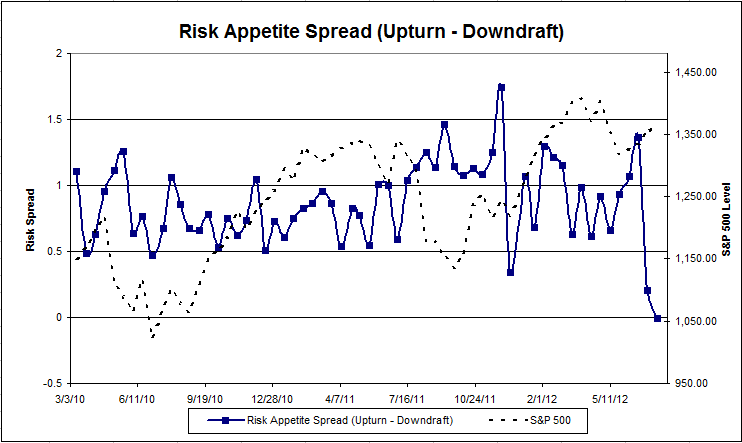
Chart 7: Risk Appetite Spread. This is a chart constructed from the data in Chart 6, where the average risk appetite of the downdraft group is subtracted from the average risk appetite of the missing upturn group. The spread decreased this round, and is the smallest spread we’ve seen yet.
The S&P; 500 rose by 0.59% from survey to survey, but most of our indicators did not respond accordingly. Average risk appetite fell, and more people feared a downturn. We’re not sure what caused such strange results this round.
No one can predict the future, as we all know, so instead of prognosticating, we will sit back and enjoy the ride. A rigorously tested, systematic investment process provides a great deal of comfort for clients during these types of fearful, highly uncertain market environments. Until next time, good trading and thank you for participating.
1 Comment | Investor Behavior, Markets, Sentiment | Permalink
Posted by:
Amanda Schaible
July 20, 2012
Here we have the next round of the Dorsey, Wright Sentiment Survey, the first third-party sentiment poll. Participate to learn more about our Dorsey, Wright Polo Shirt raffle! Just follow the instructions after taking the poll, and we’ll enter you in the contest. Thanks to all our participants from last round.
As you know, when individuals self-report, they are always taller and more beautiful than when outside observers report their perceptions! Instead of asking individual investors to self-report whether they are bullish or bearish, we’d like financial advisors to weigh in and report on the actual behavior of clients. It’s two simple questions and will take no more than 20 seconds of your time. We’ll construct indicators from the data and report the results regularly on our blog–but we need your help to get a large statistical sample!
Click here to take Dorsey, Wright’s Client Sentiment Survey.
Contribute to the greater good! It’s painless, we promise.
Leave a Comment » | Sentiment | Permalink
Posted by:
Amanda Schaible
July 16, 2012
Our latest sentiment survey was open from 7/6/12 to 7/13/12. The Dorsey, Wright Polo Shirt Raffle continues to drive advisor participation, and we greatly appreciate your support! We will announce the winner early next week. This round, we had 59 advisors participate in the survey. If you believe, as we do, that markets are driven by supply and demand, client behavior is important. We’re not asking what you think of the market—since most of our blog readers are financial advisors, we’re asking instead about the behavior of your clients. Then we’re aggregating responses exclusively for our readership. Your privacy will not be compromised in any way.
After the first 30 or so responses, the established pattern was simply magnified, so we are comfortable about the statistical validity of our sample. Most of the responses were from the U.S., but we also had multiple advisors respond from at least three other countries. Let’s get down to an analysis of the data! Note: You can click on any of the charts to enlarge them.
Question 1. Based on their behavior, are your clients currently more afraid of: a) getting caught in a stock market downdraft, or b) missing a stock market upturn?

Chart 1: Greatest Fear. From survey to survey, the S&P; 500 rose 1.5%, and the greatest fear numbers performed as expected. The size of the fear of downturn group decreased from 94% to 85%, while fear of a missed upturn rose from 6% to 15%. Overall, client sentiment remains poor.

Chart 2: Greatest Fear Spread. Another way to look at this data is to examine the spread between the two groups. The spread decreased from 88% to 69%.
Question 2. Based on their behavior, how would you rate your clients’ current appetite for risk?

Chart 3: Average Risk Appetite. Once again, the average risk appetite performed as expected, rising from 2.39 to 2.49. This indicator continues to fall in line with the market.

Chart 4: Risk Appetite Bell Curve. This chart uses a bell curve to break out the percentage of respondents at each risk appetite level. We are still seeing a low amount of risk, with most clients wanting a risk appetite of 2 or 3. Very few clients are looking for high risk investments.

Chart 5: Risk appetite Bell Curve by Group. The next three charts use cross-sectional data. The chat plots the reported client risk appetite separately for the fear of downdraft and for the fear of missing upturn groups. This chart performs as expected, with the upturn group wanting more risk than the downturn group. However, both groups prefer a relatively low amount of risk and the difference between the two is slight.

Chart 6: Average Risk Appetite by Group. The average risk appetite of those who fear a downturn increased with a market. However, the average risk appetite of those who fear missing an upturn decreased drastically, even as the market did well.

Chart 7: Risk Appetite Spread. This is a chart constructed from the data in Chart 6, where the average risk appetite of the downdraft group is subtracted from the average risk appetite of the missing upturn group. The spread decreased this round, and is the smallest spread we’ve seen yet.
The S&P; 500 rose by 1.5% from survey to survey, and most of our indicators responded accordingly. Average risk appetite rose, and fewer people feared a downturn. However, both groups had low average risk appetites.
No one can predict the future, as we all know, so instead of prognosticating, we will sit back and enjoy the ride. A rigorously tested, systematic investment process provides a great deal of comfort for clients during these types of fearful, highly uncertain market environments. Until next time, good trading and thank you for participating.
Leave a Comment » | Investor Behavior, Markets, Sentiment | Permalink
Posted by:
Amanda Schaible
July 6, 2012
Here we have the next round of the Dorsey, Wright Sentiment Survey, the first third-party sentiment poll. Participate to learn more about our Dorsey, Wright Polo Shirt raffle! Just follow the instructions after taking the poll, and we’ll enter you in the contest. Thanks to all our participants from last round.
As you know, when individuals self-report, they are always taller and more beautiful than when outside observers report their perceptions! Instead of asking individual investors to self-report whether they are bullish or bearish, we’d like financial advisors to weigh in and report on the actual behavior of clients. It’s two simple questions and will take no more than 20 seconds of your time. We’ll construct indicators from the data and report the results regularly on our blog–but we need your help to get a large statistical sample!
Click here to take Dorsey, Wright’s Client Sentiment Survey.
Contribute to the greater good! It’s painless, we promise.
Leave a Comment » | Investor Behavior, Markets, Sentiment | Permalink
Posted by:
JP Lee
July 3, 2012
This is getting serious! We’ve written about this “death of equities” theme before. The strategist at Bank of America Merrill Lynch rolled out some interesting data today regarding the “death of equities.” Despite generally rising prices for the past three years, stocks have gotten very little respect—and now there’s this from an article at CNBC:
For a group notorious for its irrational exuberance at the very worst times, Wall Street strategists have taken a decidedly bearish tack as of late.
In fact, their current consensus allocation to stocks versus bonds and other asset classes makes the group the most bearish since 1997, according to data compiled by Bank of America Merrill Lynch.
This average equity allocation at 49.3 percent is “the first time below 50 in nearly 15 years, suggesting that sell side strategists are now more bearish on equities than they were at any point during the collapse of the tech bubble or the recent financial crisis,” wrote Savita Subramanian, chief U.S. equity and quant strategist for the firm, in a note entitled, “Wall Street Proclaims the Death of Equities.”
I put the fun part in bold. This is the most bearish that strategists have been for 15 years! The best thing about their bearishness, though, is the implication from contrary opinion.
Bank of America’s Subramanian actually has the data that backs up this contrarian view. According to her report, when the indicator has hit levels this low over the last 27 years, total returns for the market have been positive 100 percent of the time, with a median return of more than 30 percent.
It makes perfect sense, given what we know about investor sentiment and subsequent returns. Who knows what will happen this time around—but those odds seem pretty good for stock investors.

Have Equities Kicked the Bucket?
Source: jjchandler.com
2 Comments | Investor Behavior, Markets, Sentiment, Thought Process | Tagged: contrary opinion, death of equities, investor behavior, investor sentiment | Permalink
Posted by:
Mike Moody


