More on the Death of Equities

July 3, 2012

This is getting serious! We’ve written about this “death of equities” theme before. The strategist at Bank of America Merrill Lynch rolled out some interesting data today regarding the “death of equities.” Despite generally rising prices for the past three years, stocks have gotten very little respect—and now there’s this from an article at CNBC:

For a group notorious for its irrational exuberance at the very worst times, Wall Street strategists have taken a decidedly bearish tack as of late.

In fact, their current consensus allocation to stocks versus bonds and other asset classes makes the group the most bearish since 1997, according to data compiled by Bank of America Merrill Lynch.

This average equity allocation at 49.3 percent is “the first time below 50 in nearly 15 years, suggesting that sell side strategists are now more bearish on equities than they were at any point during the collapse of the tech bubble or the recent financial crisis,” wrote Savita Subramanian, chief U.S. equity and quant strategist for the firm, in a note entitled, “Wall Street Proclaims the Death of Equities.”

I put the fun part in bold. This is the most bearish that strategists have been for 15 years! The best thing about their bearishness, though, is the implication from contrary opinion.

Bank of America’s Subramanian actually has the data that backs up this contrarian view. According to her report, when the indicator has hit levels this low over the last 27 years, total returns for the market have been positive 100 percent of the time, with a median return of more than 30 percent.

It makes perfect sense, given what we know about investor sentiment and subsequent returns. Who knows what will happen this time around—but those odds seem pretty good for stock investors.

Have Equities Kicked the Bucket?

Source: jjchandler.com

Posted by:


From the Archives: Markets Act Like Real People

July 3, 2012

Critics of the Efficient Markets Hypothesis continue to get more press. Newsweek’s Barrett Sheridan recently wrote an article that discusses the Efficient Markets Hypothesis (EMH) versus the adaptive-markets hypothesis (AMH). He mentions one of the key flaws in EMH: that market participants are rational.

He goes on to focus on MIT professor Andrew Lo and his AMH work. Lo does not share the EMH tenet that the financial markets consist of cool, calm, and rational investors. He suggests that investors will behave differently depending on their psychology at any given moment. (Some of the old brokers I knew called it the fear-greed pendulum.) It follows that any investment rule based on a fixed measurement of value for the market such as yield, P/E ratio, etc. will work only sporadically over time if the AMH is valid. Nothing is set in stone because investors continually change and adapt to the market ecosystem.

Our Systematic RS portfolios use relative measurements. We believe in an adaptive approach to investing that recognizes that since markets are controlled by real people, they act like real people.

—-this article originally appeared 1/5/2010. Every advisor knows that the risk tolerance of clients changes over the course of a market cycle. I still can’t figure out why anyone thinks that the Efficient Markets Hypothesis ever made sense.

Posted by:


The VIX and Relative Strength Returns

July 3, 2012

In this post, I’ll be looking at another market indicator, the VIX, which is otherwise known as the fear index. The Chicago Board Options Exchange Market Volatility Index measures the expected market volatility over the next 30 days. When VIX is low, there is a low expectation of volatility; and when high, the opposite is true. The VIX is quoted in percentage points, and roughly correlates with the expected annualized percentage change of the S&P; 500.

Looking at monthly data starting in 1990, the VIX has ranged from about 10 at the end of January 2007 to about 60 at the end of October 2008. The highest reading ever was an intra-day high 89.53 on October, 24th 2008. In fact, 7 of the highest 10 readings have occurred since the financial crisis started in 2008.

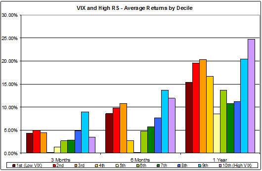
To find returns, we’ve sorted the VIX into deciles, from lowest to highest. We then used Ken French’s high relative strength database (explained here) to determine the average percentage of growth 3, 6, and 12 months out.

Chart 1: Average Relative Strength Returns by VIX Decile.

The returns tend to have a U shape, with high returns at both extremes of the VIX. This is true when looking at all three periods (3, 6, and 12 months). Furthermore, average returns have been best when the VIX is extremely high rather than extremely low. To get some perspective, the bottom 20% of month-end readings range from 10 to 13, and the top 20% range from 25 to 60.

Even though some of the largest growth rates have occurred when the VIX is high, we must remember that most investors are risk averse and prefer low volatility. Therefore, convincing clients to invest when the VIX is high may be a daunting task. If you’d like to read more, both the VIX index and the preference for low volatility are discussed in this previous blog post.

There have been consistent relative strength return trends when looking at VIX readings over the past 22 years. If these trends continue, there may be high future returns next time the VIX hits an extreme level.

Posted by:


Relative Strength Spread

July 3, 2012

The chart below is the spread between the relative strength leaders and relative strength laggards (universe of mid and large cap stocks). When the chart is rising, relative strength leaders are performing better than relative strength laggards. As of 7/2/2012:

The RS Spread pulled back over the past week, but continues to trade above its 50 day moving average.

Posted by: