Relative Strength, Decade by Decade

June 5, 2012

This post explores relative strength success by decade, dating back to the 1930s. Once again, we’ve used the Ken French data library and CRSP database data. You can click here for a more complete explanation of this data.

Chart 1: Percent Outperformance by Decade. This chart shows the number of years in which relative strength has outperformed the CRSP universe each decade. RS outperformance has occurred in at least half of all years each decade.

Chart 2: Average 1-Year Performance by Decade. This chart shows the average yearly growth by decade of a relative strength portfolio and of the CRSP universe. Each decade, the average performance of relative strength has been greater than the average performance of the CRSP universe. Generally speaking, when the market’s average performance is increasing, RS outperforms CRSP by a greater percentage than it does when the market is doing poorly.

In short, relative strength has been a durable return factor for a very long time.

Posted by:


Stellar Performance—Out of the Limelight

June 4, 2012

Ron Lieber of the NYT explains his surprise that some of the biggest winners over the last 30 years are not the companies that get all the hype:

This week, I asked Wilshire Associates to look back 30 years to the beginning of the big bull run in stocks and figure out which of the companies in its index of more than 5,000 American enterprises had performed best over that stretch.

My guess is that you haven’t heard of half of the Top 10.

Back in 1982, would you have staked your claim on Danaher, the conglomerate that comes in at No. 3? Or might you have waited a few more years, until it was loaded up with debt courtesy of Michael Milken, the onetime junk bond king?

What about Apco Oil & Gas at No. 4? Or Precision Castparts at No. 7? Or maybe the high-tech balloons made by Raven Industries at No. 8 would have been more your taste. Ever heard of HollyFrontier at No. 10?

You get the idea. To have earned the 21 to 26 percent annualized returns (including reinvested dividends) that these companies delivered to investors over the last 30 years, you would have had to pick them out, invest enough to move the needle in your portfolio and then be smart enough to hang on.

Let’s start with selecting the stocks. The top-performing stock on the Wilshire list is Home Depot. Was anyone pointing at that company back in the early 1980s and insisting that it was going to the moon?

“Oh no,” said Arthur Blank, one of Home Depot’s founders, when I asked him this week. “We had no idea that was going to happen. When we went public in 1981, we only had eight stores.”

Indeed, the best investments are often the ones that few people have heard of, and sometimes the companies like it that way.

One of the benefits of building portfolios based on relative strength ranks is that the amount of hype that a company receives has no impact on whether or not the company is included in the portfolio. Certainly, some on that list have received considerable amounts of attention, like Apple, but I think Lieber is right that many of the other names are off the radar of many investors. A relative strength ranking system is a true meritocracy where securities are added and removed from portfolios based on one essential criteria—performance of that security relative to all other securities in the investment universe.

Dorsey Wright currently owns a number of the securities listed above. A list of all holdings for the trailing 12 months is available upon request.

Posted by:


Relative Strength vs. Value - Performance Over Time

May 31, 2012

Thanks to the large amount of stock data available nowadays, we are able to compare the success of different strategies over very long time periods. The table below shows the performance of two investment strategies, relative strength (RS) and value, in relation to the performance of the market as a whole (CRSP) as well as to one another. It is organized in rolling return periods, showing the annualized average return for periods ranging from 1-10 years, using data all the way back to 1927.

The relative strength and value data came from the Ken French data library. The relative strength index is constructed monthly; it includes the top one-third of the universe in terms of relative strength. (Ken French uses the standard academic definition of price momentum, which is 12-month trailing return minus the front-month return.) The value index is constructed annually at the end of June. This time, the top one-third of stocks are chosen based on book value divided by market cap. In both cases, the universes were composed of stocks with market capitalizations above the market median.

Lastly, the CRSP database includes the total universe of stocks in the database as well as the risk-free rate, which is essentially the 3-month Treasury bill yield. The CRSP data serves as a benchmark representing the generic market return. It is also worthwhile to know that the S&P; 500 and DJIA typically do worse than the CRSP total-market data, which makes CRSP a harder benchmark to beat.

Source:Dorsey Wright Money Management

The data supports our belief that relative strength is an extremely effective strategy. In rolling 10-year periods since 1927, relative strength outperforms the CRSP universe 100% of the time. Even in 1-year periods it outperforms 78.6% of the time. As can be seen here, relative strength typically does better in longer periods. While it is obviously possible do poorly in an individual year, by continuing to implement a winning strategy time and time again, the more frequent and/or larger successful years outweigh the bad ones.

Even more importantly, relative strength typically outperforms value investment. Relative strength defeats value in over 57% of periods of all sizes, doing the best in 10-year periods with 69.3% of trials outperforming. While relative strength and value investment strategies have historically both generally beat the market, relative strength has been more consistent in doing so.

Posted by:


From the Archives: The Math Behind Manager Selection

May 31, 2012

Hiring and firing money managers is a tricky business. Institutions do it poorly (see background post here ), and retail investors do it horribly (see article on DALBAR ). Why is it so difficult?

This white paper on manager selection from Intech/Janus goes into the mathematics of manager selection. Very quickly it becomes clear why it is so hard to do well.

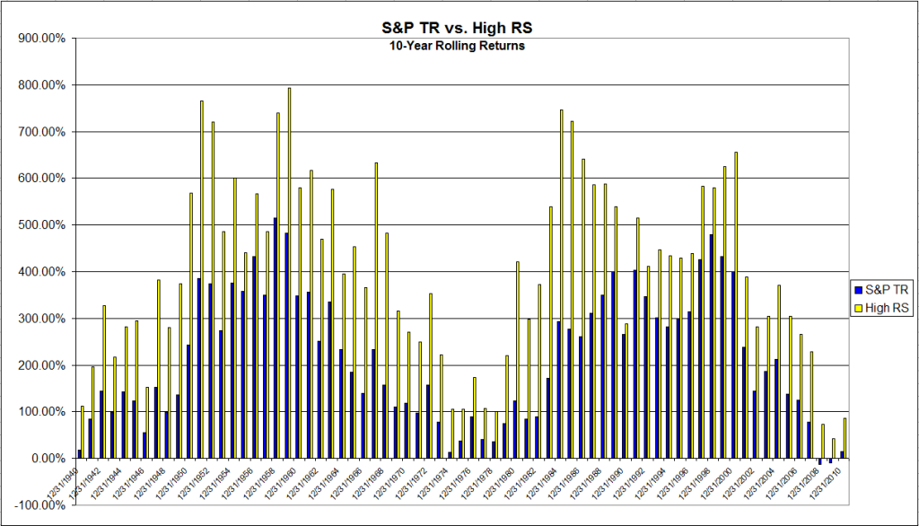
Many investors believe that a ten-year performance record for a group of managers is sufficiently long to make it easy to spot the good managers. In fact, it is unlikely that the good managers will stand out. Posit a good manager whose true average relative return is 200 basis points (bps) annually and true tracking error (standard deviation of relative return) is 800 bps annually. This manager’s information ratio is 0.25. To put this in perspective, an information ratio of 0.25 typically puts a manager near or into the top quartile of managers in popular manager universes.

Posit twenty bad managers with true average relative returns of 0 bps annually, true tracking error of 1000 bps annually, hence an information ratio of 0.00.

There is a dramatic difference between the good manager and the bad managers.

The probability that the good manager beats all twenty bad managers over a ten-year period is only about 9.6%. This implies that chasing performance leaves the investor with the good manager only about 9.6% of the time and with a bad manager about 90.4% of the time.

In other words, 90% of the time the manager with the top 10-year track record in the group will be a bad manager! Maybe a longer track record would help?

A practical approach is to ask how long a historical performance record is necessary to be 75% sure that the good manager will beat all the bad managers, i.e., have the highest historical relative return. Assuming the same good manager as before and twenty of the same bad managers as before, a 157 year historical performance record is required to achieve a 75% probability that the good manager will beat all the bad managers.

It turns out that it would help, but since none of the manager databases have 150-year track records, in practice it is useless. The required disclaimer that past performance is no guarantee of future results turns out to be true.

There is still an important practical problem to be solved here. Assuming that bad managers outnumber good ones and assuming that we don’t have 150 years to wait around for better odds, how can we increase our probability of identifying one of the good money managers?

The researchers show mathematically how combining an examination of the investment process with historical returns makes the decision much simpler. If the investor can make a reasonable assumption about a manager’s investment process leading to outperformance, the math is straightforward and can be done using Bayes’ Theorem to combine probabilities.

…the answer changes based on the investor’s assessment of the a priori credibility of the manager’s investment process.

It turns out that the big swing factor in the answer is the credibility of the underlying investment process. What are the odds that an investment process using Fibonacci retracements and phases of the moon will generate outperformance over time? What are the odds that relative strength or deep value will generate outperformance over time?

The research paper concludes with the following words of wisdom:

A careful examination of almost any investor’s investment manager hiring and firing process is likely to reveal that there is a substantial component of performance chasing. Sometimes it is obvious, e.g., when there is a policy of firing a manager if he has negative performance after three years. Other times it is subtle, e.g., when the initial phase of the manager search process strongly weights attractive historical performance. No matter the form that performance chasing takes, it tends to produce future relative returns that are disappointing compared to expectations.

Historical performance alone is not an effective basis for identifying a good manager among a group of bad managers. This does not mean that historical performance is useless. Rather, it means that it must be combined efficiently with other information. The correct use of historical performance relegates it to a secondary role. The primary focus in manager choice should be an analysis of the investment process. [emphasis added]

This research paper is eye-opening in several respects.

1) It shows pretty clearly that historical performance alone–despite what our intuition tells us–is not sufficient to select managers. This probably accounts for a great deal of the poor manager selection, the subsequent disappointment, and rapid manager turnover that goes on.

2) It is very clear from the math that only credible investment processes are likely to generate long-term outperformance. Fortunately, lots of substantive academic and practitioner research has been done on factor analysis leading to outperformance. The only two broadly robust factors discovered so far have been relative strength and value, both in various formulations–and, obviously, they have to be implemented in a disciplined and systematic fashion. If your investment process is based on something else, there’s a decent chance you’re going to be disappointed.

3) Significant time is required for the best managers to stand out from the much larger pack of mediocre managers.

This is a demanding process for consultants and clients. They have to willfully reduce their focus on even 10-year track records, limit their selection to rigorous managers using proven factors for outperformance, and then exercise a great deal of patience to allow enough time for the cream to rise to the top. The rewards for doing so, however, might be quite large–especially since almost all of your competition will ignore the correct process and and simply chase performance.

—-this article originally appeared 1/28/2010. I have seen no evidence since then that most consultants have improved their manager selection process, which is a shame.

Posted by:


Emerging Markets Investing

May 23, 2012

Index Universe has an article pointing out that simply buying a large, cap-weighted index might not be the way to go in emerging markets. For one thing, China, Brazil, South Korea, Taiwan are 60% of the fund. The article discusses potential problems in some of the BRIC markets, and then proceeds to pick out a bunch of promising countries like Poland, Turkey, and Indonesia.

Personally, I suspect that buying a large cap-weighted index and then hoping for the best was never a very viable strategy. Perhaps it happened to work out over certain time periods, but things change and different economies can have really different stock market performance. And I have to say that I don’t have a lot of confidence in analyst’s guesses either, although I’m sure they know a lot more about the fundamentals of overseas economies than I do.

Here’s a thought: let relative strength sort out where you should be investing. For example, here’s the current country breakdown for the DWA Emerging Markets Technical Leaders Index, as seen through the holdings of PIE, the Powershares ETF based on the index:

Source: Powershares (data as of 3/31/2012)

Malaysia, Mexico, and Indonesia are the largest weights right now—and those weights are based entirely on the objective performance of the underlying stocks in the market, not on someone’s opinion about what market will be good. When performance changes, the weights will change, often substantially. As an investor, you don’t have to contemplate whether or when the Czech Republic might outperform India. The weights change quarterly without you having to worry about it.

Relative strength is a different, and dynamic, way of investing globally.

See www.powershares.com for more information about PDP, PIE and PIZ. Past performance is no guarantee of future returns. A list of all holdings for the trailing 12 months is available upon request.

Posted by:


Relative Strength Still Off the Radar

May 16, 2012

The Big Picture has a thumbnail summary of the annual Merrill Lynch US Equity and US Quant Strategy pieces, where they interview 100 large institutional managers. Of particular interest to me was the top ten return factors by popularity.

via The Big Picture (click on image to enlarge)

You can see that relative strength did not crack the top ten. On the bigger chart, which you can see in the article, relative strength came in at #11. Of course, there are many formulations of relative strength, so even that ranking probably covers a lot of different methods.

A number of the popular factors are value-related and some are based on profitability. All of these factors ultimately interact in complicated ways, but you don’t have to worry about a crowded trade in relative strength.

Value, quality, and risk-related factors are all much more popular than relative strength.

via The Big Picture (click on image to enlarge)

Posted by:


Warren Buffett vs. Gold

May 9, 2012

Warren Buffett reiterated at his recent “Woodstock for Capitalists,” otherwise known as Berkshire Hathaway’s annual meeting, that he much preferred productive assets to gold. Charlie Munger agreed. For the record, I’ve got nothing against productive assets. They produce earnings and sometimes dividends and that’s nice. However, a global tactical asset allocator should not be too eager to count out gold.

Gold has had good relative strength for much of the last decade—and as a result it has dramatically outperformed Warren Buffett. Bespoke took up this exact issue and had this to say:

Given the fact that BRK/A does not pay a dividend, no matter how much a holder ‘fondles’ or looks at their holdings, one share of BRK/A stock purchased twelve years ago is still one share today. Sure, you can sell it for more now than you bought it then, but the same is true of gold. In fact, your gain on gold is considerably more than your gain would be on BRK/A. Looking at the performance of the two assets since the start of 2000 shows that the value of gold has increased considerably more than the value of Berkshire Hathaway. In fact, with a gain of 466% since the start of 2000, gold’s gain has been nearly four times the return of BKR/A (466% vs 120%).

Their nifty graphic follows:

Source: Bespoke (click on image to enlarge)

Relative strength has no axe to grind. One of the great benefits of using relative strength to drive tactical asset allocation is that it is objective and adaptive. Relative strength does not have a philosophical bias in favor of, or against, gold. If relative strength is high, perhaps it should be included in the portfolio. If relative strength is low, it’s out—period.

The point of investing is not to serve our biases, but to own the best-performing assets that we can identify.

Posted by:


Factor Investing

May 8, 2012

Diversification, risk management, and returns are all important in investing. Increasingly, factor exposure is being used to accomplish these goals. A Wall Street Journal article covered the issue very well (may be behind a pay wall, sorry).

By changing the way you spread out your stock holdings, you can reduce risk and boost returns—even in a highly correlated market like today’s.

The trick? A concept known as “factor investing,” which originated in academia two decades ago and now is finding favor among institutional investors and high-end financial advisers.

Factor investing replaces traditional asset allocation—such as a portfolio with 30% in U.S. stocks, 20% in developed international markets, 10% in emerging markets and 40% in bonds—by focusing on specific attributes that researchers say drive returns. These “risk factors” include the familiar—like small versus large-size companies or growth versus value stocks—as well as more esoteric measures such as volatility, momentum, dividend yield, economic sensitivity and the health of a company’s balance sheet.

As a reader of this blog, you’re probably already familiar with factor investing through relative strength—something that academics call momentum. Using factors rather than style boxes has some advantages.

“There are a lot of nuances you may be missing by focusing only on style and size,” says Savita Subramanian, head of equity and quantitative strategy at BofA Merrill Lynch Global Research. “You may be missing a whole layer of outperformance you could have gotten.”

Some fairly high-end investors are converting portfolios to focus on factor exposures. By converting to factor exposure, investors are trying to drill down to the actual return drivers.

Big investors are taking heed. In 2009, researchers assigned to analyze the Norwegian Government Pension Fund recommended it reorient its portfolio around risk factors. And the California Public Employees’ Retirement System underwent a similar change in approach in 2010.

After 2008, big investors discovered that they had factor exposure anyway—it was just exposure they were not aware of and hadn’t controlled. There’s a lot less potential for surprise if the factor exposures are constructed deliberately!

New products are becoming available to feed the demand for factor exposure as well.

Until recently, it was hard for small investors to dabble in factor investing. But that is changing.

In the past year at least six firms—BlackRock’s iShares, Russell Investments, Invesco PowerShares, Factor Advisors, QuantShares and State Street Global Advisors—have launched factor-based exchange-traded funds, or have filed paperwork to do so.

Of course, overlooked among the rush of big firms racing to create factor exposure is the grand-daddy of relative strength, the Powershares DWA Technical Leaders Index (PDP). It’s actually been around more than five years and has performed nicely over that time, beating the S&P; 500 despite a market environment that has been hostile to relative strength strategies. (We’re looking forward to seeing how it performs in a better RS market!)

One of the big advantages of factor exposure is that some factors offset one another beautifully. We’ve written before about the nice efficient frontier that is created by combining relative strength and low volatility. (You can see the chart below.) These factors work well together because the excess returns are uncorrelated.

Source: Dorsey Wright (click to enlarge to full size)

In short, there’s more to portfolio construction than asset allocation and style boxes. Factor exposure should be considered as well if the result is a better portfolio for the client.

See www.powershares.com for more information about PDP. Past performance is no guarantee of future returns. A list of all holdings for the trailing 12 months is available upon request.

Posted by:


Relative Strength-A Critical Portfolio Management Tool

February 13, 2012

Mike Moody’s Relative Strength–A Critical Portfolio Management Tool now appears in the current issue of IMCA’s Journal of Investment Consulting. Whether you are managing relative strength portfolios yourself or you are employing relative strength strategies, this article answers the essential questions:

  • What is relative strength?
  • Why does it work?
  • Where does it work?
  • What have been the results?
  • What are its drawbacks?
  • How does it fit in an asset allocation?

Click here to read the article.

Posted by:


Momentum Over Multiple Cycles

November 23, 2011

In a recent interview, Jim O’Shaughnessy made the case for following quantitative strategies that have performed well over multiple market cycles:

The average investor does significantly worse than a simple index … It’s literally because of the way our brains are wired. As [neuro-finance researchers] look at super-fast scans of the brain making decisions under uncertainty, we see that even with a so-called professional investor making the choice, it is not the rational centres of the brain that fire when they’re making those choices. It is the emotional centres of the brain.

That’s one of the reasons why finding good strategies that have performed well over multiple market cycles – and then having the ability to stick with them through thick and thin, even when they’re not working for you – is the key to good long-term success.

Which brings me to the long-term performance of relative strength strategies. We tracked down total return data for the S&P; 500 going back to 1930 and compared it to the momentum series on the website of Ken French at Dartmouth (top half in market cap, top 1/3 in momentum). The chart below shows 10-year rolling returns, which is why it starts in 1940. The average ten-year returns? 405% for relative strength and 216% for the S&P; 500, a near doubling! That’s without the momentum series getting any credit for dividends. Even more impressive, the ten-year rolling return of the relative strength series outperformed in 100% of the time periods.

Click to enlarge

Source: J.P. Lee, Dorsey, Wright Money Management

Results such as these should provide more than enough confidence to stick with relative strength through the thick and thin.

Posted by:


Combining Relative Strength and Low Volatility

October 12, 2011

The power of relative strength as a return factor has been well documented and that evidence is the reason that relative strength drives all of our investment strategies. However, just because it is a winning return factor over time doesn’t mean that anyone should or will construct an asset allocation composed entirely of relative strength-based strategies. Financial advisors who are in a position to decide which strategies to include in an asset allocation must then decide how to find complementary return factors. We have previously written about the benefits of combining relative strength and value, for example.

However, it appears that value is not the only suitable complement for relative strength strategies. Another option would be to consider combining the recently introducted PowerShares S&P; Low Volatility Portfolio (SPLV) with our own PowerShares DWA Techical Leaders Portfolio (PDP).

A description of each is as follows:

The PowerShares DWA Technical Leaders Portfolio (PDP) is based on the Dorsey Wright Technical Leaders™ Index (Index). The Fund will normally invest at least 90% of its total assets in securities that comprise the Index and ADRs based on the securities in the Index. The Index includes approximately 100 U.S.-listed companies that demonstrate powerful relative strength characteristics. The Index is constructed pursuant to Dorsey Wright proprietary methodology, which takes into account, among other factors, the performance of each of the 3,000 largest U.S.-listed companies as compared to a benchmark index, and the relative performance of industry sectors and sub-sectors. The Index is reconstituted and rebalanced quarterly using the same methodology described above.

The PowerShares S&P; 500® Low Volatility Portfolio (SPLV) is based on the S&P; 500® Low Volatility Index (Index). The Fund will invest at least 90% of its total assets in common stocks that comprise the Index. The Index is compiled, maintained and calculated by Standard & Poor’s and consists of the 100 stocks from the S&P; 500 Index with the lowest realized volatility over the past 12 months. Volatility is a statistical measurement of the magnitude of up and down asset price fluctuations over time.

The efficient frontier below points out that combining the two can be an effective way to reduce the volatility and/or increase the return over using PDP or SPLV independently.

(Click to enlarge)

The table below is also for the period April 1997-September 2011. (The hypothetical returns for PDP only go back to April 1997.)

Perhaps most interesting to asset allocators is the fact that the correlation of excess returns of PDP and SPLV over this time period was -0.29. The goal of asset allocation is to not only add value, but to also construct an allocation that clients will stay with for the long-run. Rather than whip in and out of PDP, perhaps a more enlightened approach is to buy and hold positions in both PDP and SPLV for a portion of the allocation.

For the time periods when hypothetical returns were used, the returns are that of the PowerShares Dorsey Wright Technical Leaders Index and of the S&P; 500 Low Volatility Index. The hypothetical returns have been developed and tested by the Manager (Dorsey Wright in the case of PDP and Standard & Poors in the case of SPLV), but have not been verified by any third party and are unaudited. The performance information is based on data supplied by the Dorsey Wright or from statistical services, reports, or other sources which Dorsey Wright believes are reliable. The performance of the Indexes, prior to the inception of actual management, was achieved by means of retroactive application of a model designed with hindsight. For the hypothetical portfolios, returns do not represent actual trading or reflect the impact that material economic and market factors might have had on the Manager’s decision-making under actual circumstances. Actual performance of PDP began March 1, 2007 and actual performance of SPLV began May 5, 2011. See PowerShares.com for more information.

Posted by:


Relative Strength and Market Volatility

September 30, 2011

Markets have been extremely volatile over the last couple of months. Volatile markets are very difficult to navigate. It is very easy to make mistakes, and when a mistake is made it is magnified by the volatility. From a relative strength standpoint, there are things you can do to help ease the pain of all of these large, unpredictable market moves. But judging by all the client calls we have taken over the years–almost always when volatility was high–the steps needed to make a relative strength model perform well are most definitely not what most investors would think!

Before we look at relative strength specifically, let’s take a step back and look at different investment strategies on a very broad basis. There are really two types of strategies: trend continuation and mean reversion. A trend continuation strategy buys a security and assumes it will keep moving in the same direction. A mean reversion (or value) strategy buys a security and assumes it will reverse course and come closer to a more “normal” state. Both strategies work over time if implemented correctly, but volatility affects them in different ways. Mean reversion strategies tend to thrive in high volatility markets, as those types of markets create larger mispricings for value investors to exploit.

When we construct systematic relative strength models, we have always preferred to use longer-term rather than shorter-term signals. This decision was made entirely on the basis of data—by testing many models over a lot of different types of markets. Judging by all the questions we get during periods of high volatility, I would guess that using a longer-term signal when the market is volatile strikes most investors as counter-intuitive. In my years at Dorsey Wright, I can’t remember talking to a single client or advisor that told me when markets get really volatile they look to slow things down!

During volatile markets, generally we hear the opposite view–everyone wants to speed up their process. Speeding up the process can take many forms. It might mean using a smaller box size on a point and figure chart, or using a 3-month look back instead of a 12-month look back when formulating your rankings. It might be as simple as rebalancing the portfolio more often, or tightening your stops. Whatever the case, most investors are of the opinion that being more proactive in these types of markets makes performance better.

Their gut response, however, is contradicted by the data. As I mentioned before, our testing has shown that slowing down the process actually works better in volatile markets. And we aren’t the only ones who have found that to be the case! GMO published a whitepaper in March 2010 that discussed momentum investing (the paper can be found here). Figure 17 on page 11 specifically addresses what happens to relative strength models during different states of market volatility.

(Click Image To Enlarge. Source: GMO Whitepaper, Sept. 2010)

The chart clearly shows how shortening your look back period decreases performance in volatile markets. The 6-12 month time horizon has historically been the optimal time frame for formulating a momentum model. But when the market gets very volatile, the best returns come from moving all the way out to 12 months, not shortening your window to make your model more sensitive.

Psychologically, it is extremely difficult to lengthen your time horizon in volatile markets. Every instinct you have will tell you to respond more quickly in order to get out of what isn’t working and into something better. But the data says you shouldn’t shorten your window, and conceptually this makes sense. Volatile markets tend to be better for mean reversion strategies. But for a relative strength strategy, volatile markets also create many whipsaws. When thinking about how volatility interacts with relative strength, it makes sense to lengthen your time horizon. Hopping on every short term trend is problematic if the trends are constantly reversing! All the volatility creates noise, and the only way to cancel out the noise is to use more (not less) data. You can’t react to all the short-term swings because the mean reversion is so violent in volatile markets. It doesn’t make any sense to get on trends more rapidly when you are going through a period that is not optimal for a trend following strategy.

We use a data-driven process to construct models. We have found that using a relatively longer time horizon, while uncomfortable, ultimately leads to better performance over time. Outside studies show the same thing. If the data showed that reacting more quickly to short-term swings in volatile markets was superior we would advocate doing exactly that!

As is often the case in the investing world, this seems to be another situation where doing the most uncomfortable thing actually leads to better performance over time. Good investing is an uphill run against human nature. Of course, it stands to reason that that’s the way things usually are. If it were comfortable, everyone would do it and investors would find their excess return quickly arbitraged away.

Posted by:


Dare to be Different

July 28, 2011

Advisor Perspectives ran a recent article by Sitka Pacific’s J.J. Abodeely. There was a fantastic quotation he pulled out from Ben Inker at GMO:

“The good news is that in the investment business there are very few people who do real asset allocation and actually move money around in an aggressive way,” Inker said. “It’s a tough thing to do and survive. The nice thing about it, and the reason why we do it, is because this means it’s an inefficiency that is not going to get arbitraged away anytime soon.”

We’ve written in the past about this exact feature of many winning investment strategies: the arbitrage involved is behavioral, not financial. Good returns derived from uncomfortable strategies do not get arbitraged away, because very few people will actually do it. In other words, if you look at your portfolio and get a warm, fuzzy feeling, you’re probably doing it wrong.

Simple examples of this phenomenon abound. Here’s one: to lose weight 1) eat less and 2) exercise more. Have I now arbitraged away the entire diet book industry because I just gave you the basic advice for free? Of course not! When I searched Amazon for “The * Diet,” I got 65,338 results (!!), ranging from The Warrior Diet to Crazy Sexy Diet to The Juice Lady’s Turbo Diet. Although I am in awe of publishers’ ingenuity in coming up with great book titles, none of these diets will necessarily work any better than my basic advice. The reason people struggle to lose weight is not because reasonable advice is not readily available; it’s because the advice is hard to implement. Eating less and exercising more is simply less comfortable than our default position of eating more and exercising less!

Relative strength is often an uncomfortable strategy whether it is implemented in equities or global asset classes simply because the portfolios can deviate significantly from the market or from traditional notions of asset allocation. On the plus side, it may give you some comfort to realize that relative strength methods have shown excellent returns for many decades—returns that are not likely to be arbitraged away unless human nature undergoes a substantial change.

Dare to be different

Source: www.samdiener.com

Posted by:


Never Underestimate Inertia!

July 8, 2011

The law of unintended consequences strikes again. A few years ago, in 2006 to be exact, legislation enabling automatic employee enrollment in 401ks was passed in order to boost retirement savings. An article in the Wall Street Journal suggests that automatic enrollment might be having the opposite effect.

Under the law, companies are allowed to automatically enroll workers in their 401(k) plans, rather than require employees to sign up on their own. The measure was intended to encourage more people to bulk up their retirement nest eggs—a key goal in a country where millions of people aren’t saving enough.

But an analysis done for The Wall Street Journal shows about 40% of new hires at companies with automatic enrollments are socking away less money than they would if left to enroll voluntarily, the Employee Benefit Research Institute found.

More people were getting enrolled in the plan, but the initial contribution rates were set at lower levels than new enrollees typically selected on their own!

More than two-thirds of companies set contribution rates at 3% of salary or less, unless an employee chooses otherwise. That’s far below the 5% to 10% rates participants typically elect when left to their own devices, the researchers said.

Some of the plans have automatic escalation, but even these plans did not seem to go far enough.

An October study by EBRI and the Defined Contribution Institutional Investment Association found that, depending on their incomes, 54% to 73% of employees would fall short of amassing enough money to retire if they enrolled in their companies’ 401(k) plans at the default-contribution rate and were auto-escalated by 1% a year to a maximum of 6%.

The net result has been a mixed bag. Enrollment rates have climbed from 67% to 85%, but contribution rates have dropped!

Among plans Aon Hewitt administers, the average contribution rate declined to 7.3% in 2010, from 7.9% in 2006. The Vanguard Group Inc. says average contribution rates at its plans fell to 6.8% in 2010, from 7.3% in 2006. Over the same period, the average for Fidelity Investments’ defined contribution plans decreased to 8.2%, from 8.9%.

Vanguard estimates about half the decline “was attributable to increased adoption of auto-enrollment.”

Obviously, it’s not the auto-enrollment itself that’s the problem. It’s simply that most of the plans have the automatic enrollment savings rate or the top escalation rate set way, way too low—and Big Brother underestimated inertia.

The study found that if people were auto-enrolled at 3%, they were just too lazy to proactively change it to 10%, or whatever. If you are in charge of auto-enrollment at your firm, the obvious fix is to start it at 6% or so, and escalate it 1% annually, up to 15% or so. A few more people might opt out due to the higher initial rate, but—again, due to inertia—most people would leave it alone and thus have a chance at a decent retirement.

Don't let inertia get the best of you

Source: www.ebaumsworld.com

Financial advisors, on the other hand, know all about inertia. Advisors have to fight client inertia all the time. Inertia is closely related to the behavioral finance construct of fear of regret. Clients don’t want to make a mistake that they will regret, so they take no action at all. Philosophically, of course, taking no action is also taking an action, but clients tend not to see it that way, despite the fact that in the long run, opportunity cost usually dwarfs capital loss.

Markets offer infinite opportunities for error and regret (much of which is unfortunately actualized by the typical retail investor) but you can’t let a little thing like that dissuade you. That’s why one of the most important functions of a financial advisor is to get clients to do the right thing at the right time. Disciplined use of relative strength can often be a big help in that regard.

Posted by:


The #1 Investment Return Factor No One Wants to Talk About

June 29, 2011

Relative strength is the #1 investment return factor no one wants to talk about. The reasons are not entirely clear to me, but perhaps it is because it is too simple. It does not require a CFA to forecast earnings or to determine an economic moat. It does not require a CPA to attempt to assess valuation. It does not require an MBA to assess strategic business decisions. In short, it does not play to the guild mentality wherein only certain masters of the universe have the elevated intellect, knowledge, and background to invest successfully.

Although relative strength is simple, I am not suggesting that relative strength is easy to implement. Losing weight is simple too: eat less, exercise more. That does not make it easy to do. Relative strength, probably like most successful investment strategies, requires an inordinate amount of discipline—and tolerance of a fair amount of randomness. Like most games that are easy to learn, but difficult to master—chess would be an apt example—proficient use of relative strength also requires deep study and experience.

Yet relative strength has been used successfully by practitioners for many generations. George Chestnutt of the American Investors Fund began using it to run money in the 1930s and said it had been in use by others for at least a generation before that. Relative strength has been shown to work in many asset classes, across many markets for more than 100 years. Since the early 1990s, even academics have gotten in on the act.

And for all that, relative strength remains ignored.

I was reminded of its apparent obscurity again this week when reading an excellent article on indexing by the macrocephalic Rob Arnott. He had a very nice piece in Advisor Perspectives about the virtues of alternative beta indexes.

In recent years, a whole new category of investments—called “alternative betas”—has emerged. Some of these alternative beta strategies, including the Fundamental Index® approach, use various structural schemes to select and/or weight securities in the index. In that sense, they fall between traditional cap-weighted approaches and active management: they pick up broadly diversified market exposure (beta) but seek to produce better results than cap-weighted indexes (what is desired from active managers).

Our CIO, Jason Hsu, and research staff have replicated the basic methodologies of many of these rules-based alternative betas, ranging from a simple equal-weighted approach to the straightforward Fundamental Index strategy to the truly exotic such as risk clustering and diversity weighting.7 The potential rewards are promising. Of the 10 non-cap-weighted U.S. equity strategies studied, all outperformed the passive cap-weighted benchmark. The range of excess returns by alternative beta strategies was between 0.4% and 3.0% per annum—matching a reasonable estimate of the top quartile of active managers—that is, the small cadre of managers who generally are successful at beating the benchmark (see Table 1). The bottom line: investors can obtain top-quartile performance with far less effort than is required to research and monitor traditional active equity managers.

Mr. Arnott has a very good point—and the numbers to prove it. Lots of alternative beta strategies are available that can potentially offer top-quartile performance relative to other active managers and that may also outperform traditional passive cap-weighted benchmarks. He is no doubt proselytizing on behalf of his firm’s Fundamental Index approach to some extent, but I think his underlying thesis is correct. He offers the following table as evidence that alternative beta strategies can outperform, using data from 1964- 2009:

Source: Advisor Perspectives, Research Affiliates (click to enlarge)

I would like to offer a slight modification of this table, since it is only a listing of “select” alternative beta strategies. Relative strength has been inexplicably excluded. Below, I present the same table of alternative beta strategies now including relative strength, the #1 investment return factor no one wants to talk about. (I have my own theory about why other indexers don’t want to talk about relative strength, but I will let you reach your own conclusions.) The relative strength returns presented in the table are for the exact same time period, 1964 through 2009. They are taken from Professor Ken French’s database and show the results of a simple relative strength selection process when using the top third (as ranked by relative strength) of the large cap universe.

Source: Research Affiliates, Dorsey Wright (click to enlarge)

Are you surprised that relative strength blows away the other alternative beta strategies?

You shouldn’t be. There are plenty of academic and practitioner studies attesting to the power of relative strength. In short, I agree with Mr. Arnott that alternative beta indexes are worth a close look. And I think it would be particularly prudent to consider relative strength weighted indexes.

See www.powershares.com for more information on our three DWA Technical Leaders Index ETFs (PDP, PIE, PIZ).

Click here for disclosures. Past performance is no guarantee of future results.

Posted by: