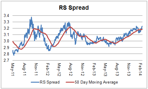
The chart below is the spread between the relative strength leaders and relative strength laggards (universe of mid and large cap stocks). When the chart is rising, relative strength leaders are performing better than relative strength laggards. As of 2/24/2014:
Rediscovering Passion for Europe
February 24, 2014The WSJ reports on the resurgent demand for European equities:
U.S. fund managers are rediscovering their passion for Europe—and not just as a vacation destination.
Since the start of the year, American investors have ramped up their bets on European stocks, spurred on by a brightening economic outlook and low interest rates.
The continent’s stock markets became a favored destination last year as the region emerged from a bruising recession. This year, with U.S. stock indexes treading water after a rip-roaring 2013, interest in European stocks has grown further, fund managers say.
Investors have sent $24.3 billion into European equity funds this year through Feb. 19, according to fund tracker EPFR Global. U.S. stock funds have seen $5 billion in outflows.
In the exchange-traded-fund world, three of the top four stock-based funds in terms of investor inflows in 2014 are the Vanguard FTSE Europe, the iShares MSCI EMU and the Vanguard FTSE Developed Markets ETFs—all of which have heavy exposure to Europe. The three have seen a combined $4.23 billion in new money this year, while $19.1 billion has flowed out of the largest U.S. stock ETF, the SPDR S&P 500 fund.
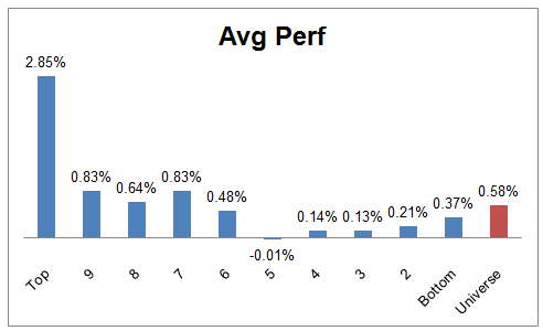
My emphasis added. All three of the ETFs referenced above are cap-weighted ETFs. To those three, I have added the PowerShares DWA Developed Markets Momentum ETF (PIZ), which had better performance in 2013 and is also ahead of those three so far in 2014:
(click to enlarge)
Source: Dorsey Wright; YTD performance through 2/21/14; Performance does not included dividends or any transaction costs
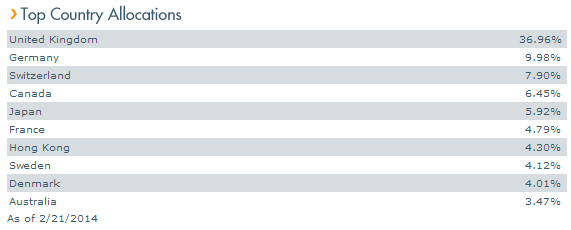
While PIZ is not exclusively focused on Europe, it is certainly heavily weighted to that region:
(click to enlarge)
Source: PowerShares
PIZ has had inflows of $360 million over the past year and now has $671 million in assets.
Past performance is no guarantee of future returns. Dorsey Wright is the index provider for PIZ. Dorsey Wright also currently owns EZU. All past holdings for the trailing 12 months is available upon request.
Posted by: Andy Hyer
Weekly RS Recap
February 24, 2014The table below shows the performance of a universe of mid and large cap U.S. equities, broken down by relative strength decile and then compared to the universe return. Those at the top of the ranks are those stocks which have the best intermediate-term relative strength. Relative strength strategies buy securities that have strong intermediate-term relative strength and hold them as long as they remain strong.
Last week’s performance (2/18/14 – 2/21/14) is as follows:
Posted by: Andy Hyer
The Growing Case Against ETFs
February 21, 2014That’s the title of a Marketwatch article by mutual fund columnist Chuck Jaffe. I have to admit that usually I like his columns. But columns like this make me nuts! (See also The $ Value of Patience for an earlier rant on a similar topic.)
Here’s the thesis in a nutshell:
…safe driving comes down to a mix of equipment and personnel.
The same can be said for mutual funds and exchange-traded funds, and while there is growing consensus that ETFs are the better vehicle, there’s growing evidence that the people using them may not be so skilled behind the wheel.
The article goes on to point out that newsletters with model portfolios of mutual funds and ETFs have disparate results.
Over the last 12 months, the average model portfolio of traditional funds—as tracked by Hulbert Financial Digest—was up 20.9%, a full three points better than the average ETF portfolio put together by the same advisers and newsletter editors. The discrepancy narrows to two full percentage points over the last decade, and Hulbert noted he was only looking at advisers who run portfolios on both sides of the aisle.
Hulbert posited that if you give one manager both vehicles, the advantages of the better structure should show up in performance.
It didn’t.
Hulbert—who noted that the performance differences are “persistent” — speculated “that ETFs’ advantages are encouraging counterproductive behavior.” Effectively, he bought into Bogle’s argument and suggested that if you give an investor a trading vehicle, they will trade it more often.
Does it make any sense to blame the vehicle for the poor driving? (Not to mention that DALBAR data make it abundantly clear that mutual fund drivers frequently put themselves in the ditch.) Would it make sense to run a headline like “The Growing Case Against Stocks” because stocks can be traded?
Mutual funds, ETFs, and other investment products exist to fulfill specific needs. Obviously not every product is right for every investor, but there are thousands of good products that will help investors meet their goals. When that doesn’t happen, it’s usually investor behavior that’s to blame. (And you’re not under any obligation to invest in a particular product. If you don’t understand it, or you get the sinking feeling that your advisor doesn’t either, you should probably run the other way.)
Investors engage in counterproductive behavior all the time, period. It’s not a matter of encouraging it or not. It happens in every investment vehicle and the problem is almost always the driver. In fact, advisors that can help manage counterproductive investor behavior are worth their weight in gold. We’re not going to solve problems involving investor behavior by blaming the product.
A certain amount of common sense has to be applied to investing, just like it does in any other sphere of life. I know that people try to sue McDonald’s for “making” them fat or put a cup of coffee between their legs and then sue the drive-thru that served it when they get burned, but whose responsibility is that really? We all know the answer to that.
Posted by: Mike Moody
High RS Diffusion Index
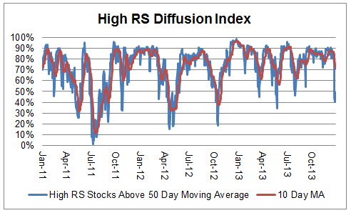
February 19, 2014The chart below measures the percentage of high relative strength stocks that are trading above their 50-day moving average (universe of mid and large cap stocks.) As of 2/18/14.
After reaching a single-day low of 26% on 2/3/14, this index has rebounded sharply. The 10-day moving average is 58% and the one-day reading is 79%.
Posted by: Andy Hyer
Weekly RS Recap
February 18, 2014The table below shows the performance of a universe of mid and large cap U.S. equities, broken down by relative strength decile and quartile and then compared to the universe return. Those at the top of the ranks are those stocks which have the best intermediate-term relative strength. Relative strength strategies buy securities that have strong intermediate-term relative strength and hold them as long as they remain strong.
Last week’s performance (2/10/14 – 2/14/14) is as follows:
Posted by: Andy Hyer
Relative Strength Spread
February 11, 2014The chart below is the spread between the relative strength leaders and relative strength laggards (universe of mid and large cap stocks). When the chart is rising, relative strength leaders are performing better than relative strength laggards. As of 2/10/2014:
Posted by: Andy Hyer
January Arrow DWA Funds Update
February 10, 201401/31/2014
The Arrow DWA Balanced Fund (DWAFX)
At the end of January, the fund had approximately 46% in U.S. Equities, 26% in Fixed Income, 16% in International Equities, and 11% in Alternatives.
DWAFX fell 1.85% in January, after gaining 15.77% in 2013.
After a remarkable year for equities in 2013, stocks pulled back in January. Fixed Income prices moved higher, helping to buffer the overall returns of the fund for the month. Interest rates moved sharply higher in the spring and summer of 2013, during initial announcements of Fed tapering of its quantitative easing program, but rates had chopped sideways for the last couple months. January was not exactly a case of what performed best in 2013, performed worst in January. Rather, Healthcare, which was one of last year’s biggest winners continued to gain relative strength and actually generated positive returns for the month. Small and mid-caps also generally continued their favorable performance compared to large caps. The biggest losses for the month came from our international equity exposure, including Japan, Netherlands, and Germany.
We believe that a real strength of this strategy is its balance between remaining diversified, while also adapting to market leadership. When an asset class is weak its exposure will tend to be towards the lower end of the exposure constraints, and when an asset class is strong its exposure in the fund will trend toward the upper end of its exposure constraints. Relative strength provides an effective means of determining the appropriate weights of the strategy.
The Arrow DWA Tactical Fund (DWTFX)
At the end of January, the fund had approximately 90% in U.S. equities and 9% in International equities.
DWTFX fell 3.30% in January, after gaining 26.19% in 2013.
There were no changes in holdings in the fund in January. Healthcare and Small-Cap Growth held up relatively well, while Consumer Discretionary and European Equities were among our worst performers for the month. Many of the longer-term relative strength trends remain firmly in place, even will the pull back over the last couple of weeks: U.S. equities continue to have strong relative strength, Emerging Markets and Commodities continue to be particularly weak, and Fixed Income and Currencies are not strong enough to warrant exposure at this point.
This strategy is a go-anywhere strategy with very few constraints in terms of exposure to different asset classes. The strategy can invest in domestic equities, international equities, inverse equities, currencies, commodities, real estate, and fixed income. Market history clearly shows that asset classes go through secular bull and bear markets and we believe this strategy is ideally designed to capitalize on those trends. Additionally, we believe that this strategy can provide important risk diversification for a client’s overall portfolio.
A list of all holdings for the trailing 12 months is available upon request. Past performance is no guarantee of future returns. See www.arrowfunds.com for a prospectus.
Posted by: Andy Hyer
Fund Flows
February 6, 2014Mutual fund flow estimates are derived from data collected by The Investment Company Institute covering more than 95 percent of industry assets and are adjusted to represent industry totals.
Posted by: Andy Hyer
The Power of Buying Pullbacks
February 5, 2014Buying pullbacks is a time-tested way to boost returns. From time to time, we’ve discussed the utility in buying pullbacks in the market. Buying the dips—instead of panicking and selling—is essentially doing the opposite of how most investors conduct their affairs. In the past, much of that discussion has involved identification of market pullbacks using various oversold indicators. (See, for example, Lowest Average Cost Wins.) In a recent article in Financial Planning, Craig Israelsen proposes another good method for buying pullbacks.
The gist of his method is as follows:
Selling a stock or fund that has been performing well is tough. The temptation to ride the rocket just a little longer is very strong. So let’s focus on the other element: Buy low.
I propose a disciplined investment approach that measures performance against an annual account value target. If the goal is not met, the account is supplemented with additional investment dollars to bring it up to the goal. (For this exercise, I capped supplemental investment at $5,000, in acknowledgement that investors don’t have endlessly deep pockets.)
Very simply, the clients will “buy low” in years when the account value is below the target. If, however, the target goal is met at year’s end, the clients get to do a fist pump and treat themselves to a fancy dinner or other reward.
One benefit of this suggested strategy is that it is based on a specific performance benchmark rather than on an arbitrary market index (such as the S&P 500) that may not reflect the attributes of the portfolio being used by the investor.
In the article, he benchmarks a diversified portfolio against an 8% target and shows how it would have performed over a 15-year contribution period. In years when the portfolio return exceeds 8%, no additional contributions are made. In years when the portfolio return falls short of 8%, new money is added. As he points out:
It’s worth noting that the added value produced by this buy-low strategy did not rely on clever market timing in advance of a big run-up in the performance of the portfolio. It simply engages a dollar cost averaging protocol - but only on the downside, which is where the real value of dollar cost averaging resides.
Very smart! (I added the bold.) It’s a form of dollar-cost averaging, but only kicks in when you can buy “shares” of your portfolio below trend. He used an 8% target for purposes of the article, but an investor could use any reasonable number. In fact, there might be substantial value in using a higher number like 15%. (You could also use a different time frame, like monthly, if that fit the client’s contribution schedule better.) Obviously you wouldn’t expect a 15% portfolio return every year, but it would get clients in the habit of making contributions to their account in most years. Great years like 2013 would result in the fancy dinner reward, while lousy market years would result in maximum contributions—hopefully near relative lows where they would do the most good.
This is an immensely practical method for getting clients to contribute toward some kind of goal return—and his 15-year test shows good results. In six of the 15 years, portfolio results were below the yardstick and additional contributions were made totalling $13,802. Making those additional investments added an extra $12,501 to what the balance would have been otherwise, resulting in a 7.7% boost in the portfolio total. Looked at another way, over time you ended up with nearly a 100% return on the extra money added in poor years.
Of course, Israelsen points out that although his proposed method is extremely simple, client psychology may still make it challenging to implement. Clients are naturally resistant to committing money to an underperforming market or during a period of time when there is significant uncertainty. Still, this is one of the better proposals I have seen on how to motivate clients to save, to invest at reasonable times, and to focus on a return goal rather than on how they might be doing relative to “the market.” You might consider adding this method to your repertoire.
Posted by: Mike Moody
High RS Diffusion Index
February 5, 2014The chart below measures the percentage of high relative strength stocks that are trading above their 50-day moving average (universe of mid and large cap stocks.) As of 2/4/14.
The 10-day moving average of this indicator is 49% and the one-day reading is 33%. Dips in this indicator have often provided good opportunities to add money to relative strength strategies.
Posted by: Andy Hyer
Quote of the Week
February 4, 2014The elements of good trading are: (1) cutting losses, (2) cutting losses, and (3) cutting losses. If you can follow these three rules, you may have a chance.—-Ed Seykota
Although this sounds tongue-in-cheek (and probably is to some extent), it’s also true. Almost nothing is more ruinous than being risk-seeking with respect to losses, yet that is the way most individual investors behave. According to research, individual investors tend to take profits quickly and let their losses run—no doubt hoping for a recovery. While this may be enjoyable for one’s ego, it is a poor way to handle a portfolio. With enough transactions, the unwitting investor finds himself holding a diversified portfolio of losing positions!
Posted by: Mike Moody
Relative Strength Spread
February 4, 2014The chart below is the spread between the relative strength leaders and relative strength laggards (universe of mid and large cap stocks). When the chart is rising, relative strength leaders are performing better than relative strength laggards. As of 2/3/2014:
Posted by: Andy Hyer
It’s All At The Upper End
February 3, 2014Almost all of the performance from a relative strength or momentum model comes from the upper end of the ranks. We run different models all the time to test different theories or to see how existing decision rules work on different groups of securities. Sometimes we are surprised by the results, sometimes we aren’t. But the more we run these tests, the more some clear patterns emerge.
One of these patterns we see constantly is all of the outperformance in a strategy coming from the very top of the ranks. People are often surprised at how quickly any performance advantage disappears as you move down the ranking scale. That is one of the things that makes implementing a relative strength strategy so difficult. You have to be absolutely relentless in pushing the portfolio toward the strength because there is often zero outperformance in aggregate from the stuff that isn’t at the top of the ranks. If you are the type of person that would rather “wait for a bounce” or “wait until I’m back to breakeven,” then you might as well just equal-weight the universe and call it a day.
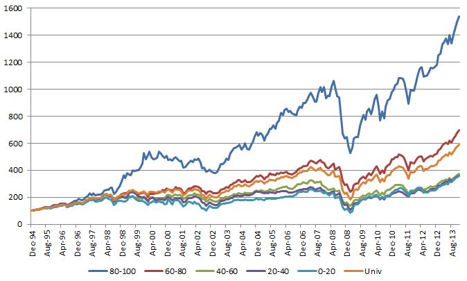
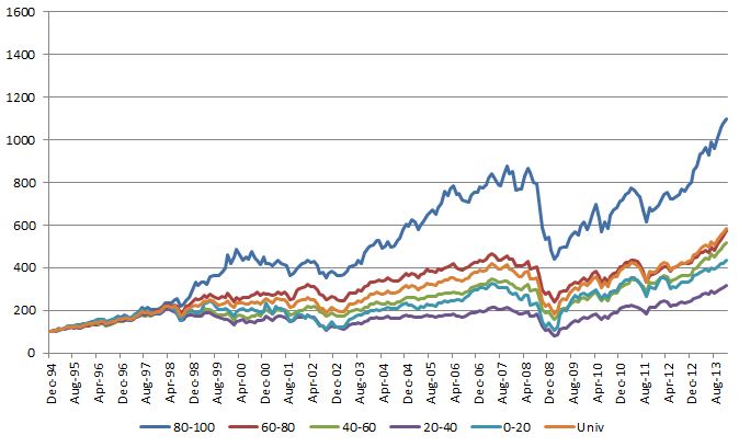
Below is a chart from a sector rotation model I was looking at earlier this week. This model uses the S&P 500 GICS sub-sectors and the ranks were done using a point & figure matrix (ie, running each sub-sector against every other sub-sector) and the portfolio was rebalanced monthly. You can see the top quintile (ranks 80-100) performs quite well. After that, good luck. The “Univ” line is a monthly equal-weighted portfolio of all the GICS sub-sectors. The next quintile (ranks 60-80) barely beats the universe return and probably adds no value after you are done with trading costs, taxes, etc… Keep in mind that these sectors are still well within the top half of the ranks and they still add minimal value. The other three quintiles are underperformers. They are all clustered together well below the universe return.
(Click on image to enlarge)
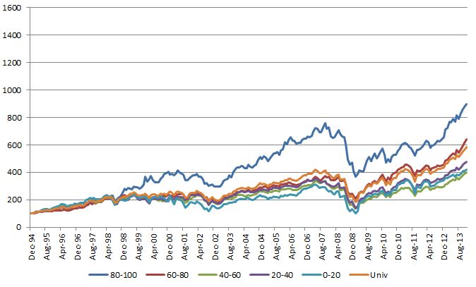
The overall performance numbers aren’t as good, but you get the exact same pattern of results if you use a 12-Month Trailing Return to rank the sub-sectors instead of a point & figure matrix:
(click on image to enlarge)
Same deal if you use a 6-Month Trailing Return:
(click on image to enlarge)
This is a constant theme we see. The very best sectors, stocks, markets, and so on drive almost all of the outperformance. If you miss a few of the best ones it is very difficult to outperform. If you are unwilling to constantly cut the losers and buy the winners because of some emotional hangup, it is extremely difficult to outperform. The basket of securities in a momentum strategy that delivers the outperformance is often smaller than you think, so it is crucial to keep the portfolio focused on the top-ranked securities.
Posted by: John Lewis
Weekly RS Recap
February 3, 2014The table below shows the performance of a universe of mid and large cap U.S. equities, broken down by relative strength decile and quartile and then compared to the universe return. Those at the top of the ranks are those stocks which have the best intermediate-term relative strength. Relative strength strategies buy securities that have strong intermediate-term relative strength and hold them as long as they remain strong.
Last week’s performance (1/27/14 – 1/31/14) is as follows:
Posted by: Andy Hyer
Fund Flows
January 30, 2014Mutual fund flow estimates are derived from data collected by The Investment Company Institute covering more than 95 percent of industry assets and are adjusted to represent industry totals.
Posted by: Andy Hyer
High RS Diffusion Index
January 29, 2014The chart below measures the percentage of high relative strength stocks that are trading above their 50-day moving average (universe of mid and large cap stocks.) As of 1/28/14.
The one-day reading of this index recently hit a low of 41% on 1/27/14. The 10-day moving average is 72% and the one-day reading is 49%. Dips in this index have often provided good opportunities to add to relative strength strategies.
Posted by: Andy Hyer
Dorsey Wright Managed Accounts
January 27, 2014Our Systematic Relative Strength portfolios are available as managed accounts at a large and growing number of firms.
- Wells Fargo Advisors (Global Macro available on the Masters/DMA Platforms)
- Morgan Stanley (IMS Platform)
- TD Ameritrade Institutional
- UBS Financial Services (Aggressive and Core are available on the MAC Platform)
- RBC Wealth Management (MAP Platform)
- Raymond James (Outside Manager Platform)
- Stifel Nicolaus
- Kovack Securities
- Deutsche Bank
- Charles Schwab Institutional
- Sterne Agee
- Scott & Stringfellow
- Envestnet
- Placemark
- Scottrade Institutional
- Janney Montgomery Scott
- Robert W. Baird
- Wedbush Morgan
- Prospera
- Oppenheimer (Star Platform)
- SunTrust
- Lockwood
Different Portfolios for Different Objectives: Descriptions of our seven managed accounts strategies are shown below. All managed accounts use relative strength as the primary investment selection factor.
Aggressive: This Mid and Large Cap U.S. equity strategy seeks to achieve long-term capital appreciation. It invests in securities that demonstrate powerful relative strength characteristics and requires that the securities maintain strong relative strength in order to remain in the portfolio.
Core: This Mid and Large Cap U.S. equity strategy seeks to achieve long-term capital appreciation. This portfolio invests in securities that demonstrate powerful relative strength characteristics and requires that the securities maintain strong relative strength in order to remain in the portfolio. This strategy tends to have lower turnover and higher tax efficiency than our Aggressive strategy.
Growth: This Mid and Large Cap U.S. equity strategy seeks to achieve long-term capital appreciation with some degree of risk mitigation. This portfolio invests in securities that demonstrate powerful relative strength characteristics and requires that the securities maintain strong relative strength in order to remain in the portfolio. This portfolio also has an equity exposure overlay that, when activated, allows the account to hold up to 50% cash if necessary.
International: This All-Cap International equity strategy seeks to achieve long-term capital appreciation through a portfolio of international companies in both developed and emerging markets. This portfolio invests in those securities with powerful relative strength characteristics and requires that the securities maintain strong relative strength in order to remain in the portfolio. Exposure to international markets is achieved through American Depository Receipts (ADRs).
Global Macro: This global tactical asset allocation strategy seeks to achieve meaningful risk diversification and investment returns. The strategy invests across multiple asset classes: Domestic Equities (long & inverse), International Equities (long & inverse), Fixed Income, Real Estate, Currencies, and Commodities. Exposure to each of these areas is achieved through exchange-traded funds (ETFs).
Balanced: This strategy includes equities from our Core strategy (see above) and high-quality U.S. fixed income in approximately a 60% equity / 40% fixed income mix. This strategy seeks to provide long-term capital appreciation and income with moderate volatility.
Tactical Fixed Income: This strategy seeks to provide current income and strong risk-adjusted fixed income returns. The strategy invests across multiple sectors of the fixed income market: U.S. government bonds, investment grade corporate bonds, high yield bonds, Treasury inflation protected securities (TIPS), convertible bonds, and international bonds. Exposure to each of these areas is achieved through exchange-traded funds (ETFs).
To receive fact sheets for any of the strategies above, please e-mail Andy Hyer at [email protected] or call 626-535-0630. Past performance is no guarantee of future returns. An investor should carefully review our brochure and consult with their financial advisor before making any investments.
Posted by: Andy Hyer
Optimal Allocation Between Stocks and Bonds
January 27, 2014Daniel Morillo of BlackRock looks to see if the 60/40 allocation is the optimal mix of bonds and equities over time:
Since my last post on the merits of using equities to balance the risk of rising rates, I’ve been asked well, what is the right mix of equities and fixed income? Almost everyone’s top-of-mind answer is, of course, 60/40. It’s a portfolio that holds 60% equities and 40% bonds, and it’s widely used as a benchmark for numerous multi-asset or “balanced” allocation products. Financial professionals tend to use it as a reference point during portfolio allocation discussions with clients, and it’s widely quoted in the media.
So, does 60/40 hold up? I decided to sift through the numbers to see. What I found is that while, in general, a 60/40 portfolio may be a reasonable bet for long term investors, it might not always be the way to go for investors who hold strong convictions.
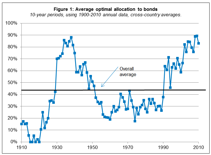
To come to this conclusion, I took equity and government bond returns from the DMS database[1], which includes annual return data for 19 countries since 1900. For each possible 10-year period in each country, I constructed the allocation that, over that particular 10-year period, would have delivered the best ratio of excess return to risk, aka the allocation with the best or “optimal” Sharpe ratio.
Figure 1 shows the average optimal bond allocation for each country, averaged across countries. Guess what? The overall average across countries and time is about 43% bonds (so, the remaining 57% would be in equities) — eerily close to the 60/40 rule.
(click on the image to enlarge)
So the answer is that, yes, since 1900 the optimal mix of equities and bonds is approximately 60/40.
However, note the variability in the optimal allocation to bonds in the chart above. In some 10-year periods it was best to have 90% allocation to bonds and in other 10-year periods it was best to have 0% allocation to bonds! While some may look at this study and conclude that there is no need to be tactical, I look at this study and come to the exact opposite conclusion. Relative strength offers an effective tool for making macro asset allocation decisions, as explored in this white paper by John Lewis.
HT: Abnormal Returns
Posted by: Andy Hyer
Weekly RS Recap
January 27, 2014The table below shows the performance of a universe of mid and large cap U.S. equities, broken down by relative strength decile and quartile and then compared to the universe return. Those at the top of the ranks are those stocks which have the best intermediate-term relative strength. Relative strength strategies buy securities that have strong intermediate-term relative strength and hold them as long as they remain strong.
Last week’s performance (1/21/14 – 1/24/14) is as follows:
Posted by: Andy Hyer
Sector Performance
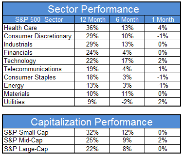
January 24, 2014The chart below shows performance of US sectors and capitalizations over the trailing 12, 6, and 1 month(s). Performance updated through 1/23/2014.
Numbers shown are price returns only and are not inclusive of transaction costs. Source: iShares
Posted by: Andy Hyer
Improving Sector Rotation With Momentum Indexes
January 21, 2014Sector has been a popular investment strategy for many years. The proliferation of sector based exchange traded funds has made it quick and easy to implement sector bets, but has also added a level of complexity to the process. There are now many different flavors of ETF’s for each macro sector ranging from simple capitalization weightings to semi-active quantitative models to construct the sector index. The vast array of choices in each sector allows investors to potentially add additional performance over time versus a simple capitalization based model.
Dorsey, Wright has a suite of sector indexes based on our Technical Leaders Momentum factor. These indexes are designed to give exposure to the securities with the best momentum characteristics in each of the 9 broad macro sectors (Telecomm is split between Technology and Utilities depending on the industry group). Long time readers of our blog should be aware of all of the research that demonstrates how effective the momentum factor has been over time providing returns above a broad market benchmark. Using indexes constructed with the momentum factor have the potential to add incremental returns above a simple capitalization weighted sector rotation strategy just like they do on the individual stock side.
The sector SPDRs are the most popular sector suite of exchange traded products. When investors make sector bets using this suite of products they are making a distinct sector bet and also making a bet on large capitalization stocks since the sector SPDRs are capitalization weighted. There are times when large cap stocks outperform, but there are also times when the strength might be in small cap, value, momentum, or some other factor. By not considering other weighting methodologies investors are potentially leaving money on the table.
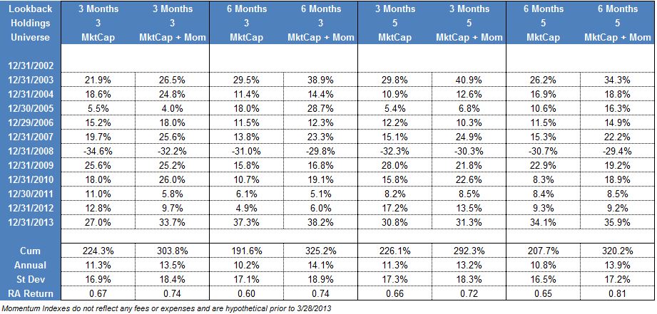
We constructed several very simple sector rotation models to determine how returns might be enhanced by implementing a sector rotation strategy with indexes based on momentum. The base models were created with either 3 or 5 holdings from the sector SPDR universe. Each month a trailing 3 or 6 month return was calculated (based on the model specification) and the top n holdings were included in equal weights in the portfolio. Each month the portfolio was rebalanced with the top 3 or 5 sector SPDRs based on the trailing return. This is an extremely simple way to implement a momentum based sector rotation strategy, but one that proves to be surprisingly effective.
The second group of portfolios expanded the universe of securities we considered to implement the strategy. All of the momentum rankings were still based on the trailing returns of the sector SPDRs, but we made one small change in what was purchased. If, for example, the model selected Healthcare as one of the holdings we would buy either the sector SPDR or our Healthcare Momentum Index. The way we determined which version of the sector to buy was simple: whichever of the two had the best trailing return (the window was the same as the ranking window) was included in the portfolio for the month. In a market where momentum stocks were performing poorly the model would gravitate to the cap weighted SPDRs, but when momentum was performing well the model would tend to buy momentum based sectors. Making that one small change allowed us to determine how important implementing the sector bet actually was.
(Click Image To Enlarge)
The table above shows the results of the tests. Trials were run using either 3 or 6 month look back windows to rank the sectors and also with either 3 or 5 holdings. In each case, allowing the model to buy a sector composed of high momentum securities was materially better than its cap weighted counterpart. Standard deviation also increased, but the returns justified the increased volatility as the risk adjusted return increased in each case.
This is one simple case illustrating how implementing your sector bests with different sector construction philosophies can be additive to investment returns. The momentum factor is one of the premier investment anomalies out there, and using a basket of high momentum stocks in a specific sector has shown to increase returns in the testing we have done.
The performance numbers are not inclusive of any commissions or trading costs . The Momentum Indexes are hypothetical prior to 3/28/2013 and do not reflect any fees or expenses. Past performance is no guarantee of future returns. Potential for profit is accompanied by potential for loss. The models described above are for illustrative purposes only and should not be taken as a recommendation to buy or sell any security or strategy mentioned above. Click here for additional disclosures.
Posted by: John Lewis
DWA Technical Leaders Webinar: Q1 Updates
January 20, 2014On Wednesday, January 16th, Tom Dorsey, Founder and President of DWA, Tammy DeRosier, Chief Operating Officer, and John Lewis, Senior Vice President and Portfolio Manager, conducted a webinar around the most recent quarterly rebalances across the DWA Technical Leaders Indexes, as well as practical implementation ideas for using the four Momentum ETFs that track these indexes.
Follow this link for a replay of this webinar.
Posted by: Andy Hyer
Is Sector Rotation a Crowded Trade?
January 16, 2014As sector ETFs have proliferated, more and more investors have been attracted to sector rotation and tactical asset allocation strategies using ETFs, whether self-managed or implemented by an advisor. Mark Hulbert commented on sector rotation strategies in a recent article on Marketwatch that highlighted newsletters using Fidelity sector funds. All of the newsletters had good returns, but there was one surprising twist:
…you might think that these advisers each recommended more or less the same basket of funds. But you would be wrong. In fact, more often than not, each of these advisers has tended to recommend funds that are not recommended by any other of the top five sector strategies.
That’s amazing, since there are only 44 actively managed Fidelity sector funds and these advisers’ model portfolios hold an average of between five and 10 funds each.
This suggests that there is more than one way of playing the sector rotation game, which is good news. If there were only one profitable sector strategy, it would quickly become so overused as to stop working.
This is even true among those advisers who recommend sectors based on their relative strength or momentum. Because there are so many ways of defining these characteristics, two different sector momentum strategies will often end up recommending two different Fidelity sector funds.
Another way of appreciating the divergent recommendations of these top performing advisers is this: Of the 44 actively managed sector funds that Fidelity currently offers, no fewer than 22 are recommended by at least one of these top five advisers. That’s one of every two, on average, which hardly seems very selective on the advisers’ part.
Amazing, isn’t it? It just shows that there are many ways to skin a cat.
Even with a very limited menu of Fidelity sector funds, there was surprisingly little overlap. Imagine how little overlap there would be within the ETF universe, which is much, much larger! In short, you can safely pursue a sector rotation strategy (and, by extension, tactical asset allocation) with little concern that everyone else will be plowing into the same ETFs.
Posted by: Mike Moody
