Relative Strength vs. Value - Performance Over Time

May 31, 2012

Thanks to the large amount of stock data available nowadays, we are able to compare the success of different strategies over very long time periods. The table below shows the performance of two investment strategies, relative strength (RS) and value, in relation to the performance of the market as a whole (CRSP) as well as to one another. It is organized in rolling return periods, showing the annualized average return for periods ranging from 1-10 years, using data all the way back to 1927.

The relative strength and value data came from the Ken French data library. The relative strength index is constructed monthly; it includes the top one-third of the universe in terms of relative strength. (Ken French uses the standard academic definition of price momentum, which is 12-month trailing return minus the front-month return.) The value index is constructed annually at the end of June. This time, the top one-third of stocks are chosen based on book value divided by market cap. In both cases, the universes were composed of stocks with market capitalizations above the market median.

Lastly, the CRSP database includes the total universe of stocks in the database as well as the risk-free rate, which is essentially the 3-month Treasury bill yield. The CRSP data serves as a benchmark representing the generic market return. It is also worthwhile to know that the S&P 500 and DJIA typically do worse than the CRSP total-market data, which makes CRSP a harder benchmark to beat.

Relative Strength vs. Value Investment Over Time Relative Strength vs. Value   Performance Over Time

Source:Dorsey Wright Money Management

The data supports our belief that relative strength is an extremely effective strategy. In rolling 10-year periods since 1927, relative strength outperforms the CRSP universe 100% of the time. Even in 1-year periods it outperforms 78.6% of the time. As can be seen here, relative strength typically does better in longer periods. While it is obviously possible do poorly in an individual year, by continuing to implement a winning strategy time and time again, the more frequent and/or larger successful years outweigh the bad ones.

Even more importantly, relative strength typically outperforms value investment. Relative strength defeats value in over 57% of periods of all sizes, doing the best in 10-year periods with 69.3% of trials outperforming. While relative strength and value investment strategies have historically both generally beat the market, relative strength has been more consistent in doing so.

Posted by:


How Safe Is Your Pension?

May 31, 2012

From “How Safe Is Your Pension?” in the July 2012 Consumer Reports, comes a stark assessment of the current pension landscape:

If you’re counting on a traditional defined-benefit pension, there’s reason to worry that you might not get everything you’ve earned. About 80 percent of the 29,000 private-sector defined-benefit plans insured by the federal Pension Benefit Guaranty Corp. have been underfunded by $740 billion. State and local public employee pensions were recently in a $1 trillion hole.

Instead of beefing up plan assets, many companies have cut benefits. Employers can change their pension rules going forward using a variety of tactics, including tinkering with benefit formulas so that your eventual payout will be reduced, “freezing” the plan to stop further accruals, or terminating an underfunded plan.

“Vested” pension assets—those that legally become your property after a period of time—are generally safe thanks to federal law. But if the plan is terminated, the PBGC, which itself is $26 billion in the red, is required to pay vested benefits only up to a certain amount, which varies by the employee’s age and the year in which the plan is terminated.

Pensions of government workers aren’t covered by the agency but are often protected by state constitutions or laws. Still, 26 states have squeezed benefits for new hires, some other workers, and retirees.

Finding ways to back out of promised retirement benefits and/or reducing benefits for new hires is going to be a dominant theme in the pension world for many years to come. For a flavor of current pension reform efforts consider the current proposal for public employees in Illinois:

Gov. Pat Quinn is proposing to raise the retirement age to 67 from 55; cap retirees’ annual cost-of-living increases at the lesser of 3% or half of the consumer price index; and increase workers’ pension contributions by three percentage points. But what makes these reforms bolder than most other states’ is that they would apply to current employees in addition to future hires.

As financial advisors, we are in a unique position to help people deal with these realities. Right at the top of the list of things that we can do to truly help our clients is to help them come to terms with the pension reforms that are and will be taking place in the coming years and adopt an appropriate savings and investment plan that accounts for these changes. The pressures to scale back pension benefits will be like nothing seen by the last generation of retirees.

Posted by:


From the Archives: The Math Behind Manager Selection

May 31, 2012

Hiring and firing money managers is a tricky business. Institutions do it poorly (see background post here ), and retail investors do it horribly (see article on DALBAR ). Why is it so difficult?

This white paper on manager selection from Intech/Janus goes into the mathematics of manager selection. Very quickly it becomes clear why it is so hard to do well.

Many investors believe that a ten-year performance record for a group of managers is sufficiently long to make it easy to spot the good managers. In fact, it is unlikely that the good managers will stand out. Posit a good manager whose true average relative return is 200 basis points (bps) annually and true tracking error (standard deviation of relative return) is 800 bps annually. This manager’s information ratio is 0.25. To put this in perspective, an information ratio of 0.25 typically puts a manager near or into the top quartile of managers in popular manager universes.

Posit twenty bad managers with true average relative returns of 0 bps annually, true tracking error of 1000 bps annually, hence an information ratio of 0.00.

There is a dramatic difference between the good manager and the bad managers.

The probability that the good manager beats all twenty bad managers over a ten-year period is only about 9.6%. This implies that chasing performance leaves the investor with the good manager only about 9.6% of the time and with a bad manager about 90.4% of the time.

In other words, 90% of the time the manager with the top 10-year track record in the group will be a bad manager! Maybe a longer track record would help?

A practical approach is to ask how long a historical performance record is necessary to be 75% sure that the good manager will beat all the bad managers, i.e., have the highest historical relative return. Assuming the same good manager as before and twenty of the same bad managers as before, a 157 year historical performance record is required to achieve a 75% probability that the good manager will beat all the bad managers.

It turns out that it would help, but since none of the manager databases have 150-year track records, in practice it is useless. The required disclaimer that past performance is no guarantee of future results turns out to be true.

There is still an important practical problem to be solved here. Assuming that bad managers outnumber good ones and assuming that we don’t have 150 years to wait around for better odds, how can we increase our probability of identifying one of the good money managers?

The researchers show mathematically how combining an examination of the investment process with historical returns makes the decision much simpler. If the investor can make a reasonable assumption about a manager’s investment process leading to outperformance, the math is straightforward and can be done using Bayes’ Theorem to combine probabilities.

…the answer changes based on the investor’s assessment of the a priori credibility of the manager’s investment process.

It turns out that the big swing factor in the answer is the credibility of the underlying investment process. What are the odds that an investment process using Fibonacci retracements and phases of the moon will generate outperformance over time? What are the odds that relative strength or deep value will generate outperformance over time?

The research paper concludes with the following words of wisdom:

A careful examination of almost any investor’s investment manager hiring and firing process is likely to reveal that there is a substantial component of performance chasing. Sometimes it is obvious, e.g., when there is a policy of firing a manager if he has negative performance after three years. Other times it is subtle, e.g., when the initial phase of the manager search process strongly weights attractive historical performance. No matter the form that performance chasing takes, it tends to produce future relative returns that are disappointing compared to expectations.

Historical performance alone is not an effective basis for identifying a good manager among a group of bad managers. This does not mean that historical performance is useless. Rather, it means that it must be combined efficiently with other information. The correct use of historical performance relegates it to a secondary role. The primary focus in manager choice should be an analysis of the investment process. [emphasis added]

This research paper is eye-opening in several respects.

1) It shows pretty clearly that historical performance alone–despite what our intuition tells us–is not sufficient to select managers. This probably accounts for a great deal of the poor manager selection, the subsequent disappointment, and rapid manager turnover that goes on.

2) It is very clear from the math that only credible investment processes are likely to generate long-term outperformance. Fortunately, lots of substantive academic and practitioner research has been done on factor analysis leading to outperformance. The only two broadly robust factors discovered so far have been relative strength and value, both in various formulations–and, obviously, they have to be implemented in a disciplined and systematic fashion. If your investment process is based on something else, there’s a decent chance you’re going to be disappointed.

3) Significant time is required for the best managers to stand out from the much larger pack of mediocre managers.

This is a demanding process for consultants and clients. They have to willfully reduce their focus on even 10-year track records, limit their selection to rigorous managers using proven factors for outperformance, and then exercise a great deal of patience to allow enough time for the cream to rise to the top. The rewards for doing so, however, might be quite large–especially since almost all of your competition will ignore the correct process and and simply chase performance.

—-this article originally appeared 1/28/2010. I have seen no evidence since then that most consultants have improved their manager selection process, which is a shame.

Posted by:


Fund Flows

May 31, 2012

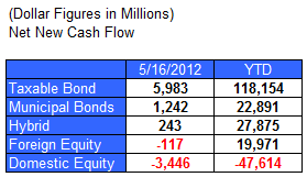
The Investment Company Institute is the national association of U.S. investment companies, including mutual funds, closed-end funds, exchange-traded funds (ETFs), and unit investment trusts (UITs). Members of ICI manage total assets of $11.82 trillion and serve nearly 90 million shareholders. Flow estimates are derived from data collected covering more than 95 percent of industry assets and are adjusted to represent industry totals.

Posted by:


One Good Data Point

May 30, 2012

This just in. We are now back at 5/25 levels for the S&P 500. From Tobias Levkovich at Citigroup, as reported by Business Insider:

Last Friday our panic-euphoria model, one of our proprietary sentiment models went into panic, that gives us a very high probability, almost 90 percent probability that markets are up in 6 months, and 96 percent probability that they’re are up in 12 months.

I have no idea how they come up with those probabilities, but it would be nice if it’s true. More generally, other analysts have also found a correlation between very negative investor sentiment and higher markets 6-12 months later.

Posted by:


Guns and Monkeys

May 30, 2012

The National Rifle Association is well-known for its slogan “Guns don’t kill people; people kill people.” This sentiment has a long history and echoes the words of Seneca the Younger that “A sword never kills anybody; it is a tool in the killer’s hand.” I have often heard fans of financial modelling use a similar line of defence.

However, one of my favourite comedians, Eddie Izzard, has a rebuttal that I find most compelling. He points out that “Guns don’t kill people; people kill people, but so do monkeys if you give them guns.” This is akin to my view of financial models. Give a monkey a value at risk (VaR) model or the capital asset pricing model (CAPM) and you’ve got a potential financial disaster on your hands.

—-from James Montier, The Flaws of Finance

To read the whole article at Advisor Perspectives click here. It’s a nice summary of some of the problems in modern finance as practiced.

Posted by:


High RS Diffusion Index

May 30, 2012

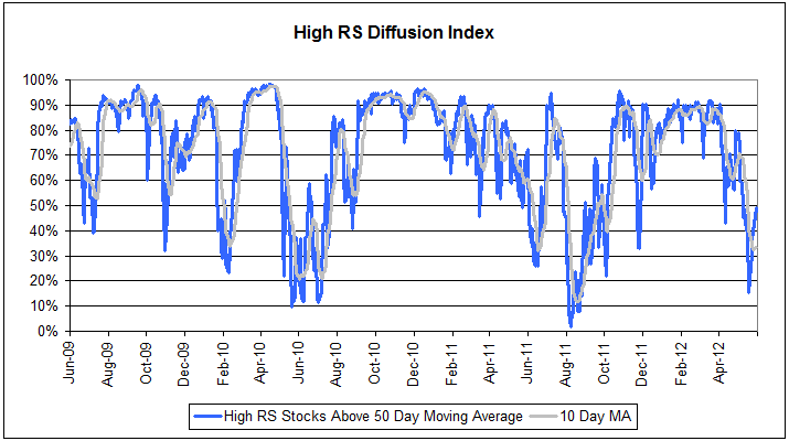
The chart below measures the percentage of high relative strength stocks that are trading above their 50-day moving average (universe of mid and large cap stocks.) As of 5/29/12.

diffusion53012 High RS Diffusion Index

This index has snapped back after reaching a low of 15% on 5/18/2012. The 10-day moving average is now 33% and the one-day reading is 49%. Dips in this index have often provided good opportunities to add to relative strength strategies.

Posted by:


Hedge Fund Alternatives

May 29, 2012

From Barron’s, an interesting insight into the alternative space:

Investor interest in hedge-fund strategies has never been higher—but it’s the mutual-fund industry that seems to be benefiting.

Financial advisors and institutions are increasingly turning to alternative strategies to manage portfolio risk, though the flood of money into that area tapered off a bit last year, according to an about-to-be-released survey of financial advisors and institutional managers conducted by Morningstar and Barron’s. Many of them are finding the best vehicle for those strategies to be mutual funds.

Very intriguing, no? There are quite a few ways now, through ETFs or mutual funds, to get exposure to alternatives. We’ve discussed the Arrow DWA Tactical Fund (DWTFX) as a hedge fund alternative in the past as well. Tactical asset allocation is one way to go, but there are also multi-strategy hedge fund trackers, macro fund trackers, and absolute-return fund trackers, to say nothing of managed futures.

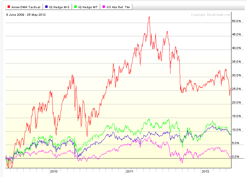
Each of these options has a different set of trade-offs in terms of potential return and volatility. For example, the chart below shows the Arrow DWA Tactical Fund, the IQ Hedge Macro Tracker, the IQ Hedge Multi-Strategy Tracker, and the Goldman Sachs Absolute Return Fund for the maximum period of time that all of the funds have overlapped.

hedgefundalternatives Hedge Fund Alternatives

(click on image to enlarge)

You can see that each of these funds moves differently. For example, the Arrow DWA Tactical Fund, which is definitely directional, has a very different profile than the Goldman Sachs Absolute Return Fund, which presumably is not (as) directional.

Very few of these options were even available to retail investors ten years ago. Now they are numerous, giving individuals the opportunity to diversify like never before. With proper due diligence, it’s quite possible you will find an alternative strategy that can improve your overall portfolio.

Posted by:


Are Equities Dead or Just Resting?

May 29, 2012

CNBC carried an article today, via Financial Times, that talked about how much investors hate stocks. Some excerpts from the article:

…institutional investors, from pension funds to mutual funds sold directly to the public, have slashed holdings in the past decade. Stocks have not been so far out of favor for half a century. Many declare the “cult of the equity” dead.

Compared with bonds, stocks have not looked so cheap for half a century. During this period, the dividend yield — the amount paid out in dividends per share divided by the share price, a key measure of value — has been lower than the yield paid by bonds (which moves in the opposite direction to prices). In other words, investors were happy to take a lower interest rate from stocks than from bonds, despite their greater volatility, reflecting their confidence that returns from stocks would be higher in the long run.

But now investors want a higher yield from equities. According to Robert Shiller of Yale University, the dividend yield on U.S. stocks is today 1.97 percent — above the 1.72 percent yield on 10-year U.S. Treasury bonds.

Some hope that the cycle is about to turn and that the preconditions for a new cult of the equity will emerge even if it takes time. Few people doubt, however, that the old cult of the equity — which steered long-term savers into loading their portfolios with shares — has died.

Indeed, equities have not been so cheap relative to bonds since 1956, which turned out to be one of the best moments in history to have bought stocks.

In the U.S., inflows to bond funds have exceeded equity inflows every year since 2007, with outright net redemptions from equity funds in each of the past five years.

I swear I’m not making this up. Side-by-side, the article discusses the death of the equity cult while it mentions that stocks are at the best buying point in 50 years, apparently without irony. Wow.

Somewhere down the road there will be a catalyst—I have no idea what it will be, but it could be much sooner than most think. Contrary opinion would suggest that we look closely at the presumption that equities are really dead. It’s quite possible that stocks, like Monty Python’s Norwegian Blue, are just resting. When sentiment gets so highly tilted to one side it is worth examining to see if, in fact, the opposite is true.

deadparrot Are Equities Dead or Just Resting?

Are Equities Dead or Just Resting?


Posted by:


From the Archives: Is Modern Portfolio Theory Obsolete?

May 29, 2012

It all depends on who you ask. Apologists for MPT will say that diversification worked, but that it just didn’t work very well last go round. That’s a judgment call, I suppose. Correlations between assets are notoriously unstable and nearly went to 1.0 during the last decline, but not quite. So I guess you could say that diversification “worked,” although it certainly didn’t deliver the kind of results that investors were expecting.

Now even Ibbotson Associates is saying that certain aspects of modern portfolio theory are flawed, in particular using standard deviation as a measurement of risk. In a recent Morningstar interview, Peng Chen, the president of Ibbotsen Associates, addresses the problem.

It’s one thing to say modern portfolio theory, the principle, remained to work. It’s another thing to examine the measures. So when we started looking at the measures, we realized, and this has been documented by many academics and practitioners, we also realized that one of the traditional measures in modern portfolio theory, in particular on the risk side, standard deviation, does not work very well to measure and present the tail risks in the return distribution.

Meaning that, when you have really, really bad market outcomes, modern portfolio theory purely using standard deviation underestimates the probability and severity of those tail risks, especially in short frequency time periods, such as monthly or quarterly.

Leaving aside the issue of how the theory could work if the components do not, this is a pretty surprising admission. Ibbotson is finally getting around to dealing with the “fat tails” problem. It’s a known problem but it makes the math much less tractable. Essentially, however, Mr. Chen is arguing that market risk is actually much higher than modern portfolio theory would have you believe.

In my view, the debate about modern portfolio theory is pretty much done. Stick a fork in it. Rather than grasping about for a new theory, why not look at tactical asset allocation, which has been in plain view the entire time?

Tactical asset allocation, when executed systematically, can generate good returns and acceptable volatility without regard to any of the tenets of modern portfolio theory. It does not require standard deviation as the measure of risk, and it makes no assumptions regarding the correlations between assets. Instead it makes realistic assumptions: some assets will perform better than others, and you ought to consider owning the good assets and ditching the bad ones. It’s the ultimate pragmatic solution.

—-this article originally appeared 1/21/2010. As we gain distance from the 2008 meltdown, investors are beginning to forget how badly their optimized portfolios performed and are beginning to climb back on the MPT bandwagon. Combining uncorrelated strategies always makes for a better portfolio, but the problem of understated risk remains. The tails are still fat. Let’s hope that we don’t get another chance to experience fat tails with the Eurozone crisis. Tactical asset allocation, I think, may still be the most viable solution to the problem.

Posted by:


Weekly RS Recap

May 29, 2012

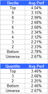
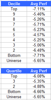
The table below shows the performance of a universe of mid and large cap U.S. equities, broken down by relative strength decile and quartile and then compared to the universe return. Those at the top of the ranks are those stocks which have the best intermediate-term relative strength. Relative strength strategies buy securities that have strong intermediate-term relative strength and hold them as long as they remain strong.

Last week’s performance (5/21/12 – 5/25/12) is as follows:

ranks52912 Weekly RS Recap

After weeks of decline, the market found some traction last week. High relative strength stocks performed well—the top quartile outperformed the universe by 0.79%.

Posted by:


Dorsey, Wright Client Sentiment Survey - 5/25/12

May 25, 2012

Here we have the next round of the Dorsey, Wright Sentiment Survey, the first third-party sentiment poll. Participate to learn more about our Dorsey, Wright Polo Shirt raffle! Just follow the instructions after taking the poll, and we’ll enter you in the contest. Thanks to all our participants from last round.

As you know, when individuals self-report, they are always taller and more beautiful than when outside observers report their perceptions! Instead of asking individual investors to self-report whether they are bullish or bearish, we’d like financial advisors to weigh in and report on the actual behavior of clients. It’s two simple questions and will take no more than 20 seconds of your time. We’ll construct indicators from the data and report the results regularly on our blog–but we need your help to get a large statistical sample!

Click here to take Dorsey, Wright’s Client Sentiment Survey.

Contribute to the greater good! It’s painless, we promise.

Posted by:


From the Archives: Inflation Rears Its Ugly Head

May 25, 2012

Howard Marks is chairman of Oaktree Capital, a large and well-known institutional alternative fixed income manager. Mr. Marks’s memos are always thoughtful and worth reading. This go round he has a discussion of all of the things that could go wrong with the world economy—essentially a list of all of the things that could go wrong. One of the things that could go wrong is inflation.

He believes rates are more likely to go higher than lower, and that inflation, long forgotten as a risk factor, might return. In addition, he has a list of suggestions on how to deal with inflation including TIPs, floating rate debt, gold, real assets like commodities, oil, and real estate, and foreign currencies. His catalog of alternatives is even longer, but you get the idea. (If you want to read the whole memo, you can find it here.)

That’s quite a list, but the first thing that I noticed about it is that not one of these items is generally considered as an investment option by retail investors. Most investors are mentally stuck in the domestic stocks/domestic bonds arena. Diversification consists of hitting more than one Morningstar style box. If inflation does come back, that’s not going to cut it. In fact, Mr. Marks asks investors, “How much of your portfolio are you willing to devote to protect against these macro forces?” He says if the answer is 5%, or 10%, or 15% that those levels are pretty close to doing nothing. He thinks a portfolio will need to devote at least 30-40% of assets toward inflation protection if it recurs.

Investment flexibility and risk diversification were the primary reasons that we launched the Systematic RS Global Macro account as a retail product last year. Many of the inflation hedges in Mr. Marks’ list are asset classes that are available in the Global Macro portfolio, including TIPs, gold, commodities, oil, real estate, and foreign currencies. Given our basket rotation strategy and our adherence to relative strength, the Global Macro portfolio could easily have 40% of its assets, or more, in inflation hedges if inflation were to recur. I think the jury is still out about how the world economy will respond to decreased levels of fiscal stimulus, but it’s good to know that you have options.

—-this article originally appeared 1/25/2010. We have not seen runaway inflation so far, but the point Howard Marks makes is valid. If/when inflation does occur, you might need to devote a lot of your portfolio to inflation protection. Is your investment process up for the challenge?

Posted by:


Sector and Capitalization Performance

May 25, 2012

The chart below shows performance of US sectors and capitalizations over the trailing 12, 6, and 1 month(s). Performance updated through 5/24/2012.

gics052512 Sector and Capitalization Performance

Posted by:


There Were These Megatrends…

May 24, 2012

American Funds is one of the largest and most respected mutual fund companies around. One of their portfolio managers, Jim Dunton, is retiring after 50 years. I love these sorts of articles because of the tremendous perspective that long-time investors have. (That’s part of the reason that Warren Buffett’s annual reports are such a hoot.)

Jim Dunton of American Funds reflecting on his 50 years in the investment business:

There were these megatrends — including the Cold War, inflation and energy — that both continued for a long period of time and then aborted and went in the other direction. The Cold War began around 1946 and continued all the way until 1990 when the Berlin Wall came down. Much happened during that period that affected the investment business. There were hot wars in Korea and Vietnam. But also important were the many scientific developments that came out of the Cold War — like satellites, GPS and aerospace advances — that we were able to invest in over the period.

With inflation, we had one long trend of almost no inflation from the 1930s, a build of inflation from the mid-60s to the early 1980s, and then a great dénouement from then until now. Inflation was matched, of course, by interest rates which were around 2% in the 1950s, went to 12% in 1980 and now are back down to 2% again.

Another key trend was energy. After the 1973 oil embargo, oil prices went from $3 per barrel to $36. The biggest input cost in the world went up 12 times almost overnight, and that fed further into high inflation. In 1979, we were consuming about 18.5 million barrels of oil per day in this country. The rise in oil prices was so significant that the resulting changes in automobile technology and alternative resources have meant that today oil consumption is back to about 18.5 million barrels.

Fantastic. Investors worry all the time about trend following somehow ceasing to work. But an experienced investor like Mr. Dunton can look back on 50 years and see a number of megatrends that made a big difference in the investment process. That probably won’t change. Relative strength remains one of the best ways to identify and participate in big trends.

Posted by:


Fund Flows

May 24, 2012

The Investment Company Institute is the national association of U.S. investment companies, including mutual funds, closed-end funds, exchange-traded funds (ETFs), and unit investment trusts (UITs). Members of ICI manage total assets of $11.82 trillion and serve nearly 90 million shareholders. Flow estimates are derived from data collected covering more than 95 percent of industry assets and are adjusted to represent industry totals.

ici52412 Fund Flows

Posted by:


Emerging Markets Investing

May 23, 2012

Index Universe has an article pointing out that simply buying a large, cap-weighted index might not be the way to go in emerging markets. For one thing, China, Brazil, South Korea, Taiwan are 60% of the fund. The article discusses potential problems in some of the BRIC markets, and then proceeds to pick out a bunch of promising countries like Poland, Turkey, and Indonesia.

Personally, I suspect that buying a large cap-weighted index and then hoping for the best was never a very viable strategy. Perhaps it happened to work out over certain time periods, but things change and different economies can have really different stock market performance. And I have to say that I don’t have a lot of confidence in analyst’s guesses either, although I’m sure they know a lot more about the fundamentals of overseas economies than I do.

Here’s a thought: let relative strength sort out where you should be investing. For example, here’s the current country breakdown for the DWA Emerging Markets Technical Leaders Index, as seen through the holdings of PIE, the Powershares ETF based on the index:

PIEallocations 2 Emerging Markets Investing

Source: Powershares (data as of 3/31/2012)

Malaysia, Mexico, and Indonesia are the largest weights right now—and those weights are based entirely on the objective performance of the underlying stocks in the market, not on someone’s opinion about what market will be good. When performance changes, the weights will change, often substantially. As an investor, you don’t have to contemplate whether or when the Czech Republic might outperform India. The weights change quarterly without you having to worry about it.

Relative strength is a different, and dynamic, way of investing globally.

See www.powershares.com for more information about PDP, PIE and PIZ. Past performance is no guarantee of future returns. A list of all holdings for the trailing 12 months is available upon request.

Posted by:


High RS Diffusion Index

May 23, 2012

The chart below measures the percentage of high relative strength stocks that are trading above their 50-day moving average (universe of mid and large cap stocks.) As of 5/22/12.

diffusion052312 High RS Diffusion Index

The 10-day moving average of this indicator is 35% and the one-day reading is 30%. This indicator reached a recent low of 15% on 5/18/12. Dips in this indicator have often provided good opportunities to add to relative strength strategies.

Posted by:


Dorsey, Wright Client Sentiment Survey Results - 5/11/12

May 22, 2012

Our latest sentiment survey was open from 5/11/12 to 5/18/12. The Dorsey, Wright Polo Shirt Raffle continues to drive advisor participation, and we greatly appreciate your support! This round, we had 53 advisors participate in the survey. If you believe, as we do, that markets are driven by supply and demand, client behavior is important. We’re not asking what you think of the market—since most of our blog readers are financial advisors, we’re asking instead about the behavior of your clients. Then we’re aggregating responses exclusively for our readership. Your privacy will not be compromised in any way.

After the first 30 or so responses, the established pattern was simply magnified, so we are comfortable about the statistical validity of our sample. Most of the responses were from the U.S., but we also had multiple advisors respond from at least four other countries. Let’s get down to an analysis of the data! Note: You can click on any of the charts to enlarge them.

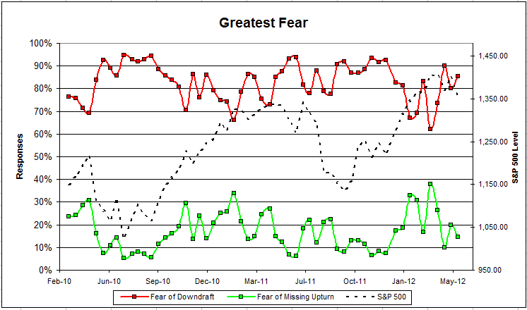
Question 1. Based on their behavior, are your clients currently more afraid of: a) getting caught in a stock market downdraft, or b) missing a stock market upturn?


greatestfear 54 Dorsey, Wright Client Sentiment Survey Results   5/11/12

Chart 1: Greatest Fear. From survey to survey, the S&P 500 fell -3.5%, and client sentiment worsened as expected. The fear of downturn group rose from 80% to 85%, while the fear of a missed opportunity group fell from 20% to 15%. Client sentiment remains poor overall.

greatestfearspread 51 Dorsey, Wright Client Sentiment Survey Results   5/11/12

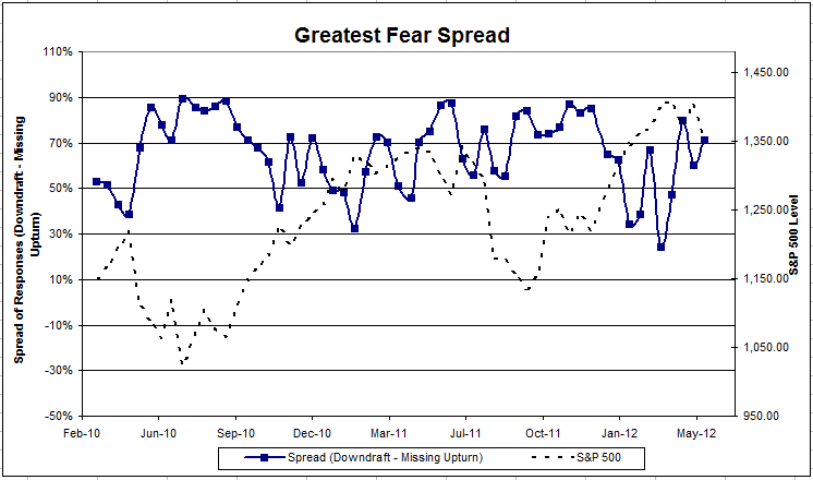
Chart 2. Greatest Fear Spread. Another way to look at this data is to examine the spread between the two groups. The spread ticked higher this round, from 60% to 71%.

Question 2. Based on their behavior, how would you rate your clients’ current appetite for risk?

avgriskapp 42 Dorsey, Wright Client Sentiment Survey Results   5/11/12

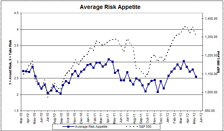
Chart 3: Average Risk Appetite. Once again, the average risk appetite performed as expected, falling from 2.77 to 2.55. Technically speaking, this indicator has broken through solid support on the downside.

bellcurve 7 Dorsey, Wright Client Sentiment Survey Results   5/11/12

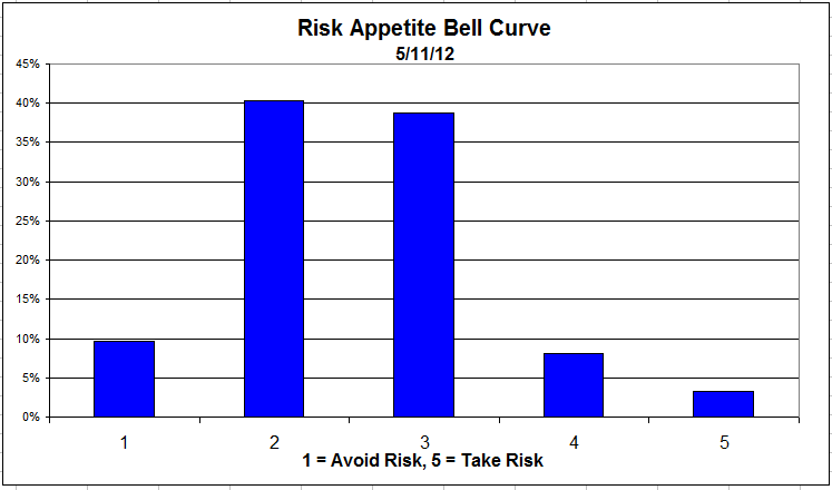
Chart 4: Risk Appetite Bell Curve. This chart uses a bell curve to break out the percentage of respondents at each risk appetite level. We’ve seen a dramatic shift to less risk over the last few surveys. right now, the majority of clients want either a risk appetite of 2 or 3.

riskappbellcurve 31 Dorsey, Wright Client Sentiment Survey Results   5/11/12

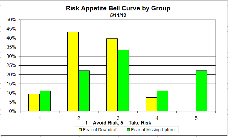
Chart 5: Risk Appetite Bell Curve by Group. The next three charts use cross-sectional data. This chart plots the reported client risk appetite separately for the fear of downdraft and for the fear of missing upturn groups. This chart sorts out mostly as expected, with the upturn group wanting more risk than the downturn group.

riskappgroup 4 Dorsey, Wright Client Sentiment Survey Results   5/11/12

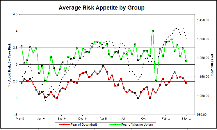
Chart 6: Average Risk Appetite by Group. This round, both groups’ risk appetite fell with the market.

riskappetitespread 3 Dorsey, Wright Client Sentiment Survey Results   5/11/12

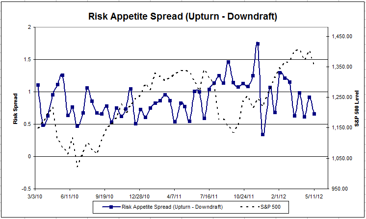
Chart 7: Risk Appetite Spread. This is a spread chart constructed from the data in Chart 6, where the average risk appetite of the downdraft group is subtracted from the average risk appetite of the missing upturn group. The spread fellthis round and is sitting pretty in its normal range.

The S&P 500 fell by -3.5% from survey to survey, and all of our indicators responded in-kind. The fear of a downturn group rose, and overall risk appetite fell. We’d expect to see both of those occuring when client sentiment is worsening.

No one can predict the future, as we all know, so instead of prognosticating, we will sit back and enjoy the ride. A rigorously tested, systematic investment process provides a great deal of comfort for clients during these types of fearful, highly uncertain market environments. Until next time, good trading and thank you for participating.

Posted by:


Relative Strength Spread

May 22, 2012

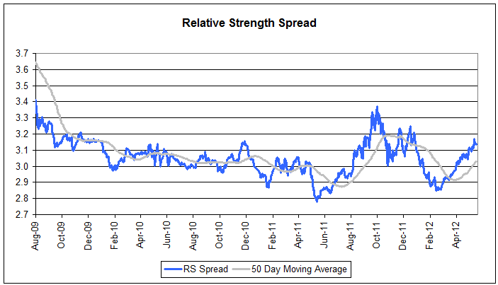
The chart below is the spread between the relative strength leaders and relative strength laggards (universe of mid and large cap stocks). When the chart is rising, relative strength leaders are performing better than relative strength laggards. As of 5/21/2012:

spread52212 Relative Strength Spread

Even during the correction of the past couple of weeks, the RS Spread has continued to rise—a potentially good sign for RS going forward.

Posted by:


The New Death of Equities

May 21, 2012

From AdvisorOne, yet another article about how much investors hate the market these days:

Despite strong U.S. equity market returns in early 2012 that sent the Dow back above 13,000 by the end of February, indications are that many Americans remain investment spectators, reluctant to participate in the equity market rally, a Franklin Templeton global poll has found.

Investor skepticism appears to be tied to the extreme volatility witnessed in 2011, in which the Dow Jones Industrial Average had 104 days of triple-digit swings-representing a significant portion of the 252 total trading days last year. Indeed, when asked about the importance of various market scenarios when deciding to purchase an equity investment, market stability was most frequently identified by U.S. respondents as an important factor.

“The market volatility that has persisted since 2008 is keeping many investors on the sidelines, and their ability to view positive equity market performance constructively has been thwarted by the market ups and downs that are at odds with the stability they are seeking,” John Greer, executive vice president of corporate marketing and advertising at Franklin Templeton Investments, said in a statement. “But the reality is that investors who have been waiting for ‘the right time’ to get back into the equity market have been missing out on the market rally we’ve witnessed over the past few years.”

This is sadly typical of retail investors. Volatility tends to be greatest at market bottoms, and volatility tends to be what investors most avoid. As a result, investors often avoid returns as well!

This period strikes me as psychologically reminiscent of the late 1970s, when Business Week famously published a cover announcing the death of equities. Consider what investors had been through: in the late 1960s, the speculative names had gotten torched. By 1973-74 even the bluest of the blue chips had gotten ripped. By the late 1970s, 20% annual corrections were the norm. The economy was a mess and investors simply opted out. The Business Week cover just reflected the spirit of the time.

The late 1970s are not so different from now. The speculative names collapsed in 2000-2002, followed by a bear market in 2008-2009 that got everything. The last couple of summers have been punctuated by scary 15-20% corrections. The economy is still a mess. Psychologically, investors are in the same spot they were when the original cover came out. Based on fund flows, “anything but stocks” seems to be the battle cry.

Yet, consider how things unfolded subsequently. Only a few years later both the market and the economy were booming. (High relative strength stocks began to perform very well several years ahead of the 1982 bottom, by the way.) The Business Week cover is now famous as a contrary indicator. It wouldn’t shock me if the current investor disdain for stocks has a similar outcome down the road.

deathofequities 1 The New Death of Equities

Business Week: the famous "Death of Equities" cover


Posted by:


Option Sentiment

May 21, 2012

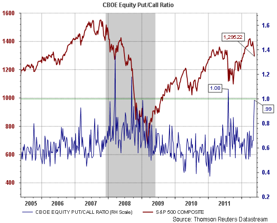
A nice chart from the blog of Horan Capital Advisors of the put-call ratio:

putcall5182012 Option Sentiment

Source: Horan Capital Advisors (click on image to enlarge)

Their observation is that ratios near one are often lows. There’s no way to know if the same thing will happen this time, but it fits in with the generally negative sentiment we see in our client behavior survey as well.

via Abnormal Returns

Posted by:


Beautiful Deleveraging

May 21, 2012

Ray Dalio of Bridgewater Associates is an interesting and pragmatic economic thinker. He had a recent interview with Barron’s, in which he described the deleveraging process in the US as “beautiful.” Here’s a snippet:

A beautiful deleveraging balances the three options. In other words, there is a certain amount of austerity, there is a certain amount of debt restructuring, and there is a certain amount of printing of money. When done in the right mix, it isn’t dramatic. It doesn’t produce too much deflation or too much depression. There is slow growth, but it is positive slow growth. At the same time, ratios of debt-to-incomes go down. That’s a beautiful deleveraging.

We’re in a phase now in the U.S. which is very much like the 1933-37 period, in which there is positive growth around a slow-growth trend. The Federal Reserve will do another quantitative easing if the economy turns down again, for the purpose of alleviating debt and putting money into the hands of people.

We will also need fiscal stimulation by the government, which of course, is very classic. Governments have to spend more when sales and tax revenue go down and as unemployment and other social benefits kick in and there is a redistribution of wealth. That’s why there is going to be more taxation on the wealthy and more social tension. A deleveraging is not an easy time. But when you are approaching balance again, that’s a good thing.

What makes all the difference between the ugly and the beautiful?

The key is to keep nominal interest rates below the nominal growth rate in the economy, without printing so much money that they cause an inflationary spiral. The way to do that is to be printing money at the same time there is austerity and debt restructurings going on.

It’s interesting that he seems pretty satisfied with the process the US has taken so far, in the sense that we may avoid significant inflation or deflation. The deleveraging process won’t be easy socially or economically, but it’s certainly preferable to a Japan-type scenario. His opinion is interesting to me because so many other commentators are falling into the doomsday camp, although half are expecting Japan-style deflation and the other half are counting on Weimar-style inflation.

I suppose it is human nature to worry about the worst thing that can happen, but Mr. Dalio suggests a middle path might be the most realistic.

Posted by:


Weekly RS Recap

May 19, 2012

The table below shows the performance of a universe of mid and large cap U.S. equities, broken down by relative strength decile and quartile and then compared to the universe return. Those at the top of the ranks are those stocks which have the best intermediate-term relative strength. Relative strength strategies buy securities that have strong intermediate-term relative strength and hold them as long as they remain strong.

Last week’s performance (5/14/12 – 5/18/12) is as follows:

ranks51912 Weekly RS Recap

The worst performance for the week actually came from the bottom quartile of the ranks (laggards).

Posted by:


People First

May 18, 2012

Financial advisors often become enamored with new whiz-bang products and new and improved methodologies. Sometimes they really are new and improved, so we always need to check them out. But the bedrock of the business is really the relationship with the client. You need to care about the client’s well-being and they need to know you care. You need to go the extra mile.

I was thinking about this in relation to this article about customer service in the retail world from PandoDaily.

There is simply no such thing as a shortcut when it comes to customer service. You can provide an alternate service, if you don’t want to invest in a local call center of friendly competent people armed with helpful databases of customer information. But don’t call this customer service, because it isn’t. To call a person reading from a script a customer-service representative is like calling a middle school play Broadway. You might as well not have an 800 number.

Zappos, GoDaddy, Qualtrics and Braintree have proven that spending money on customer service isn’t throwing money away — it’s investing in the business. Done well, good customer service is the difference between a mediocre business and a great one. You can get shoes anywhere, and Zappos’ site design has never been that amazing; its entire success is wrapped up in treating people well. GoDaddy doesn’t view its call center as a “cost center,” arguing it has actually generated more than $100 million in annual revenues.

If anything, client service is even more important in wealth management because the product itself is intangible. How can you put a price on financial security and peace of mind? And, as GoDaddy shows, good client service can generate revenues, not just add to costs. People come first.

Posted by: